- Home
- Transportation
- Trains
- 17 Simple And Cheap Ways To Make NYC's Subways A Lot Better
17 Simple And Cheap Ways To Make NYC's Subways A Lot Better
1. Antimicrobial Benches

2. Cardinal Directions
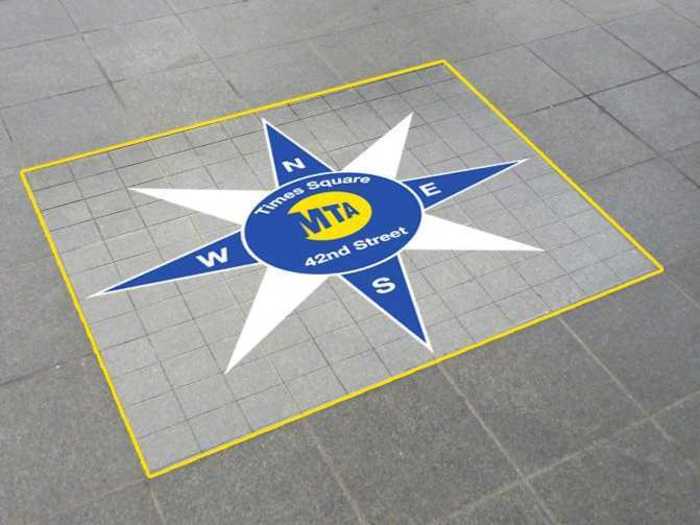
"Wouldn’t it be great to step out of a train, look slightly down, and see what direction you’re in? Stations can be very disorienting, especially after a long trip.
"Simple cardinal directions alleviate this problem."
Image and text provided by Randy Gregory II's "100 Improvements to the New York Subway".
3. Stairway Directions
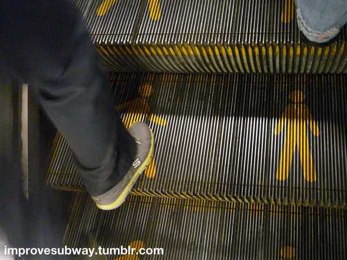
"If you’re kind (or observant), when you use the escalators, the rule is “stand on the right, walk on the left”. Subtle reminders like these markings would help remind users of this rule, and keep busy New Yorkers moving.
"(Person designed by Tara from The Noun Project)"
Image and text provided by Randy Gregory II's "100 Improvements to the New York Subway".
4. Error Messages
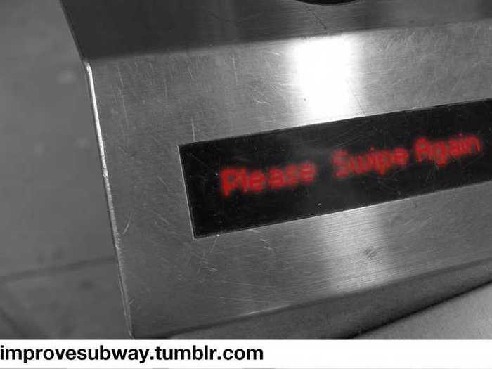
"When you swipe a metrocard, a green message appears on the lcd screen, and a beep goes off. Every time. Even if you miss-swipe, your card is out of money/time.
"It’d be better if a different light showed, or if a different sound played."
Image and text provided by Randy Gregory II's "100 Improvements to the New York Subway".
5. Attraction Guides
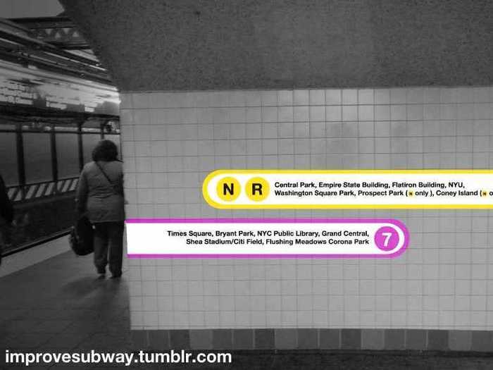
"In the past 8 months, I’ve had more than a few times where a fellow traveler has asked me where a particular building or feature of the city is in relation to where we are in the subway.
"Why aren’t there guides for that? Maybe just a simple system of lines in parts of the station can show where buildings are like the NYC Public Library (the last rider I encountered was looking for the specific one from GhostBusters), and what lines the user would have to take in order to get there."
Image and text provided by Randy Gregory II's "100 Improvements to the New York Subway".
6. Metrocard Machines On Platforms
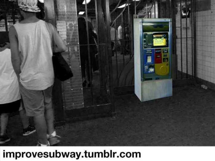
"You swipe your metrocard, and you realize that after swiping, you have a few cents left…what if you could refill it immediately, while waiting for the train?"
Image and text provided by Randy Gregory II's "100 Improvements to the New York Subway".
7. Notifications On Platforms
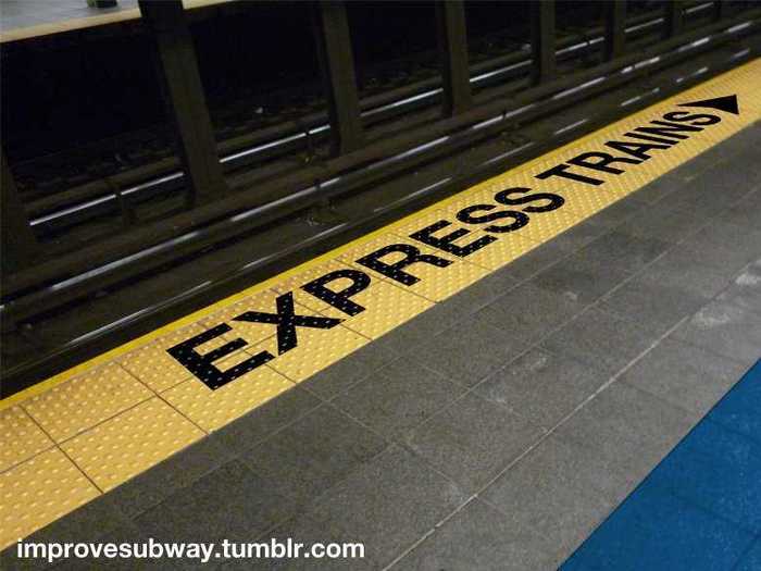
"Once again, playing off of the concept of not knowing which train is which, why not have massive typography on the ground of the platform?
"This mockup also shows the proposed 'blind line'."
Image and text provided by Randy Gregory II's "100 Improvements to the New York Subway".
8. Designated Directions On Stairs
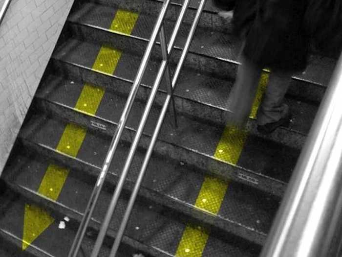
"At first glance, this could be seen as a hopeless gesture. But in countries like Japan, this works. People see the arrows, and follow accordingly, minus rush hour.
"A man can dream, right?"
Image and text provided by Randy Gregory II's "100 Improvements to the New York Subway".
9. Station Colors
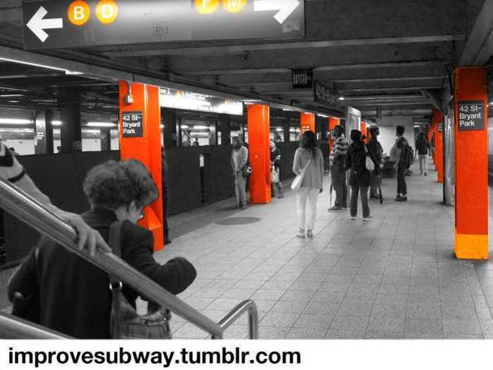
"There is a certain industrial feel to the subway stations. Some stations, like Union Square, are completely gorgeous in their layout and design, and the new stations, like Fulton Center, are incredible in their scale & move towards a friendlier environment.
"However, many stations could benefit from some color, namely the color of the lines they represent. BDFM could be painted in brilliant Pantone 165, and the 7 line could have swirls of purple throughout the line, adorning walls and columns alike."
Image and text provided by Randy Gregory II's "100 Improvements to the New York Subway".
10. Hand Sanitizer
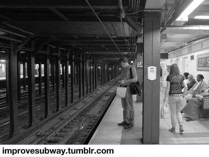
"The subway is a dirty place. Hand sanitizer machines, placed throughout the station could help improve the cleanliness, and help promote better health during cold & flu season.
"Position them near the attendants to reduce the risk of vandalism."
Image and text provided by Randy Gregory II's "100 Improvements to the New York Subway".
11. Moving The Vertical Bars
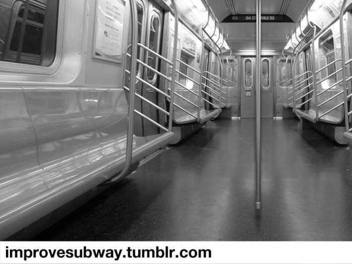
"A WNYC listener suggested this, and I find it’s a positive suggestion. Riding the 7 train everyday, there’s always the moment when the train is packed, and everyone gathers around the bar in the middle of the doors.
"This causes an annoyance, especially when there’s space in the areas in between the doors, where I usually like to stand.
"Moving the bars to the middle of those sections would help separate these crowds, which could help in rush hours."
Image and text provided by Randy Gregory II's "100 Improvements to the New York Subway".
12. System Diagrams On Platforms
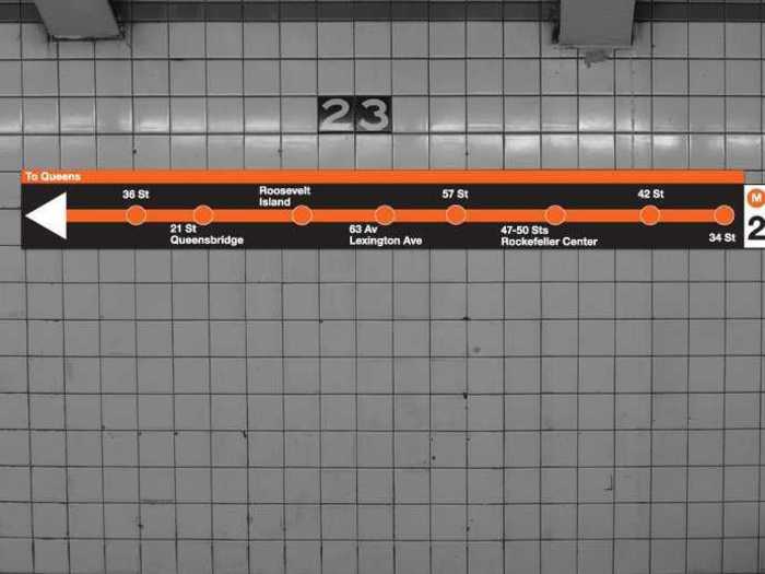
"Inspired by the subways in Barcelona, there should be a revised system in how the subway diagram is shown. Make it big, make it obvious.
"This way, travelers know where they’re going."
Image and text provided by Randy Gregory II's "100 Improvements to the New York Subway".
13. Emergency Guides
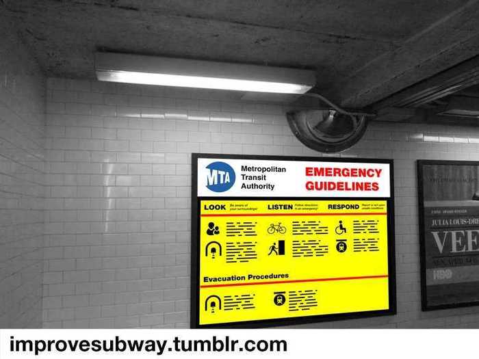
"In San Francisco, they do an excellent job of making emergency procedures large & easily legible through a system of symbols and san serif fonts.
"While the MTA does a good job of conveying information, it could be bigger and more 'in the face' of the common rider.
Image and text provided by Randy Gregory II's "100 Improvements to the New York Subway".
14. More Courtesy Signs
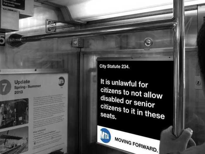
"In San Francisco, there are signs dictating that it is the law to allow senior citizens and the disabled the opportunity to sit on the seats in the front of the bus.
"In New York, it’s a suggestion. Time for a change?"
Image and text provided by Randy Gregory II's "100 Improvements to the New York Subway".
15. Bus Schedules
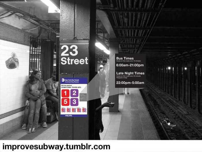
"Recently, I’ve learned that the bus service in NYC is excellent, despite the poor traffic, it’s generally consistent. Being a subway-only kind of person, I know little to nothing about the buses, and the information available at the subway stations aren’t very friendly in their language.
"If the system was redesigned for a focus on the most important information (times, bus numbers, routes), and then strategically placed in the station, riders might be more interested in using the bus system."
Image and text provided by Randy Gregory II's "100 Improvements to the New York Subway".
16. Histories Of The Subway
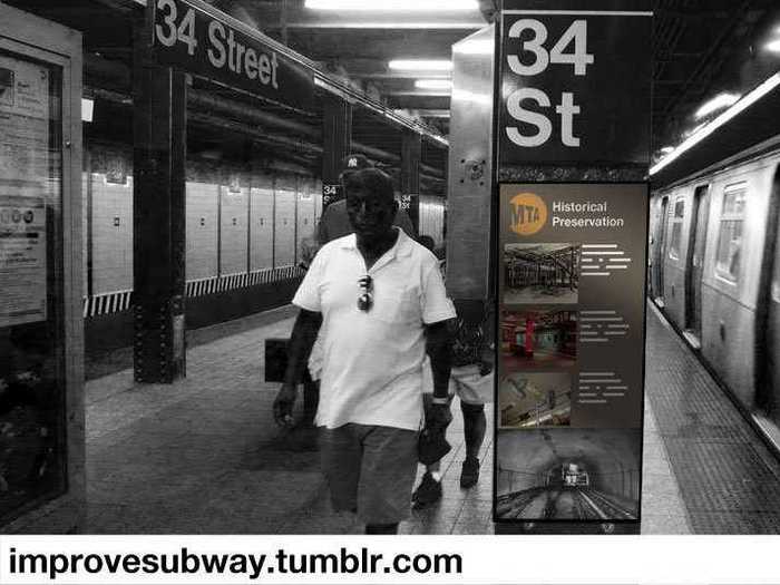
"The subway has an incredible history. Being one of the biggest engineering marvels in the country, it’d be nice to learn about the histories of the stations while waiting for a train.
"Construction methods, cooling systems, the manpower involved…there is a deep and rich history here, and it deserves to be spread throughout the system."
Image and text provided by Randy Gregory II's "100 Improvements to the New York Subway".
17. Exit/Enter Only Turnstiles
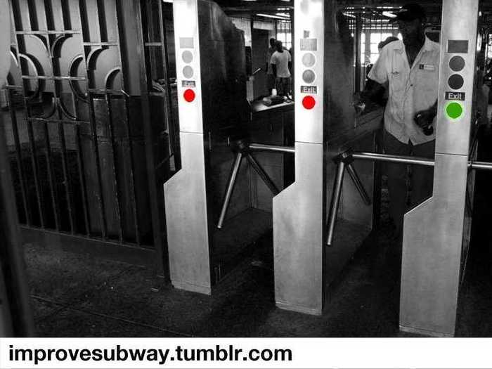
"Currently, when commuters enter or exit the turnstiles, it’s generally a mad rush. In the middle of rush hour, it’s an even bigger pain.
"Using rider data, we could figure out when these “rushes” happen, and by utilizing LEDs and locking turnstiles, we could make exiting riders go through one lane, versus three.
"This could also work in reverse…if more riders exit then enter, depending on data, the lighting could be different, and the turnstile could be locked the other way.
"(Thanks to William Wong for the inspiration.)
Image and text provided by Randy Gregory II's "100 Improvements to the New York Subway".
There's room for improvement everywhere.

Popular Right Now
Popular Keywords
Advertisement