We had interior designers critique 10 famous apartments from shows like 'Friends' and 'Gossip Girl'
Sophia Mitrokostas

- Not every fictional TV apartment is created equally, according to interior designers.
- Interior designers liked some of the apartments seen on "Friends" and "The Mindy Project."
- But apartments from series like "Gossip Girl," "Sex and the City," and "How I Met Your Mother" weren't as popular.
Television is filled with some truly eye-catching abodes, but not all on-screen apartments are created equally when it comes to style.
Insider had a group of interior designers critique some of the most famous living areas on TV.
Here's how the pros reacted to the apartments, plus what they loved or hated about each.
Experts thought Monica and Rachel's apartment from "Friends" had plenty of personality, but needed a few updates.
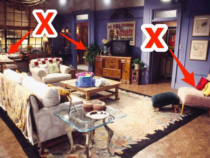
Few television spaces are as iconic as the New York City apartment where Monica and Rachel lived during the early seasons of "Friends."
Katie Stix, design director of Tennessee-based Anderson Design Studios, told Insider that she appreciated the vibrant walls and eclectic styling of the classic sitcom abode.
"The purple walls are bold but iconic. The mismatched furniture properly relays the women's young, single, New York lifestyle in the '90s," said Stix. "Though I cringe every time I see the table lamp; it's too old looking for them. Maybe Monica's aunt left it behind."
Another interior designer praised the apartment's floor plan but thought some of the styling details needed a second look.
"This apartment layout works because it leaves a circulation path from the bedroom," Lonni Paul, an interior designer based in Los Angeles, told Insider. "However, the unruly plant on the TV cabinet looks like it needs some help."
Paul also said she didn't like the red and yellow pillows on the small chair off to the side since they "stand out and feel out of place."
Designers thought the layout of Frasier Crane’s apartment from "Frasier" was confusing.
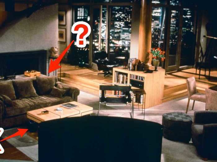
The swanky Seattle apartment of television's most famous radio psychologist may have been Frasier Crane's pride and joy, but NYC-based interior designer and former TV writer Alec Holland told Insider that the apartment's floor plan and styling could use an update.
"Why would anyone have their furniture facing away from that fireplace? I'd turn everything around, and open the living space up," said Holland.
He also suggested giving the coffee table a face-lift.
"If you replaced that horrible coffee table with something more modern and square, stacked some picture books on it, and added a few [art objects], it would up the elegant vibe," Holland told Insider.
Stix took issue with the bland color palette of the apartment and also vetoed Frasier's eye-catching coffee table.
"A little color would be welcome in this room, it is just so vanilla and beige. I wish they placed the Eames lounge chair in a more prominent place and got rid of the heinous coffee table," she said.
Ted Mosby's apartment from "How I Met Your Mother" was not a hit with designers.
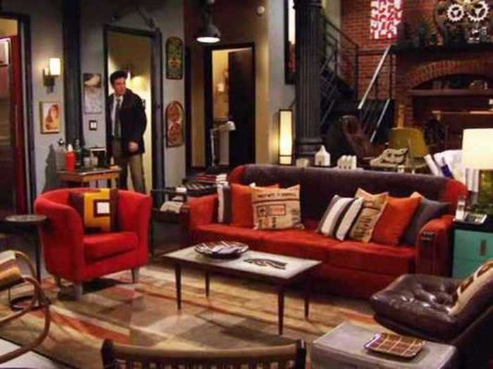
Although Ted Mosby may be employed as an architect, some of his design choices left interior designers scratching their heads.
"Yikes! I don't even know where to begin on this one. The clutter is out of control and every inch of space is filled with something. The red everywhere is overwhelming," said Paul.
The layout of the apartment also seemed counterintuitive to Holland, who suggested rearranging the furniture and adding curtains to make the space more functional.
"This is another example of a TV apartment where the fireplace isn't the focal point. I'd flip this room around pronto. If the office has to stay, I'd hang a good drape that can close it off so you don't have to look at it," he said.
However, interior designer Kobi Karp of Miami's Kobi Karp Architecture and Interior Design appreciated some aspects of Ted's abode.
"I do see a drafting table in the back of the room near the window, which is exactly where I would place it if it were my apartment," said Karp.
The designer also said Ted's apartment could benefit from some hidden-storage solutions to help him creatively hide all of his clutter.
The loft from "New Girl" inspired mixed reactions from designers.
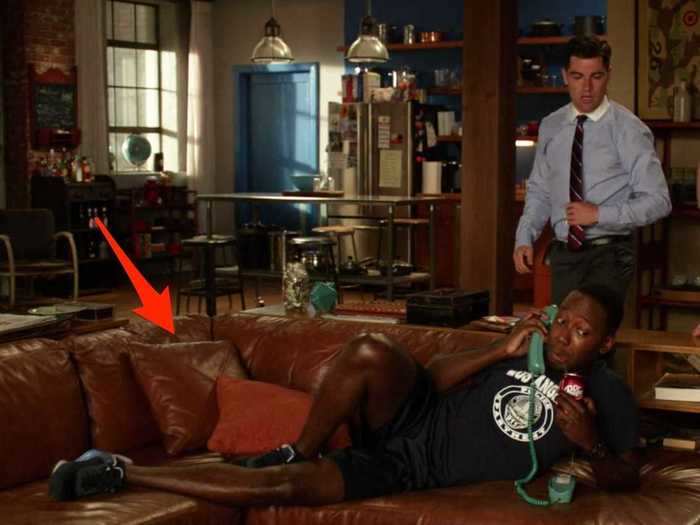
The apartment from "New Girl" is a huge space with a distinctly masculine vibe — but it's not perfect.
For starters, Paul told Insider that the furnishings of this apartment might be out of sync with its massive proportions.
"Everything here feels out of scale. The sofa is too small as well as the coffee table. The chair and ottoman feel too big by contrast. The side table to the left of the sofa is too high. I wish the sofa was a lighter color to brighten up the place. The apartment is too dark," she said.
However, Stix raved about the roomy loft and its "fresh" vibe.
"I really love everything here. The space itself is amazing and I love the sectional. The 'found' collected items are hip and fresh," she told Insider.
Although the designer did like the combination of the sofa and a bookshelf, she conceded that the apartment could benefit from brighter light fixtures or additional floor lamps.
Stylists found Mindy's apartment from "The Mindy Project" to be totally trendy, especially her home office.
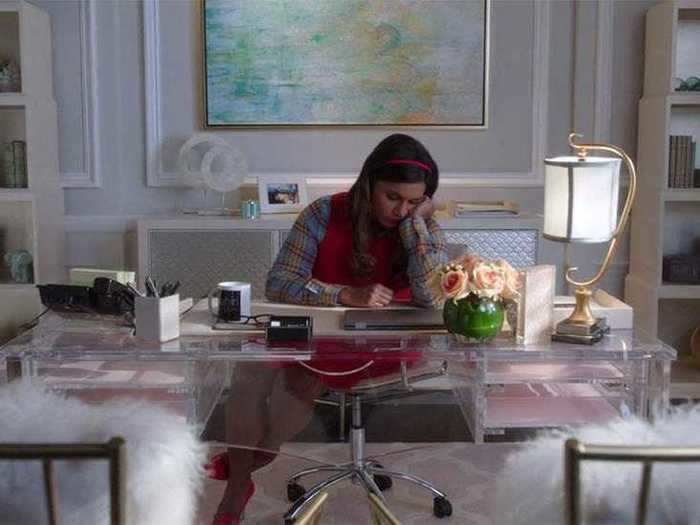
Mindy's combination brownstone apartment and medical practice seems like a stylish marriage of elegance and maximalism — and designers love it.
"This space is on-point and on-trend for current design styles. I like the decorative molding and the two-tone wall colors in her office," Joe Human, NYC-based interior designer of Designs By Human, told Insider.
That said, even though the Lucite desk is cool and works well with the room, it's not exactly practical, Human pointed out.
Paul also gave Mindy's office a big thumbs up, praising the color choices and soft character of the furnishings.
"This is a super chic office and the transparent desk makes the room appear larger than it is. The light colors mixed with the pastels also give the room a feminine vibe," said Paul.
Carrie Bradshaw's apartment from "Sex and the City" earned mixed praise from stylists, who especially had issues with her bedroom.
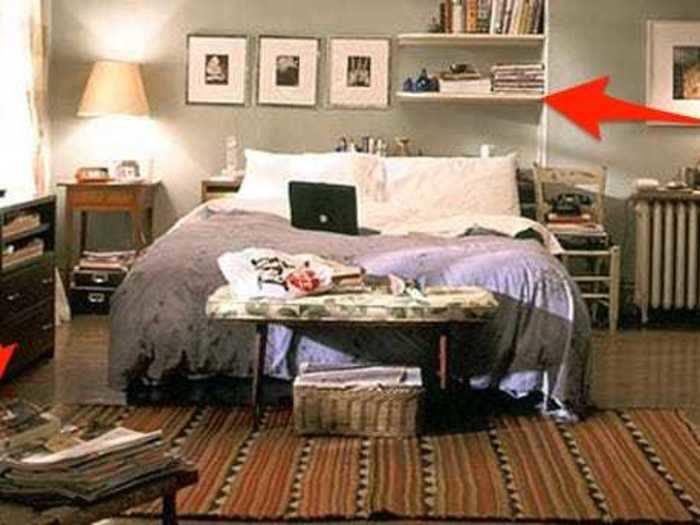
Fans of "Sex and the City" know Carrie Bradshaw for her fashion obsession and cavernous closet, but her apartment, in particular, her bedroom, provoked mixed reviews from interior designers.
"The asymmetry of the room denotes that the owner has an artistic mind," said Karp. "I like the placement of the bed, allowing the morning sun to act as a natural alarm clock for the person sleeping."
Karp also pointed out the magazine problem in Carrie's bedroom, saying perhaps she could benefit from another bookshelf so she could cut back on the tabletop clutter.
Holland, however, wasn't in love with the casual vibe of Carrie's bedroom, calling it "lackluster."
"I'd get a good shag rug, put a headboard on that bed, and maybe wallpaper behind it to create a more interesting focal wall. I'd also lose the off-center bookcase above the bed — a disaster waiting to happen — and paint that radiator a glossy black," he said.
Jerry's apartment from "Seinfeld" is surprisingly modern but also a little boring.
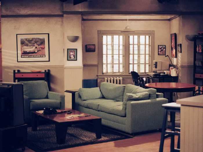
Even though "Seinfeld" debuted in 1989, designers say Jerry Seinfeld's apartment has actually aged pretty well.
"I've always liked this apartment. It's orderly with everything having a place to go. The sofa color pops making the room brighter and the modern style gives the room a point of view," said Paul.
Of course, there's always room for improvement. Stix told Insider that she would have liked to see more personality in the apartment's styling.
"My first thought is that this apartment desperately needs art. I love the couch color but it drives me nuts when the accent pillows match the couch," said Stix.
Although Stix approved of the sofa color, she disliked the apartment's muted color palette.
"The wall color is drab and looks too much like a TV set. it would have been better if the paneling and trim was a deep olive green," she said.
The Humphrey loft from "Gossip Girl" needs a total makeover, according to designers.
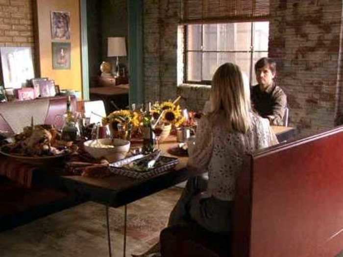
On "Gossip Girl," the Humphrey family's Brooklyn loft is meant to be a cool and quirky living space, but designers didn't appreciate its awkward layout and confusing combination of furnishings.
"This is such a weird space. The window and rattan-type shades are awesome, but everything else should be a start over," said Human.
Stix also found the apartment to be a little unappealing, and noted that it didn't feel like a real family's home.
"This set seems too 'decorator' and staged. I don't care for the tile floors; a stained concrete or distressed hardwood would be more appropriate," she said. "The entry area takes over the entire space and the sitting area is squished in the corner."
She suggested that adding ceiling beams would help accentuate the "warehouse" vibe that the designers may have been going for.
Read More: The first and last outfits of 12 characters on 'Gossip Girl'
Sheldon and Leonard's apartment from "The Big Bang Theory" was a total flop with interior designers.

Although Sheldon and Leonard may be bonafide brainiacs, designers told Insider that the design of the physicists' apartment is anything but genius.
"This is an eclectic bachelor pad that is begging for a makeover," said Paul. "The leather sofa looks really lumpy and uncomfortable, and the wooden chair next to the lounge chair looks out of place. There's also too much clutter."
Karp was also not a huge fan of the apartment's styling, especially its eclectic mix of furniture.
"This looks like a very simple apartment that is very organized. However, the mismatched collection of furniture and décor makes the apartment look a bit like a thrift shop," he told Insider.
The designer added that the apartment could use matching pillows, and that the items displayed on the shelves could use better integration into the space as a whole.
Don Draper's apartment from "Mad Men" is the epitome of mid-century style.
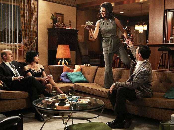
It doesn't get more mid-century modern than Don Draper's Manhattan apartment on "Mad Men."
Paul told Insider that the advertising guru's home is a great visual representation of the character's personality.
"This retro-style apartment is masculine and perfect for a type-A personality. It's organized and nothing feels out of place," said Paul.
That said, Paul has some suggestions, pointing out that the apartment would look much better with a patterned rug.
Holland was also taken with the sleek styling of Draper's urban abode.
"There's not much wrong here. I could see a more festive fabric on the sofa, but those stools are perfection. The hanging light and wood features are also all a big 'yes' for me," he said.
Read More:
READ MORE ARTICLES ON
Popular Right Now
Popular Keywords
Advertisement