THEN AND NOW: 35 photos that show how famous fast-food company logos have changed over time
Meredith Cash,Erin McDowell

- Companies like McDonald's, Starbucks, and KFC have some of the most well-known logos in the world.
- However, the original versions of their logos would be unrecognizable today.
- McDonald's first logo, for example, featured a winking cartoon chef called Speedee.
- Starbucks' original logo features a more detailed drawing of its iconic siren.
Some of today's most recognizable logos in the fast-food industry looked remarkably different when they were first introduced.
McDonald's first logo, for example, featured a winking cartoon chef called Speedee, a predecessor to the fast-food chain's current mascot, Ronald McDonald.
Meanwhile, Starbucks' original logo featured a topless siren, a two-tailed mythical creature similar to a mermaid, and competitor Dunkin' chose to shed the "Donuts" portion of its name and, with it, its old logo.
Below, see how the logos of 10 major fast-food companies have evolved over time.
Read the original article on InsiderLong before Ronald McDonald became the face of McDonald's, the fast-food brand used a cartoon chef named Speedee for branding.
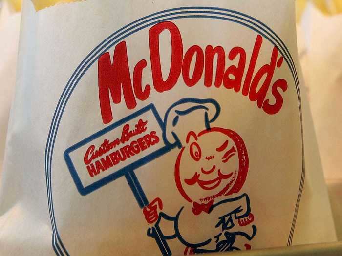
Speedee was meant to symbolize McDonald's quick service. In 1948, the brand's founders, Richard and Maurice McDonald, introduced the Speedee Service System to streamline their operations.
McDonald's burgers once came wrapped with a Speedee decal on the front.
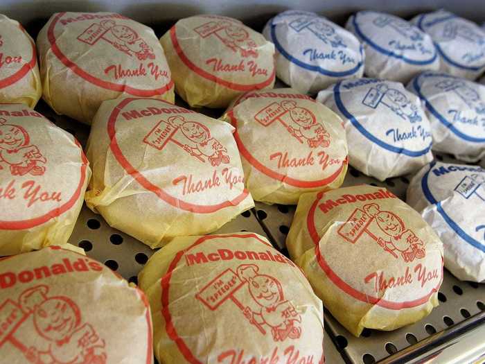
Speedee also adorned road signs and other McDonald's emblems.
McDonald's scrapped the Speedee logo for the first form of its iconic golden arches in 1961.
That same year, Ray Kroc bought the rights to the fast-food chain from the McDonald brothers.
Seven years later, the McDonald's logo began to further resemble its current form.
During this period, the chain's name also appeared within the Golden Arches logo.
Today, McDonald's main logo is a sleek, stand-alone rendition of the classic Golden Arches.
The chain's name no longer appears in the logo itself.
But you can still find relics of McDonald's past at some locations.
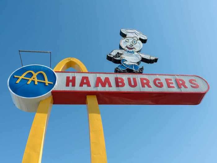
The first two renditions of McDonald's logos, Speedee and Ray Kroc's original Golden Arches, appear on a sign outside of the oldest operating McDonald's location in Downey, California.
Founded in 1972, Popeyes wasn't always called Popeyes Louisiana Kitchen.
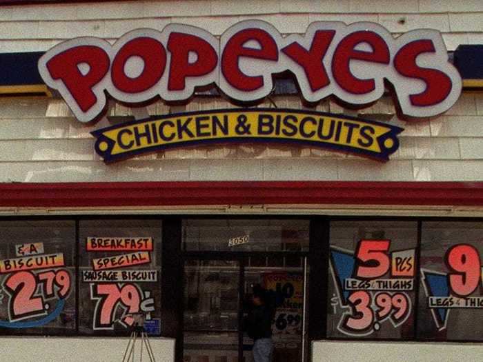
Instead, it used to be called Popeyes Chicken & Biscuits, and after that, Popeyes Famous Fried Chicken & Biscuits.
The original logo featured cartoonish red-and-white letters and a yellow banner that read "Chicken & Biscuits."
In 2008, Popeyes changed its brand to Popeyes Louisiana Kitchen.
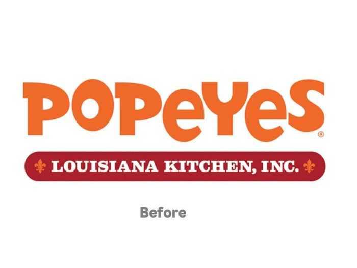
The yellow was dropped from the chain's branding and the company began using the colors orange and red, as well as a fleur-de-lis to pay homage to New Orleans, Louisiana, where the brand hails from.
The company also introduced the chain's now-famous advertising campaign, "Louisiana fast."
In 2020, Popeyes simplified its logo yet again amid tremendous sales and worldwide expansion to China.
The letters are now straighter, thicker, and the logo is now Popeyes' signature orange color.
The combination mark also changed from a red "P" with the words "Louisiana Kitchen" encircling it to an illustration of a white chicken on an orange background, according to a report by Business Insider.
Taco Bell's original location used block-style lettering to showcase the restaurant's name.
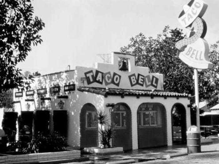
The location also featured a retro bell and a sombrero on a sign.
Between 1984 and 1994, Taco Bell rocked a colorful logo with a straight variation of its classic bell.
The red, yellow, orange, and green logo lasted for 10 years.
Taco Bell once again updated its logo in 1995.
The most recent iteration of Taco Bell's logo is the simplest yet.
In 2016, the company chose to update its logo for the first time in more than 20 years with a sleek look featuring a white bell on a purple background and simplified block lettering.
Burger King's original logo features a king with a lopsided crown seated atop a hamburger and holding a giant soda. In 1969, the company simplified its logo to look like a burger.
Burger King swapped out its logo for the first time in franchise history just two years after the chain was purchased by the Pillsbury Company.
A slight change in 1994 came with a cleaner font and darker, slightly larger burger buns.
A slight change in 1994 came with a cleaner font and darker, slightly larger burger buns.
The new logo incorporated straight, block letters, and axed the curvy font that screamed "1970s."
Five years later, in 1999, Burger King introduced its current logo, which tilted the burger on its side, shrunk the burger buns, and incorporated a blue swirl mark around the outside.
The current color scheme ties back to the company's original logo.
Kentucky Fried Chicken's original logo was a black-and-white drawing of Colonel Sanders.
Sanders famously created the fried chicken recipe and achieved widespread success later in his life.
In the early 1990s, the brand added a pop of color to its logo.
Kentucky Fried Chicken also altered its rendition of its founder and began embracing its "KFC" moniker.
Later, KFC dropped its slashed, red and white design and instead opted for a close-up of Sanders.
The logo lasted until 2006.
The fast-food chain updated its logo once again in the mid-2000s, placing Sanders against a red background.
KFC also placed a red apron over Sanders' traditional white suit to remind customers about the Colonel's past as a chef.
When Starbucks first opened in 1971, the brand boasted a very different logo from the one we're all familiar with today.
The coffee brand's original logo featured a detailed drawing of a topless siren, a two-tailed mythical creature similar to a mermaid.
In the late 1980s, Starbucks introduced green to its logo. Today, green is the brand's signature color.
The company created a cleaner version of the iconic siren and surrounded her with "Starbucks Coffee" in block letters.
The coffee brand made a slight logo change in 1992.
The new logo, which focused in on the siren's upper body, christened Starbucks stores for 19 years.
In 2011, Starbucks unveiled its most recent logo update.
The company kept its iconic siren symbol while dropping the exterior text and further embracing its green and white color scheme.
Subway was founded in Bridgeport, Connecticut, in 1965 when nuclear physicist Dr. Peter Buck invested $1,000 into a sandwich shop as a way for college freshman Fred DeLuca to pay for his tuition.
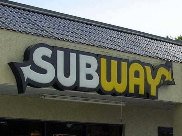
The original Subway store boasted a similarly shaped logo with entirely yellow lettering, but was updated to its white, yellow, and forest green form just three years later.
From 1982 to 2016, the brand adjusted its logo to have a slanted font.
The new logo also had slightly less curvy arrows on either end.
And in 2016, the sandwich chain updated its logo once more.
The brand embraced vibrant colors and its original font for its most recent logo. It also straightened out the arrows on the "S" and "Y."
Domino's original logo featured a pizza box with a red domino and the restaurant's name.
The brand embraced this logo and very similar iterations for many years after its founding in 1960.
The pizza chain simplified its logo to a single-tile domino in 2012.
Dunkin' Donuts' logo has changed considerably since the company was first founded in 1950.
The original logo featured a 1950s-esque maroon cursive font.
Soon after, the brand chose to embrace its famous donuts in its iconography. The company's logo featured "Dunkie" the donut-based character from 1956 through 1960.
Many iterations later, in the early 2000s, Dunkin' Donuts settled on its pink and orange color palette.
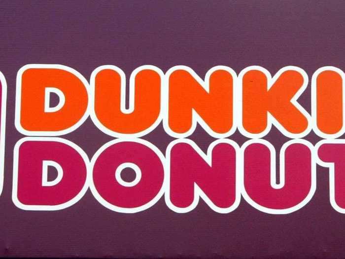
The brand also featured a coffee cup in its logo.
The coffee and confectionery chain modernized the coffee cup in its logo in 2007.
Shortly after, leadership would go even further to shake the brand's association with doughnuts.
Dunkin' dropped the "Donuts" from its name in September 2018.
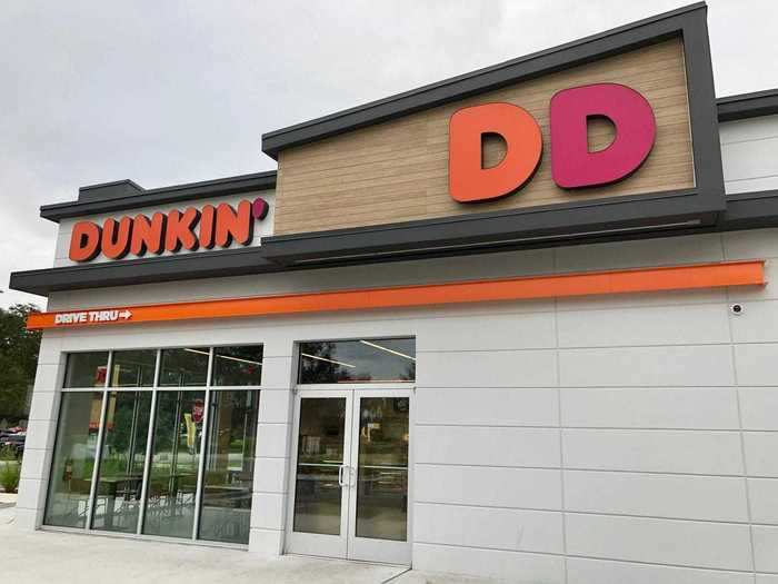
The name change, and subsequent logo changes, went into place at the beginning of 2019.
For almost the entire duration of Wendy's existence, the burger chain's logo has been some iteration of curved, block letters and a cartoon of Melinda Lou "Wendy" Thomas, daughter of Wendy's founder Dave Thomas and the namesake of the brand.
Aside from differences in coloring and the addition of "Quality is Our Recipe" above Wendy's head, the chain's logo remained almost entirely unchanged between 1969 and 2013.
The fast-food restaurant's new logo, which launched in 2013, gave Wendy a fresh look.
The changed logo also swaps out the old block lettering for a font that looks more like handwriting and eliminates the black, curvy decal from the original logo.
- Read more:
- Why so many fast-food logos are red
- Taco Bell is serving a watermelon-flavored slushy with candy 'seeds' you can eat
- Burger King pulled an ad showing people eating its Vietnamese burger with oversized chopsticks after it was called racist
- We compared the most popular menu items at Chick-fil-A, KFC, and Popeyes — and the winner is clear
READ MORE ARTICLES ON
Popular Right Now
Advertisement