The ugliest skyscraper in every state
Frank Olito

- Every state has a skyscraper that locals hate.
- Some buildings are considered ugly because they have weird design quirks, like the AT&T Building in Nashville and the ultra-thin Wells Fargo building in Salt Lake City.
- Others are too bland and thus considered eyesores, like One Shell Square in New Orleans, Louisiana, and SunTrust Plaza in Richmond, Virginia.
All across the country, there are tall and striking buildings ... but not all of them are visually appealing.
Just like every state is home to an ugly building, every state has an ugly skyscraper. Scouring local online forums, architectural critiques, and news articles, Insider went state by state to find the most architecturally questionable structures 15 floors or taller.
Keep reading to find out which skyscraper in your home state locals consider the biggest eyesore.
Some locals feel that the top of Alabama's RSA Battle House Tower in Mobile doesn't fit with the rest of the building and was "slapped on as an afterthought."
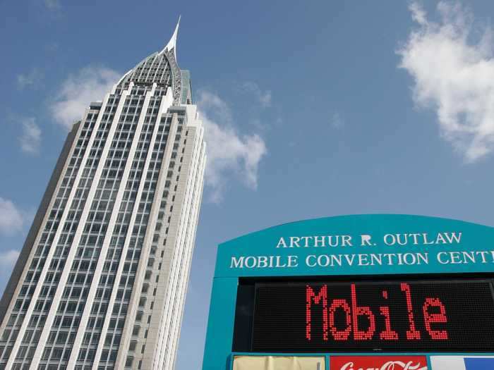
"I have mixed feelings about the RSA Battle House in Mobile. It's not ugly and it does not offend me, but the rather flamboyant top strikes me as a pastiche that has an element of kitsch to it," Clark Park said on City-Data.com. "It actually looks like a traditional Russian 'Kokoshnik' tiara. I'm not against skyscrapers having spires or finials, but I think they should relate to the overall architectural design of the structure and not some useless ornament that was slapped on as an afterthought."
Alaska's Hilton Anchorage East Tower is sometimes called "old" and "ugly."
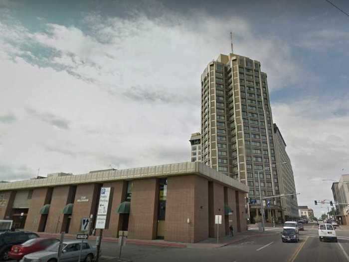
"This hotel is old, ugly, [and] there are stains on the carpet," said one reviewer on TripAdvisor. "It's expensive [and] needs a coat of paint on the walls."
Arizona's Wells Fargo Building in Phoenix was once deemed "a 27-story-high extension of the sidewalk."
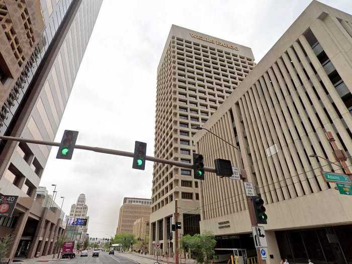
"If it weren't for those windows, this thing would just look like a 27-story-high extension of the sidewalk," Phoenix New Times wrote. "Ugly."
Arkansas' Simmons Tower in Little Rock has been described as "god awful."
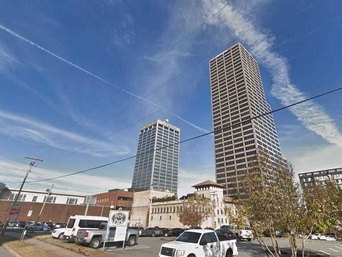
"Simmons Tower is god awful and looks like a big brown...cube," said one poster on Urban Planet.
One news outlet called California's 1100 Wilshire in Los Angeles "hideously mismatched."
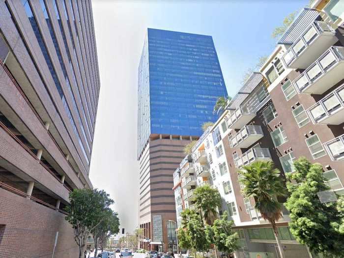
"Imagine you're building a clay-colored office structure," Time Out Los Angeles wrote. "You have 16 stark, rectangular floors finished so you decide to take a break at the bar. A fuzzy number of shots later, you find yourself at the losing end of a bet: The remaining 20 stories will be built as a glass triangular tower. This is the only explanation for the hideously mismatched 1100 Wilshire that we're willing to accept."
Colorado's One Lincoln Park in Denver has been described as a "train wreck."
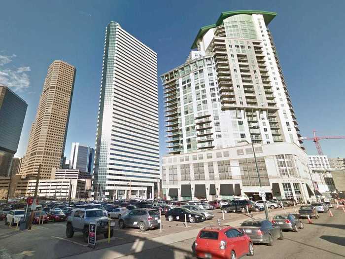
"One Lincoln Park is a train wreck, and not just because the developer, Erik Osborn, was indicted for grand theft, but because the building is a total mess architecturally," Denver's Westword wrote. "For instance, what does that traditional-looking base have to do with the 'Miami Vice'-style tower that rises above it?"
The review of the building continues, "And digital design is what encouraged many of its excesses, including the ill-proportioned arched top, which appears to have the wrong radius. Speaking of wrong, the tower looks too short in relation to both the base and the curved topper."
Connecticut's Knights of Columbus Building in New Haven is sometimes compared to a fortress.
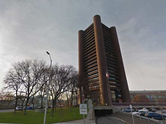
The Knights of Columbus Building is "a fortress-like office tower with massive turrets at each corner, which was so bluntly arrogant in its blank, alien form that it made all the city seem its prisoner," The Washington Post wrote.
Delaware's Wilmington Tower in Wilmington has been described as having a "brutalist exterior."
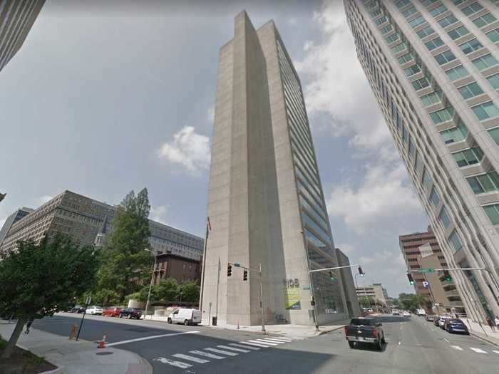
"Many professionals and businessmen, who have leased space in the 21-story tower, properly called the American International Building, say the structure with the 'brutalist' exterior is not user-friendly," the News Journal reported at the time of the building's opening.
Locals call Florida's Majesty Building in Altamonte Springs the "I-4 Eyesore."
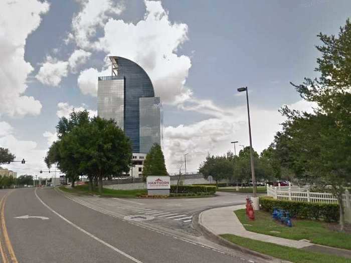
Some locals agree that the Majesty Building in Altamonte Springs is the ugliest skyscraper in Florida.
Georgia's Georgia-Pacific Tower in Atlanta has been described as "blocky and lifeless."
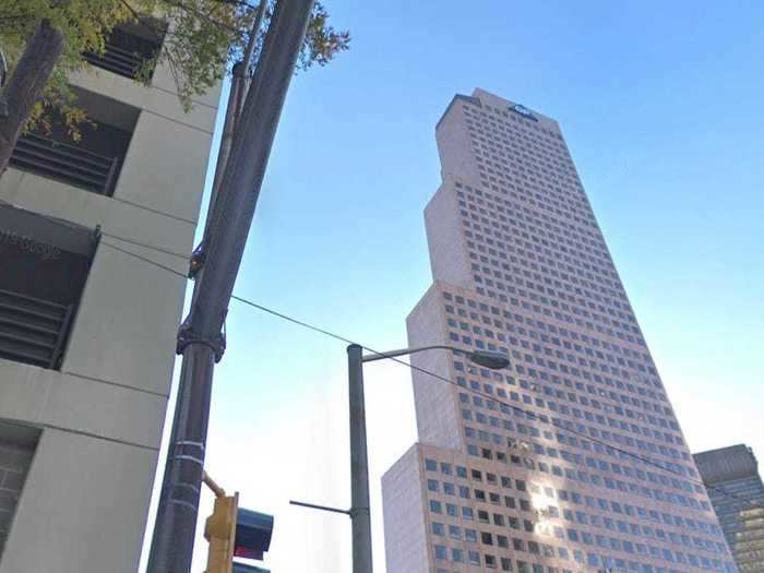
"How ugly is this?" one user wrote on skyscrapercity.com. "Far too blocky and lifeless."
Locals don't love the patterned exterior of Hawaii's Grand Waikikian Hotel in Honolulu.
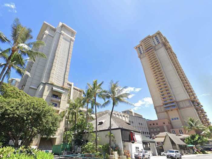
Locals are not fond of the architectural flair of the Grand Waikikian Hotel.
Idaho's Zions Bank Building in Boise is 18-stories tall, and that's really all there is to describe it.
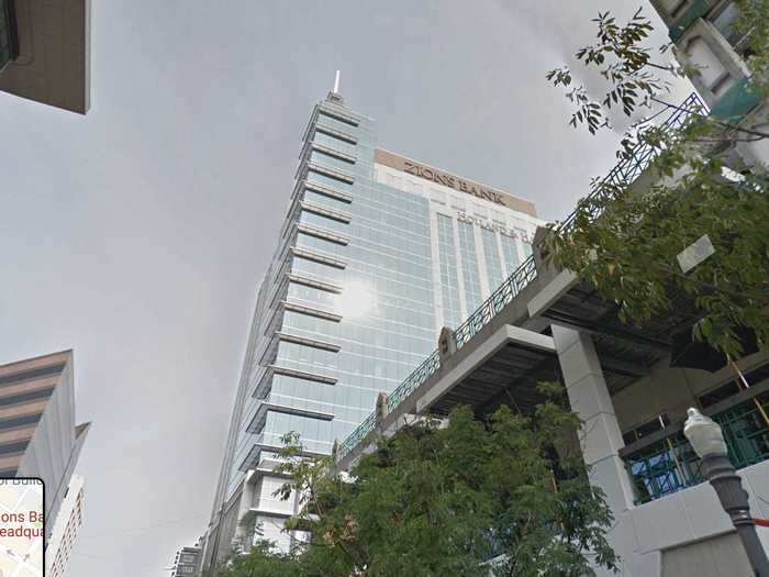
Locals agree that the Zions Bank Building is the ugliest skyscraper in Idaho.
A media outlet called Illinois' 311 S Wacker Dr in Chicago an "outdoor mall in skyscraper form."
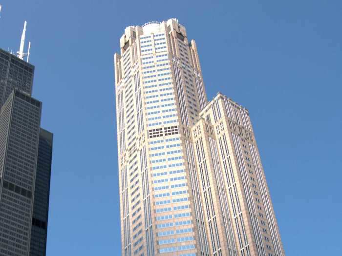
"This pink, postmodern model of excess, on the other hand, screams '1990,' like an outdoor mall in skyscraper form," Time Out Chicago wrote. "The building's crown is gaudily lit up at night by more than 1,500 fluorescent tubes."
Indiana's Salesforce Tower in Indianapolis is said to look like a child made it.
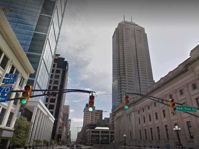
The Salesforce Tower is the tallest building in the state, but its clunky design is unimpressive. "The Salesforce building looks like my 12-year-old nephew made it out of a Lego moon kit," one Twitter user said about the building.
Iowa's 801 Grand in Des Moines is often compared to a fortress because of its quirky design.
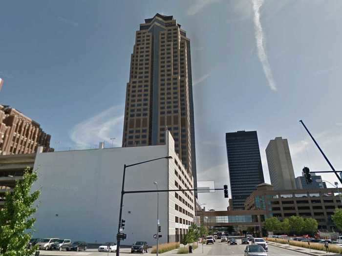
801 Grand is the tallest building in the state, but its bizarre asymmetrical design makes it look like a fortress in the middle of the city. One Reddit user described the building as looking "cold."
Not everyone is a fan of the blue hue of Kansas' 250 Douglas Place in Wichita.
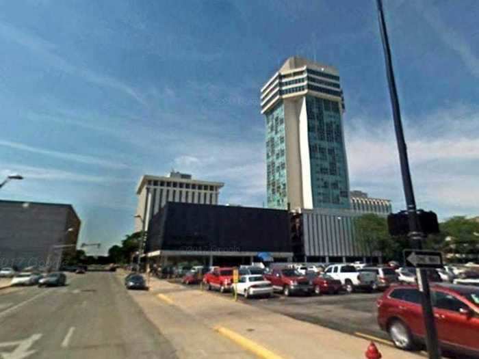
"Having been built during the 1960s/70s, the building's exterior is rather ugly," one reviewer said about the apartment building.
Kentucky's Kaden Tower in Louisville has been described as a "monstrosity."
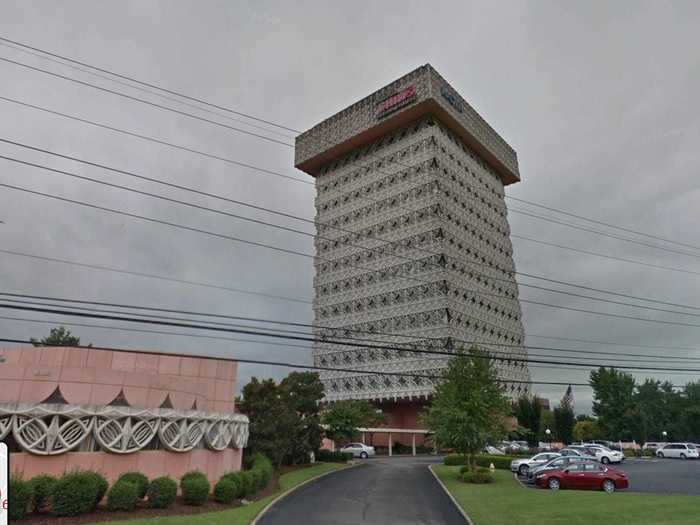
Locals agree that the Kaden Tower is the ugliest skyscraper in Kentucky. One reader even called it "a monstrosity."
Louisiana's Hancock Whitney Center in New Orleans has been compared to a cage.
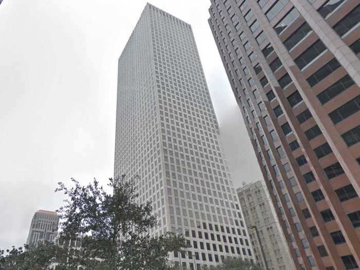
"The worst part about this building is that almost the exact same thing was built only a year earlier in Houston," one commenter wrote on a skyscraper forum. "Big, empty corporations usually make big, empty-feeling office building designs. New Orleans has an otherwise, subtle, old-fashioned downtown and this building smears '80s boxy feces all over it. Maybe them not cleaning the exterior properly is supposed to make it blend in more. Looking at it inspires such emotions as 'pointlessness' and 'cage.'"
A blogger said Maine's Franklin Towers in Portland appear to be inspired by the Soviets.
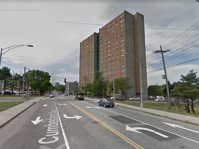
Christian MilNeil, a Portland, Maine, blogger, said the Franklin Towers are "a fine example of Soviet sentimental architecture."
Some even want to tear the building down because of its appearance.
"Yeah, we can't tear down Franklin Towers – even if most people think it's ugly, it's also home to hundreds of people who have the ability to walk to work and errands," MilNeil also said.
Maryland's World Trade Center in Baltimore stands out for its geometric shape ... and not in a good way.
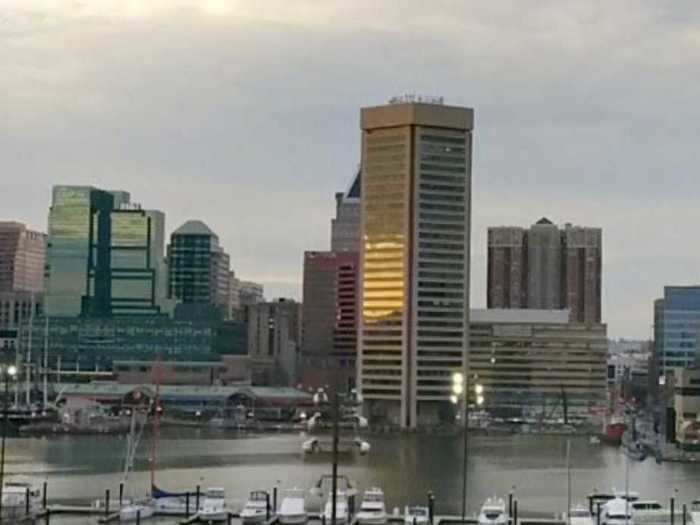
The Baltimore World Trade Center is an odd pentagon-shaped building that looks dated and bland amongst the city's skyline, and is often simply described as "ugly."
Massachusetts' One Beacon Street in Boston has been described as 37-stories of "nothingness."
"The 37-story modern is representative of what one reader called 'nothingness,'" Curbed Boston writes. "Indeed, One Beacon is just kind of there and adds little aesthetically to the skyline."
One local called Michigan's Renaissance Center in Detroit an "unfinished concrete disaster."
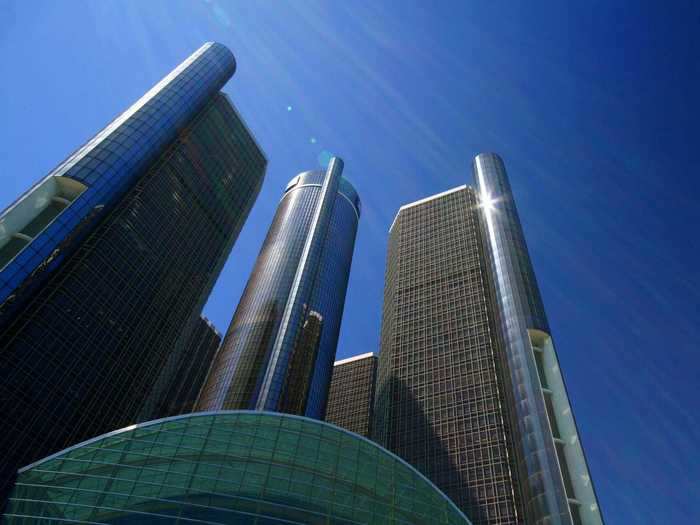
"This is the ugliest eyesore in Detroit," Yelp user Ted C. said. "It's like, 'Hey world look at us with our new 1973 look!' It's a hulking, ugly, unfinished concrete disaster that lost its spotlight during the Donahue era."
Minnesota's Capella Tower in Minneapolis is a little too mismatched for some.
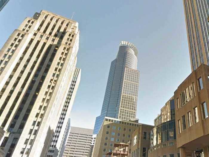
The Capella Tower is often considered an eyesore on the skyline because of its mismatching shapes. The bulk of the building has hard, rectangular lines, while the top is circular, seeming to be out of place.
"But seriously, why just a partial halo on top of Capella tower?" one Reddit user asked. "Why not go all the way around..?"
Despite the shiny gold hue, Mississippi's Gold Strike Casino Resort in Robinsonville is bland.
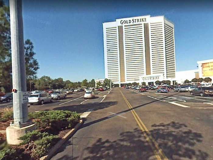
Locals agree that the Gold Strike Casino Resort is the ugliest skyscraper in Mississippi.
Missouri's St. Louis Compton Hill Water Tower is 179 feet tall, and it was built in 1897. It certainly looks like a remnant from another time.
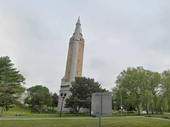
Locals agree that the St. Louis Compton Hill Water Tower is the ugliest skyscraper in Missouri.
Montana's DoubleTree by Hilton Hotel is considered on the dark and ominous side.
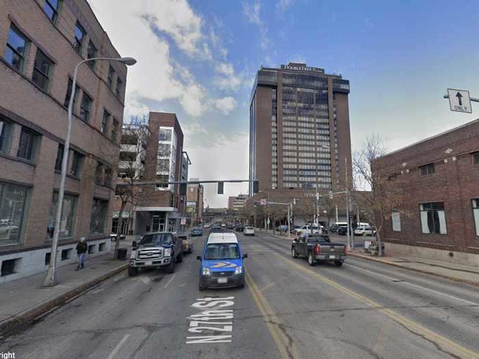
Originally known as Crowne Plaza Hotel Billings, the Double Trees' exterior is covered in dark brick, making the entire building look dark and ominous.
"The dark maroon color of the bricks was a special order for the Crowne Plaza," the Billings Gazette reported. "The color was achieved when the clay was mixed into a special manganese oxide mixture that was fired at 1,860 degrees."
Nebraska's WoodmenLife Tower in Omaha is nothing to write home about.
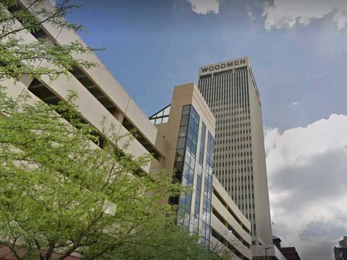
While the WoodmenLife Tower is nothing to write home about during the day, at night it's adorned with kitschy LED lights that many locals hate.
"I need to be brutally honest when I say this, the Woodmen is ugly," one blogger said on Omaha Forums.
A media outlet called out Nevada's Trump Tower an "eyesore."
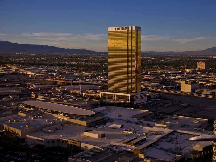
"Not everything beautiful needs to flash like gold," Huffington Post wrote. "The Trump Tower in Las Vegas is a perfect example of that. Completed in 2008, the 620-foot-tall structure is an eyesore even in a city filled with over-the-top architecture."
New Hampshire's Brady Sullivan Plaza in Manchester is not beloved by locals.
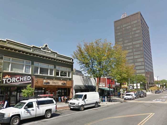
Brady Sullivan's Plaza is the second-tallest building in the state of New Hampshire, and one of very few high rises: It thus stands out as is. "It would be nice if the skyline was filled in a bit more with another high-rise," one Reddit user wrote, but generally its plain black framing with non-descript windows doesn't do it any favors.
The odd architectural design of New Jersey's Urby in Jersey City makes it disliked among locals.
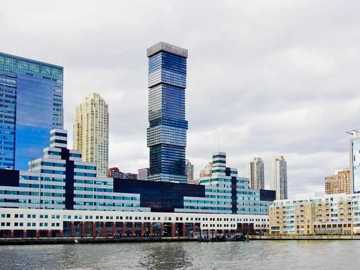
The Urby Harborside in Jersey City is ... unique-looking, with jagged edges and a mismatching color scheme that are hard to ignore. There are even plans to build two more versions of the building.
"I'm impressed," one reviewer wrote on the Skyscraper City forum, "not by the fact that there are three towers, but instead by how awfully ugly they are. Cheap, nasty, modernism."
New Mexico's Bank of the West Tower is a prime example of modernist architecture that many people hate.
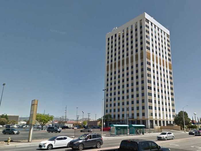
"Now the Bank of the West Building, it's a literally shining example of modernist architecture," New Mexico Magazine reports. But not everyone is a fan of the modernist movement, especially critics who sometimes describe it as "boxy, cold, and downright ugly."
New York's 432 Park Avenue in Manhattan has been compared to a giant matchstick.
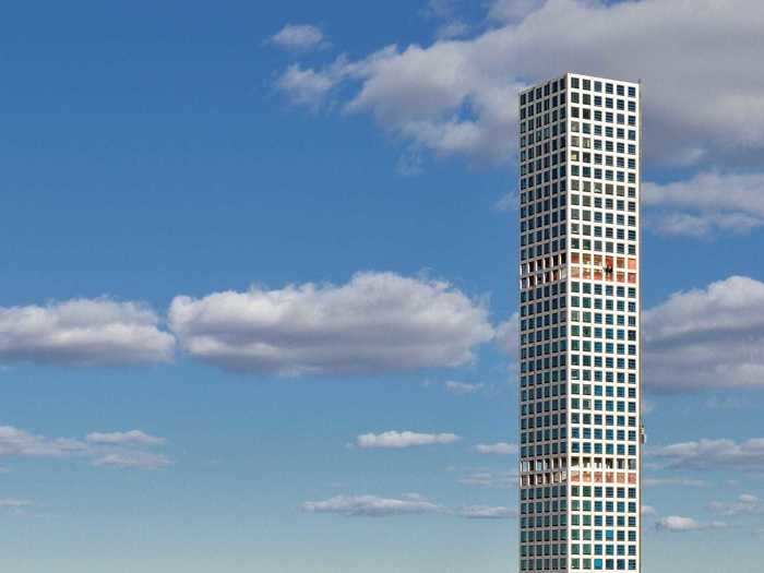
Locals agree that 432 Park Avenue is the ugliest skyscraper in New York. Additionally, the Telegraph wrote that the building "has been criticized for failing to blend in with the surroundings and resembling a giant matchstick."
One publication called North Carolina's Duke Energy Center the ugliest building in downtown Charlotte.
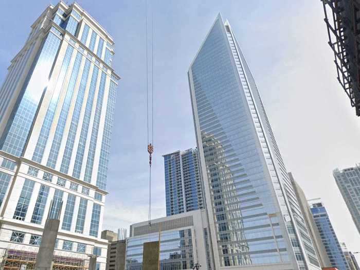
Charlotte Magazine said the Duke Energy Center "looks like Dallas highway architecture" and that it's "downtown's ugliest building."
North Dakota's State Capitol Building in Bismarck is just very, very non-descript.
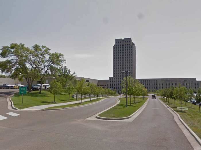
Locals agree that the State Capitol Building in Bismarck is the ugliest skyscraper in North Dakota.
Ohio's Crosley Tower in Cincinnati is sometimes compared to a Disney villain's lair.
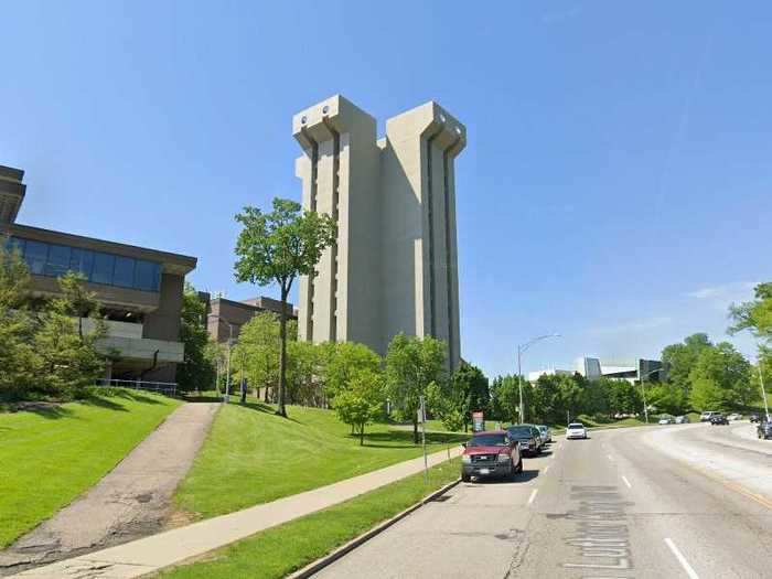
Crosley Tower is located on the University of Cincinnati campus, and in 2017, it was named the eighth-ugliest college building in the country.
"Crafted from a single pour of concrete, this 16-story building looks more like a Disney villain's lair than a part of the University of Cincinnati's campus," Architectural Digest wrote.
It is slated for demolition but no date has yet been given.
Oklahoma's University Club Tower in Tulsa is too round for some people's tastes.
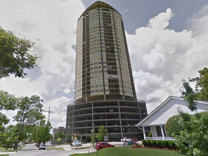
News on 6 in Oklahoma asked locals what the ugliest buildings are in their hometown, and University Club Tower was named. "You can't ignore the University Club Tower, which is said to be the first major building in the United States designed using a computer," the news station wrote.
Many locals don't like the artsy shapes on Oregon's Portland Building.
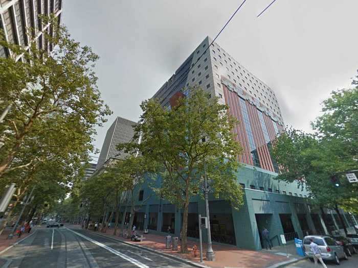
Locals agree that the Portland Building is the ugliest skyscraper in Portland.
Locals voted Pennsylvania's Jefferson Center, formerly known as the Aramark Tower, in Philadelphia as the ugliest building in the state.
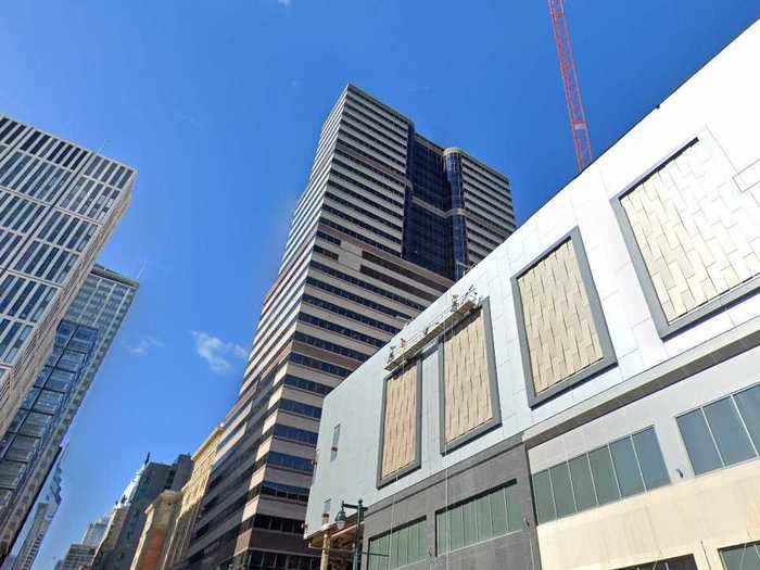
Locals agree that the Aramark Tower is the ugliest skyscraper in Pennsylvania.
Rhode Island's Textron Tower in Providence could be compared to a prison.
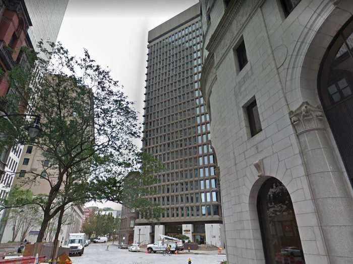
Textron Tower's grid-like exterior is reminiscent of prison architecture. It was nominated in a Providence Journal poll as one of the ugliest buildings in the city.
Locals voted South Carolina's Holiday Inn Charleston-Riverview as the ugliest in the state.
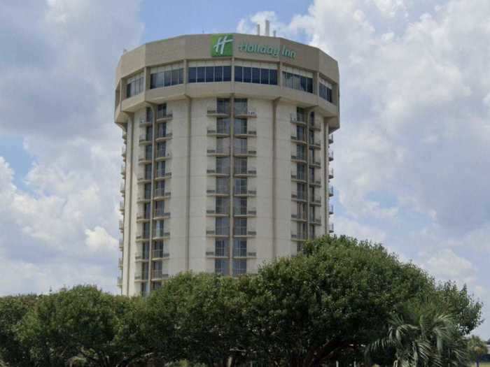
Locals agree that Holiday Inn Charleston-Riverview is the ugliest skyscraper in South Carolina.
While South Dakota's CenturyLink Tower, formerly known as the Qwest Tower, in Sioux Falls is the tallest building in the state with only 11 stories, it's also generally considered the ugliest.
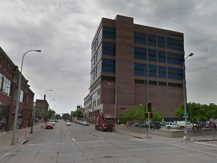
Locals agree that the tallest building in the state is also the ugliest skyscraper in South Dakota.
Tennessee's AT&T Building in Nashville is often compared to Batman's mask.
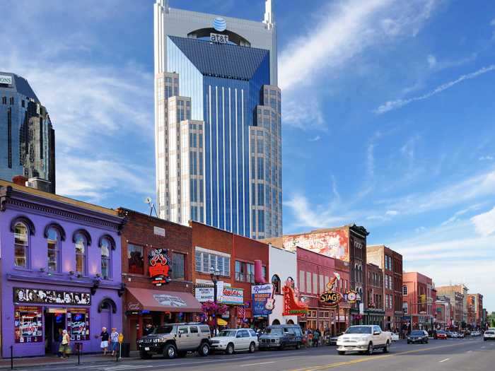
Locals agree that the AT&T Building is the ugliest skyscraper in Tennessee.
One media outlet called Texas' Mercer West Tower in Houston "a toothpick with a few windows thrown in."
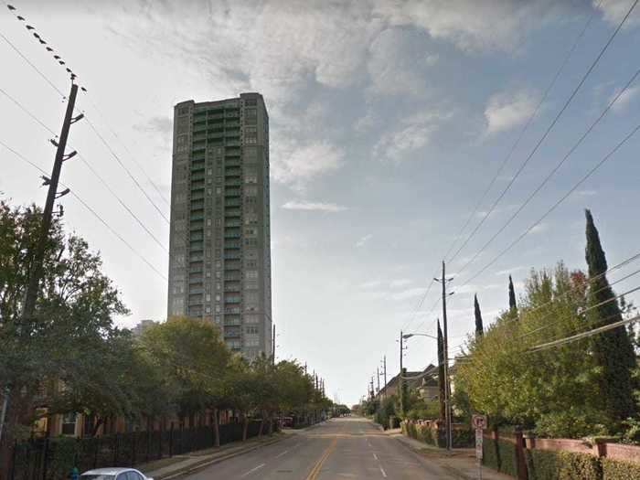
"This condominium — which seems to be the architectural equivalent of a toothpick with a few windows thrown in — has been almost universally despised since it was built in 2002," the Houston Press wrote. "The building is a sickly yellow color and looks as if it would blow over in a strong gust of wind. Adding to its unattractiveness is the fact that it contains virtually no windows on the south side, something which the builders attributed to the fact that their tenants wouldn't want to overlook the Southwest Freeway."
Utah's LDS Church Office Building in Salt Lake City has been voted one of the ugliest in the state.
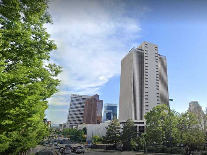
The Salt Lake City Tribune polled its local residents to find out which buildings they consider the ugliest. The LDS Church Office Building was the only skyscraper mentioned by locals and got 22% of the vote.
While Vermont's Decker Towers in Burlington is the tallest building in the state with only 11 stories, it's also usually considered the ugliest.
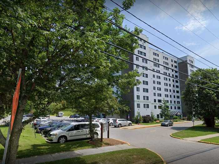
Locals agree that the tallest building in the state, Decker Towers, is also the ugliest.
Virginia's Adaire apartment building in Tysons Corner has been described as "a horrific mess."
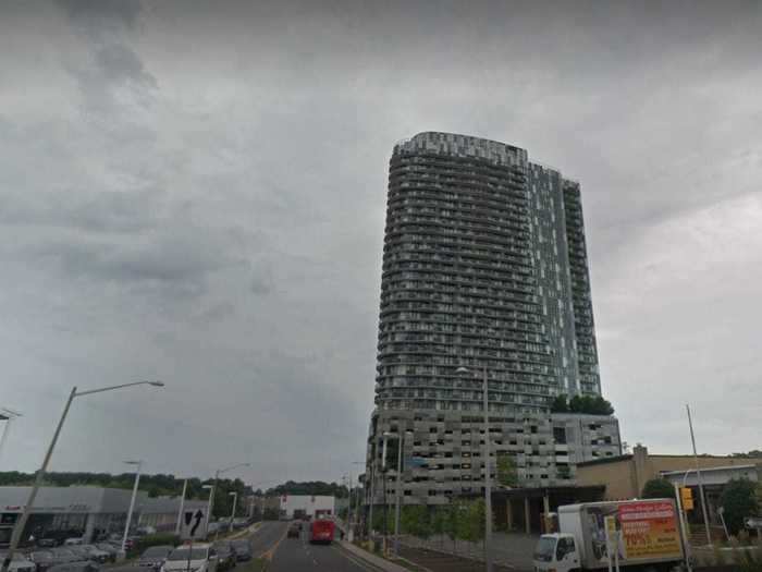
A Reddit thread about the Adaire apartment building titled "this horrific mess" has a number of complaints about the building.
"When they were building it, I thought that was a temporary facade and kept waiting for them to put the real one up... but they never did," one user wrote, while another commented: "That color scheme reminds me of having to go to the bathroom real bad."
The unique architecture of Washington's Rainier Tower in Seattle has been said to "provoke discomfort."
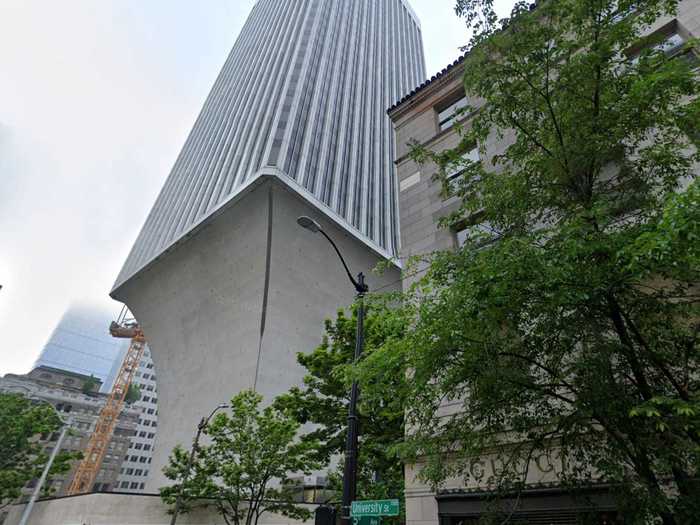
"Architecture critic Lawrence Cheek called this 31-story skyscraper a 'horrifying megahulk' that provokes 'instinctive discomfort.' Its wineglass-stem shape was probably an engineering marvel when it was built in 1977," Seattle Pi wrote.
West Virginia's Chase Tower in Charleston has not impressed many locals with its box-like design.
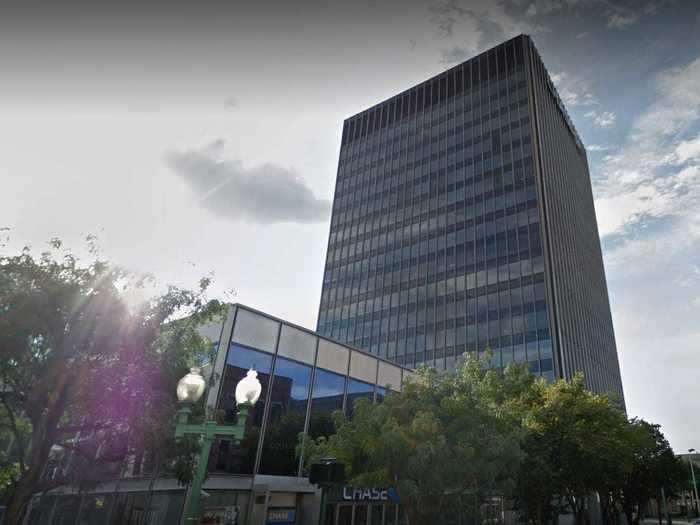
"The Chase Tower is black and shaped like a box. I am sorry but I find nothing impressive about it," one user wrote on the City-Data online forum.
Wisconsin's 411 East Wisconsin Center in Milwaukee has been called a "dismal concrete box."
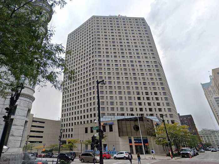
"It's amazing how ugly this looks compared to the rest of downtown," a commenter wrote on skyscraper blog. "The shadow that dismal concrete box must create is not worth its office space. They bulldozed a wonderful relic called the Goldsmith building to build this jagged shard."
Wyoming's White Hall in Laramie is the tallest building in the state with only 12 floors, but many see it as lacking any sort of architectural flair.
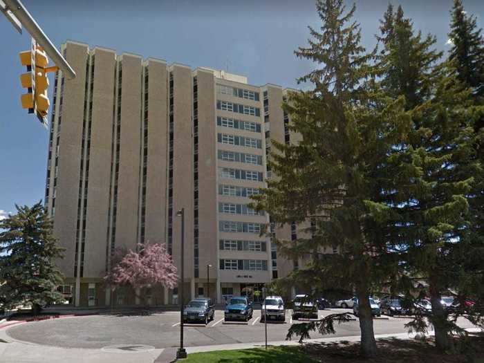
White Hall on the University of Wyoming campus is the tallest building in the state of Wyoming, and it's an eyesore. The exterior of the building seems blank and lacks any architectural design.
In fact, one Reddit user called the building and its height "rather sad."
READ MORE ARTICLES ON
Popular Right Now
Popular Keywords
Advertisement