Interior designers reveal the 12 things in your home you should get rid of
Rachel Murphy

- We spoke with designers about the decorations they think people should remove from their homes.
- Small rugs and artificial plants might make your space appear cheap or unfinished.
Home-design trends come and go, and there are some things that just don't work anymore.
From matching furniture sets to outdated accent walls, here are 12 things in your home you might want to get rid of, according to interior designers.
Consider swapping out pillows that match your sofa.
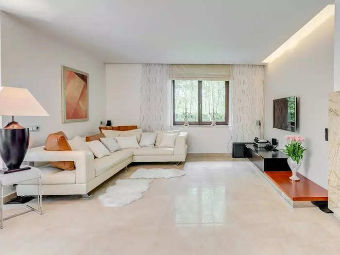
Kimberly Rasmussen, a principal design partner at Establish Design, told Business Insider that you should toss couch pillows that match your sofa, including any that might have come with it.
"Instead, play with texture, color, and pattern to accent the main fabric," she said. "This is an investment that will add interest, and the fabrics will help pull your room together."
If you want a cozier space, it's time to toss harsh white lightbulbs.
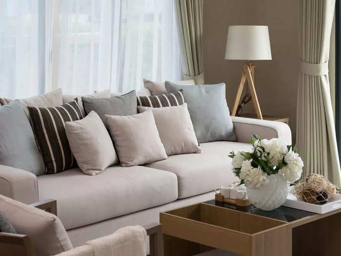
"Replace your harsh, cool whites with a soft, warm white bulb," Rasmussen said. "This adds warmth to your room like the light from a candle or roaring fire."
Take down any window treatments that make it difficult for you to get natural light.
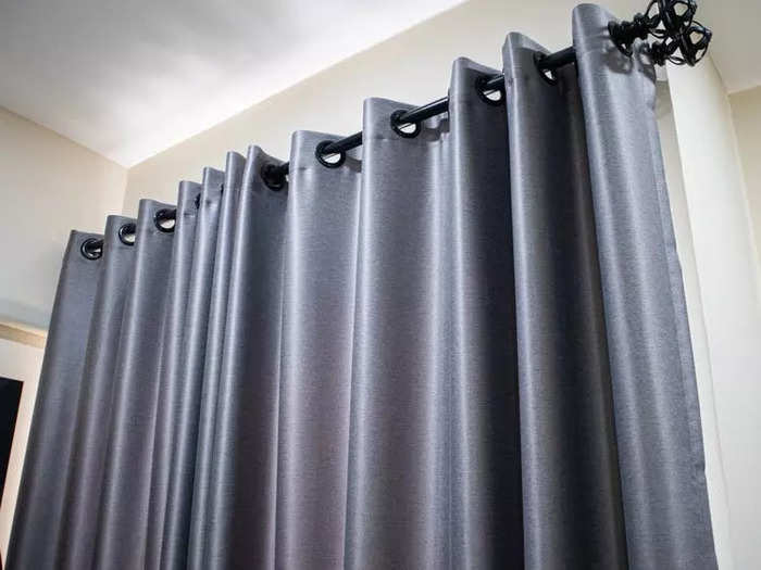
Natural light can brighten a room, make it look larger, and show off light-catching finishes, according to Annie Santulli of Annie Santulli Designs.
So, naturally, the first thing she thinks you might want to get rid of is any window treatment that makes it especially difficult for you to get natural light.
"Window treatments should frame a space, but they don't have to be overbearing or heavy to add warmth," Santulli told BI. "Using sheers or translucent metallics are a way to create some level of coverage without adding weight."
But if you still want to block the sun or have privacy, she suggests layering different window treatments to add dimension and texture to your space "while also allowing for more options to handle light and privacy."
Heavy or dark fabrics and finishings might weigh down your space.
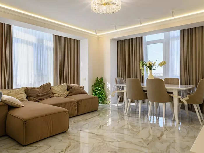
Santulli told BI that while it was once really popular "to use dark heavy fabrics and finishings to create warm sophisticated spaces," these materials just make rooms feel "overbearing" and kind of gloomy now.
Because of this, she said, you should consider swapping out thick wool curtains, and heavy blankets for "lush textures and warm-colored accents" that can help to elevate your space instead of dragging it down.
Accent walls aren't as stylish as they once were.
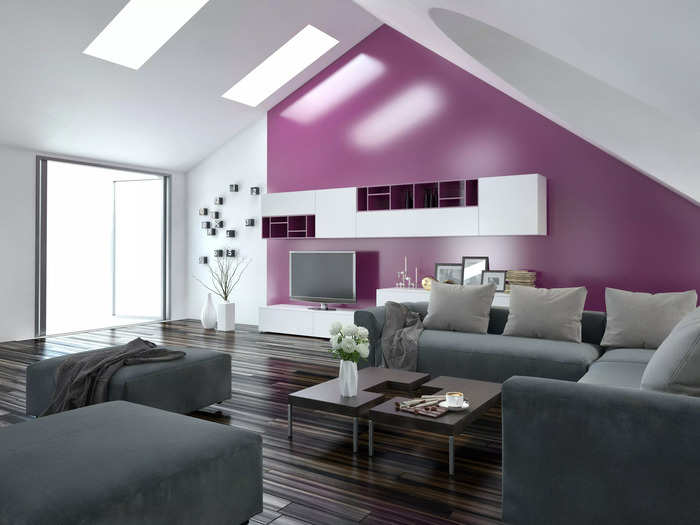
Rasmussen said that although accent walls can add a big statement to a space, you should be careful about how you use them because of how easily they can look dated.
She suggested that instead of committing to designing a whole wall, you simply create a decorative focal point by using easy-to-remove pieces like art, plants, or a mirror.
If there's a chair rail in your dining room, consider removing it to make your space look bigger.
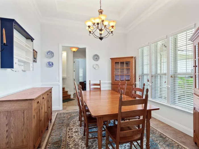
Iantha Carley, the owner of Iantha Carley Interiors, told BI that the chair rail is a "puny strip of wood" that doesn't do much beyond awkwardly splitting a room in half, thus making the entire space look smaller.
To open up your space, she suggests removing the railing and opting for "plain walls or a more substantial wainscoting" for a much larger design impact.
If most of the pieces of furniture in your home are a version of stained wood, you might want to switch some of them out.
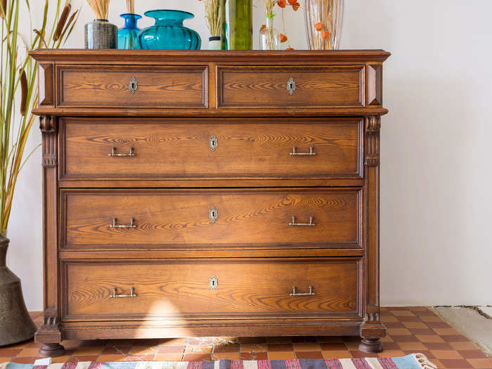
When most of the furniture you own is wood-stained, it can start to look a bit "drab and dreary," said Suzan Wemlinger, the principal interior designer at Suzan J Designs.
"You should mix things up a bit — not only with the wood species and stain colors but take it a step or two further and bring in some painted pieces as well as some non-wood pieces," she said.
Rugs that are too small for your space can make your room look awkward.
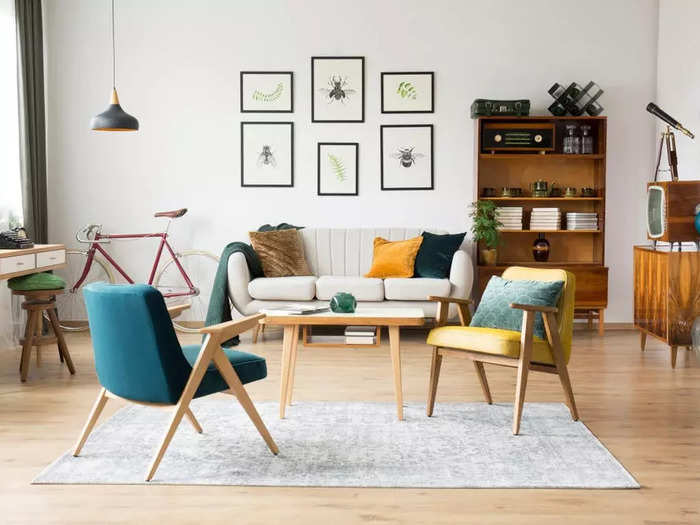
It doesn't matter how nice your rug is — if it's too small for the room, you should probably get rid of it, according to Wemlinger.
"Having a rug off-scale in a room — no matter how fine the rug is or how nice the furniture is — makes a room look cheap," she told BI. "A rug under a dining table looks great unless it's so small that the dining chairs don't fit on the rug or only fit when the chairs are pushed in."
Builder-grade tile and backsplashes can come off as dated and boring.
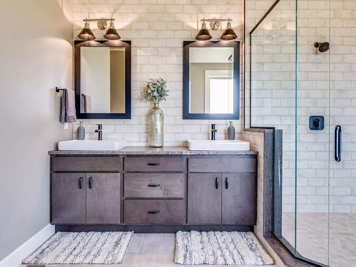
"This is standard in many homes built within the last 20 years," Wemlinger said. "Usually basic beige porcelain or ceramic tile is typically used for all the floors, backsplashes, shower, and tub surroundings."
"All the tile in a home should not be the same," she added. "It may make it easy for potential buyers to visualize their things in the home, but there is no personality in that."
She said you might want to try using different materials or shapes to switch up your space and make the tiles feel more updated.
If your TV is above your fireplace, you might want to consider moving it.
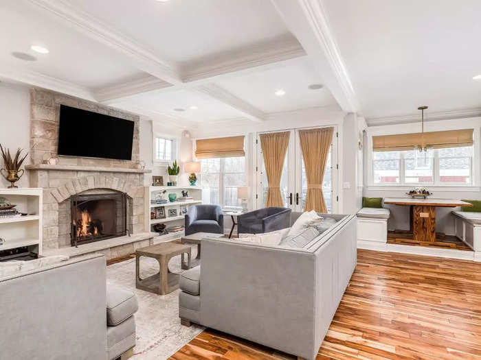
Though the space above a fireplace might be a popular place to hang your TV, Kesha Franklin, an interior designer at Halden Interiors, told BI that's a big no-no.
"One of my big design pet peeves is placing the TV above the fireplace," Franklin said. "The fireplace place is a focal point in a room. I say get rid of the TV and enjoy a moment by the fire without the distraction of a screen."
Fake plants and real plants that haven't been properly cared for don't have a place in most spaces.
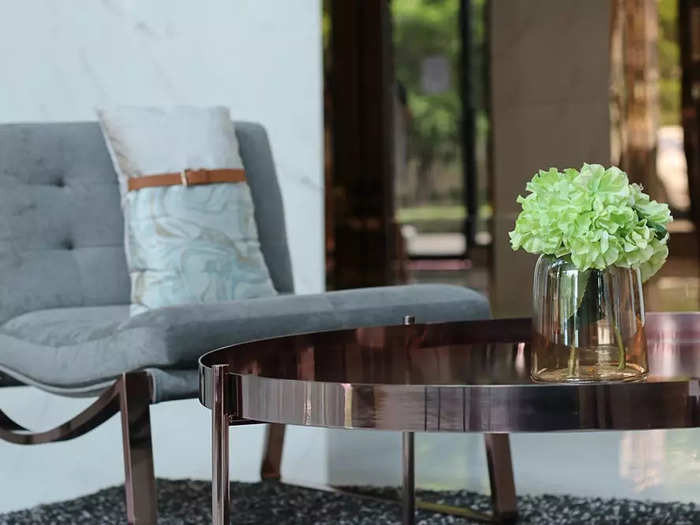
"Having a beautiful pop of greenery in your home design can definitely make a statement and be a way to bring the outdoors in, but a faux plant can become a dust magnet," Franklin said. "Depending on the quality, it can cheapen the overall look and feel of your home."
That said, real plants can be even worse if they're dying or dead because they signal a "lack of care for your space and sometimes can produce an odor, which is unpleasant," she said.
Matching couch sets could appear dated and make your space feel like a furniture showroom.
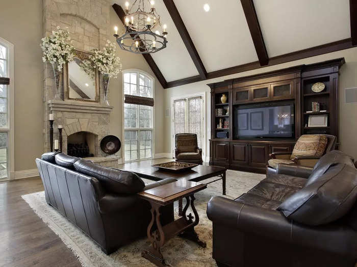
Carley told BI that you should consider swapping out some pieces if you have a matching sofa and loveseat.
In many cases, these matching sets can appear dated or so matchy-matchy that your space looks like a furniture showroom.
"Go for a tailored look and replace the loveseat with two comfortable upholstered chairs," she said.
This story was originally published on January 1, 2020, and most recently updated on March 4, 2024.
Popular Right Now
Popular Keywords
Advertisement