I'm an interior designer. Here are 10 things in your living room you should get rid of.
Paynter Rhed

- As an interior designer, I have a few tricks to replace a lot of outdated living-room trends.
- Word art can look tacky and plastic outlet covers don't show much personality.
Movie and book collections need to go — or be concealed.

Though your stack of limited-edition DVDs can be a great conversation starter, they're going to make your room look busy and overwhelming.
Giant stacks of books or movies can be visually distracting but a storage solution will give your space a less cluttered atmosphere and make the room more relaxing.
A good storage solution for movies and books is also a great way to visually conceal the items while keeping them in one desired location. Many bookshelves or media stands have closed fronts with drawers or doors to conceal miscellaneous items.
There's such a thing as too much lighting.
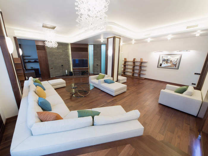
Though I love a well-lit room, I certainly have a pet peeve for too much lighting. Walking into a room that has a ceiling light, recessed can lighting, and accent and floor lamps can feel overwhelming and unnecessary.
I think lamps are a must in terms of function but not decor — you should have attractive lamps that serve a purpose, not overpower a space.
If you're worried your room isn't bright enough, purchase dimmable bulbs, which can be adjusted when ample light is and isn't desired.
Consider the scale of your room when you're getting a sofa.
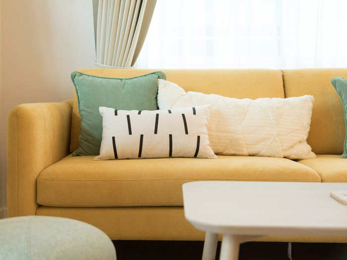
It's important to consider scale when mapping out any space. If your living room has a sofa that's too large, it can make the room feel small. In turn, having a sofa that's too small will make the room look empty.
If you're concerned about selecting a sofa that's too big or small, gather some specs and tape where you'd want the piece of furniture to go on the floor to get an idea of how much space it will occupy.
You can also go with a modular-sofa option that can be reconfigured based on how you want to build your seating. Slightly moving smaller pieces around to change a layout or placing them in a whole new space would also be easier than moving an entire sofa around.
Get rid of outdated prints and colors.
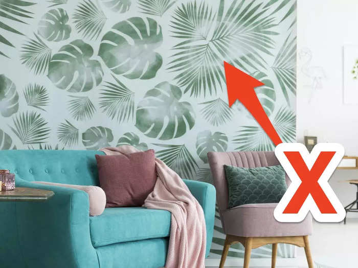
Trendy prints and colors change yearly but you can stay up-to-date with neutral-toned furniture and finishes and different accent pieces.
Neutrals are relaxing so having them as the main colors in a room creates an opportunity to build some contrast and visual interest through colorful decor pieces. Replacing outdated prints through pillows and blankets is one of the easiest living-room face-lifts.
Refreshing a space with updated textures and layers is also easy and affordable, considering that buying a $25 pillow is much less taxing than repainting an entire room.
Word art and letters all over the wall can look too busy.

Who knew that words spelled out on a wall would be such a decor trend? I've seen just about every word in the English language spelled out on people's walls with letters from Hobby Lobby or HomeGoods but they can make a wall look too busy.
If you're having trouble coming up with ideas for wall decor, check out Pinterest for unique solutions that don't involve spelling out your family's last name.
Consider a family photo collage, tapestries, macromeres, paintings, or mirrors.
You don't need overpowering window treatments.
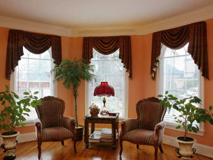
Heavy window treatments are outdated and unnecessary, especially since sheer curtains are a lightweight alternative that still have some texture. If blocking out light is a priority, skip sheer curtains and go for black-out shades, which can be as thin as linen.
I also think valances scream 1970s and short or choppy curtains that float a foot or so off the ground cut the line of sight and make a wall seem shorter than it is.
I'm tired of seeing white plastic blinds as well since, to me, they scream "first college apartment." If you prefer blinds, roller shades or wood options are a much better look.
Plastic light switches and outlet covers can be updated.
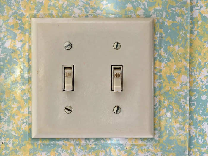
Another pet peeve of mine is outlet and light-switch covers being an afterthought. I've seen homes that have thousands of dollars worth of renovations with outlets concealed by plastic covers you can find at a dollar store.
Updating plastic covers to something more luxe is one of the easiest things you can do to impact your living space. There are some great options on Amazon, or if you're like me and must see and touch items, Menards also carries a good selection.
I think covers that pair nicely with the current architecture and have a finish matching the trim used throughout the home would look more cohesive. I also like when the covers are painted the same color as the walls because it gives a really seamless look.
Gray isn't always the answer.
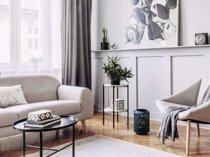
Though all design trends come back, I hope the use of gray will take a while to make its next round. Homes with a gray sofas, plank flooring, curtains, and throw blankets and charcoal accent pillows can look dull. The color of a space can change your mood so why not have a color that promotes comfort instead of one that embodies dullness?
Gray can come off as stark and overly commercial but warmer tones feel relaxed and inviting. Luckily, I see a lot more browns and warm neutrals used in design projects lately.
This being said, I appreciate gray tones with other contrasting finishes. Adding warmer colors next to gray pieces can create a contrasting yet refreshing color palette.
Invest in durable fabrics.
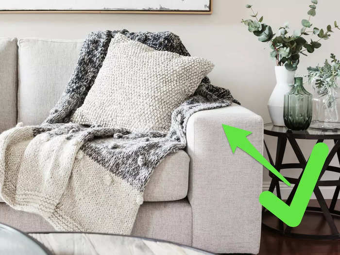
With today's technology, purchasing easy-to-clean fabrics is a no-brainer. Though classic linen and velvet are staples used for decades, you can achieve a similar look with treated fabrics.
For example, some fabric companies are plasticizing their materials to make them as stain-resistant and durable as acrylic and outdoor fabrics to give a classic look while being able to withstand kids and pets.
Acrylic fabric options such as Sunbrella or Perennials are also great, durable options. Since they're easy to clean, these fabrics open the door up to bringing in light colors like whites and creams.
Steer clear of shiny paint finishes.

I think a high- or semi-gloss paint finish gives a shiny and almost oily look to a wall. Though this shiny paint is easy to clean, you can achieve similar results with a satin finish and avoid an overly reflective look.
A more subdued wall finish can let the furniture and art make a statement without competing with a shiny wall. Minimal sheen is also easier on the eyes and gives the overall aesthetic of the space a more relaxed tone, which, in a residential space especially, is necessary.
Popular Right Now
Popular Keywords
Advertisement