I'm an interior decorator. Here are 10 things I'd never have in my bathroom.
Kelly Kruger

- As an interior decorator, I avoid design choices that make bathrooms feel sterile or cheap.
- I think matching towel sets and themed bathroom art lack personality and feel dated.
As an interior decorator, there are a few design elements I wouldn't put in my bathroom.
Here are 1o things I would never have in my bathroom.
Floor-to-ceiling tile looks too sterile.
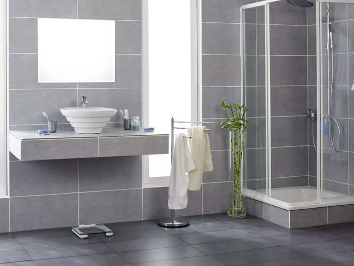
I've found that a bathroom with floor-to-ceiling tiles usually comes across as cold and sterile instead of luxurious.
Though I think the look works for a walk-in shower or feature wall, decorating all over with tile is an expensive choice that's difficult to update as trends change.
Plastic bathroom accessories bring down an elevated design.
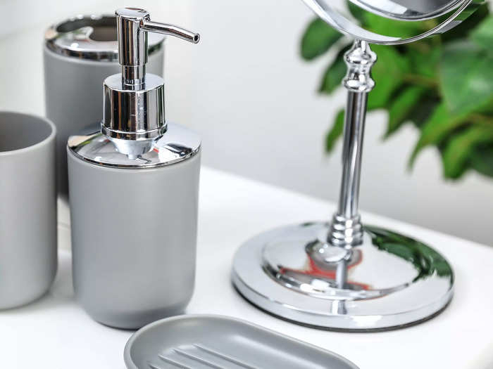
Consider upgrading plastic accessories, such as shower-curtain rings, soap dispensers, and trash cans, to nonplastic options for an elevated design.
Higher-quality metal or ceramic finishes can give your bathroom a luxurious appeal while adding color, texture, and charm to the space.
Black toilets kind of scare me — plus they can be hard to keep clean.
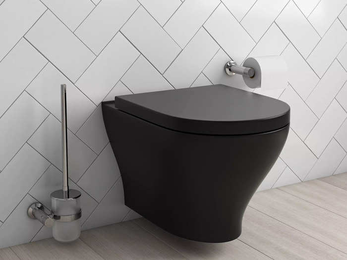
Black toilets remind me of the uncomfortable feeling of using portable toilets — in which you really don't want to see the bottom.
A black toilet might seem like a chic, modern choice, but the color can make it harder to clean. Though a white toilet shows dust, watermarks, and smudges, a black one hides all the grime and buildup.
If you want to bring a moody-chic look into the bathroom, do it with black towel rods and fixtures rather than a toilet.
Matching towel sets are uninspiring.
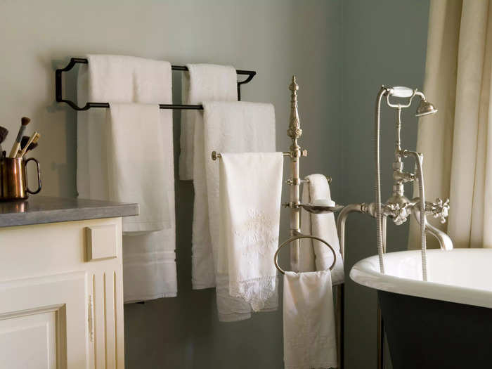
Using towels with the same color throughout the bathroom creates a stagnant design and doesn't bring much fun into the space. Even patterned towel sets typically lack visual variety and color contrast.
I prefer mixing different towel colors and patterns that work well together and coordinating them with floor mats and shower curtains. The finished look appears more dynamic and personalized.
Unprotected wallpaper can get wet and moldy in a bathroom.
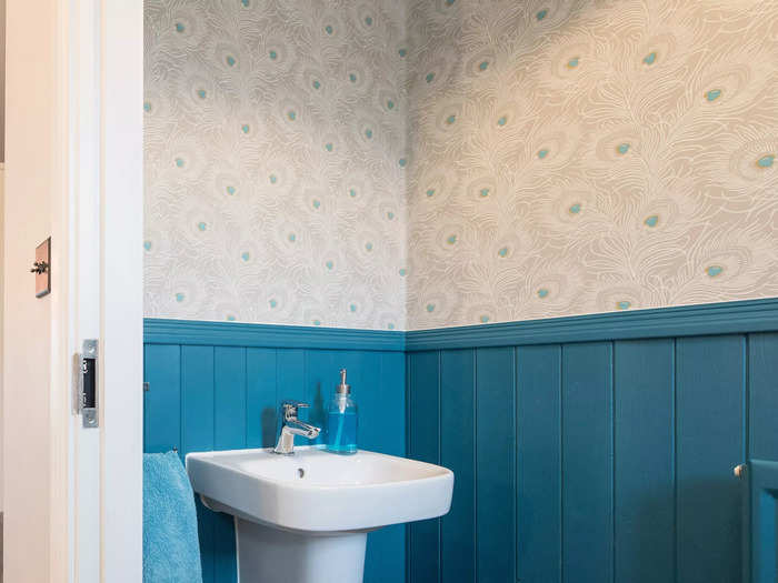
Wallpaper is an awesome choice for smaller spaces but not all options will work in the bathroom. I prefer to use a peel-and-stick variety as its vinyl material is more water-resistant than the paper-based alternatives.
If you love a traditional wallpaper design, you might get away with using it in a powder room or half-bath, where there isn't a shower. But I still recommend treating the paper with a protective coating to keep it from getting damaged after installation.
Tile countertops can lead to grimy grout that stains easily.
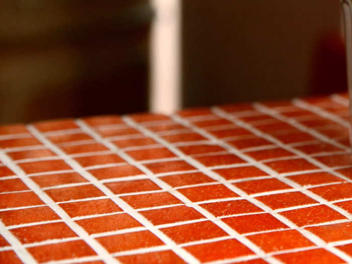
Though grid tiles are trending, I don't recommend using them for bathroom vanities or other high-traffic areas because the grout tends to quickly accumulate dirt.
I also find that the hard-to-clean grout will eventually stain from things like colored soap, makeup, and lotion.
If you're determined to incorporate this trend into your bathroom, consider using the tiles as a backsplash or on shower walls where they're less likely to see spills.
Art doesn't need to be bathroom-themed.
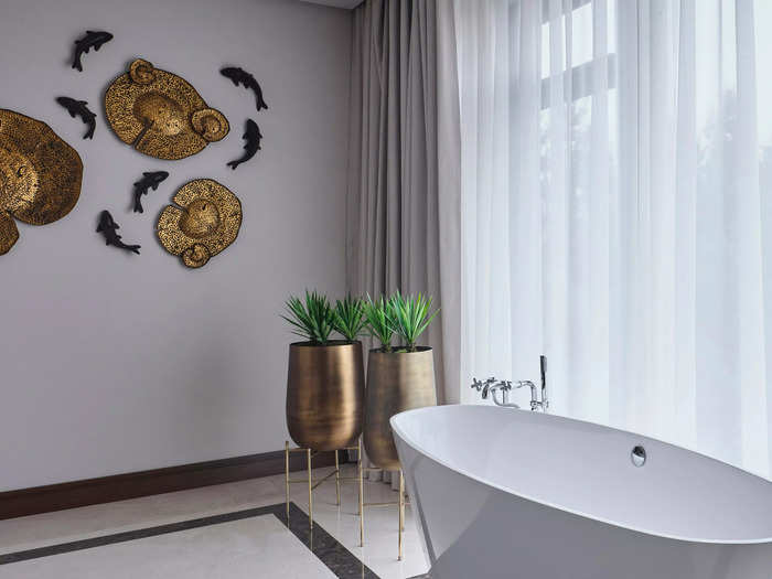
Instead of choosing themed artwork you think works in a bathroom or spa, treat your wall decor as you would in any other room.
Pick elevated artwork that inspires you and uses colors from your home decor to make your bathroom an extension of your space's aesthetic.
Just be sure to choose art that can withstand the steam to avoid mildew forming on paper-based products.
Pedestal sinks are a wasted opportunity for storage.
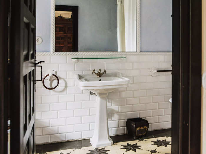
Though pedestal sinks are a classic silhouette, they just aren't practical for most homes. The lack of storage and counter space means they're only useful for washing hands.
Unless you have space for additional storage options, I wouldn't even use these sinks in the powder room, as they can't store extra supplies for guests.
Matte paint doesn't typically hold up in a steamy bathroom.
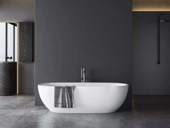
Matte paints aren't ideal for bathrooms because they have a tendency to absorb moisture. I recommend a semigloss to high-gloss paint option to better protect the drywall from moisture damage.
If you love the matte look, you can try using limewash paint, instead. It has a similar look, but it's supposed to be naturally mold-resistant and antibacterial.
Frameless vanity mirrors can feel dated.
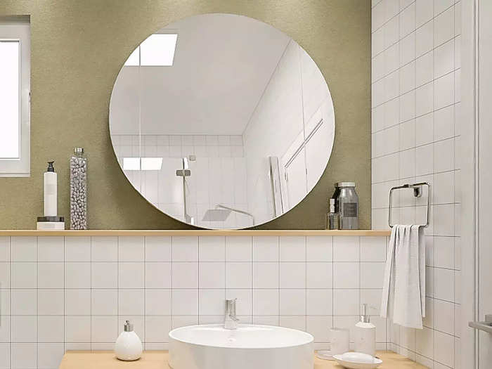
Though they're a neutral option, I find frameless mirrors, especially those with a beveled edge, look dated.
A framed mirror is an opportunity to add stylistic personality to your space, much like hanging art. I suggest tying your color palette and existing hardware finishes into your mirror to bring the space together.
Popular Right Now
Popular Keywords
Advertisement