I paid an interior designer $500 to tell me how to decorate my home. It was very helpful, but it wasn't a magic fix.
Katherine Fiorillo

- I paid $500 for an interior designer to tell me how to improve three rooms in my home.
- She had great tips for improving my bedroom, but I'm not sure about her vision for my basement.
I've never had a great eye for decorating.
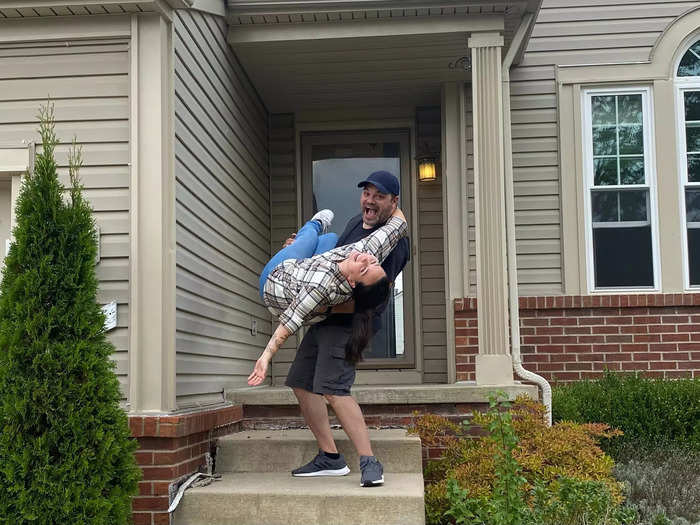
I'm 27 and own my home, but I've never felt like I really knew how to decorate a space to make it feel full and cozy.
After making small changes and improvements over the past few years, I realized I don't have an eye for interior design and decided to hire someone to help me make my vision come to life.
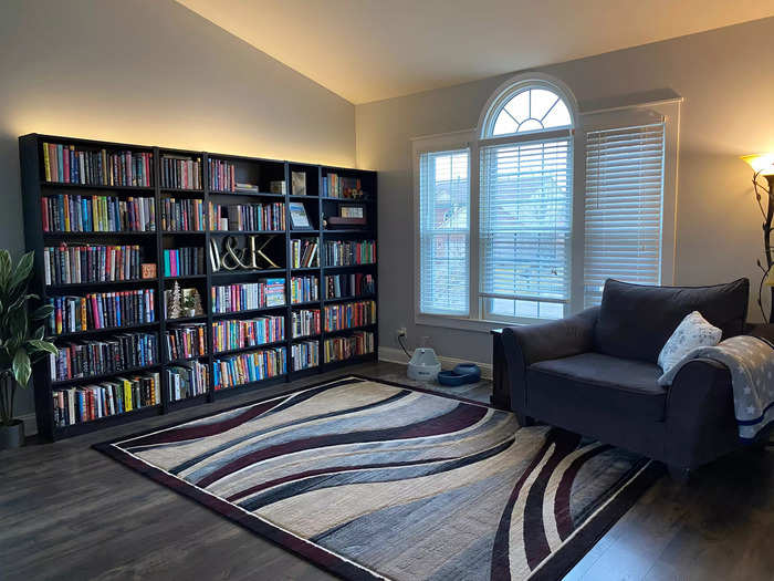
There are a few spaces in my house I adore and didn't want to change, like my front reading room, but others that fall flat.
My home office, dining room, kitchen and kitchenette, and guest room are all straightforward spaces that I don't think need revamping right now.
Instead, I wanted help with three specific spaces: our primary bedroom, living room, and finished basement.
I found an interior designer who offered the specific and budget-friendly design services I was looking for.
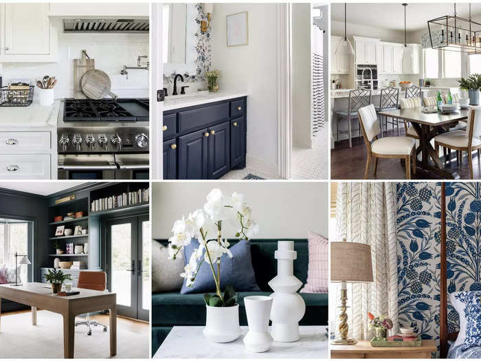
I decided to work with Alisa C. Popelka of Alisa Cristine Interiors because I really liked the before-and-after photos on her Instagram. They helped me picture what she might to do help my home.
I also liked that for $500, she would do an in-home design consultation and send me a digital design guide with her recommendations and inspiration photos. That way, I could execute the vision on my own time and budget, rather than paying her to do the shopping for me.
We didn't need help choosing a color palette or paint colors.

Our home's color palette is pretty defined. We repainted when we first moved in, replacing the lavender walls with a cool gray-toned blue.
Most of our furniture and decor are cool-toned grays and light blues, accented by greenery and pops of off-white.
A lot of my furniture is also pretty new, so I wanted to reimagine the space rather than replace pricey items.
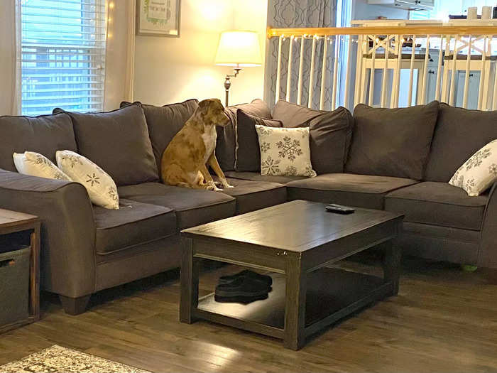
About three years ago, I purchased couches and a bedroom set for my last house. Though they don't fit my new space perfectly, they are new enough (and expensive enough) that I don't want to replace them.
I told my designer I was willing to purchase a few new pieces, but I wanted to make the most of the furniture I already have.
I also wanted help finding accessories that would round out the space and make it feel more complete.
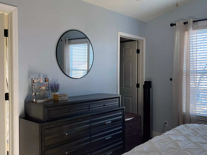
She said our bedroom layout was mostly right, but needed to be brightened up with lighter accessories.
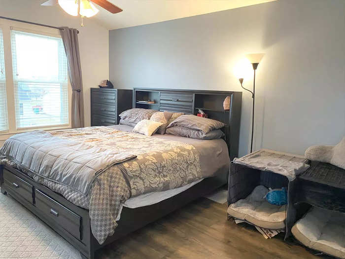
Our bedroom mostly feels like a crowded afterthought.
With a big window on one wall, the doorway on another, and two doors to a bathroom and walk-in closet on a third wall, there's only one place for our bed in the primary bedroom. The interior designer agreed, so we made no plans to move our bed.
She said the space needed more balance.
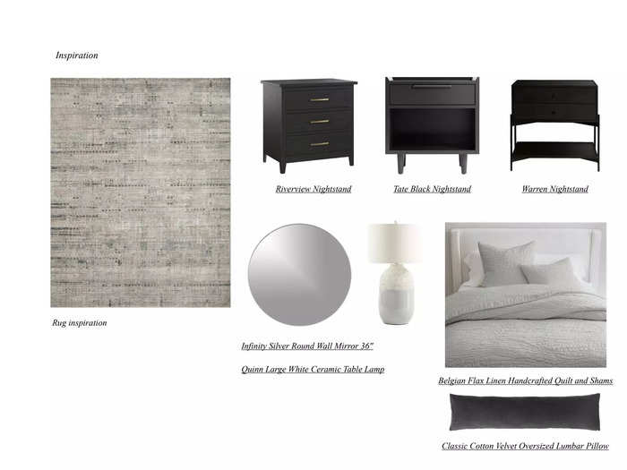
She recommended that we find another place for my husband's dresser and add two end tables with "textured" lamps on each side to bring balance.
She also suggested we replace the cheaper ceiling light in our bedroom with something nicer and add another, softer light source to avoid the sometimes-harsh overhead light.
She recommended we added one or two big pieces of art over our bed and a mirror above my dresser, lighten up the bedding and curtains, replace the dog's cages with a big dog bed, and add a large area rug.
She was right — adding a big piece of art above the bed was a game changer.
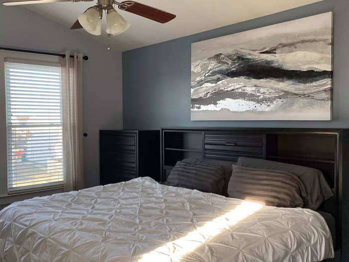
We still need to make a lot of changes, including different bedding, but the big piece of art makes our room look bigger. I think it's because it draws your eye up to the ceiling height.
The lighter, longer curtains she suggested also made the dark furniture feel less heavy.
Our living room's elongated shape has always stumped me.
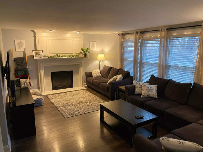
Our living room is longer than it is wide and very awkwardly arranged right now — I affectionately call it my "couch room," since couches line two of the walls.
I actually gave this room a mini makeover last year — adding curtains, a rug, photos, and more mantle decor — but it didn't feel like enough.
Her main suggestion for this space surprised me.
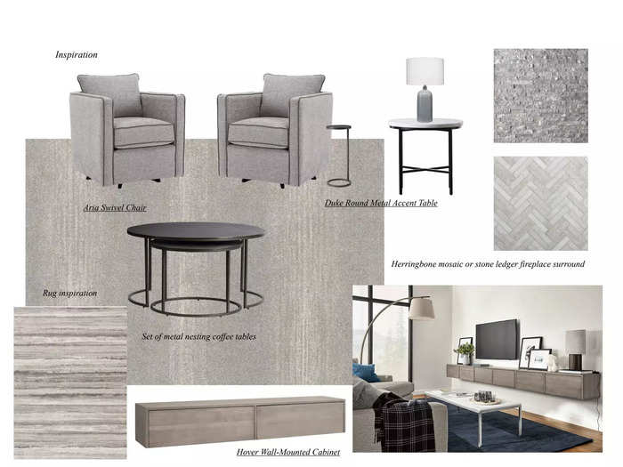
Much to my surprise, the designer told me to replace my second couch with two chairs.
I've seen this style choice on social media, and I'm open to trying it but it feels like a big undertaking because I'm not sure what to do with the other couch.
I'm not ready to part with it and it won't fit downstairs or in any other space in my home.
She also suggested we replace the entertainment center with something that would sit closer to the wall.
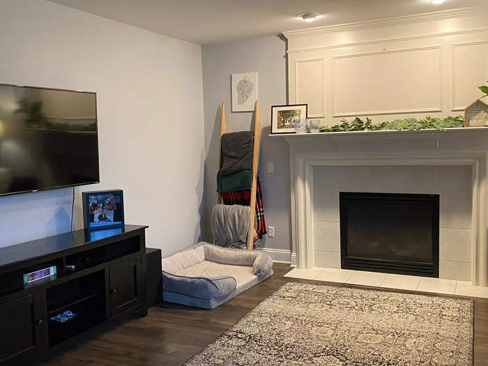
We don't actually use the entertainment center to store anything other than our internet router and a speaker. Her suggestion made me realize how bulky the piece is in an already-crowded living room.
She said we also need to get a much larger rug, art pieces that fit the space better, and a round mirror for the center of the mantle.
The finished basement was our biggest conundrum, and the interior designer agreed.
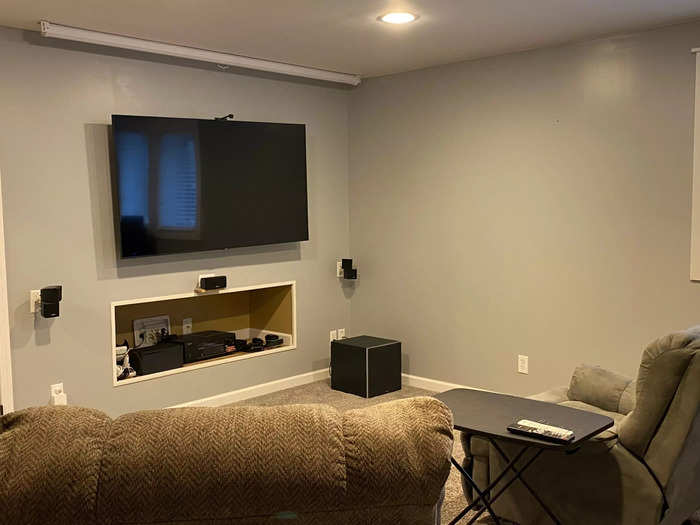
Our finished basement just looks and feels empty to me.
The chairs were from two different rooms in our last home, so they don't match. Since we've never had a vision for the space, we haven't really attempted anything to make it look welcoming.
As the basement door opens to face a hallway wall, it's extremely challenging to get large furniture down the stairs, so moving one of our couches down there was out of the question.
My husband wants to be able to display some personal items on the walls and has a collection of vintage game consoles that he'd like to keep somewhere other than boxes, but he also didn't want the area to feel like a stereotypical "man cave."
The interior designer's recommendations were helpful, but we haven't bought into this vision yet.
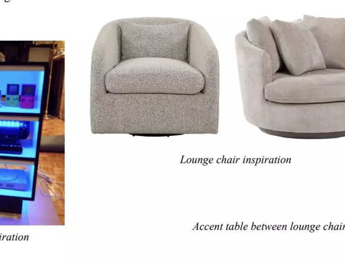
In the design guide, she gave us a lot of suggestions for the basement, but it's going to be a big project so it's the last room of the three we plan to tackle.
I liked the lounge chairs she suggested, but I'm not sure the console display has the level of elegance I was hoping for.
I loved that the designer sent me a document laying out what we covered in our meeting and some suggestions for what to look for.
The guide was incredibly detailed, which is really helpful since I'm slowly bringing her suggestions to life and it may take me months to feel like we're making progress.
I can see myself referencing this while I'm in a store or shopping online. I also appreciated the included pictures but had to find different stores than the ones she suggested.
The price range at even the more "budget-friendly" stores she suggested was so far above what was realistic for us (I don't know if I will ever spend close to $800 on an end table) but the styles gave me something to look for when I shop at places like TJ Maxx and Target.
Overall, the consultation was extremely helpful but I shouldn't have gotten my hopes up that this would be a magic fix.
Honestly, I did think an interior designer would find all of the perfect solutions but my expectations should have been more realistic, especially for a $500 consultation.
Her suggestions for the bedroom were exactly what I was looking for and the small changes have already improved my space, but I still don't know exactly what to do about our finished basement.
Still, bringing in a new perspective was just what I needed to get a jump start on this project and I love that I get to make the changes on my own timeline and budget.
Popular Right Now
Popular Keywords
Advertisement