I had an interior designer critique my childhood bedroom. Here's how she'd make it better and more sophisticated for my late 20s.
Ashley Probst

- I asked an interior designer how to update my childhood bedroom to be sophisticated for my late 20s.
- She suggested that I move furniture and paint my walls white for a more neutral base
I'm one of many "boomerang kids" who moved back in with their parents or guardians during the pandemic.

After leaving my hometown and living independently for nearly a decade, my life took an unexpected turn and I ended up temporarily moving back into my childhood home about year ago. I also grew up in Hawaii, where multigenerational households are quite common.
My childhood bedroom isn't exactly the same as it was when I was a kid, but I'd still like to update it for my late 20s.
This space has been used as a guest room since I originally moved out.
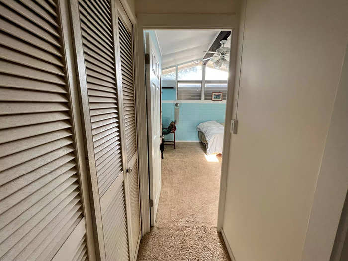
Although it's not overtly childlike, I've felt called to update it to be more sophisticated while offering an air of creativity.
To help gain inspiration and tips for design changes, I reached out to award-winning interior designer Kimberly Horton. Here's how she'd update my space for my late 20s.
Changing the paint color can make a drastic difference in any space.
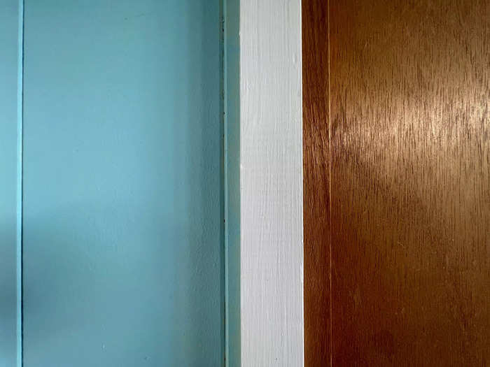
Horton said the current walls look noticeably young and vibrant, so utilizing a different color would help create a more mature space.
"You have such great natural light in this space that we can utilize a wide variety of colors successfully," she said, noting that I seemed to be attracted to light, bright, and airy spaces based on the projects I'd selected from her portfolio.
"I would recommend painting the walls Snowbound by Sherwin Williams. It's a stunning soft white that will warm up your space pretty quickly," Horton said.
My bed wasn't placed in an optimal position.
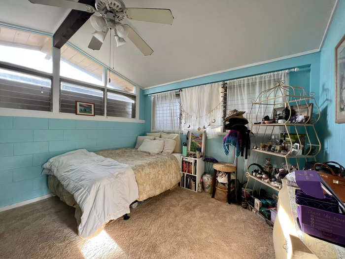
Horton also said having the bed against a wall can make the room feel cramped, which she said "negates the relaxing feel that most people desire" in a bedroom.
Horton suggested I make the bed more of a focal point.
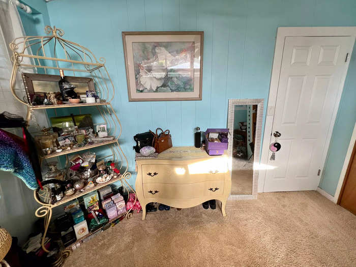
She explained that when the eyes have nothing to rest on, it can create a chaotic energy.
One's bed is typically the focal point in a bedroom, so its original placement in my space was a missed opportunity. She recommended that I move my bed to where my dresser currently stands to create more of a visual flow.
I was encouraged to add a headboard and footboard to my bed set.
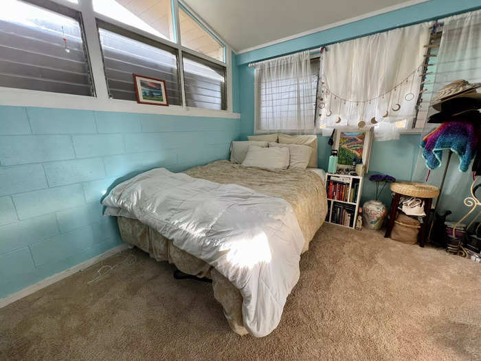
My bed appeared to be low, which Horton said only works with particular design aesthetics.
"Unless you're wanting a zen or minimalist design that calls for a low bed profile, the scale is really important here," she explained. "I would purchase an upholstered headboard and footboard set to elevate this, and add fabric."
Roman shades would help accentuate my windows.
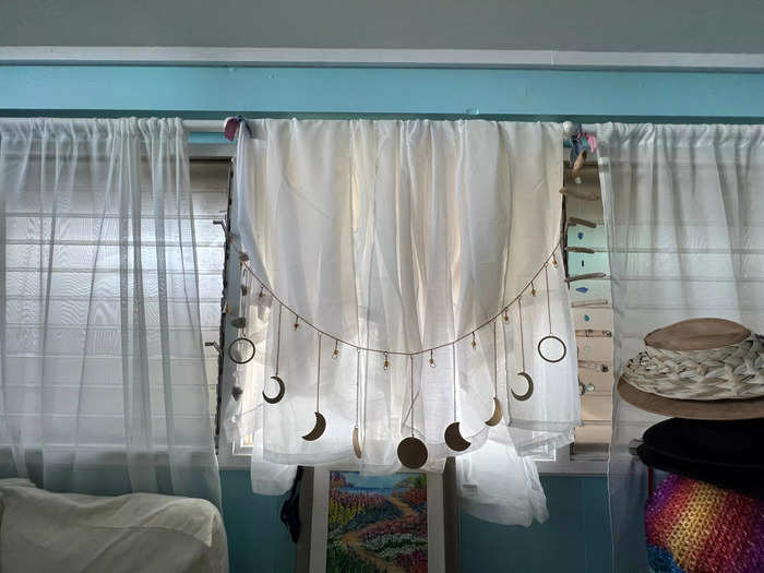
Moving my bed away from the windows would allow for more functionality.
Horton also pointed out the height and layout of my windows, which are high off of the ground, call for a particular type of covering.
"This space really wants Roman shades instead of drapery," she said. "I would recommend a grass-weave Roman shade to add a different texture to the space."
I need to start thinking outside of the box for additional storage.
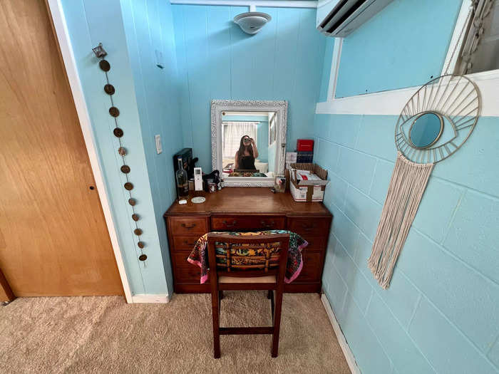
It's common for homeowners to use floor space for storage while forgetting that the walls can also be utilized, especially in rooms like mine that have high ceilings.
"Consider some floating shelves to store items you may want to display, but don't need frequent access to," Horton said. "I would also swap out any open storage for closed storage to keep things appearing organized — even if it's still messy inside."
One form of closed storage she suggested was a nightstand on either side of the bed.
She also suggested displaying my hats for function and aesthetic.
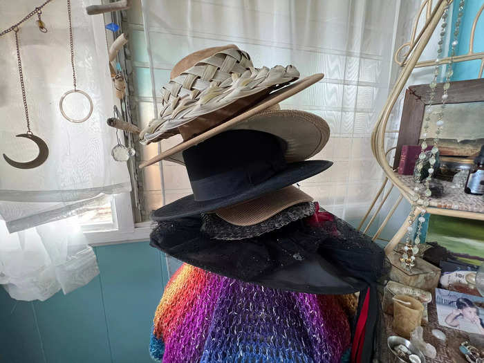
Since my wall space is minimal, Horton recommended hanging my hats above the bed. Right now, they're sitting in a pile near my corner shelf.
"This will draw attention to this area but will utilize it for functional purposes, as well," she said.
After envisioning a more serene space with a neutral base, we got to have fun discussing personalization.
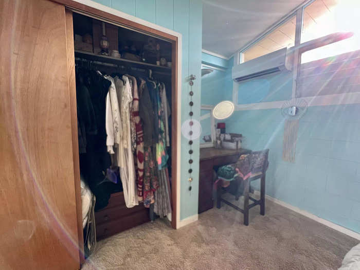
Fortunately, my room gets good natural light because I have windows on two walls. Because my lighting is pretty nice, Horton recommended I focus on getting creative with my bedding, wallpaper, area rugs, and furniture.
Dark colors and layers are important elements for upgrading my bedding.
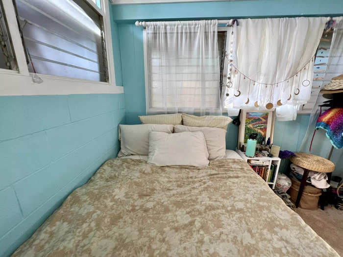
To balance out the light, neutral base of the room, Horton recommended accenting the space with dark colors like deep green, purple, or blue.
"Make sure the bedding incorporates layers and accent pillows to avoid the room feeling flat," she said. On a queen bed, this means having two Euro sham pillows against the headboard.
She also pointed to elongated lumbar pillows, especially "options that incorporate a touch of your bedding, but a unique pattern."
One specific layer she recommended adding was an area rug.
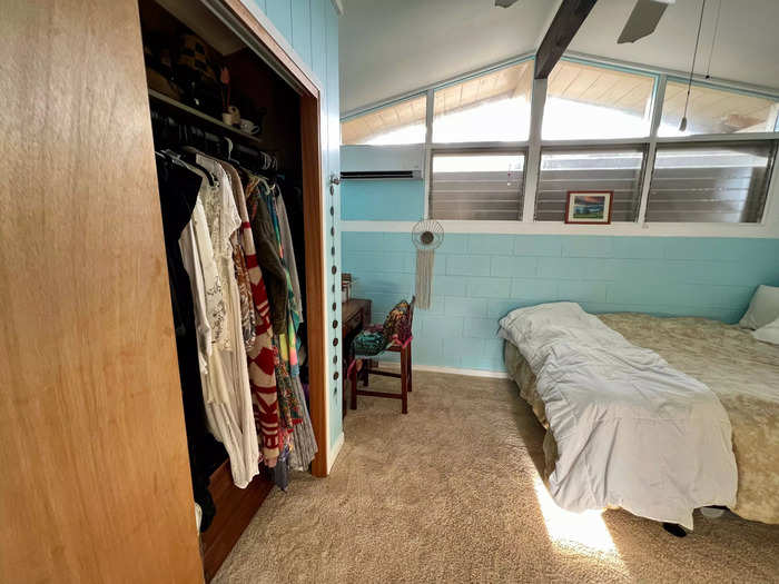
Horton said that incorporating an area rug underneath my bed would help define the space. "Carpet on carpet exists," she emphasized.
One suggestion that surprised me was to put wallpaper on my ceiling.
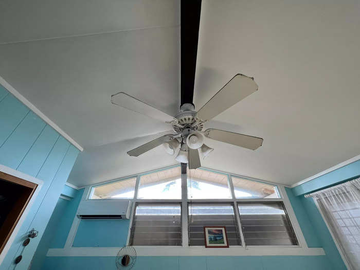
Since my room has enough texture as it is, Horton said I could add wallpaper to the ceiling, which is a technique I hadn't heard of before.
She remembered I'd mentioned tarot cards and suggested wallpapers like this tarot-inspired pattern or this witchy design from Etsy, saying both would balance out darker bedding if I got any.
On par with the witchy theme, she offered options for a new altar space.
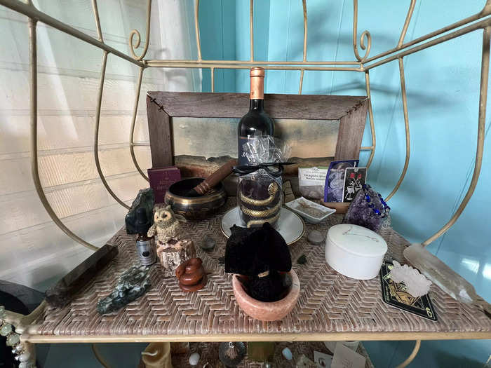
My altar space is deeply personal within my spiritual practice, so Horton suggested finding a piece of furniture that would be more suited to my personality.
"Utilizing the height you have is a great way to bring the eye up and provide ample storage, but it does get lost in the space. Since it's a passion of yours, I would recommend really telling that story louder," Horton said.
She pointed to curved furniture and natural woods, which inherently offer a bit of charm.
She suggested this wooden geometric bookshelf or this charcoal one with a curved arch to "add that character in a more subtle way."
I'm excited to implement some of Horton's recommendations.
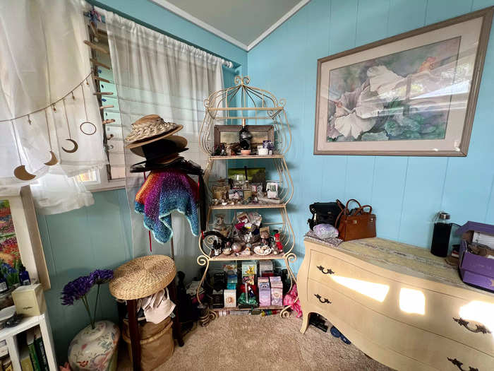
Horton provided design ideas that aligned with my vision for a more sophisticated space with a touch of childlike wonder.
A bedroom update has been on the back of my mind for quite some time, so I'm motivated to apply these ideas and other tips to truly make this space my own once again.
Popular Right Now
Popular Keywords
Advertisement