An interior designer critiqued my one-bedroom apartment. Here's how she'd make it feel bigger and cooler for 2 young adults.
Gia Yetikyel

- An interior designer told me how to make my one-bedroom Chicago apartment look bigger and more chic.
- She recommended more vertical storage and negative space.
About two years ago, my partner and I found a 1,400-square-foot one-bedroom apartment in Chicago. Since then, we've tried to make it feel like home for two post-college young adults.
To get some advice on how to upgrade our space, I reached out to Julie Purpura, owner and design director of Avenir, a Chicago-based and LGBTQ-founded design firm.
What initially drew me to Purpura was her retail and coffee shop, The Center of Order and Experimentation, which she co-owns with Jean Cate. The store's camp and funky '60s design signaled that I had found someone who has both a sharp eye for detail and a similar taste in style.
Here's what Purpura suggested we do to make the apartment feel bigger and more stylish for two recent grads.
I love maximalism but needed to focus on decluttering.
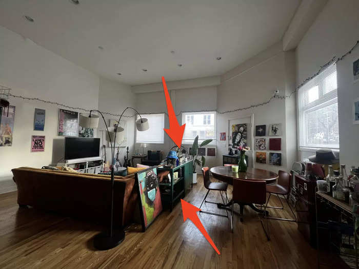
Our vision upon moving in was to have a home where we could host large gatherings with food, music, and chatter filling the tall walls. Thus, most of my energy went into making the living room a thriving social space.
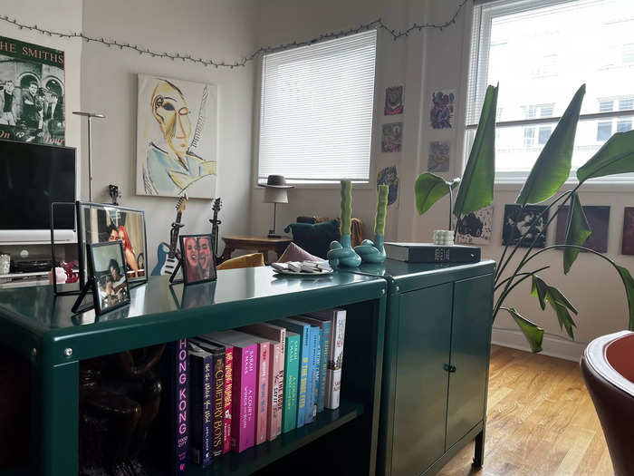
As a trinket-lover, the living room also became a place to show everything I've collected over the years — from restaurant matchboxes to weirdly shaped candles and gifted tchotchkes from friends. Although I like the thought of leaving them all on display, these tchotchkes have become a source of overstimulation rather than a nod to maximalism.
Purpura suggested that, if we cut down on our small bits and bobs, we can really make our yellow sofa a star in our space.
"I think that you could still go maximalist with your sofa. It's so cool, where if everything around it was simple, it just pops and you're going to notice this more," Purpura told Insider.
She told me putting every trinket on display at once can create a cluttered look.
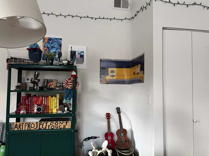
Although I enjoy exhibiting my tchotchkes, Purpura noted how busy this area looked.
Purpura mentioned the importance of being thoughtful when deciding what to display. Decluttering doesn't mean having to throw these trinkets away, rather, you could put them in vertical-storage areas and filter what you keep out.
She said the string lights have to go.
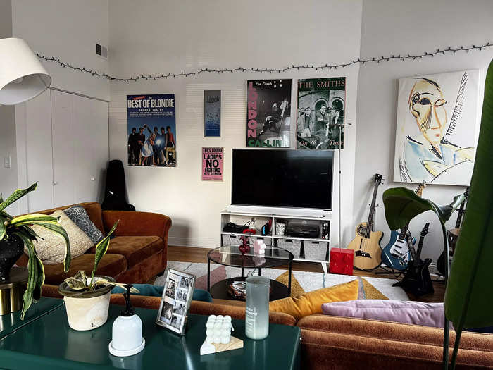
Both my partner and I love the string lights, but Purpura wasn't a fan.
The designer recommended replacing them with other forms of soft lighting like lamps and renter-friendly wall sconces. Additionally, she suggested hanging our string instruments — which were currently on the floor — on the wall as utilitarian décor.
"I'd probably do something big where you have a focal point because right now when you walk in here, there's a lot to look at," Purpura said.
Purpura drew an example of our living room with some design adjustments.
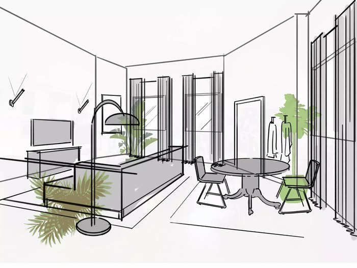
Purpura offered a redesign of the living room in a way that emphasizes the intention behind decorating, instead of putting everything on display.
She recommended hanging taller, fabric curtains to accentuate the 18-foot ceilings, and putting one large painting on the wall, rather than a collage of posters, to add a touch of sophistication.
"I would immediately want to hang drapery because your windows are in an interesting place. I love how tall the ceilings are. I wanted to elongate that and have something that brings your eyes all the way up," Purpura told Insider.
Out from the living room is the hallway, where she said we could take advantage of our high ceilings by adding taller bookshelves.
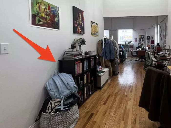
The hallway is one of the most awkward parts of the apartment. The stretched, white walls make this space look elongated but don't offer enough leeway to actually do much with it.
In an attempt to utilize it, we put our desks, bookshelf, and coat rack in the space. Purpura suggested working with the tall ceilings by getting larger and lighter-colored bookshelves to fit the area better and offer more room to decorate with.
She also said we shouldn't feel the need to fill every single spot with something. Negative space serves a purpose when decorating because it makes the space feel more open, said Purpura.
"Not all shelves have to have books. Some of them could have nothing," she said.
Past the hallway is the kitchen, to which Purpura recommended we add vintage rugs and fake plants.
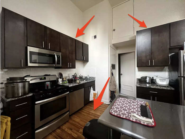
Although Purpura loved the kitchen's metal island, she suggested we put fake plants on the top of our cabinets and invest in a vintage runner to add warmth to the space.
Vintage carpets, she noted, last both physically and aesthetically.
"You can use vintage rugs instead of one of those ugly walk-off mats," Purpura told Insider. "They last forever."
The metal island is helpful, but can also be a source of clutter if not organized properly.
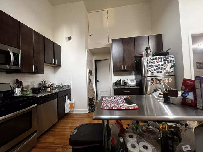
Purpura advised getting a separate holder for our many spices, as they take up too much space in the narrow cabinets and end up getting jumbled.
Unfortunately, she said, having more things often means buying more things to put your stuff in. So, she also suggested we put baskets beneath the metal island to help organize a bunch of our cooking supplies.
Beside the living room is the dining room, which could offer some storage potential.
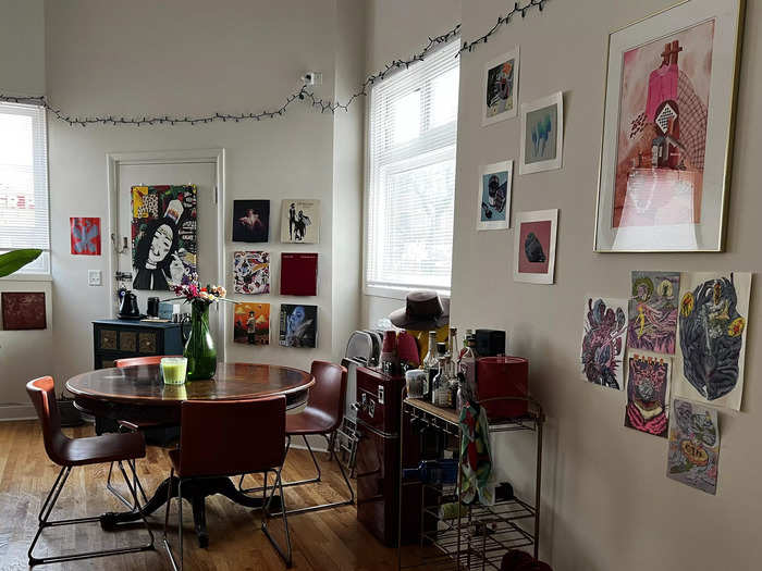
Purpura liked the old-fashioned style of our dining-room table but she said her eyes were then immediately drawn to the door behind it that we do not use.
We currently have it covered with a small makeshift coffee-station cabinet, but she suggested putting a large armoire to cover it instead.
This would cover the door more and also add more organized, hidden storage to the living-room area.
The bedroom's furniture created too much of a uniform contrast against the walls.
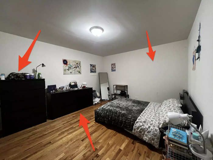
According to Purpura, the lack of personality in the bedroom stems from a mixture of bare walls, poor lighting, and matching Ikea furniture — I couldn't disagree.
The brash lighting only accentuates the white paint and starkness against the black dressers and bed frame. Additionally, hanging a large piece of art in place of the posters would help make the space look more high-end.
She offered some quick fixes like getting matching nightstands but venturing into slightly mismatched and more vertical furniture for clothing storage. The goal for us here would be to aim for symmetry, not uniformity.
She said we should lean into complementary furniture pieces, not matching ones.
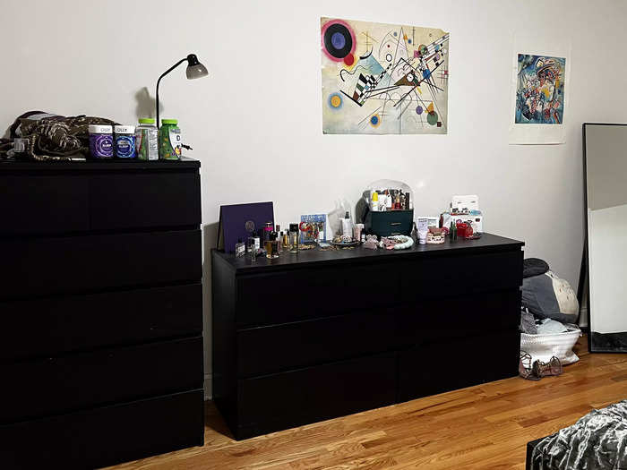
Finding softer-colored wooden dressers would offer lesser contrast and create an elegant aesthetic, Purpura said.
"You need an eclectic mix to make it look like you're well-traveled, like you are collecting beautiful furniture pieces," she said "It shows that it's more thoughtful in this space."
She also encouraged us to add more vertical storage to make the ceilings look taller. The storage would also help me hide some of the items taking up space on my dresser, like makeup.
Purpura recommended warmer tones for a more luxurious feel in the bathroom.
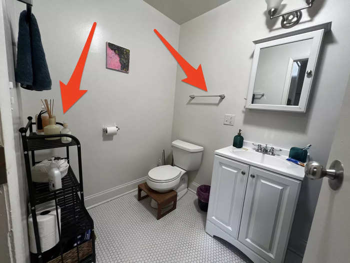
The bathroom holds similar issues to the bedroom. Its white walls and lighting make the space feel akin to a hospital.
Purpura suggested we create an accent wall by using renter-friendly wallpaper or even drawer liners. She also said we could create a more warm-toned atmosphere by adding decorative towels, switching the light fixture, and swapping out the black storage unit for a dark, wooden one.
Adding storage that can close so as not to display everything can keep the space feeling clean, Purpura said.
Accessible storage can help create a charming ambiance in the bathroom.
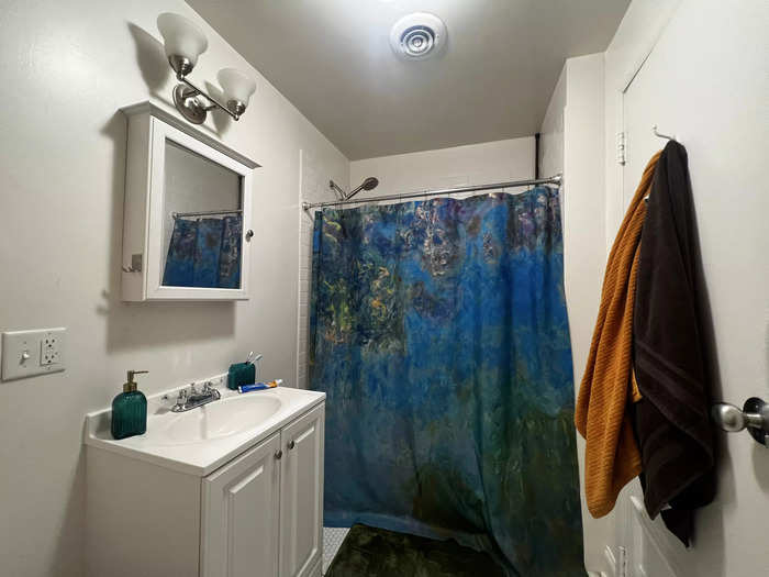
It helps to think of what a hotel would have in its bathrooms, and try to emulate that luxurious feel in your space, Purpura said. She suggested learning how to fold towels with aesthetics in mind if I wanted to display them in a pretty way.
Creating rituals through accessible and appealing storage in the bathroom offers more of an experience rather than a chore.
Overall, Purpura offered a wake-up call about experimenting with maximalism.
Since moving to this apartment, I've prided myself in the amount of effort I've put into its décor and overall vibe, especially being that so many pieces of my furniture and art are secondhand.
But as much as I wanted to adopt a maximalist aesthetic, Purpura showed me the nuance of experimenting with negative space and how that fits into the intention behind maximalism.
"How do you make living in a small space feel bigger? Buy less shit," she said "And then just make sure everything can close."
I've started implementing some of Purpura's décor suggestions and am excited to search for more vertical storage pieces.
Popular Right Now
Popular Keywords
Advertisement