17 popular trends interior designers wish would disappear
Sophia Mitrokostas

- Business Insider asked interior designers about decorating trends they don't like.
- Experts said all-white interiors and open shelving are impractical for most people.
All-white interiors are impractical and hard to maintain.
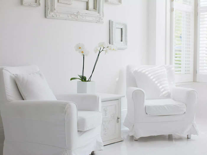
Architect and interior designer Kobi Karp of Kobi Karp Architecture and Interior Design told Business Insider that the all-white, minimalist trend isn't practical for most homes.
"White fabrics, especially white leather, stain easily. This style is popular in magazines, so designers are frequently asked to do it, but people are often left with potentially exorbitant cleaning and maintenance costs," he said.
Instead of going all white, try a rich blue or sage green that imparts a cool and clean vibe without the laborious upkeep.
Open shelving is overly trendy and hard to pull off.
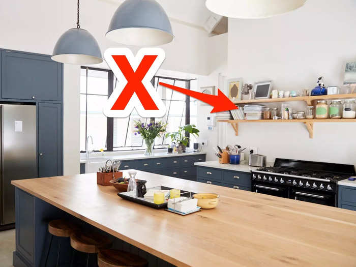
Jennifer Weisberg, interior designer and owner of JLW Interiors, told BI that the open-shelving kitchen trend usually looks a lot better on Instagram than it does in real life.
"Open shelving is so overdone at this point," she said. "It's also quite impractical, as very few people want to take the time to make sure their dishes and glassware are always perfectly organized."
If you want the airy feel of open shelving but don't want to spend hours curating your kitchen items, consider opting for light-colored wood or frosted-glass cupboards.
Vessel sinks can be unsanitary and aren't user-friendly.
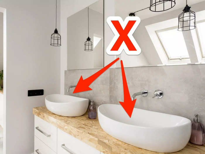
A vessel sink is one where water runs from a faucet into a raised basin or bowl that is attached to a flat countertop.
Interior designer Leslie Markman-Stern of Leslie M. Stern Design told BI that these sinks are difficult to keep clean and can be hard to use.
"It can be hard to clean around vessel sinks and they're not user-friendly for most, especially short people, seniors, or those who have disabilities," she said.
To make matters worse, it's often tough to find handles and faucets that work with an existing vessel if the sink needs to be repaired.
Midcentury modern furniture may be overused.
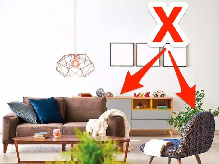
Midcentury modern refers to a style of furniture and decor that was popular from roughly the late 1940s to the early 1960s.
Although its streamlined look has recently experienced a revival, designers feel that its ubiquity has made it feel commonplace.
"Mid-century modern furniture has been used too much. It's a shame because there are other vintage styles that have interesting qualities and may actually be better made," Markman-Stern told BI.
Since midcentury modern furniture is so simple, the designer said, many manufacturers have been churning out poorly made replicas of it for years. If you're shopping for vintage pieces, it's wise to buy from a reputable antique dealer.
Faux-distressed decor can look tacky.
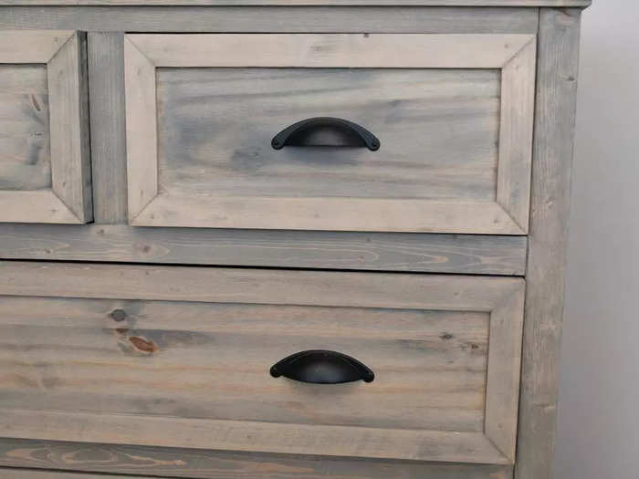
Interior designer Sally Soricelli of Nestorations told BI that the trend of decorating with heavily distressed furniture has definitely run its course.
"Everyone has been distressing and chalk-painting furniture for years now," she said. "Unfortunately, most of these mass-produced distressed pieces look cheaply made."
If you're looking to add texture and dimension to your interior, try investing in an authentic antique piece or upholstering an existing furniture item with an interesting fabric.
Dining benches look good but can be hard to actually use.
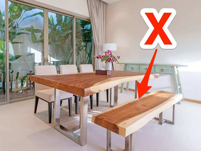
Dining benches can complement rustic decor while keeping a low profile, meaning they can be easily stowed away under tables.
But Karp pointed out that this seating trend can be downright uncomfortable.
"Dining benches are great until the person sitting in the middle has to get up, because that means everyone has to get up," he told BI. "They are also extremely uncomfortable to sit on for long periods of time."
Some designers wish accent walls would go away.
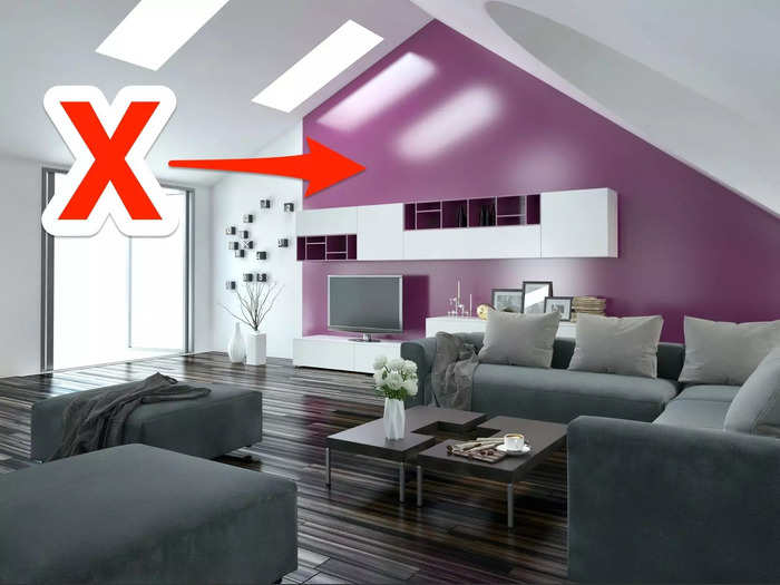
Painting or wallpapering an accent wall is still a popular way to decorate a room, but some designers are over the trend.
"The trend of painting one wall of a room a different color is definitely outdated and I never recommend it to clients," said Soricelli. "If you love the color enough, paint the whole room."
You can also use accessories, pillows, or fabrics to add complementary colors to a space.
Barn doors don't block light, sound, or smells.
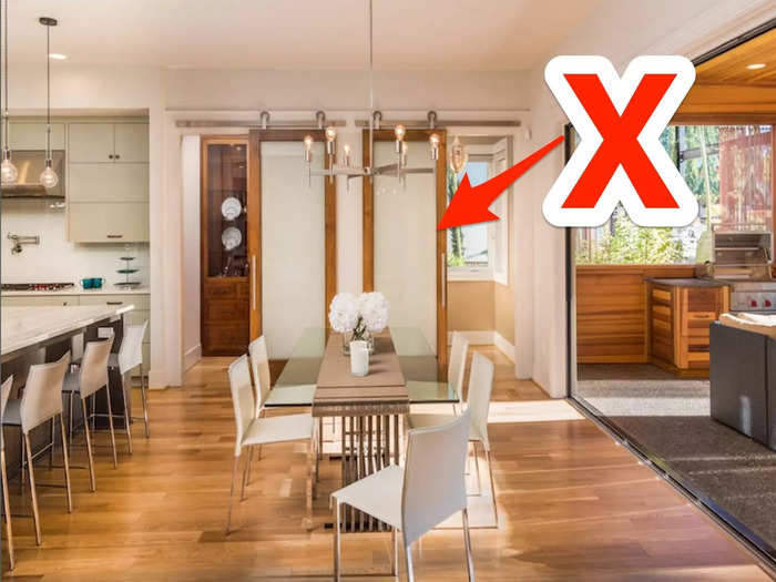
Swapping traditional, hinged interior doors for large, sliding barn doors is a mainstay of farmhouse-chic decorating.
Sadly, these doors often function as little more than wooden curtains.
"Aesthetics aside, sliding barn doors are terrible at being doors," Karp told BI. "They don't create any kind of seal between the wall and the door so they do almost nothing to block out sound, and light and odors seep in through the sides."
Shiplap is a tired interior trend.
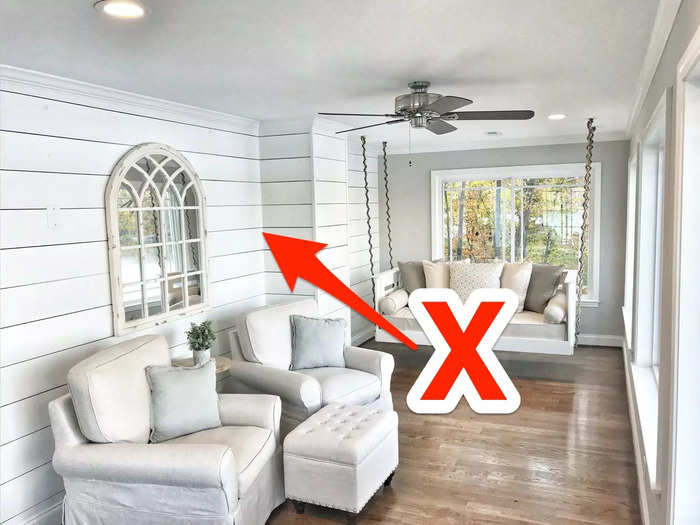
Shiplap is a type of wooden paneling that was originally used to create a water-tight seal for the hulls of boats.
Following its liberal use on renovation shows like HGTV's "Fixer Upper," shiplap sailed into homes everywhere as interior siding. But some designers think the nautical material should catch the next wave out.
"Shiplap is way too overdone — literally everything seems to be covered in shiplap these days. There are so many other woodwork choices that I'd love people to embrace in their homes," Soricelli told BI.
Palm prints are everywhere, and not in a good way.
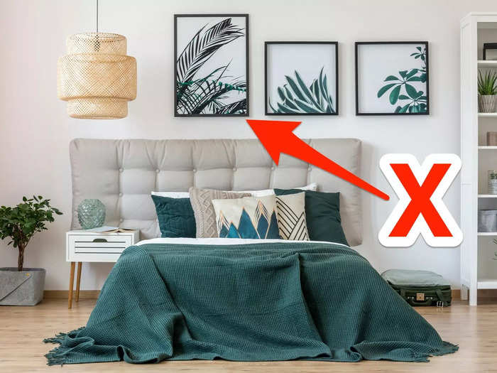
Alessandra Wood, an interior designer with online design service Modsy, told BI that bold, tropical palm prints should be replaced with something more current.
"I love a good palm print. But knock-off prints seem to be everywhere, and the oversaturated use of palm print has made it lose a bit of its appeal," she said.
Terrazzo-covered everything has some designers rolling their eyes.
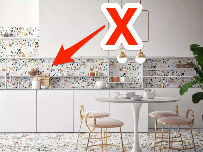
The terrazzo-print trend is still in full swing, but designers were unanimous in their dislike for the colorful material
"The use of the terrazzo pattern on everything but actual terrazzo flooring has made it feel a little overplayed," Wood said.
Weisberg added that installing terrazzo material in bright colors can make the pattern overwhelming.
"Terrazzo tends to look very busy, especially in bold color combinations. I find clients tire of this pattern quickly," she told BI.
Matching furniture sets can be pricey and boring.
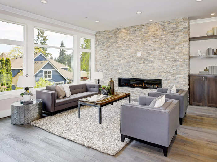
Colin Haentjens, architect and interior designer, told BI that splurging on a trendy matching furniture set is usually a financial and design mistake.
"A living room filled with furniture that has matching legs, colors, and materials is boring," he said. "Manufacturers profit from this trend for matching sets, but you can save money and find more unique pieces by shopping around."
Bold "pops" of color can actually look dated.
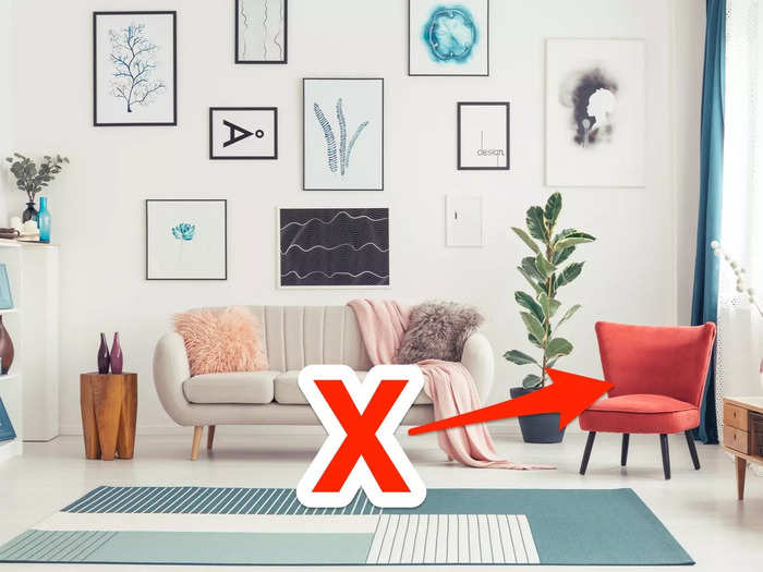
You might think that throwing a bright-red armchair into your all-white living room will add interest and originality. But Haentjens argued that bold pops of color can actually look unsophisticated.
"The trend of adding 'pops of color' with furniture and upholstery has actually been around for over a decade. This strategy can give a space a childish feel, especially if the color is primary or too saturated," he told BI.
Instead, the designer recommended simply painting neutral-colored walls a more interesting color.
Lights with paper shades are affordable but ubiquitous.
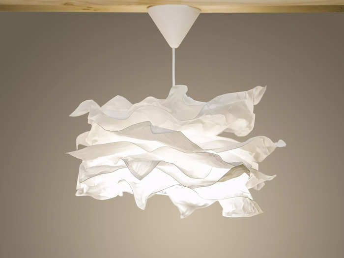
Lights with paper shades are cheap and practical, but Haentjens cautioned that they can look dull and uninspired.
"A certain affordable Swedish furniture company makes paper-shade light fixtures that can be found in every apartment," he told BI. "Steer clear of these to avoid having the same light as all of your friends."
"Living walls" are a nightmare to maintain.
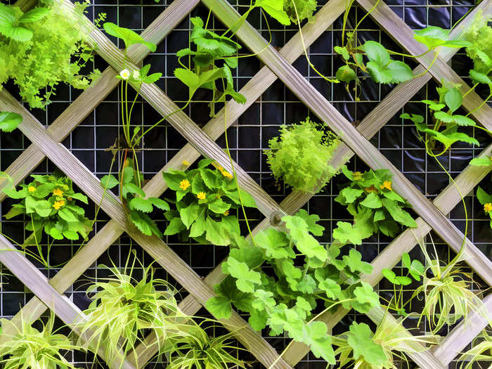
So-called "living" or "green" walls are vertical racks of potted plants arranged to give the illusion of a wall made of living greenery. Unfortunately, designers aren't in love with this plant trend.
"Living walls are hard to maintain, given their vertical placement. They also create the potential for mold, allergens, and unwelcome insects inside the home," Weisberg said.
Karp also decried the practice of using plastic plants to create living walls.
"Artificial green walls don't offer the air-cleaning benefits of a real living wall and actually harm the environment due to their use of plastic," he told BI. "This is one trend I'd love to see disappear."
Gray interiors can feel gloomy and dull.
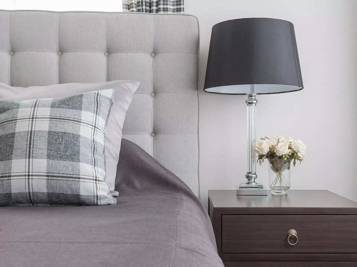
Popular colors come and go, but gray has been having a major moment in interior design for the past few years.
"Gray has been everywhere. Gray walls, gray floors, gray furniture, gray everything," said Soricelli. "But the cool tones of gray can sometimes feel depressing and sterile, especially if it's all over the room."
If you're into the idea of a neutral color palette, consider incorporating some warmer beige or even blush tones to balance out the severity of gray.
The look of a tile countertop isn't worth the upkeep.
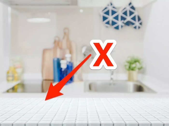
Covering your bathroom or kitchen counter with tile might add texture and visual interest, but Karp outlined several reasons this trend is a bad idea for most homes.
"In a high-humidity environment such as a bathroom or kitchen, bacteria can breed alarmingly fast on the porous surface of tiles," he told BI. They're also extremely prone to staining, and it's very hard to clean the grouting,"
Karp also noted that, in addition to their hygiene concerns, tile countertops don't provide a smooth surface for resting objects and they're prone to cracking and chipping.
This story was originally published in July 2020 and most recently updated on June 18, 2024.
Read More:
Popular Right Now
Popular Keywords
Advertisement