We visited Apple and Microsoft's flagship stores in NYC - and the winner was obvious
I started at the Apple store.

While the exterior looked different, the company's design principles and retail philosophy were intact inside the store.
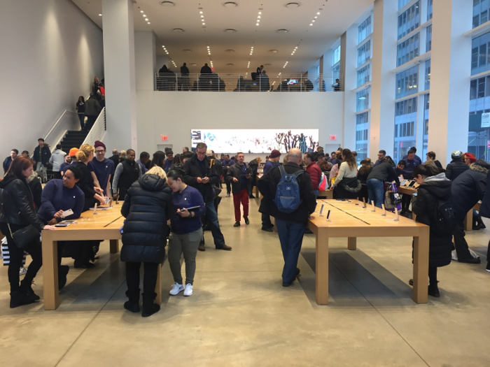
While the stores have been tweaked since their debut in 2001, they continue to emphasize minimalism, interaction with Apple products, and personable employees.
The store's layout was even clearer from above.
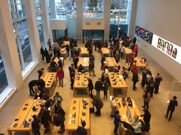
Apple stores encourage customers to interact with products by eliminating distractions.
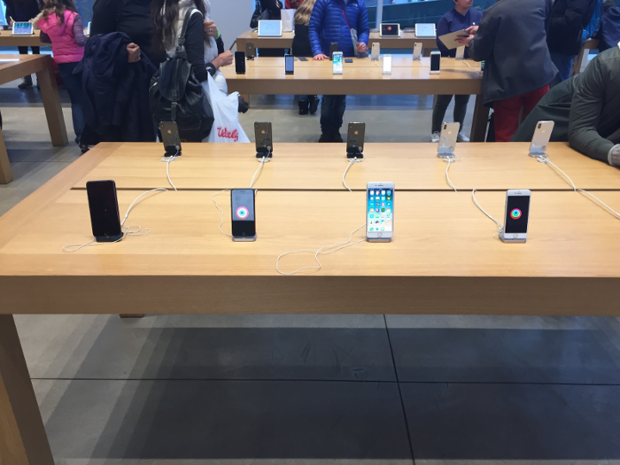
The Fifth Avenue store prevented clutter by displaying a very limited amount of inventory and doing away with signs and price stickers. The result was that my focus was immediately directed toward trying out the products.
Apple's display strategy is similar to a luxury clothing or jewelry store.
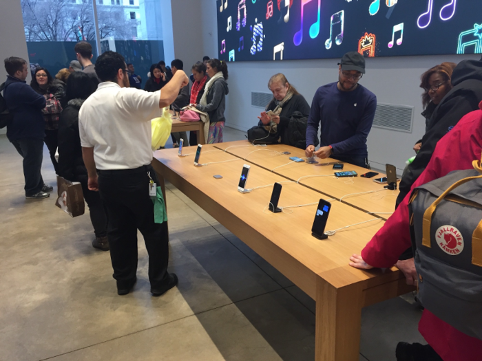
It's no coincidence Apple put its flagship New York City store near luxury brands like Cartier, Bergdorf Goodman, and Louis Vuitton. The store even had an employee dusting off the products.
The second floor showed off some recent tweaks.
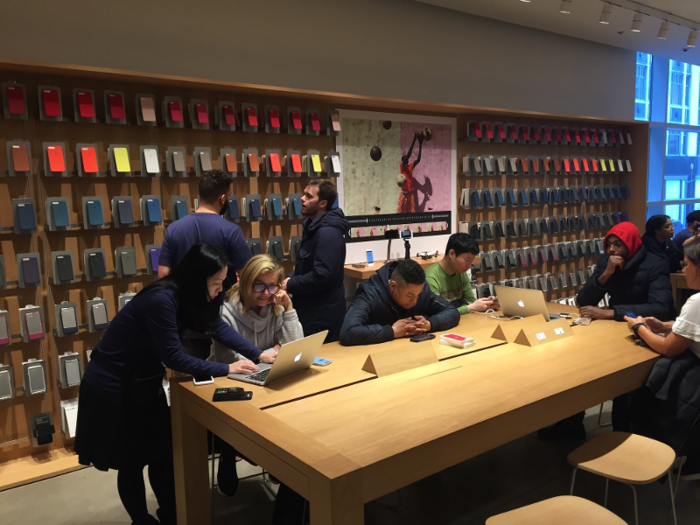
When Angela Ahrendts became Apple's senior vice president of retail and online stores in 2014, one of her priorities was improving the displays for complementary products like phone cases.
The cases caught my attention as soon as I arrived at the second floor. The fact that the most brightly-colored cases were placed above eye level for the average person — so they would be visible even if people were standing in front of them — spoke to Apple's attention to detail.
The store also did a good job of creating opportunities for customers to interact with complementary products.

On both floors, many of the display tables were occupied by a number of customers.
It was difficult to find tables that were empty enough to get a clear view of the products.
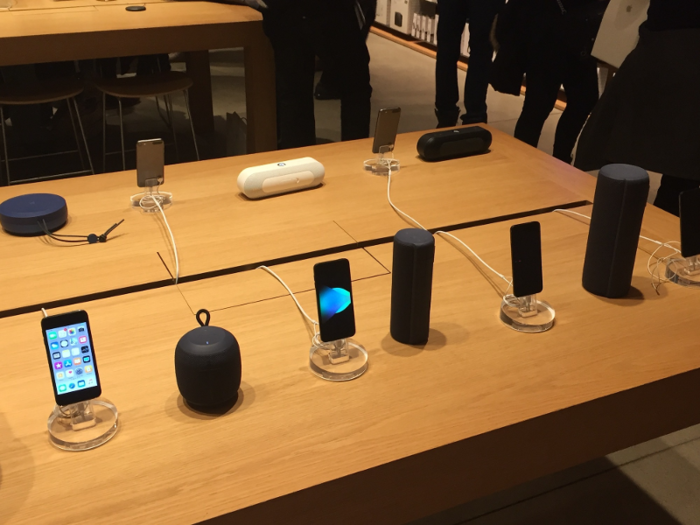
Ahrendts also wanted Apple stores to host classes where customers could learn how to use their products.
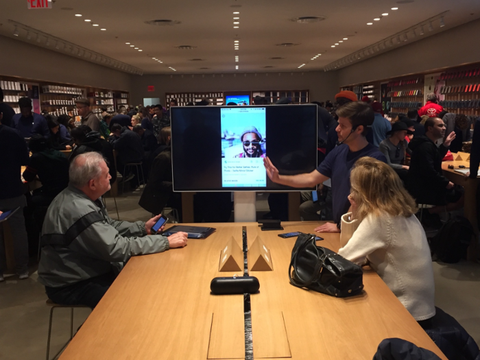
During my time at the store, I observed an Apple employee teaching a class about taking photos with iPhones. He used conversational language, an interactive display, and simple examples to make the lesson accessible for customers of any skill level.
In my experience, Apple's retail employees have always been exceptional.
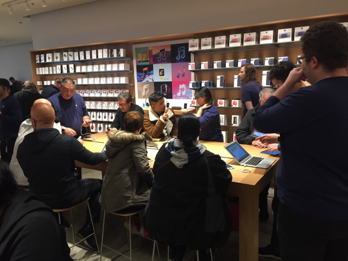
I'd previously had an excellent experience at this store while having my laptop fixed in 2017 and, over the years, I've been impressed by how personable and attentive Apple employees tend to be — even when the store is packed.
I went to the Microsoft store next.
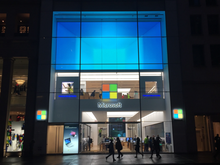
Microsoft's Fifth Avenue location opened in 2015. It's just a five-minute walk from the Apple store.
It's clear that Microsoft took inspiration from Apple.
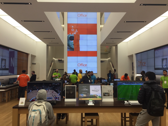
While the product spacing and focus on interactivity reminded me of Apple, there was a little too much sensory stimulation on the first floor. In addition to three large screens in the middle and on the sides of the room, I heard two songs playing at once. (This was likely the result of a DJ program customers could demo.)
The store also took a similar approach to customer service.
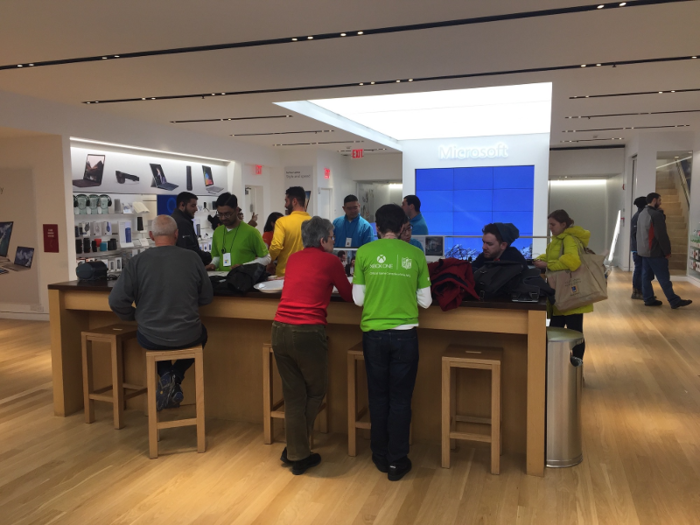
On the second floor, customers could either seek help at a communal table that resembled Apple's Genius Bar or use a series of individual tables for more personalized service.
The first-floor displays were a little busier than Apple's, but still clean enough to make the products inviting and accessible.
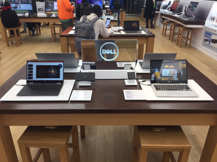
But the variety of products the store sold was a double-edged sword.
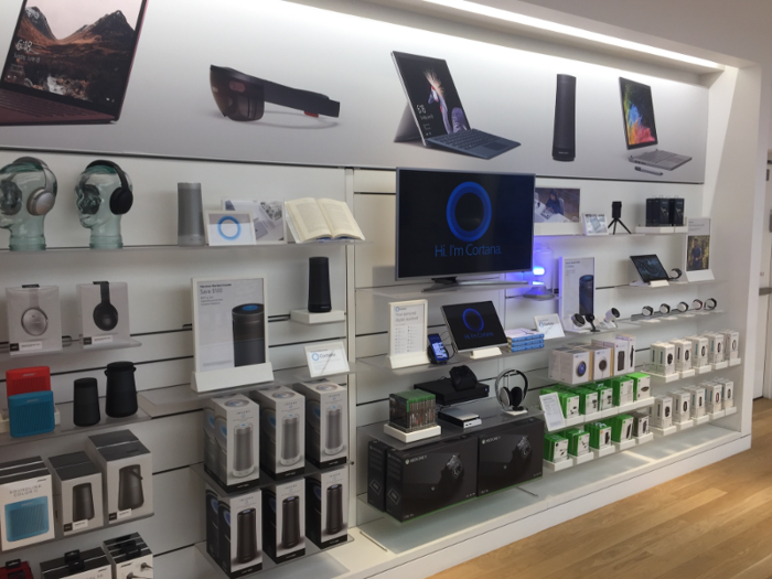
While the store was clean and organized, it could have benefitted from placing more inventory in backrooms and making the products stand out more. This display divided my attention between a number of items.
The upside was that the Microsoft store was more likely to show you something you haven't seen before.
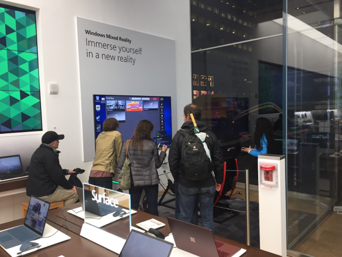
For example, each of the three floors had a virtual-reality section. I tried two of them and came away excited about the idea of owning a VR headset.
In general, the store reflected Microsoft's strategy.
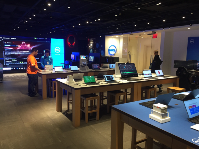
While Apple positions its products as luxury items that are aesthetically-pleasing and easy to use, Microsoft appeals to a customer base that is more focused on processing power.
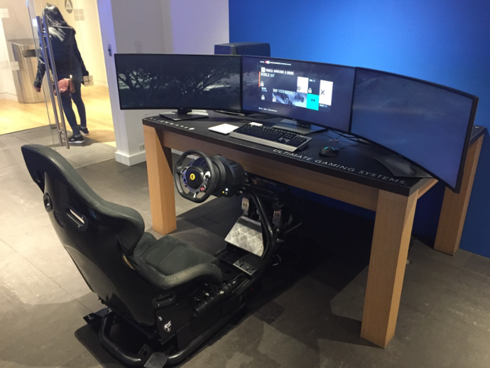
Like gamers...
...and businesses.
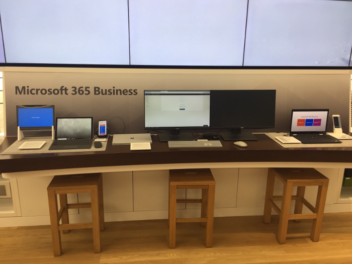
While the Microsoft store wasn't as coherent as the Apple store, it gave customers more opportunities to be surprised by items they might not already own.
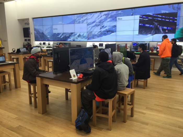
Apple wants customers to buy into a network of products that look and feel similar. The advantage is that if you own an iPhone, for example, it's pretty easy to figure out how to use an iPad. There's less overlap between Microsoft Office and an Xbox; they provide more differentiated experiences and higher learning curves.
Apple's product strategy and aesthetic brilliance gave its store an edge over Microsoft's. Each of the items in its 5th Avenue store was intuitive, and the store's minimalist design never made me feel overwhelmed.
Microsoft's store had a more difficult task in trying to sell a range of products that don't necessarily look like each other or operate in similar ways. While you're more likely to come across a product that's completely different from something you own, you probably don't want to spend the time necessary to get a grasp on a video game console or DJ software when you're in a crowded retail environment.
Popular Right Now
Popular Keywords
- India’s wearables market decline
- Vivo V40 Pro vs OnePlus 12R
- Nothing Phone (2a) Plus vs OnePlus Nord 4
- Upcoming smartphones launching in August
- Nothing Phone (2a) review
- Current Location in Google
- Hide Whatsapp Messages
- Phone is hacked or not
- Whatsapp Deleted Messages
- Download photos from Whatsapp
- Instagram Messages
- How to lock facebook profile
- Android 14
- Unfollowed on Instagram
Advertisement