The 10 best logo changes of 2015
10. With the help of design firm Studio Tilt, IHOP changed the "Restaurant" bar in its logo to create a smiley face that adds a burst of cheer. The brand reinvention arrived two months before the popular restaurant chain reported its strongest second-quarter sales in over a decade.
9. The dinner-reservation service OpenTable worked with Tomorrow Partners for a logo that looks great on the current generation of smartphones. Its icon cleverly represents a diner waiting for a table.
8. Creative agency Troika updated Turner Broadcasting's logo with a modern look that still maintains its unique "r" shapes.
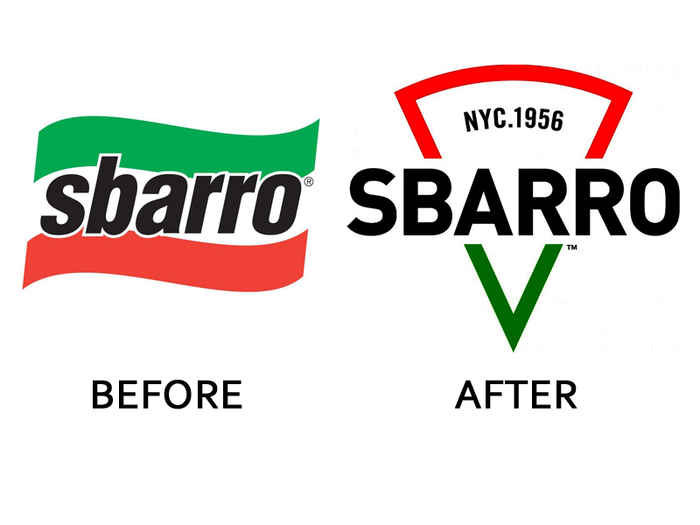
7. Sbarro's new owners are hoping to revive the struggling pizza chain. Its 2015 branding overhaul, which evokes a slice of pizza, is a step in the right direction.
6. Emerald Nuts worked with the agency Girvin to replace its previously old-fashioned logo with a sleek, modern update.
5. Pentagram's redesign of The Ritz-Carlton's logo helps it stand out in the luxury-hotel market. The agency cleaned up the lion crest, gave the lettering a bolder font, and imbued it all with an unusual shade of blue that the chain will now embrace as its own.
4. Google Ventures, Google's venture-capital arm, reinvented itself as "GV" this year and redesigned its logo in-house to accompany the change. It takes the "G" from Google's new logo and slashes into it with a half visible "V," adding some character.
3. Agencies Bloom and Anomaly refreshed Johnnie Walker's logo with a more detailed character and contemporary luxury-label lettering meant to appeal to a young, sophisticated audience.
2. Viacom's Spike network worked with the Bluemarlin agency to create a more mature logo that may help it attract a broader audience beyond its core male demographic.
1. After 17 years of using basically the same logo, Google's in-house redesign launched in September. The tech giant's distinctive and uniform new look is great in its applications across all Google products. It's fresh while remaining true to the brand.

Popular Right Now
Popular Keywords
- India’s wearables market decline
- Vivo V40 Pro vs OnePlus 12R
- Nothing Phone (2a) Plus vs OnePlus Nord 4
- Upcoming smartphones launching in August
- Nothing Phone (2a) review
- Current Location in Google
- Hide Whatsapp Messages
- Phone is hacked or not
- Whatsapp Deleted Messages
- Download photos from Whatsapp
- Instagram Messages
- How to lock facebook profile
- Android 14
- Unfollowed on Instagram
Advertisement