See the hidden meanings inside 21 tech company logos
LG's logo has three meanings: It contains the letters LG, a smiley face, and it looks like the symbol for an on/off button. And its elements can be rearranged into a Pac Man logo ...

Another simple but brilliant use of white space: The old Flight Finder logo is two F's that describe a plane between them.

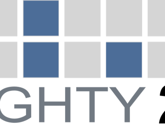
The squares in data analytics company Eighty20's logo represent binary code: The top line, 1010000, represents 80 and 0010100 represents 20.
The apocryphal story of the slanted "E" in the Dell logo is that founder Michael Dell wanted it to represent his desire to turn the world on its ear. Some also say it emulates a floppy disk.
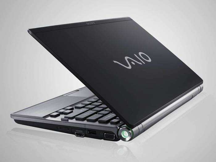
In Sony designed the original Vaio logo, with the letters V and A represent an analog waveform and the I and O represent a binary code.
You've probably noticed that Amazon's logo contains a yellow arrow that doubles as a smile, but did you also notice that it points from A to Z?
Facebook Places was Facebook's now defunct response to the check-in app Foursquare. Note that the red arrow is pointing at a number four ... an indicator of its intended target.
We love the Skitch logo because it looks like the feathers on an arrow, but those fletchings double as an S and its reflection.
Cisco's logo represents a digital signal that happens to take the form of the Golden Gate bridge, which is in San Francisco, the city after which the company is named.
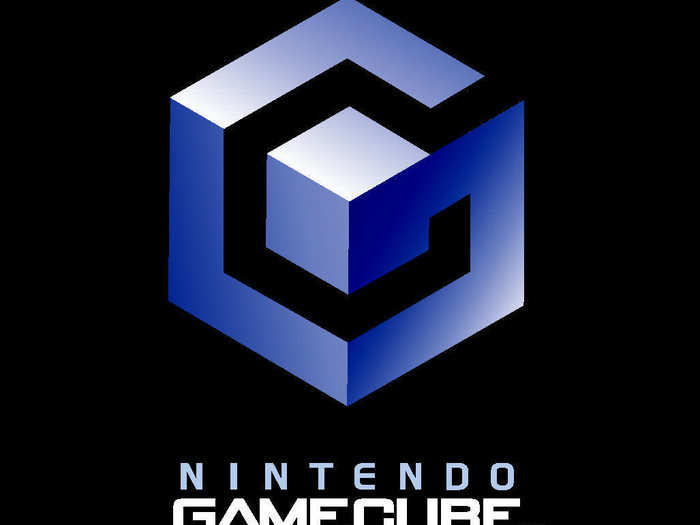
Nintendo's Gamecube logo is famously clever: It's not just a cube within a cube, it also shows the letter G enclosing a C in negative space.
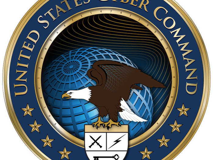
The U.S. Cyber Command incorporated a 32-character code inside the gold inner rim of its seal. The link at the bottom of this image reveals its meaning.
Document maker Quip's logo is obviously a Q, but it's also a pen poised to write on a piece of paper.
Microsoft XNA is a developer tool for games. The logo contains a mashup of the Morse code for XNA."— · · —" means X, "— ·" means N, and "· —" means A.
The Ubuntu operating system logo actually represents three people holding hands and looking upward.
Google's "Picasa" name is a play on the concept of a home for your pictures. Casa is Spanish for house, and there is a house inside the colored camera shutter leaves in the logo.

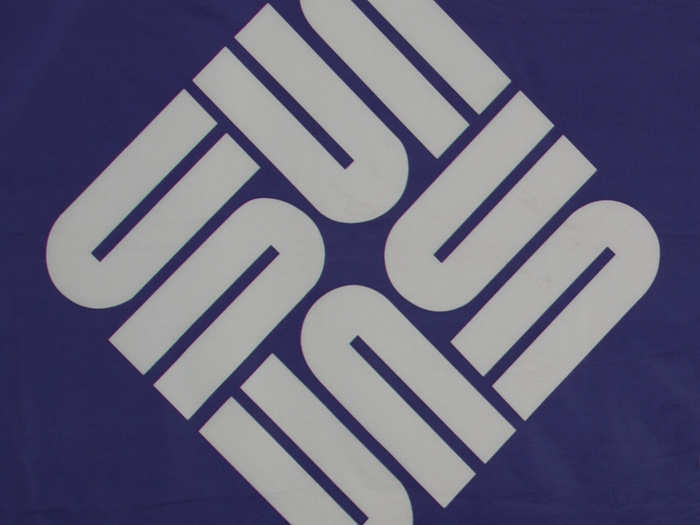
Sun Microsystems was acquired by Oracle in 2010 but its simple logo was deceptively clever. It consists only of "u" shapes arranged to form a box of "S's" that also spell the word "Sun" when divided down the middle.
OK, so Claimair's logo is obviously a paper airplane. But it's a brilliant visual pun: This company helps you with the paperwork when you have to bring a complaint against an airline.

Rdio's logo uses the negative space inside the "d" and the "o" to show a semibreve and a crotchet, two common musical note symbols. (Rdio went bankrupt in 2015.)
Hotel Tonight's logo is either a bed or a lower-case "h," depending on how you look at it.

Just In Case's clever logo consists entirely of negative space representing a bundle of documents tied up in legal ribbon.
Sure, the logo for Twitter cofounder Biz Stone's Q&A app Jelly looks like a jellyfish. But it's also a brain.
Popular Right Now
Popular Keywords
- India’s wearables market decline
- Vivo V40 Pro vs OnePlus 12R
- Nothing Phone (2a) Plus vs OnePlus Nord 4
- Upcoming smartphones launching in August
- Nothing Phone (2a) review
- Current Location in Google
- Hide Whatsapp Messages
- Phone is hacked or not
- Whatsapp Deleted Messages
- Download photos from Whatsapp
- Instagram Messages
- How to lock facebook profile
- Android 14
- Unfollowed on Instagram
Advertisement