Apple
- Apple's iOS 14 update is full of new iPhone features that touch almost every aspect of the operating system, from Apple's apps to the home screen, privacy, and much more.
- After using the software for a full day, I've come across a few new features that have been immediately helpful and noticeable.
- Among the biggest are the updates Apple has made to the home screen, which make it easier to see information at a glance and parse through my giant library of apps.
Apple's next major iPhone update won't officially launch until the fall, but the company made an early version of its iOS 14 software available for free through its beta program on Thursday.
When it launches, iOS 14 will bring a bunch of changes to the iPhone, from the way the home screen looks to upgraded privacy controls, new ways of using apps, and much more.
I've been using the iOS 14 beta for a full day, and although it will take quite some time to dig into all (or even most) of the new additions, there are a few immediate changes that stood out to me right after upgrading.
The biggest takeaway is that Apple is doing much more to help us manage the deluge of apps crowding the home screens of our iPhones. The company has done this by adding tools for managing the sheer amount of apps installed on our phones, and also by creating a new ways to access parts of apps when we need them.
Here's a quick look at the immediate changes I've noticed in iOS 14 so far.
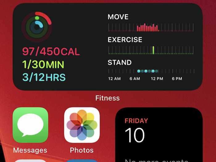
Widgets have made my home screen feel more useful.
Lisa Eadicicco/Business Insider
Apple has significantly improved widgets in iOS 14, finally bringing the iPhone closer to the level of customization that Android has provided for years.
Widgets in iOS 14 have a new design that shows more data and they now come in multiple sizes. Best of all, you can finally drag and drop them onto the home screen.
The most obvious benefit from this has been the ability to make my home screen more than just a hub for my most frequently-used apps. Glancing down at the home screen can now tell me all sorts of information like what's next on my calender, progress toward my fitness goals, and a to-do list I've recently drafted in the Notes app.
Among the most interesting new widgets is the Smart Stack, which as its name implies is comprised of several widgets piled on top of one another. The widget choices are curated based on the apps you use the most, which for me included Photos, Weather, Calendar, Notes, Apple Maps, and Music. The stack also rotates throughout the day to show relevant information.
These choices were a bit hit-or-miss for me. While Photos, Calendar, and Notes are definitely among my most-used apps, I rarely if ever use Apple Music or Apple Maps.
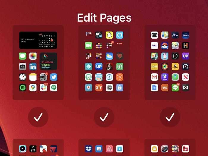
I've finally said goodbye to the pages and pages of apps that were cluttering my phone.
Lisa Eadicicco/Business Insider
iOS 14 introduces a new section of the home screen known as the App Library, which sorts all of your apps both by category and in alphabetical order. In the short time I've been using iOS 14, this has made it so much easier to manage by sprawling app collection.
Your iPhone automatically creates folders for your apps in the App Library based on app categories (i.e., social, productivity, utilities), in addition to folders for suggested apps and apps you've recently installed.
Other than these folders, the App Library also lets you browse all of your apps in a list view organized in alphabetical order.
The best part, though, is that you can finally choose to hide some app pages and send newly installed apps straight to the App Library.
This has made my iPhone feel so much less cluttered. I have 12 app screens on my iPhone — but I've decided to hide all of them except for the first two, where my most frequently used apps reside. You can choose to hide home screens by tapping the dots positioned above the dock when in jiggle mode.
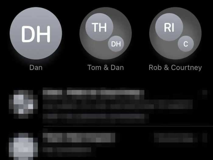
Messages feel neater now that I can pin important conversations.
Lisa Eadicicco/Business Insider
One of the big themes in iOS 14 seems to be improved organization, and that holds true in the Messages app as well.
You can now pin messages to the top of the Messages app in iOS 14, meaning you'll no longer have to scroll through the app to find relevant chats.
This has saved me a lot of time when contacting the people I text most frequently. I didn't even try to dig through my text history in the past — I'd usually just start a new message entirely. Now, being able to pin conversations to the top of the app means those threads are at my fingertips whenever I launch Messages.
Apple's messaging app is also getting another feature that makes it easier to manage conversations: Mentions for group conversations. That means if you're in an ongoing group thread with many people, you can choose to only get notifications when a person mentions you specifically in a new message.
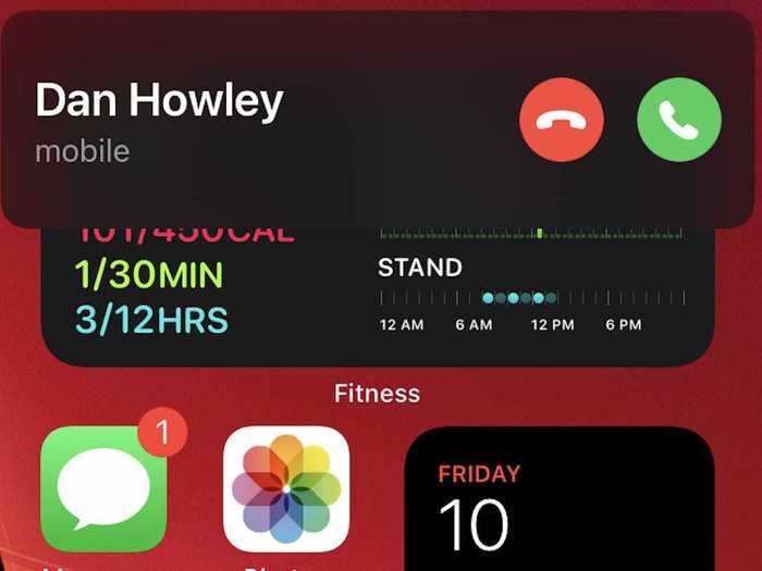
Incoming phone calls are much less intrusive.
Lisa Eadicicco/Business Insider
Apple is introducing a new user interface for incoming phone calls in iOS 14.
Rather than dominating the entire screen — which can feel jarring — you'll see an indicator that looks similar to a banner notification near the top of the screen.
You can also continue to use your iPhone as you normally would while receiving an incoming call. That can be useful at times when you may receive an unexpected call just as you're about to hit send on that email.
It's easier to take Night Mode photos on the iPhone 11 and 11 Pro.
Dave Smith/Business Insider
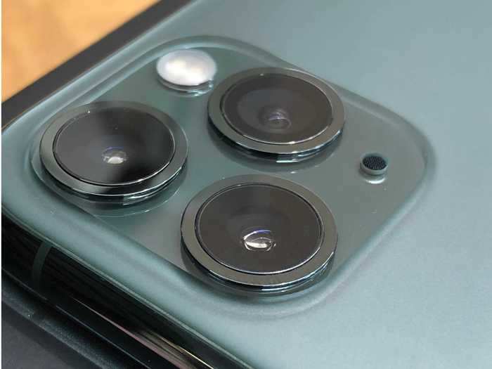
If you have an iPhone 11 or iPhone 11 Pro, you may have noticed that it can be difficult to take stable Night Mode photos.
Apple is addressing that in iOS 14 by introducing a new guidance indicator to help you keep your phone steady during the duration of the shot. This indicator, which leverages the iPhone's gyroscope, looks like a cross that appears in the middle of the screen.
I tested this out on an iPhone 11 Pro Max running iOS 14 alongside an iPhone 11 Pro running iOS 13, and I found that the new indicator made it easier to keep my shot centered — especially when shooting with one hand.
Overall, these changes make many daily tasks — like sending texts and checking the weather — feel faster. But it also makes you wonder why Apple didn't add these improvements long ago.
Apple
So far, iOS 14 feels like a welcome update that streamlines nearly everything I do on my phone — from checking the news and weather to finding apps and sending texts.
But none of these are necessarily new behaviors, and some of these additions — especially widgets — feel more like Apple is catching up to Android rather than introducing new capabilities.
Still, there are some aspects of iOS 14 that could change how we use our phones in the future.
App Clips, for example, could help us cut down on the number of apps we install in general and is setting the stage for iPhones that are more proactive by showing you relevant information as you need it.
And the new privacy protections in iOS 14 are designed to hold app makers more accountable for the data they collect by providing more information in the App Store.
All told, the ability to change the home screen alone will make iOS 14 feel like a much more significant update than years past.

