The Hey app focuses on its so called Imbox, for important email.Hey/Basecamp
- Hey is a new email app from Basecamp that's designed to help you get the most out of your email.
- It lets you sort emails into categories for newsletters and shipping notifications, and makes it possible to screen emails just like you screen phone calls.
- The email provider, which was initially invite-only, has caught on in the short time it's been available, breaking into the top 100 iPhone apps the day after it launched.
- Overall, I found that Hey made my inbox feel more organized and has the potential to help me find relevant information more quickly, but it comes with a learning curve and a hefty price tag: $99 per year.
There's been an obsession with killing email in recent years, and for good reason. Our inboxes have become an unwieldy place, often cluttered with messages that aren't very relevant which makes it challenging to cut through the noise.
Major email providers like Google, as well as lesser-known services like $30-per-month Superhuman, have done a lot to improve our inboxes over time. Google has added features that make its email smarter by helping to complete your sentences, and there are an array of filters, notification settings, and tabs available to keep your inbox feel organized.
But office communications software provider Basecamp is taking a different approach with Hey, the new email service it debuted in June. It's not trying to subdue or oversimplify your inbox by making it as easy as possible to get to inbox zero. Rather, it's turning the inbox into what it was always meant to be: a hub for all of your most important messages, alerts, and other information. It's not running from the fact that your inbox is constantly flooded — it's embracing it.
Hey costs $99-per-year and launched on June 16 as an invite-only service, but the company has since expanded it to the general public. It blocks email tracking software and doesn't sell ads, instead relying on subscriptions.
The service appears to be catching on. It broke into the iPhone's top 100 productivity apps by daily downloads the day after its launch, according to data from App Annie, and later ranked 99th by daily downloads in the Google Play Store's Communications app category. The app also garnered much attention after its creators raised concerns to Apple after Apple's initial decision to reject app updates from Hey, citing a rule that requires app makers to use Apple's in-app payment system.
Apple eventually approved the app's updates after threatening to remove it from the App Store.
There's no shortage of email apps available for iPhone and Android users, but what makes Hey interesting is that it's not just layering additional features on top of your existing email account. It's meant to be a completely fresh start, and in my personal experience it's helped me make sense of my inbox rather than just racing to clear it out.
"It's well overdue that we get better tools to defend ourselves and our attention and our love affair with email," David Heinemeier Hansson, Basecamp's cofounder and CTO, said in a previous interview with Business Insider's Rosalie Chan.
Here's a closer look at Hey and what it's been like to use it.
Hey, which I've been using over the past couple of days, works differently than your average inbox.
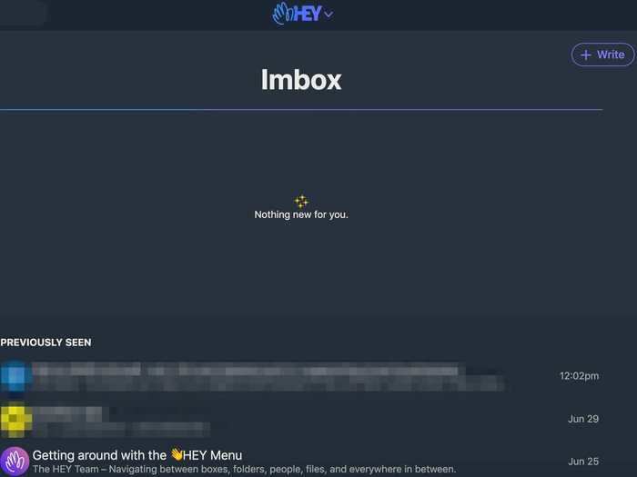
Hey's Imbox
Basecamp/Hey (screenshot)
Rather than having one main inbox, Hey dissects it into a few different categories based on the type of mail you typically get. First, there's the Imbox — an inbox for your important stuff. This is where you can view new emails that you haven't previously seen as well as messages you've already read.
But messages don't just appear in your Imbox. You have to screen first-time senders, similar to the way you would screen a phone call. The idea is to make sure you're not getting slammed with emails that aren't relevant to you (although these emails aren't completely lost, you can still view them in a section called Screened Out).
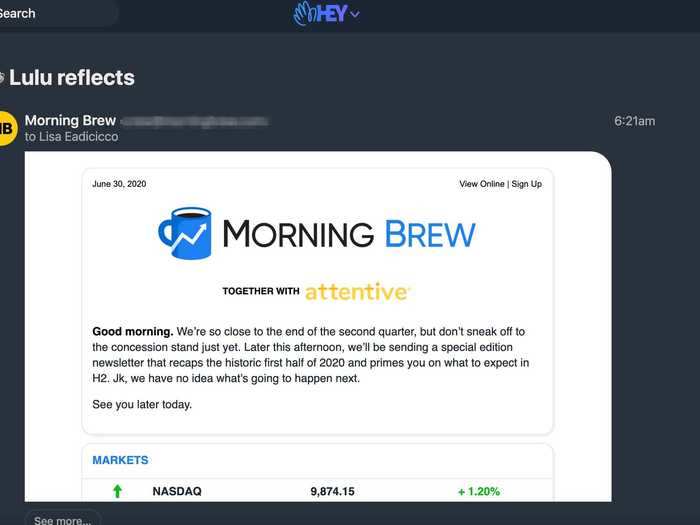
Then there's also The Feed, a home for content like newsletters and marketing emails.
The Feed section of Hey
Basecamp/Hey (screenshot)
In other words, this section is for emails that you'd like to read but don't need to respond to. The Feed also has a different interface that isn't just the pile of subject lines stacked on top of one another like you may be accustomed to. The Feed is designed to be just that — it's a feed showing previews of these emails that you can scroll through seamlessly without having to navigate back to your inbox.
Next, there's the Paper Trail, a category for storing shipping notifications, online shopping receipts, and similar information.
The Paper Trail, where you can send receipts and similar emails.
Basecamp/Hey (screenshot)
I've also been using this section to keep track of any emails from my credit card providers and Venmo transaction alerts, for example.
When you receive an email, you can choose to always have emails from that sender appear in The Feed or Paper Trail, so you know where to find these notices moving forward rather than sifting through one overflowing inbox.
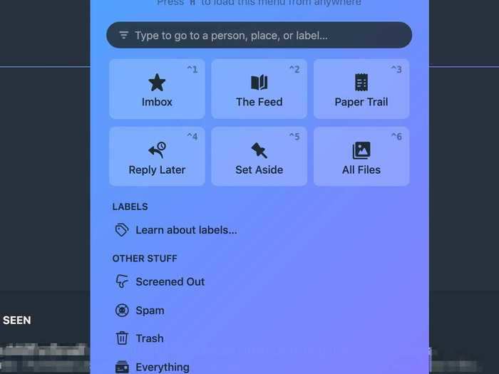
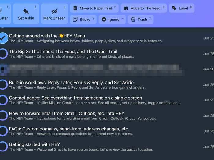
Hey also has a place for storing emails that require a reply that you may not have the time to answer at the moment, as well as a bucket for emails that you may need to reference later. These are the "Reply Later" and "Set Aside" categories shown in the menu below.
Use this menu to navigate between different sections of Hey
Basecamp/Hey (screenshot)
"Set Aside" could make it easier to find emails containing flight tracking numbers or other types of data you may need to access in a pinch. In the workplace, I could imagine that folder being helpful for keeping messages like office FAQs or meeting instructions handy.
There's also a separate folder just for attachments, meaning you won't have to sift through emails to find a specific photo or PDF someone may have sent you. You can also pin "Set Aside" emails to the bottom of your inbox to keep them top-of-mind.
But that's just the basics of how Hey is structured.
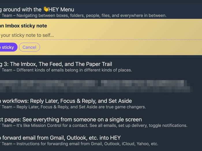
You can add sticky notes to emails in Hey.
Basecamp/Hey (screenshot)
These features alone aren't what make Hey particularly unique. Gmail offers tabs for sorting emails into categories, like newsletters and social media emails, as does Superhuman.
It's the idea that Basecamp is going beyond just allowing you to sort or label emails by category and is actually thinking about why you might be looking for a particular email. As such, its features are centered on surfacing and organizing information from your inbox in a way that makes sense depending on your use for it.
The ability to read all of your newsletters in a feed rather than by clicking on them individually is just one example of this mindset, but here are a few others:
- The ability to rename email threads for your own reference without changing the title for other recipients
- A tool for clipping text from emails so it can be quickly referenced without pulling up the entire email
- The ability to merge separate email threads about the same subject into one
- Sticky notes that can be tacked onto emails in your Imbox for your own personal reference
Overall, in the few days I've been using Hey, I've felt like the act of checking email has become more efficient and less time consuming.
You can also access the Hey menu by clicking the avatar icon next to an email.
Basecamp/Hey (screenshot)
I've been having email from my personal Gmail account, which is usually full of marketing emails, newsletters, and transaction notifications, forwarded to Hey, and I've appreciated how it's helped me to recalibrate how I sift through email.
Although Hey doesn't feel like it's intended for people like myself who are only concerned with achieving inbox zero, it's certainly helped me to do so.
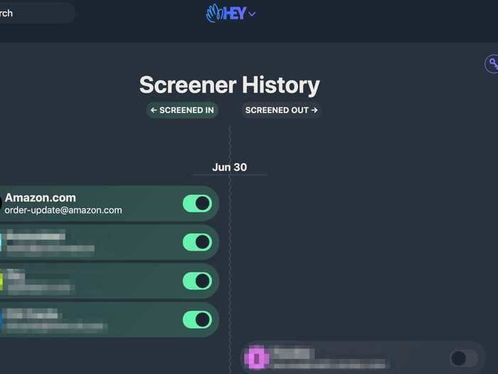
This is Hey's screener history, which shows you which email addresses you've greenlit and which ones you've blocked from accessing your Imbox and when.
Basecamp/Hey (screenshot)
I usually set aside time near the end of the week or weekend to blow through the hundreds of emails I typically get in my Gmail account, many of which I either trash or mark as read. Screening emails as they come in and designating them to drop in different buckets alleviates that burden in a couple of ways: by reducing the amount of email that makes it to my Imbox, and by making it easier to address new messages more efficiently as they come in.
Still, while I appreciate the benefits that Hey offers compared to a more traditional email service, it's not perfect — and pretty pricey at $99 per year.
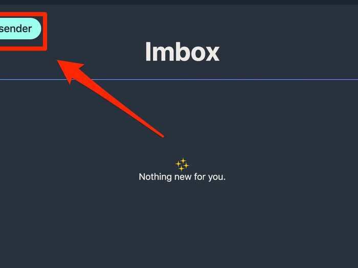
Here's what you'll see when you get an email from someone for the first time.
Basecamp/Hey (screenshot)
Screening first-time senders can feel a bit cumbersome after a while, especially if you get a lot of email on a daily basis. Hey's Imbox and folders don't show any unread counts, a deliberate decision meant to prevent you from feeling overwhelmed. I can appreciate this, but knowing how many emails I have left to look over in a day often makes me feel more organized, not less.
Hey also doesn't support signatures yet, although Basecamp says that feature will be coming soon. The company is working on a way to create signatures that are neater and more concise than the ones currently available through other email services.
Hey is a fresh take on email that seems to be best-suited for email power users, not people who are only interested in breezing through their inbox as quickly as possible.
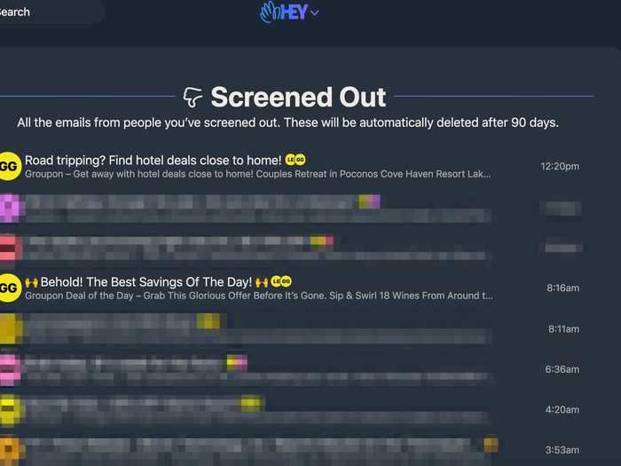
And here's where you see all the emails you've screened out.
Basecamp/Hey (screenshot)
Hey teaches you to re-think email, and that requires a little bit of time and effort.
You'll have to learn some new habits and be willing to stray away from the idea of email as you know it today — i.e., an inbox where new emails pile up in the form of a list of subject lines. Hey walks you through this brilliantly, but you still need to be open to changing your habits and expectations when it comes to email.
That's because the point of Hey isn't just to de-clutter your inbox; it's to give you the tools you need to make email actually work better for you.
That's the audience that Hey is tapping into: power users that want to get more out of their email and are willing to pay $99 per year to do so through the extra features and enhanced privacy.

