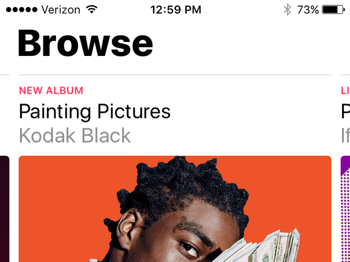
Why is everything so large?
The very first thing I noticed when I opened Apple Music was that everything is huge now. The album covers, photos, and video stills take up huge chunks of the screen, and the font is enormous.
Seriously, it’s really, really big. It’s large to the point where it just seems like some higher-up at Apple approached Apple Music’s designers and told them to design the app as if their core audience was older people who bring reading glasses to restaurants so they can see the menu.
Don’t get me wrong, everything looks really nice. You can say a lot about Apple and their products, but you can’t say that they aren’t beautiful. Compared to Spotify’s relatively bare-bones design, Apple Music is a joy to scroll through and explore.
But jeez everything is big.
That said, I'm not ready to jump ship yet
Apple Music is a flawed app. With the Apple pedigree and competition from Spotify, I was expecting a more positive experience from my first few days. But unlike my first go-around with this streaming service, I haven't gotten the urge to throw my hands up and go back to the familiar.
The curated playlists and recommended music sections are visually appealing and make me curious to jump in and listen. And the promise of Apple Music exclusives, if only for a few weeks at a time, has also caught my interest.
Despite the fact that it isn't as user-friendly as other music apps, I want to give it a chance to win me over. I'm going to spend more time with it over the coming weeks. Time will tell if it can make a convert out of me.


