Here's How Apple Can Make Its Next iPhone Design A Lot Better
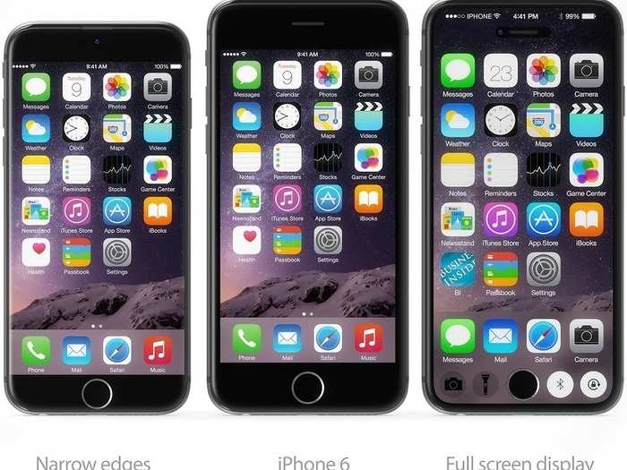
Here, Hajek has shown what an iPhone 7 with hardly any bezel along the edge could look like, keeping the 4.7-inch display in the iPhone 6 but expanding it to the phone's borders.

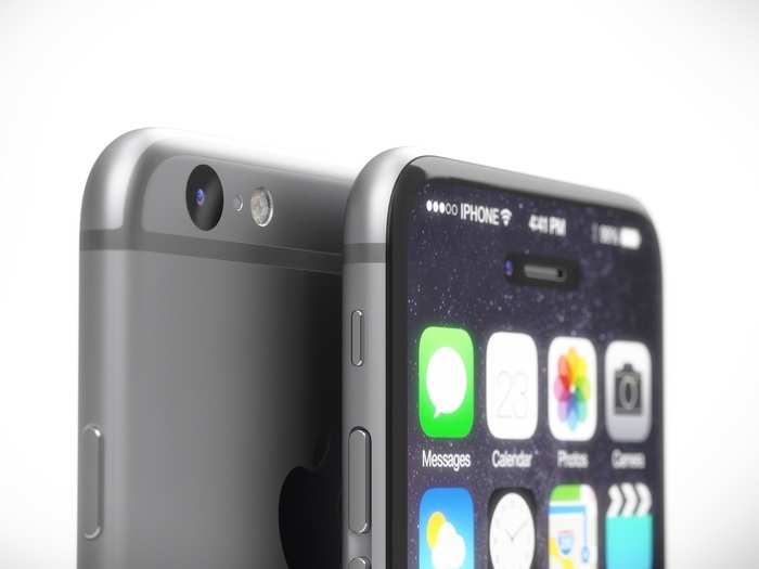
To create a smaller top bezel, Hajek moved the speaker to the top of the iPhone.
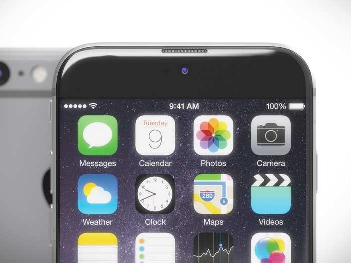
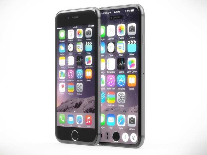
Here's a closer look at the edge-to-edge display.
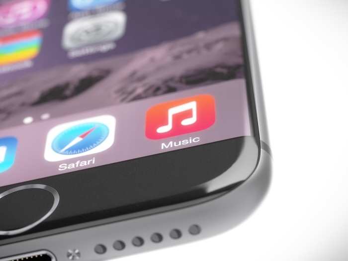
By making the top and bottom bezel of the iPhone smaller and introducing an edge-to-edge display, Apple could theoretically preserve the 4.7-inch screen size of the iPhone 6 but still reduce the overall size of the phone.
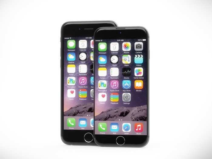
Here's a closer look at how the smaller bezels could make the phone have a smaller physical footprint.
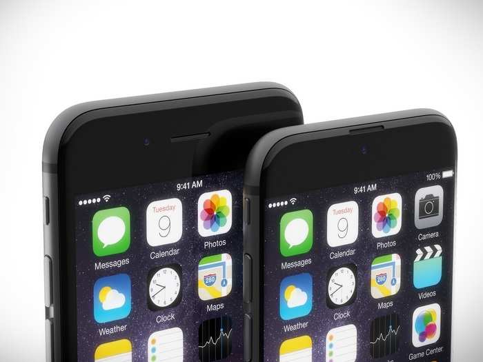
Unless Apple changes the size of the home button, this is about as small as the bottom bezel could get.
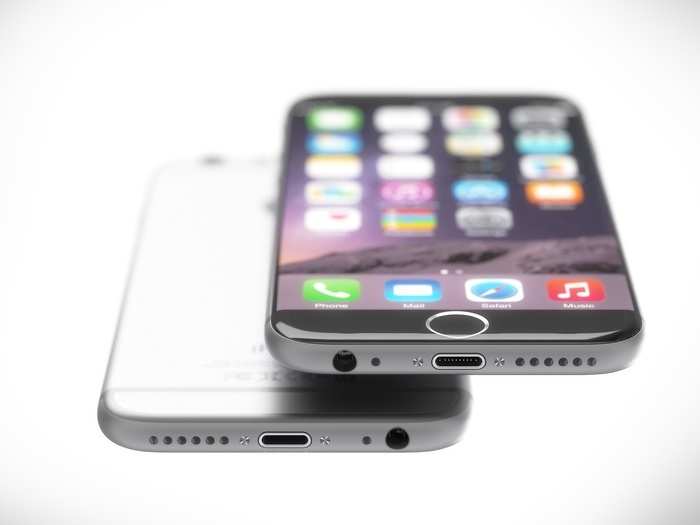
Some features, like the iPhone's home button, are likely here to stay, since Apple Pay revolves around the Touch ID fingerprint sensor. But what if Apple decided to introduce an iPhone where the display takes up the entire front panel?
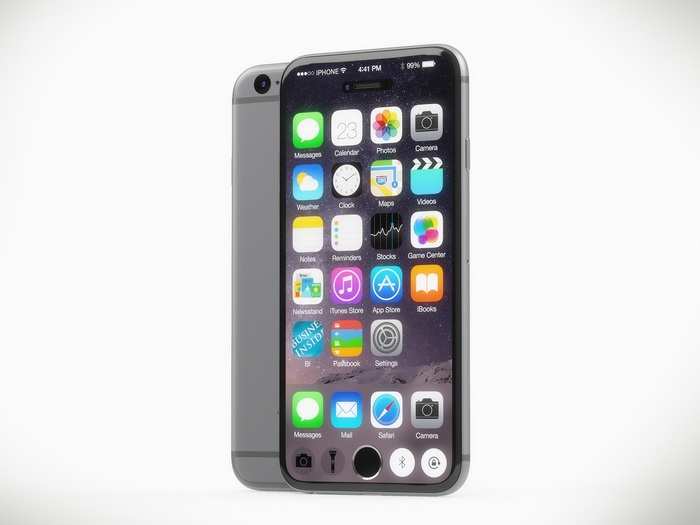
To imagine what this could look like, Hajek designed a concept that would use Sharp's "Free-form" display tech, which could theoretically be used to create a giant screen with two holes in the display: one for the home button, and one for the speaker and front-facing camera.
To make use of the extra space around the home button, Apple could feasibly provide easy access to settings or include more apps on the main screen.
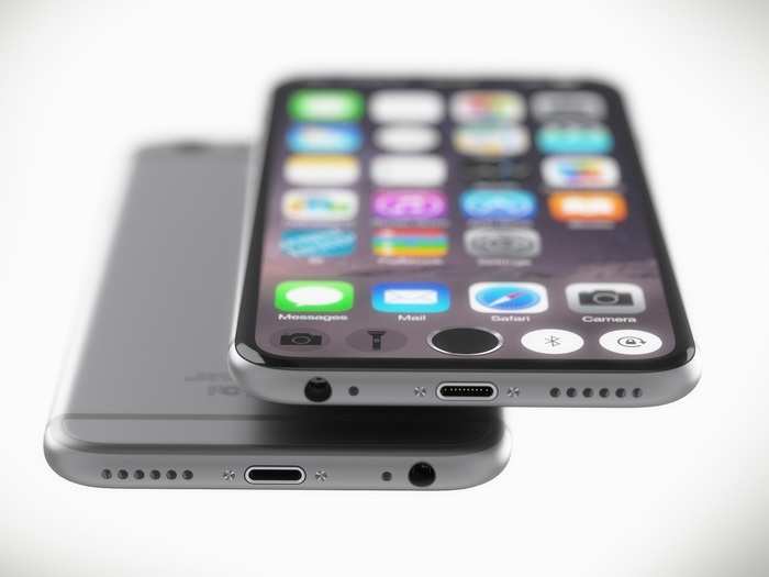
Here's a view of how the display would work.
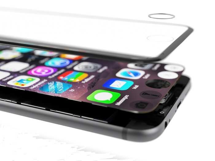
It's hard to believe Apple would choose a full-screen display though, as it's tough to see how the space around the home button could be very useful with the home button disrupting the design.
Apple is far more likely to go in direction of the edge-to-edge design, but here's how they all look next to each other.
Wish your phone could do more?
Popular Right Now
Advertisement