Did You Notice These 15 Companies Changed Their Logos This Year?
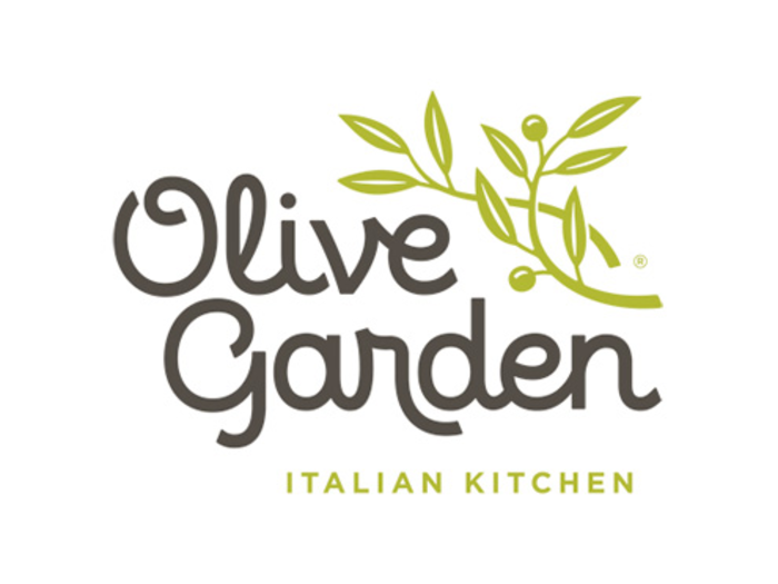
This is Olive Garden's old logo. The restaurant changed its logo in March ...

And was jeered for making a logo that some people felt was too generic.
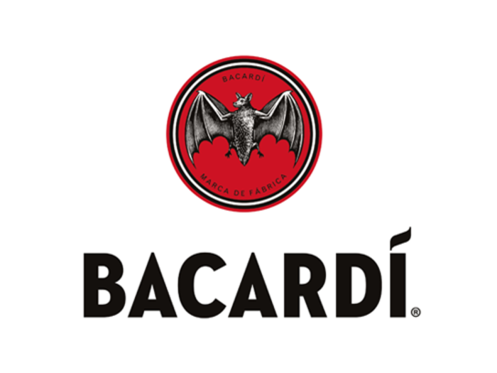
Bacardi's old logo featured the brand's iconic bat.
The new logo has a smaller bat, creating a cleaner, more distinct design.
PayPal made some improvements to its old logo.
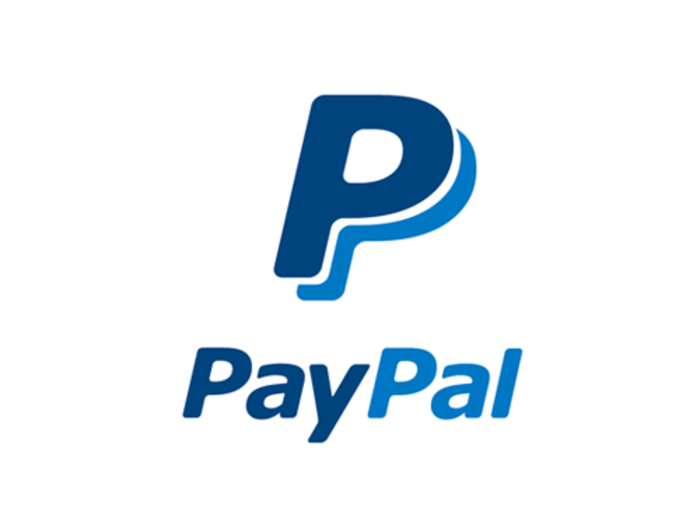
The new logo has a bolder wordmark and more vibrant colors, and the overlapping Ps are designed to emphasize human connection.

Black & Decker's old logo used an ampersand to connect the names of the brand's two founders.
Its new logo uses the trendier plus sign, instead.
Lipton's old logo featured a bright lemon.
The new logo isn't too different, but it reminds us a lot of the Lay's potato chips logo.
See what we mean?
Cadillac's old logo is something of an icon in the automotive world.
The new logo isn't much different, but Cadillac got rid of the laurel wreath that used to appear underneath its crest.
Florida State University's old logo was there when the Seminoles won the national championship in football this past season.
Its new logo tilts the Seminole's head toward the sky and replaces the "Florida State" lettering with a feather.
Getting rid of your school name might be a college sports logo trend. Here's Illinois' old logo.
And here's the new logo, which identifies the school only with a block 'I'.
In the pros, the Tampa Bay Buccaneers made some tweaks to its old flag logo, seen here.
The result is Tampa's brighter new logo, ARRRGHuably the Bucs' best yet.
Reebok's old logo was never quite as famous as the Nike Swoosh or Adidas' three-stripe design.
But its new logo makes the brand look more like a B2B software company.
Fandango's old logo was designed to look like a movie ticket.
Its new logo has its letters closer together, and an upside-down 'F' hidden in the orange space.
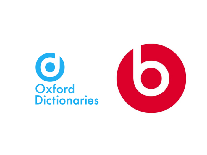
Oxford Dictionaries' old logo was a fairly plain wordmark.

Its new logo is a bit more stylish, but it looks a lot like the logo for Beats by Dr. Dre.

See? That's the Beats logo on the right.
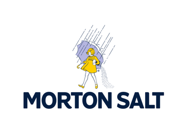
Morton Salt's old logo has been a fixture of grocery stores everywhere for years.
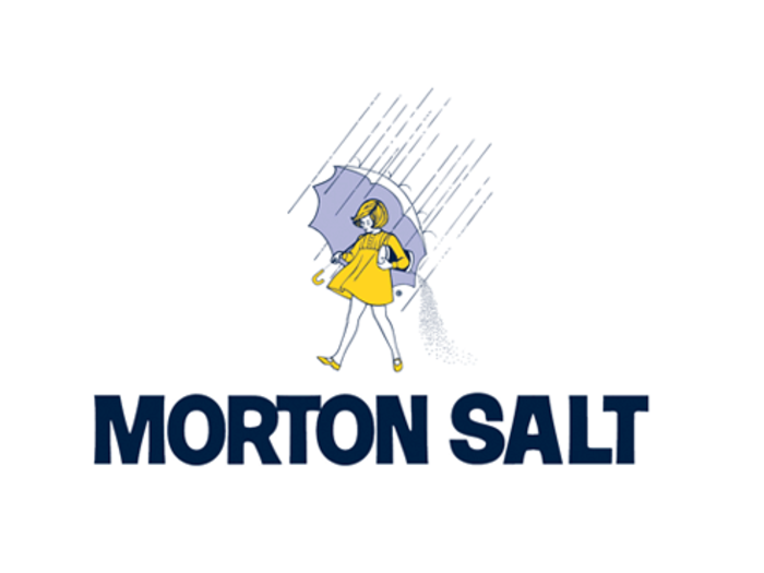
Their new logo has several very slight changes. There's a little curve at the end of the 'R' in the lettering, and fewer blue lines in the woman's hair.
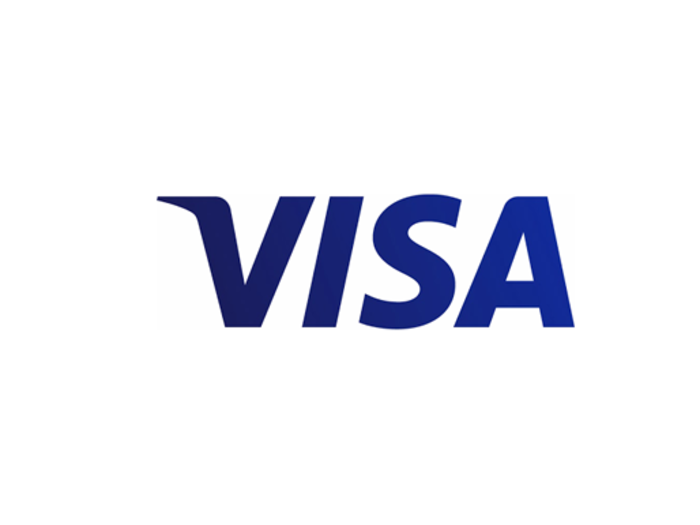
Visa's old logo famously had a golden tip on the 'V'.
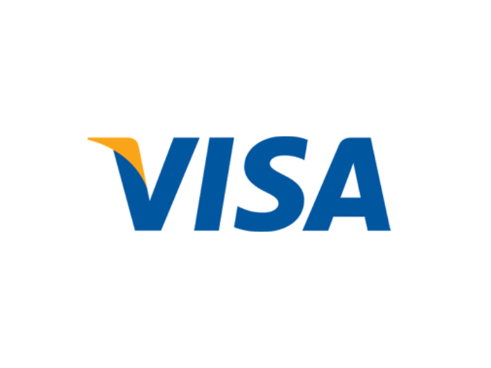
The new logo gets rid of this flourish. The letters are also darker shades of blue.
Popular Right Now
Popular Keywords
- India’s wearables market decline
- Vivo V40 Pro vs OnePlus 12R
- Nothing Phone (2a) Plus vs OnePlus Nord 4
- Upcoming smartphones launching in August
- Nothing Phone (2a) review
- Current Location in Google
- Hide Whatsapp Messages
- Phone is hacked or not
- Whatsapp Deleted Messages
- Download photos from Whatsapp
- Instagram Messages
- How to lock facebook profile
- Android 14
- Unfollowed on Instagram
Advertisement
