The 10 Best Corporate Logo Changes Of 2014
10. Pizza Hut

9. PayPal
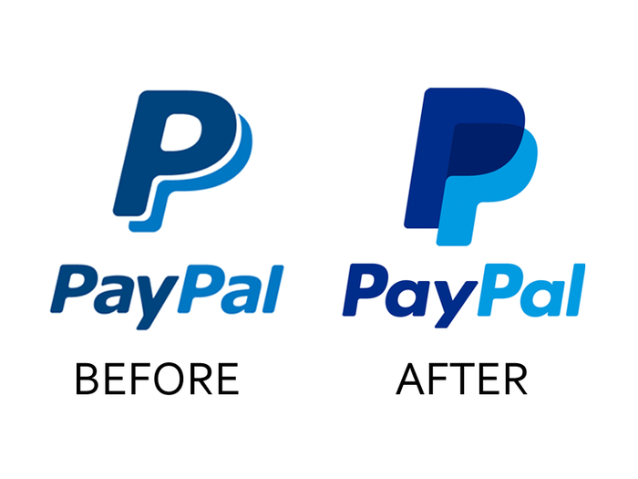
The old PayPal logo was stale and outdated. The new one manages to be instantly recognizable but is brighter and looks especially good as a smartphone app icon.
8. Reebok
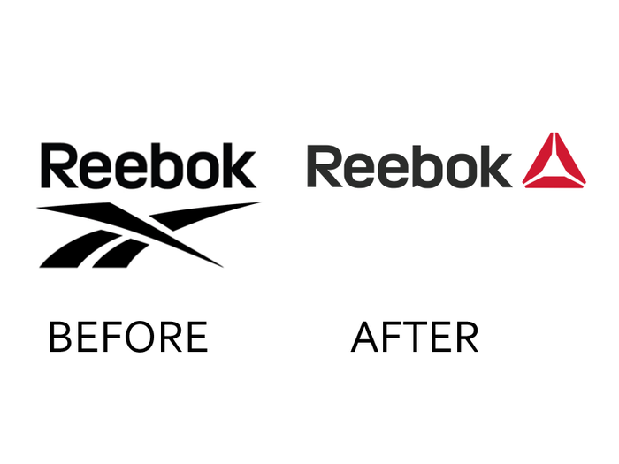
If you grew up wearing Reebok Pumps, you may be furious to see the classic Reebok logo go — but don't worry, it lives on in the retro Reebok Classics brand. For its main brand, Reebok has stopped trying to play catch-up to Nike in professional sports and decided to focus on ordinary people dedicated to fitness, especially in the CrossFit community. The new logo isn't the most original design, but it's clean and looks good on the new workout gear.
7. Equinox Fitness Clubs
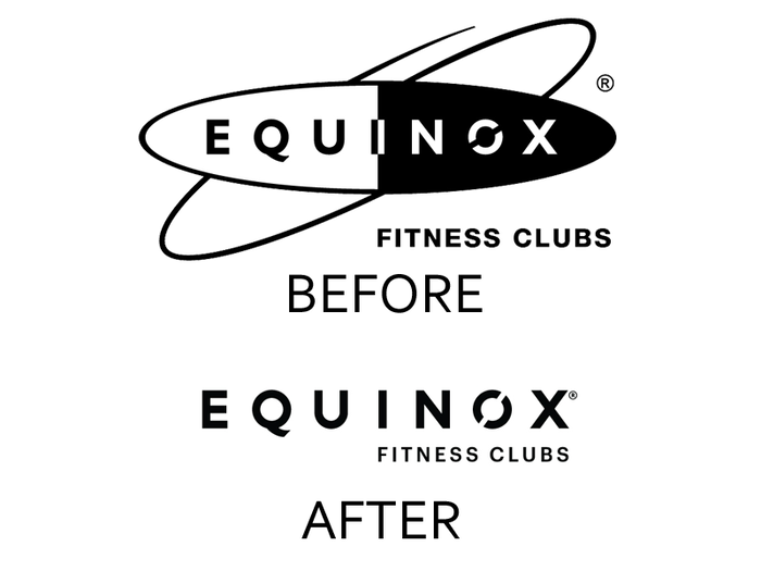
High-end fitness club Equinox embraces a luxury image with its stripped-down yet edgy new logo, which looks better than ever on the brand's trademark risqué advertisements.
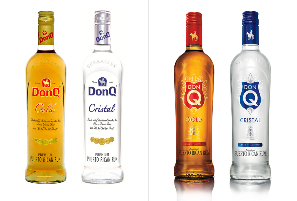
6. Don Q Rum
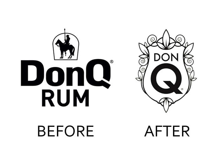
We're a fan of the Don Quixote figure in the logo of Puerto Rico's favorite rum company, but the new crest looks great on the completely redesigned bottles. The new look will help them stand out on crowded American liquor store shelves, where the brand is less well-known.
5. Panda Express
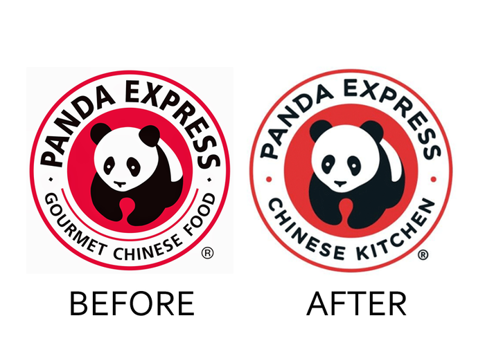
Fast food Chinese chain Panda Express made just a few subtle changes to its logo, but they work very well together. Changing "Gourmet Chinese Food" to "Chinese Kitchen" gets rid of unnecessary clutter (and "gourmet" wasn't fooling anyone), and the softer red and rounder panda are more inviting.
4. IFC
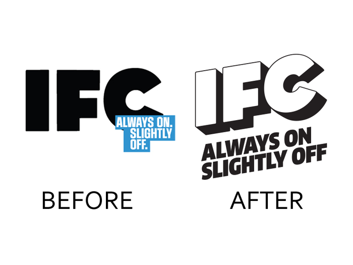
The Independent Film Channel is the place for new "Portlandia" episodes and broadcasts of "The Big Lebowski." The redesigned logo pops and works really well with IFC's cool, irreverent vibe.
3. Codecademy
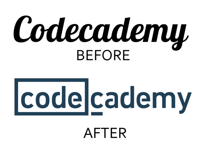
Codecademy boasts over 24 million users who have gone through over 100 million of the site's free coding exercises. For such a popular site, it had a very generic logo. The new one not only looks professional, the word "code" is now instantly recognizable within its own box, and the underlined "c" references a coder's cursor.
2. Southwest Airlines
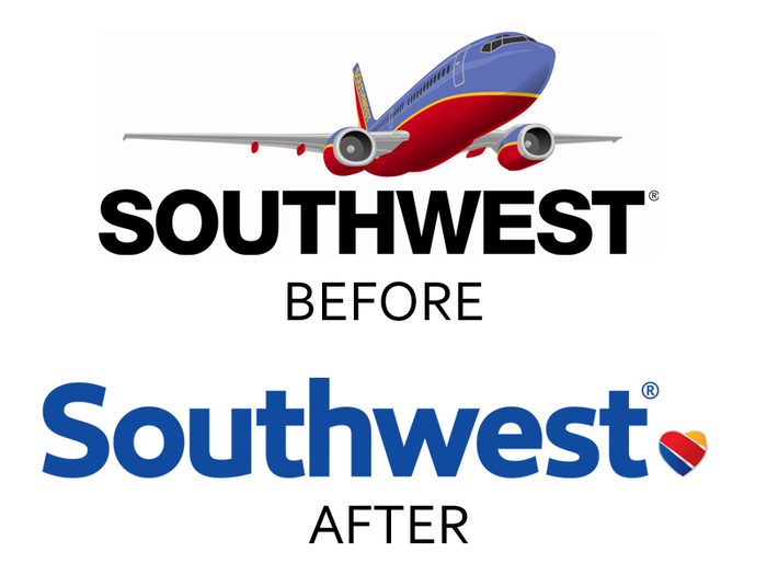
Southwest Airlines celebrated a significant expansion in 2014 with a complete rebranding. It ditched the goofy airplane image and boldly went with a heart icon that looks like nothing else in the airline industry. The color scheme also looks great on the airline's planes.
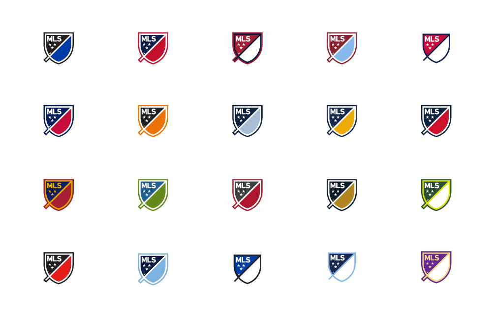
1. Major League Soccer
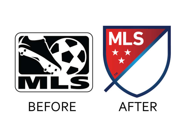
The World Cup Final between Germany and Argentina attracted 26 million viewers in the US, making it the most-watched soccer game in American history; there is now no doubt that soccer has arrived in the US. So it's only fitting that the US have a bold logo for its professional league, the MLS.
The new look, which will premiere on the field next year, brings to mind European soccer crests and looks beautiful adapted into each of the league's team colors in jerseys. It's an exciting redesign and our favorite of the year.
We weren't a fan of every logo change...
Popular Right Now
Advertisement