Did you notice that these 20 companies changed their logos this year?
Google changed its logo significantly for the first time in 16 years, replacing a dated serif font with a cleaner one while retaining the childlike feel synonymous with the brand.
Studio Tilt inversed the "Restaurant" bar in IHOP's logo to create a smiley face that adds a burst of cheer without detracting from recognizability of the popular restaurant chain.
Designers have long hated Verizon's logo, and its new one from Pentagram is in the vein of another mocked tradition of stripping down a logo and adding an icon in the top right corner.
Music streaming service Spotify underwent a much-needed logo update in 2013, and this year Collins gave it a fresh color scheme change accompanied by alternate color schemes that brought it beyond green.
Facebook decided it wanted an update rather than redo of its logo and turned to designer Eric Olson, creator of the old logo's font, to design a font the company could call it own.
MiresBall transformed the logo of hotel chain Best Western into something reminiscent of Procter & Gamble's logo, and went with a dated 3-D look for its icon.
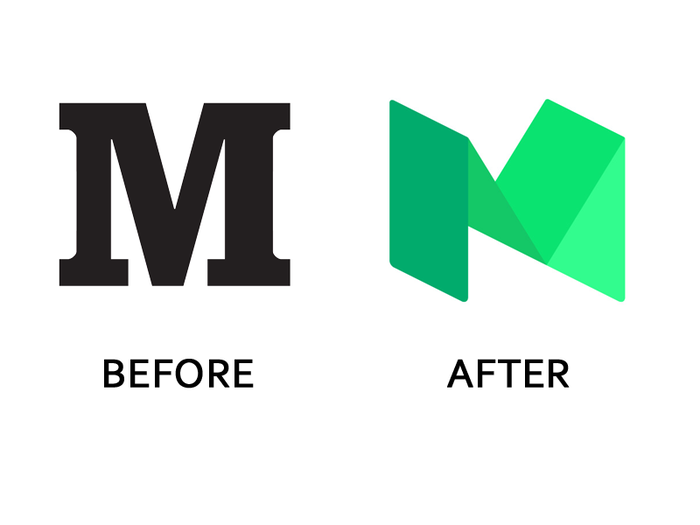
Twitter co-founder Ev Williams' publishing platform Medium worked with PSY/OPS to go from a single 'M' in Stag font to a strange geometric figure that blends sharp and round edges.
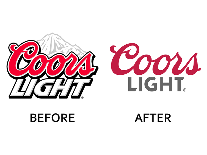
Turner Duckworth took sports bar staple Coors Light from loud and cartoonish to a more contemporary feel that looks best on cans.
Kentucky Fried Chicken has played a lot with how it wants to present itself over the past decade, and this year they decided to nostalgically return to the brand's roots and use a stripped-down logo from Grand Army.
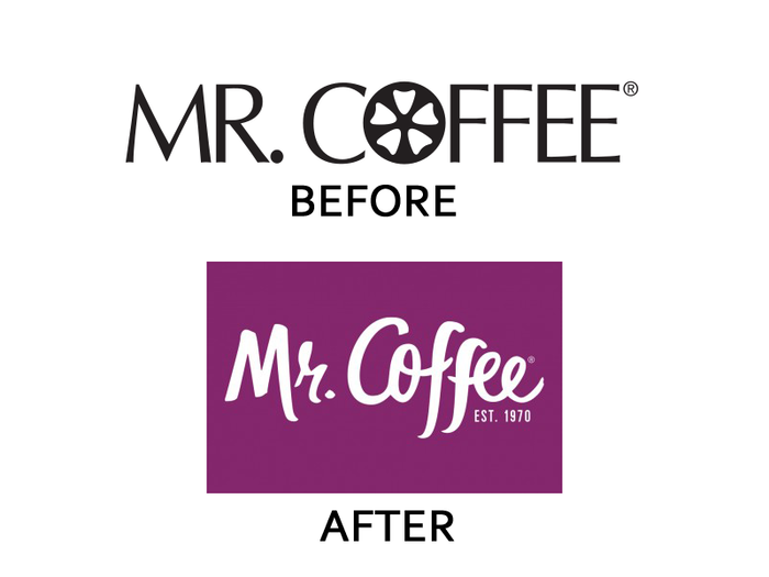
Mr. Coffee worked with Blacktop Creative to develop a new look for its affordable coffee makers to make them appealing to younger consumers.
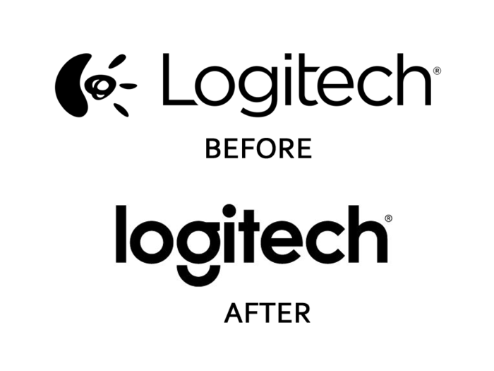
Design Studio dropped Logitech's Expressionist face and went with a contemporary sans-serif look distinguished by a unique 'g.'
Saatchi & Saatchi gave hardware manufacturer Lenovo a new, straightforward logo that is intended to catch attention by being placed on a wide variety of colored backgrounds.
Southern Comfort's new logo from Helms Workshop is part of a brand overhaul meant to make the liqueur bottles pop off the shelves and appeal to young drinkers.
GIRVIN took Emerald Nuts' logo from something that looked more appropriate on an old-fashioned car and turned it into something sleek and modern.
The dinner reservation service OpenTable worked with Tomorrow Partners for a logo that looks great on the current generation of smartphones and uses an icon representing a diner waiting for a table.
Beardwood&Co. added some much-needed balance between the words 'Honest' and 'tea' in the Coca-Cola-owned brand's logo and added a leaf to one of the 't's for fun.
Credit bureau TransUnion's new look from Avenue replaces the double 'T' in the old logo with a more appropriate 'tu' in an icon that can stand on its own, all in a much brighter and friendlier color scheme.
Prophet kept the super-serifed 'E' icon and cleaned up the rest of the logo to look more appealing to a contemporary consumer.
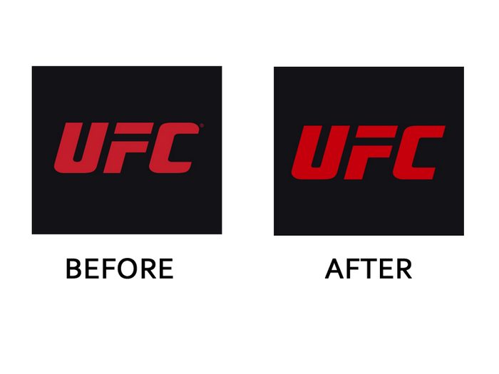
UFC's update from Troika includes a more attractive 'C' and brighter red to bring uniformity to the brand's 15 properties, as it will now be used in each of them.
Venturthree gave video streaming service Dailymotion a sans-serif logo that utilizes letter overlap as a distinguishing feature rather than an ominous radio tower.
Popular Right Now
Popular Keywords
Advertisement