- Home
- stock market
- PRESENTING: The most important charts in the world from the brightest minds on Wall Street
PRESENTING: The most important charts in the world from the brightest minds on Wall Street
Gary Shilling

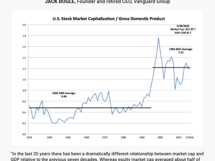
Jack Bogle
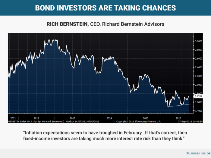
Rich Bernstein
David Rosenberg
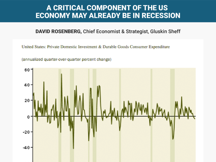
It does not include services (healthcare and education), non-durables (food and gas), net exports or government.”
Purely domestic and private-sector oriented and acutely sensitive to policy shifts, financial conditions and the ever-changing contours to the business cycle.
This metric contracted at a 3.2% annual rate in Q2, the steepest decline since the Great Recession ended in the second quarter of 2009. In fact, this is a pattern because real cyclically-sensitive has contracted now for three quarters in a row and by nearly a 2% annual rate over this time frame — since the peak in the third quarter of last year.
Except for two instances in the past six decades — the soft landings of the mid-1960s and mid-1980s — did such a decline in this index not end up leading the overall economy into an outright recession.
The big difference? In those two other such episodes, the Fed was cutting rates — by 150 basis points both times — as opposed to raising them (or threatening to do so).
There may be a slate of reasons for the Fed to raise rates — to cure financial excesses, to assist savers, to ease the pressure in the pension fund and insurance industries, and to help banks expand their tight margins — but if it is about data-dependency, we have a barometer here that has an 80% track record in predicting recessions.
No slam dunk, there is no such thing, but the Fed seems willing to play with fire.
Peter Hooper
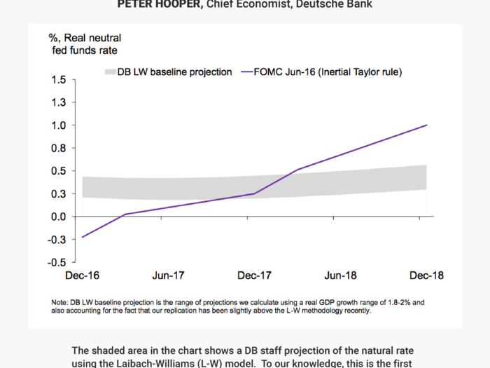
This chart shows two different estimates of the expected path of the natural (or real neutral) level of the fed funds rate. The line in the chart shows the level that is implicitly imbedded in the the Median FOMC forecast from June. This line is computed using a "Fed preferred" version of the Taylor rule, and indicates that in June, the median Committee participant saw the real neutral rate as slightly negative at the end of this year but rising more than 100 bps over the next several years.
The shaded area in the chart shows a DB staff projection of the natural rate using the Laibach-Williams (L-W) model. To our knowledge, this is the first time a forecast has been done with the L-W model outside the Fed. (The shaded area is reflects a range of uncertainty around our replication of the L-W model.) This model-based projection shows the current level of the natural rate to be higher than the median FOMC projection, and augurs in favor of raising rates sooner rather than later.
But the L-W model also shows a much flatter trajectory of the natural rate going forward, auguring for both a lower level of the longer-run neutral fed funds rate and a flatter trajectory for the "dots" than the FOMC median forecast has over the next several years.
For more on this issue, see P Hooper, M Luzzetti, and T Slok, "Lower for Longer? the Outlook for the Neutral Fed Funds Rate," Deutsche Bank, Global Economic Perspectives, August 23, 2016. Click here for the note »
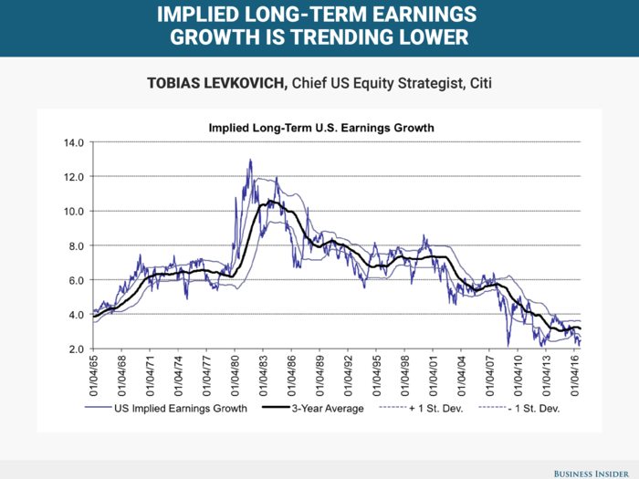
Tobias Levkovich
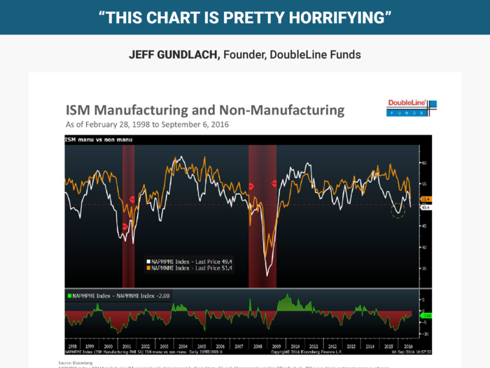
Jeff Gundlach
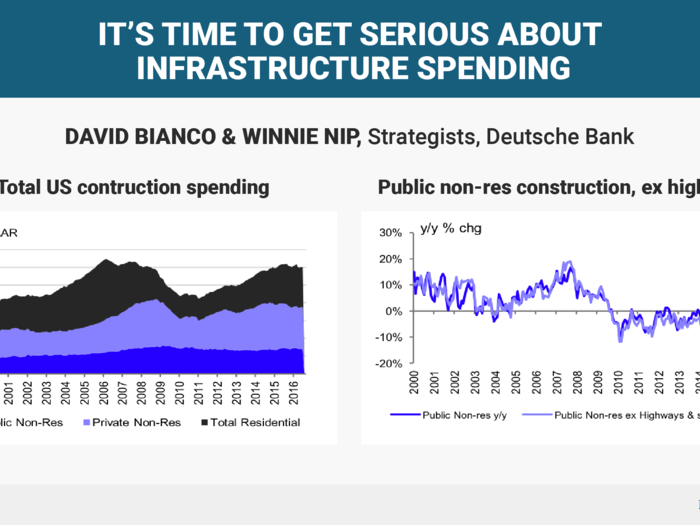
David Bianco & Winnie Nip
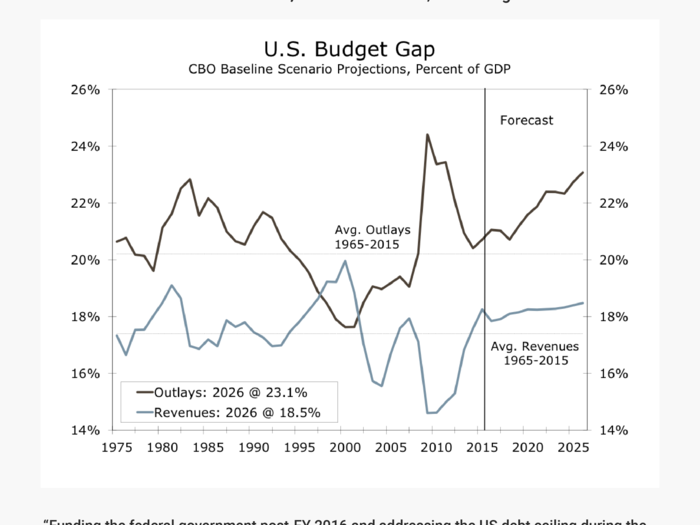
Sam Bullard
Liz Ann Sonders
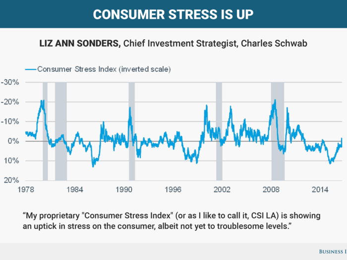
The higher stress is accounted for by rising healthcare costs and other household liabilities, and weaker job and personal disposable-income growth. For now though, those pressures are being offset by easier year-over-year oil/food inflation comparisons. Given consumers' near-70% weight in the US economy, this bears watching.
Joe LaVorgna
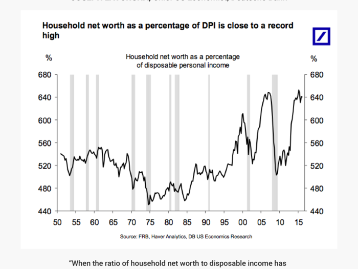
Byron Wien
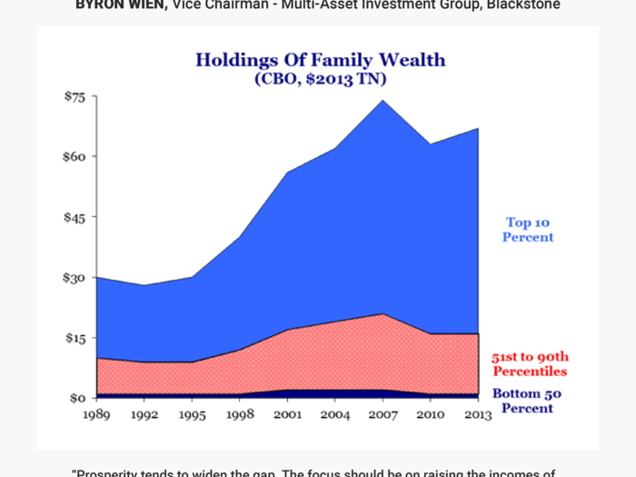
Jonathan Golub
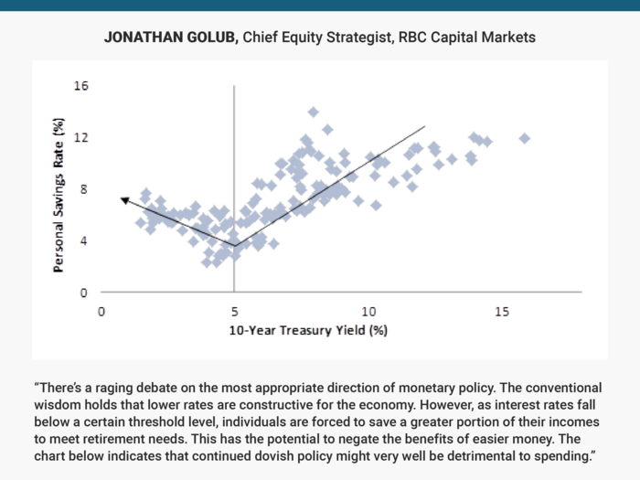
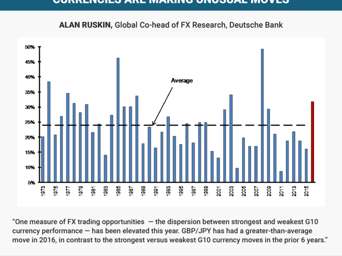
Alan Ruskin
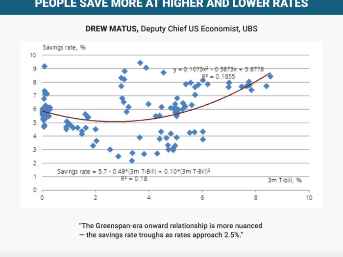
Drew Matus
Michael Feroli
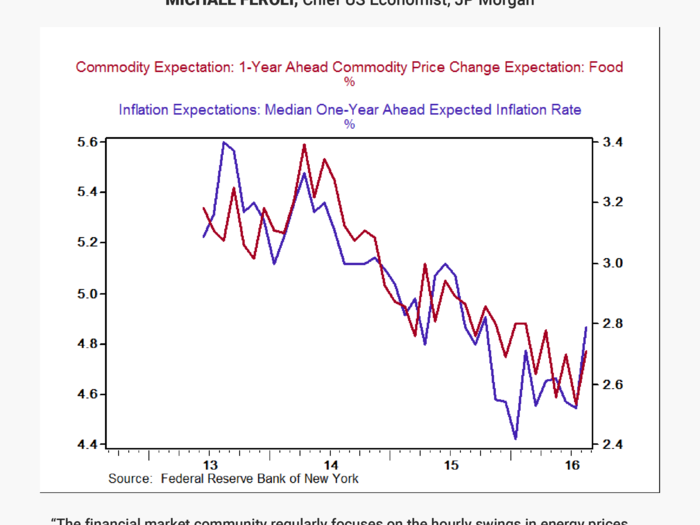
Our analysis has found a reasonably tight link between households’ inflation expectations and either realized or expected food prices (the latter can be seen in the chart below which looks at overall and food inflation expectations in the NY Fed’s survey). In July the CPI for food and beverages had increased only 0.3% over the prior year – the lowest on record barring one period around the Great Recession. Low food-price inflation is good news for consumers, but the effect on inflation expectations may be a key factor keeping the Fed wary of raising rates.
Bespoke Investment Group
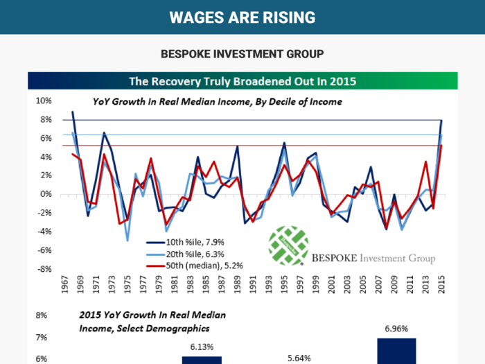
Key drivers of the faster growth were expanding working population, faster wage gains, and slower inflation. Importantly, lower income groups (most noticeably millennials and Hispanics) saw the fastest income growth as overall income inequality declined.
Lori Calvasina
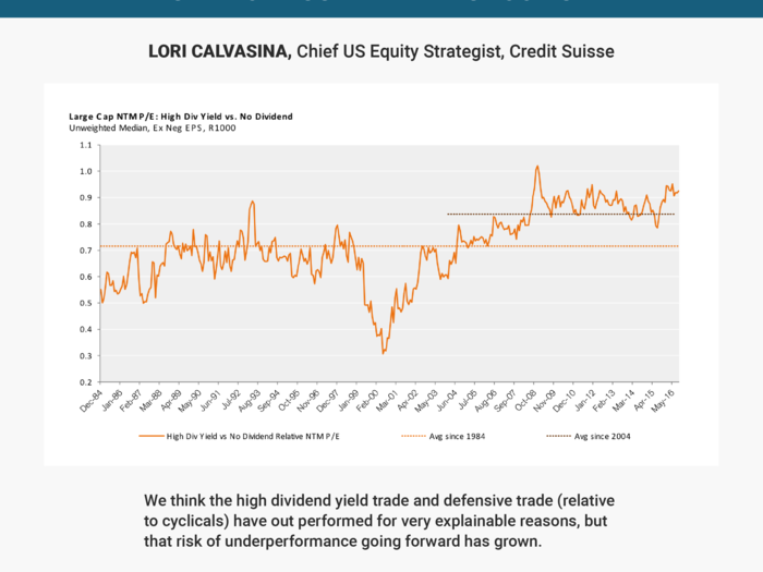
Our main concerns on the defensive and high dividend yield trades include:
- Valuations for high dividend and defensive trades look overvalued, both in absolute terms and relative to non-dividend paying companies and cyclicals.
- Inflows into defensive/yield oriented sector funds and low volatility ETF’s are fading (low volatility ETF’s actually saw outflows starting in mid-August), while outflows from cyclical sector funds are becoming less onerous.
- Cyclicals now seem under owned by hedge funds, as equity long/short cyclical to defensive exposure is near five year lows in the Americas and at five year lows on a global basis, and
- Earnings revisions momentum for defensives has returned to its 2014 high and looks ripe for a shift lower.
Aurelija Augulyte
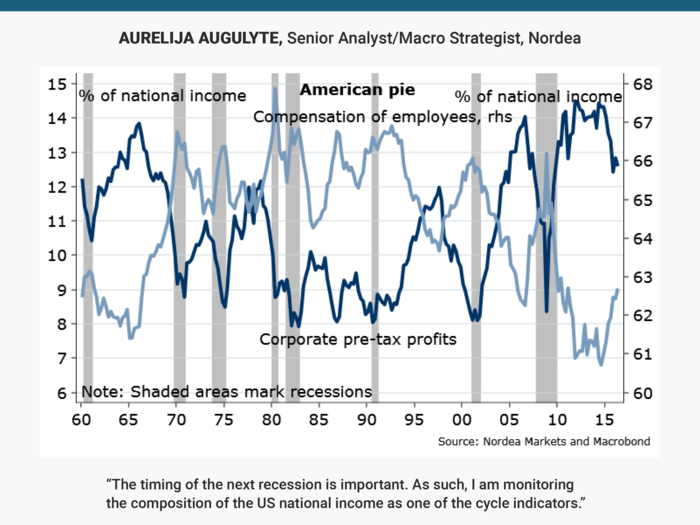
Historically, when the employee income share rises at the expense of the corporate profits, it is a warning for recession. Are we there yet?
Jeff Kleintop
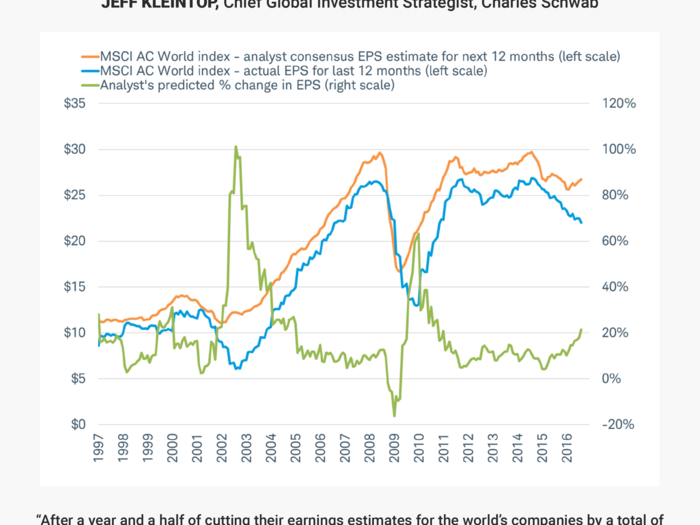
Since the end of February, the trends in earnings estimates for the coming year and actual earnings over the past year have headed in different directions. These divergent trends have made the gap between estimates and actual earnings the widest since 2009, as you can see in the 20-year history illustrated in the chart.
John Butters
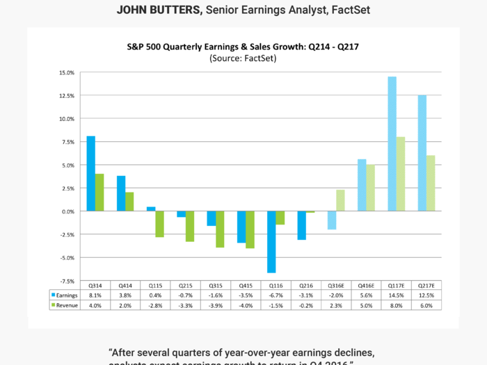
Analysts are also projecting double-digit earnings growth for the index for the first half of 2017. The Energy sector is predicted to be the largest contributor to the (estimated) double-digit earnings growth for the first half of 2017, as analysts believe the price of oil will increase next year.”
Tadas Viskanta
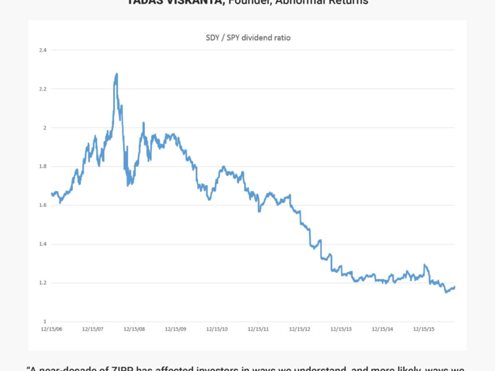
This can be seen in the chart below from Greg Merrill, CFA, via Twitter. He shows the relative yield of $SDY, the SPDR S&P Dividend ETF, against the S&P 500 ETF ($SPY). As you can see, the relative yield on the "high" dividend stocks has been in decline since the onset of the financial crisis. This is indicative of a “reach for yield” that more often than not ends in tears. We will not find out the full extent of this kind of behavior until we have a rise in interest rates and/or a full-blown bear market.
Oleg Melentyev
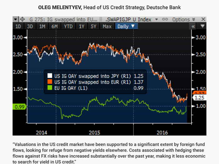
The chart shows how a portfolio of US IG bonds FX-hedged for only three months forward delivers little incremental yield pickup to EUR-benchmarked IG investors, compared to their domestic alternatives (US IG swapped into EUR for 3mo yields 33bps over EUR IG index).”
Nonfinancial single-As, the preferred destination of Asian money, swapped for only a year delivers less OAS than US single-A investors have ever accepted in the history of this market (63bps at its lows in recent weeks, compared to an all time low OAS of 70bps on our DM USD IG single-A index). With the Fed actively seeking to re-engage in policy normalization, such costs are expected to continue to go higher, resulting in a slowdown, stopping, or potentially even reversal of such foreign flows.
Joshua Brown & Michael Batnick
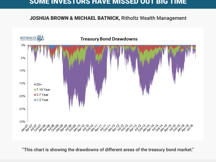
Now of course this is no easier than timing the stock market, and those who chose to shorten their duration after the Taper Tantrum of 2013 have missed out on big returns. Since May 2013, the 20+ year is up 22%, the 3-7 is up just 6%.
Julian Emanuel
Neil Dutta
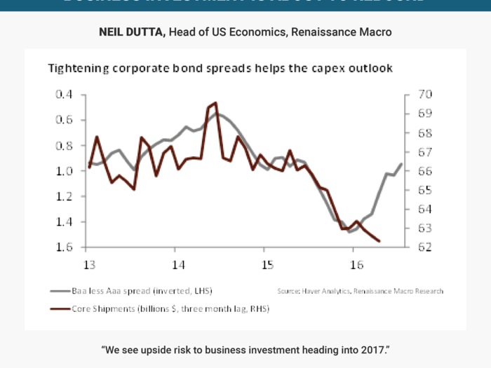
Recall that much of the weakness in core capital goods started with the broad tightening of financial conditions around mid-2014. The dollar surged, corporate-bond spreads widened, commodity prices sank, and equity markets went nowhere. This year, we've seen a broad easing of financial market conditions.
Our chart shows the Baa less Aaa corporate bond spread measuring the market's willingness to fund a risky firm relative to a safe one. Spreads have narrowed meaningfully and with a lag, we'd expect investment to rebound.
Tom Keene
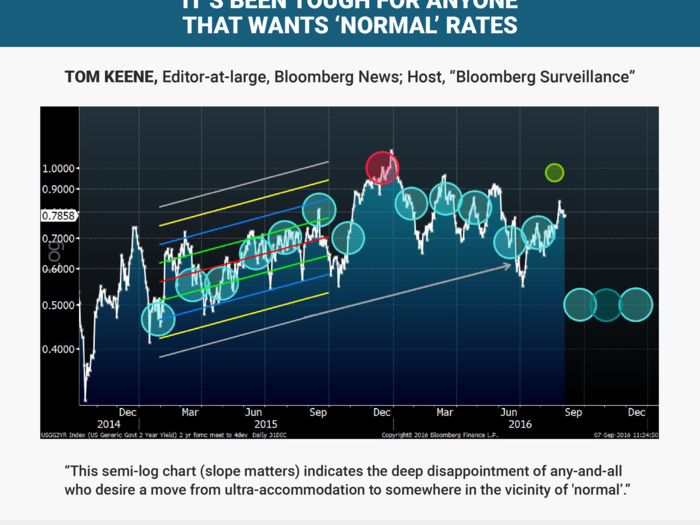
Shown is the US 2-year yield. Most circles are FOMC meetings with a trend across part of 2015. Then, note how the yield and the five circles rollover off of trend. The central tendency of the 2015 trend is approximated by the green circle. The three end-2016 meetings await a vertical setting.”
So What: This semi-log chart (slope matters) indicates the deep disappointment of any-and-all who desire a move from ultra-accommodation to somewhere in the vicinity of 'normal'. Key is the extended gray arrow four (4!!!!)-standard-deviations off the 2015 trend. The divergence of FOMC chat and market reality is signaled by the early-July 2016 plunge in yield. It will be of interest where September 21, November 2 and the December 14 meetings settle out in yield, in dots and in FOMC policy.
Michael McDonough
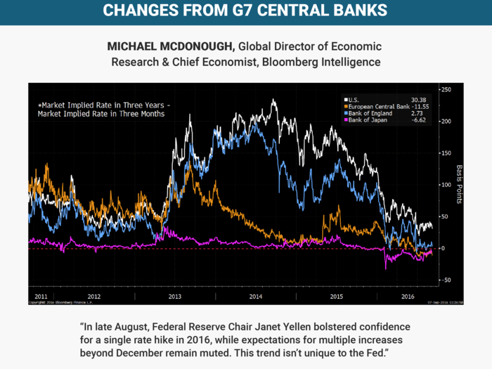
Scrutinizing the difference in what the market expects policy rates will be in three years versus three months shows the expected magnitude of central bank tightening over the medium term. It ignores anticipated short-term changes in central bank policy rates over the next three months.
This calculation shows a dramatic convergence in expected rate changes for the Fed, European Central Bank, Bank of England and Bank of Japan to nearly zero. In 2013, these central banks, excluding the BOJ, were expected to embark on relatively strong tightening cycles. Waning economic prospects, first in the euro-area and later followed by the U.S. and the U.K., dramatically reduced expectations for medium-term rate hikes. In the U.S., excluding a likely 25-bp rate hike in December, the market is anticipating only a small chance for additional hikes over the next three years.
For the ECB and BOJ, a modestly negative spread between the three-year and three-month market implied rates indicates a greater likelihood of rate cuts versus tightening. In August, the BOE cut rates by 25 bps and enlarged the size of its asset purchases in response to the U.K.’s July vote to leave the European Union. The market prognosis for policy in Europe and Japan is likely more accurate than the outlook for the U.S.
Randy Frederick
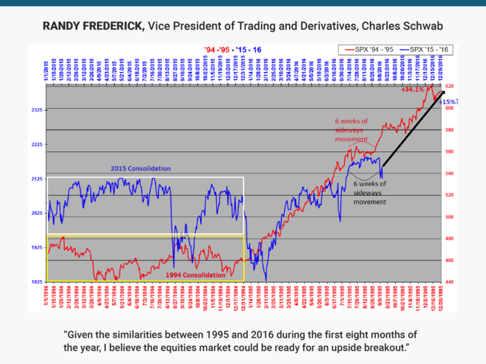
The catalyst for such a breakout could be the FOMC meeting September 20 – 21.
Consider the following similarities between 1995 and 2016:
- Both followed mostly sideways consolidation years; 1994 was -1.5% & 2015 was -0.7%.
- Both years spent much of July through Sept moving sideways.
- On 7/11/16, the SPX ended a 287 day dry-spell without a new high; the longest period ever in a bull market.
- On 2/14/95, the SPX ended a 262 day dry-spell without a new high; the second longest period ever in a bull market.
- 1995 VIX average was 12.4; excluding the January correction and the Brexit spike, 2016 YTD VIX average was about 13.5.
- 1995 average unemployment rate was 5.6%; 2016 YTD average unemployment rate was 4.9%.
- GDP for the first 2 quarters of 1995 was +1.4%; for the first 2 quarters of 2016 is has been +1.0%.
- Relatively high consumer sentiment ratings for the first 9 months of the year; 1995 = 93.1, 2016 = 91.7.
If this correlation holds it implies an SPX close near 2350 at the end of 2016, or a full year gain of approximately +15%. This may seem overly optimistic, but consider that the SPX is currently +16% from the correction lows on 2/11 and +6% from the Brexit lows on 6/28. A close of 2350 means the SPX would need to gain about +10% from current levels (2130).
While 1995 was not an election year, the following historical performance data from previous election years, provides even more reasons to be optimistic in the final 4 months of 2016.
- Excluding bear market years (2000 & 2008) in election years since 1988, the SPX has averaged +4.0% from 9/1 through election day.
- Excluding bear market years (2000 & 2008) in election years since 1950, the SPX has averaged +4.7% from 9/1 through year end.
Claus Vistesen
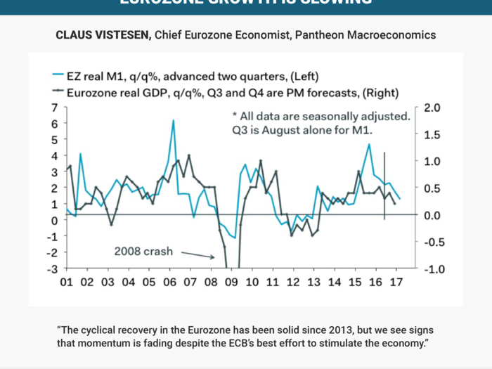
Recent revisions suggest that real GDP jumped 2% last year, but real M1 growth — the best leading indicator in the euro area — imply that growth will slow to about 1.5% this year, before a further drop to about 1.2 in 2017. This story will not play well amid investors’ expectations and the ECB’s ambitious goals, but it is probably consistent with the long-run cyclical trend of EZ GDP growth.
Robert Johnston
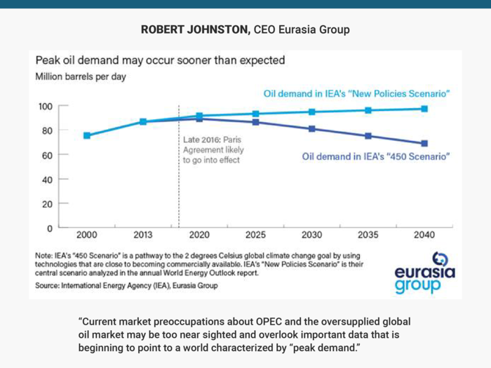
It may be time to rethink the conventional medium-to-long term trajectory for global oil demand.
Current market preoccupations about OPEC and the oversupplied global oil market may be too near sighted and overlook important data that is beginning to point to a world characterized by "peak demand" The continued push of climate-focused energy policies and carbon reduction strategies now seen globally will be the main catalyst for global oil demand peaking sooner than anticipated. If this becomes a structural trend, then "peak demand" will create serious risks for global oil producers.
Sam Stovall
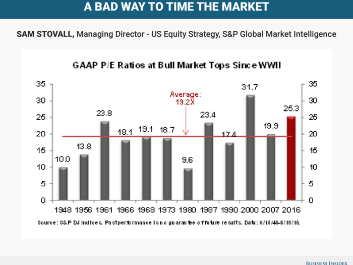
If this bull market ended on August 15, its P/E on trailing 12-month GAAP EPS would have placed it among the top two most expensive bull-markets since WWII. The P/E was more than 600 basis points above the average of 19.2X.
Yet, P/E ratios don’t make for a good market-timing tool, as seven of the 12 bulls since 1945 topped out below the long-term average and two succumbed with P/Es of 10X or lower.
Joe Quinlan
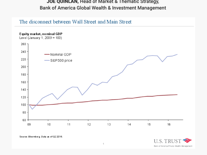
While uber-ease monetary policies have inflated asset prices, and boosted the wealth of owners of capital/equities, the effects on the real economy have been more muted. This disconnect has fueled voter discontent and rising populism in the US, leaving the owners of capital very concerned and vulnerable to the upcoming election.
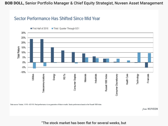
Bob Doll
John Mauldin
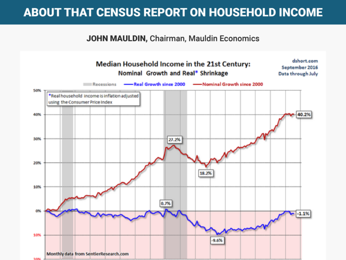
Doug adjusts it for CPI inflation and then makes the nominal vs. real chart shown here.
What do we see?
- Adjusting for inflation (blue line), median household income is still down slightly from January 2000. Real income for the median household has mostly gone sideways for almost 17 years.
- Sentier’s monthly data also shows a significant income gain in calendar 2015 – but it also shows the trend leveling out in 2016 through July. Whatever factors helped last year may not be persisting.
- Note this is median household income, not average. That means half of all households haven’t enjoyed even the flat income we see here. Their income fell in inflation-adjusted terms.
- The Census Bureau 2015 data showed income gains concentrated mostly in large cities at 7.3%. Suburban residents saw a 4.0% median gain, while those in rural areas outside metro zones saw no gain at all, and possibly a slight drop.
This data explains much of the populist anger seen in this year’s election campaigns. After more than a decade of no real income growth, millions of people are out of patience. Those outside the cities and suburbs did the worst. It’s no coincidence Donald Trump is leading in those places.
Remarkably, our Federal Reserve is apparently planning to make the situation worse with more QE and possibly negative interest rates when the already-overdue next recession hits. I’m telling my readers to prepare for a severe recession and major market turbulence.
Komal Sri-Kumar
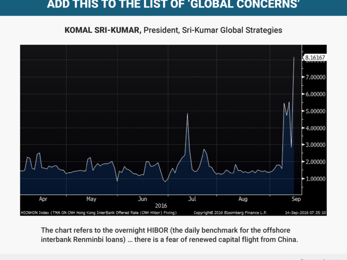
HIBOR surged to 8.16% today (September 14) from 2.84% yesterday (September 13). Why is this occurring, and why is this a source of big concern?
The rise is taking place as Chinese authorities act in the offshore (i.e., Hong Kong) money market and use mainland banks to drain liquidity. This, in turn, is intended to hike interest rates for RMB loans, thereby curbing the demand for dollars. In short, there is a fear of renewed capital flight from China which, indirectly, gets reflected in the surge in HIBOR.
As fears of a Fed rate hike persist, this tendency is likely to continue as well. Concerns about the RMB exchange rate, and about the fallout from another devaluation, were probably an important component of the “global” worries that Lael Brainard expressed in her speech on Monday just before the Fed’s Silent Period began.
***Business Insider note: HIBOR surged to 23.7% on Monday September 19 as the PBoC’s efforts to fight capital flight intensified, with the central bank focusing on draining liquidity to discourage purchase of dollars.
Ben Carlson
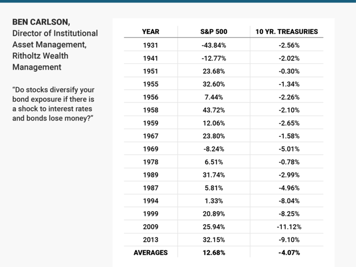
Traditional portfolio management is based on the premise that you allocate to stocks for growth and bonds for stability. Bonds earn their place in a portfolio by providing valuable diversification benefits as they typically counteract stock losses during bear markets.
We think very few investors are looking at this relationship the other way around — do stocks diversify your bond exposure if there is a shock to interest rates and bonds lose money?”
So we looked back at every calendar year since 1928 to find when bonds showed an annual loss to see how stocks performed in a down bond year.
Over these 88 years there were 16 times that bonds showed an annual loss. Stocks were down in just 3 of those years. So more than 80% of the time when bond returns were negative, stock returns were positive. And on average stocks have provided a double digit spread over bonds when they have fallen.
The average loss in bonds has been relatively small as well which this tells us is that interest rate risk has not been the biggest risk to owning bonds in the past. The biggest risk has been inflation eroding your purchasing power. So we also looked at real returns (after inflation) and found that bonds have actually lost money 37 out of 88 years or roughly 40% of the time. In those 37 years stocks were down just 12 times on a real basis. That means real stock returns were positive almost 70% of the time when real bond returns were negative.
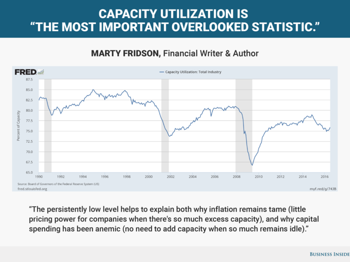
Marty Fridson
John Hussman
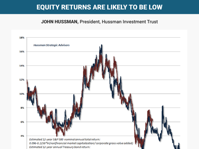
While investors recognize that long-term Treasury yields are depressed, they may not recognize that equity returns are likely to be similarly low, because market valuations are already extreme on historically reliable measures (i.e. measures that are best correlated with actual subsequent market returns).”
Future investment returns on a 10-12 year horizon are actually likely to be lower for stocks than they are for bonds. Of course, investors can seek comfort in substantially less reliable valuation measures like the price/forward operating earnings ratio, but this is a false comfort because that measure has a weak correlation with actual subsequent returns.
Investors can also seek comfort in assertions that the S&P 500 is "fairly valued relative to interest rates" here, but only provided that "fair" is defined as an expected nominal total return now averaging just 1.4% annually on the S&P 500 over the coming 12-year period. When analysts say that stock market valuations are "justified" by the low level of interest rates, that’s exactly what they mean, whether they realize it or not.
Given that typical pension fund return assumptions are close to 7%, and often higher, central banks have nearly ensured a pension crisis in the coming years as a result of substantial underfunding.
Scott Minerd
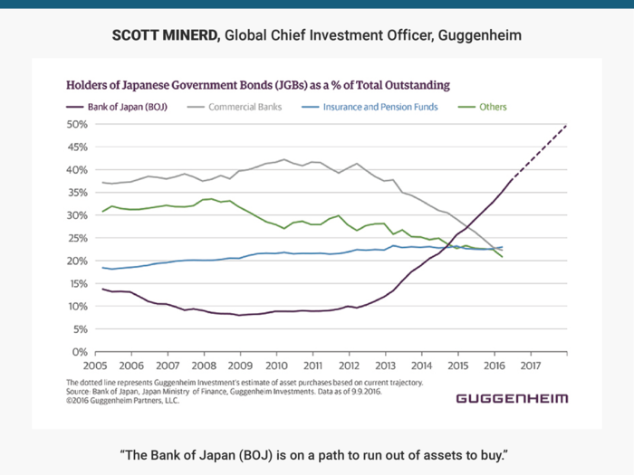
Since beginning its latest quantitative easing program in April 2013, the BOJ’s holdings have jumped from 13 percent to 38 percent of outstanding Japanese Government Bonds (JGBs), and are on pace to reach 50 percent by the end of 2017. Additional buying is constrained by institutional JGB holders’ reluctance to sell, and the BOJ bought 86 percent of new issues in the first half of 2016.
Its other options — purchase more non-sovereign, less liquid securities; go deeper into negative rates; or possibly engage in helicopter money — are even more extreme. Japan could be a harbinger for the monetary policy endgame in developed economies: If more active fiscal policy doesn’t step in, expect low rates for a long time.”
Frederik Ducrozet
George Goncalves
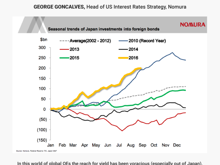
The presence of a captive buyer base that is not economically incentivized (i.e., central bank QEs and/or some ALM-based flows) helped drive global yields to extremes away from traditional “fair value” measures. Unlike the 2010 record year (where Japan largely bought only USTs before the Fed launched further QEs) the record pace thus far is more balanced and aimed at yield / spread pickup via Agency/MBS and Corporates. The key to future bond demand depends on what happens with JGB yields post any BoJ tweaks versus how high (and attractive) do the global yields/spread pickup ahead.
Mark Neuman
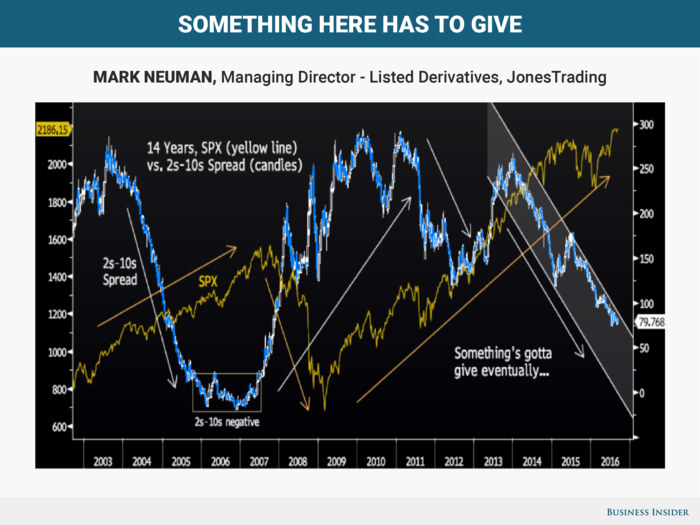
2s-10s shaded channel since 2013, “bearish flattener.” Just cannot see the contra argument now. It mirrors 2s-10s COLLAPSE in 2003-06, including 06-07 average rate MINUS 6bps? A harbinger? After that, a rate spike sent 2s-10s to 300 and the SPX crashed. Then came an UNPRECEDENTED QE and the SPX rallied big as the Fed balance sheet exploded. The 2s-10s faded to 150, and the SPX didn’t care. It rallied further. 2s-10s then bounced to 250+ then resumed lower to sub-80 while SPX to all-time highs.
Seems a huge disconnect, new harbinger? The party may continue, but the hangover to be worse than 08-09?
Steve Feiss
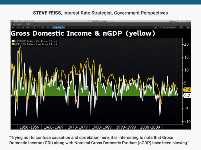
The Fed tightened in December of 2015 (red dashed line) and is set to tighten again. Trying not to confuse causation and correlation here, it is interesting to note that Gross Domestic INCOME (GDI) along with Nominal Gross Domestic Product (nGDP) have been SLOWING. GDI FACTS: Q3 of 2015 2.5%, Q4 @ 1.5%, Q1 of 2016 registered 0.8% and most recently, Q2 2016 arrived at 0.2% ... Not a Fed mandate but also NOT ideal timing or backdrop for rate hikes which will work to SLOW an already sluggish (at best) economy.
While not a mandate OF the Fed, one would think there is reasonable cause and effect, at some level and so, reason for continued PATIENCE and a strong case for LONG DURATION FI positions on dips.
Sean Darby
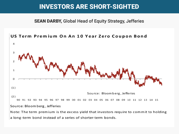
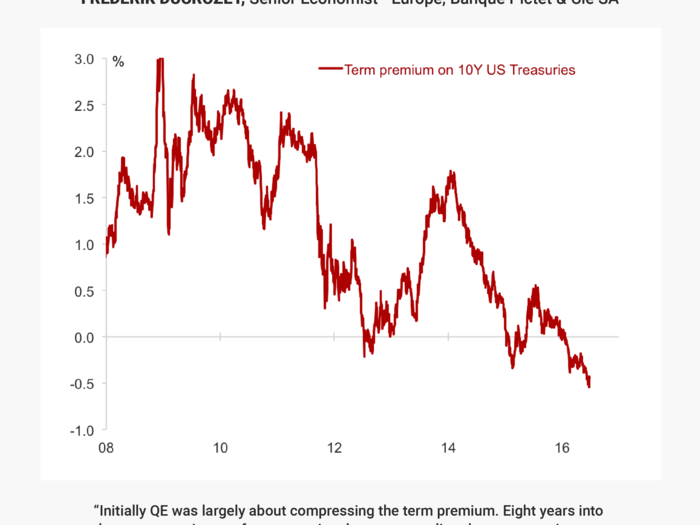
Equity investors appear to have concentrated just on the upcoming Fed meeting. But equities are long duration assets are priced off the long end of government bond markets.
However, the US term premium suggests that fixed income investors appear to have few fears over an inflation or growth surprise. There is a great deal of complacency over the long end of the US government bond market from equity investors.
Scott Buchta
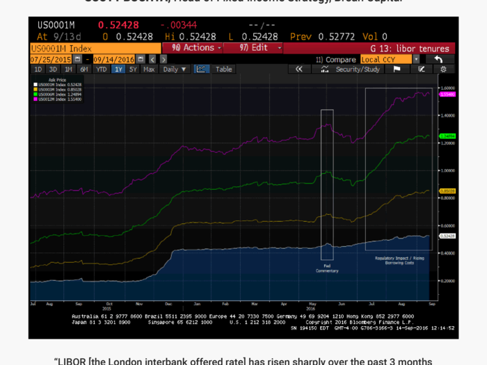
A significant shift of institutional money from Prime to Government MMKT funds has already taken place, causing borrowing costs to skyrocket for unsecured short-term borrowers. In addition, changes being made to the way that LIBOR itself is being calculated have also had an adverse impact on the index over the past few months.
We expect to see the LIBOR indices remain elevated past Oct 14th as these changes are structural in nature. This benefits investors (especially those whose assets reference 3mo or 12mo LIBOR) and will be detrimental to borrowers (especially those with leveraged balance sheets).
Vladimir Miklashevsky
The Daily Shot Newsletter
Nela Richardson
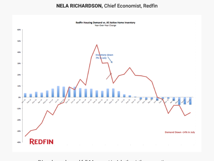
Rock-bottom mortgage rates have enticed buyers into the real estate market and the number of customers touring homes are at record levels; yet still, offers have not kept pace. Even strong buyer interest can’t squeeze a fresh listing from what’s become a dry turnip of housing supply. For this reason, housing continues to underperform its potential.
Svenja Gudell
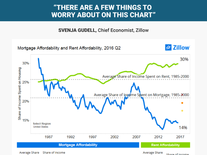
Today, a home buyer making the national median income and looking to buy the median-valued U.S. home ($187,000 as of Q2 2016) would need to spend about 14 percent of their income on their mortgage each month – down from a log-term average of about 21 percent in pre-bubble years. A renter making the same amount but renting the typical home would need to spend roughly 30 percent of their income on rent – up from 26 percent historically.
There are a few things to worry about on this chart. First and most obvious is that worsening affordability for renters will compromise their ability to one day become homeowners: More money spent on rent means less money saved for a down payment.
Buyers, too, can clearly see the writing on the wall if/when mortgage interest rates rise. There’s a lot of headroom for rates to rise on a national level and still keep homes relatively affordable, but in some very hot local markets mortgage affordability is already worse today than it was historically – even with rates hovering near record lows.
Unless incomes rise meaningfully across the board, and/or home values and rents begin growing much more slowly, these trends aren’t sustainable in the long run.
Carl Quintanilla
Matt Boesler
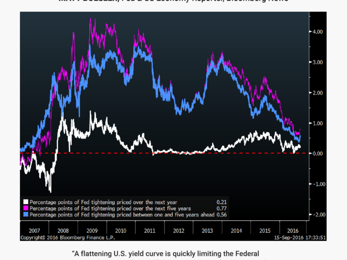
Episodes of market turmoil at various points in 2016 have already reduced the number of rate hikes priced in over the next five years from seven to just three. The problem of asymmetric risks to the economy this development poses helps explain why the Fed is taking things so slow.
@Jesse_Livermore
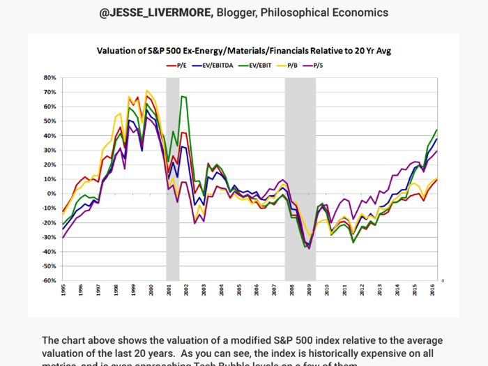
This fact need not represent a near-term worry for the market, which has every reason to be expensive, but it should worry anyone that wants to eventually retire, because it's going to make the process of growing wealth more difficult.
Sam Ro
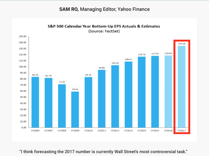
I think forecasting the 2017 number is currently Wall Street's most controversial task.
According to FactSet, analysts are looking for an impressive 13.5% year-over-year jump in earnings per share. Historically, forecasts start the year too optimistic and get revised down, which is particularly concerning today as forward P/E ratios are well-above their long-term averages. Should those earnings forecasts come down one of two things could happen: 1) P/Es get stretched to even more frightening levels, or 2) stocks tumble. To be clear, stretched P/Es are no guarantee of a near-term sell-off. But they can certainly induce some anxiety.
Martin Enlund
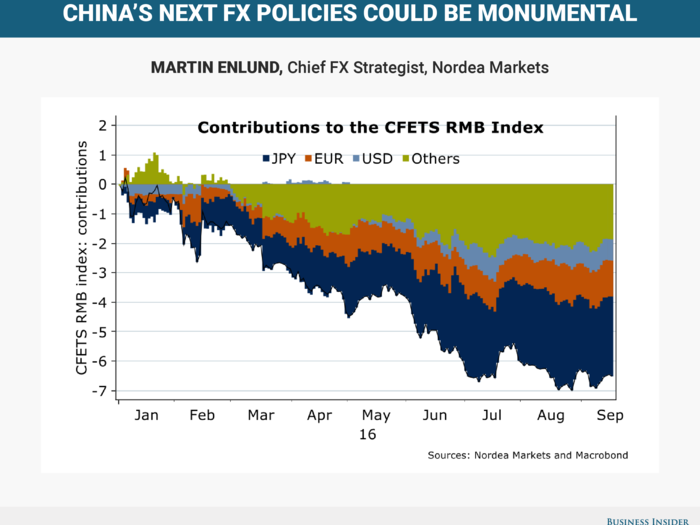
China’s currency has been weakening at an almost 10% annualized clip year-to-date, driven primarily by a surging JPY. If the Bank of Japan or the Fed manages to orchestrate a turnaround in USD/JPY, how will PBoC react?
If it allows or seeks further CNY depreciation, not only could USD/CNY soar, it would also make the Fed’s rate hike ambitions more difficult, while risking spillovers over to risk sentiment and to Asia FX in general. There’s also speculation the CNY’s October inclusion into the SDR could augur the way for another shift in China’s FX policies (to allow more currency weakness), especially given views that the current US president is a geopolitical lame duck.
Alexander Ineichen
Gennadiy Goldberg
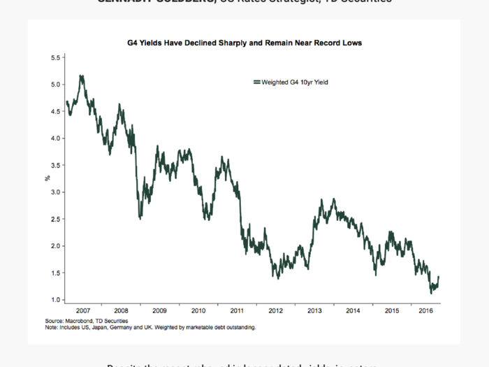
This should continue to support spread products, credit markets, and should maintain considerable pressure on pension and investment funds as they struggle to achieve higher returns. With little pickup in global growth on the horizon and inflation remaining contained, investors will likely continue to keep interest rates on G4 sovereign debt capped.
Anand Omprakash
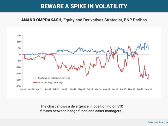
Hedge funds appear to be positioned close to historical extreme levels of shorting (red line). Initially, they were positioned this way to take advantage of the VIX futures term-structure (it was basically too expensive). Eventually, this trade got crowded and the distortion basically disappeared. The result could be a short squeeze in volatility (very sharp rise in VIX futures like what we saw in June) if the Fed hikes and/or another macro catalyst comes in worse than expected.
Walter Zimmermann
Chris Louney
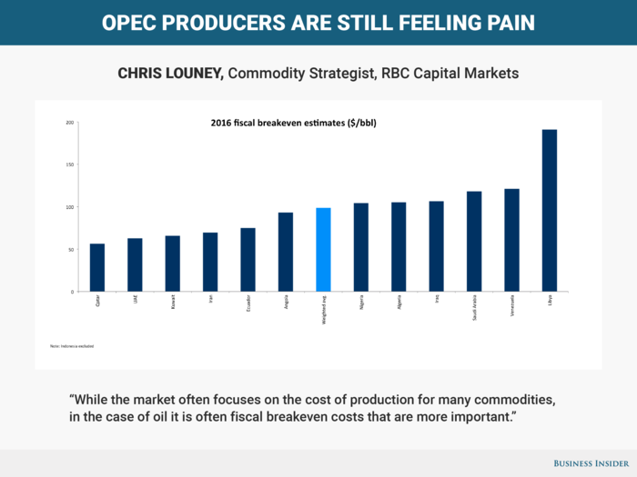
This is because oil funds the state machinery of many oil producing countries, especially in OPEC, where it serves as the primary and in some cases the only real source of state revenue. In our analysis, all 2016 OPEC fiscal breakeven costs are higher than $50/bbl, with the cheapest being roughly $10/bbl higher than current prices. In fact, the highest is more than four times the current price level, and the weighted average more than double at $98.83/bbl. This tells us that even for the flushest of OPEC states, all are feeling pain in the current price environment.
Katie Stockton
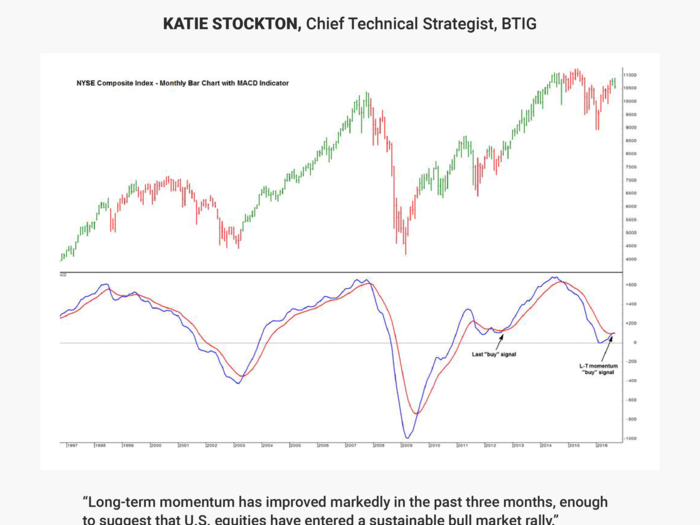
The uptrend that began in 2009 is still very much intact, but momentum was weak from November 2014 through last month, based on the popular Moving Average Convergence Divergence (MACD) indicator pictured on the monthly chart of the NYSE Composite Index. This indicator has flashed its first “buy” signal since September 2012, when the U.S. equity market launched a steady two-year rally.
Popular Right Now
Popular Keywords
Advertisement
