Here's what the US presidential election map looks like adjusted for population
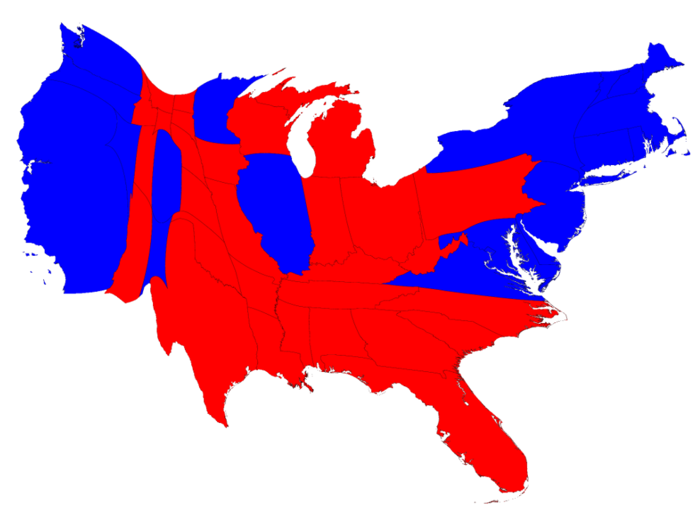
Here's the basic electoral college map, with states that Hillary Clinton won in blue and states that Donald Trump won in red (assuming that Trump's narrow lead in Michigan continues to hold).

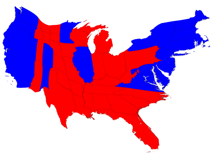
But, of course, the US population is not evenly distributed among the states. This map distorts the sizes of the states to reflect their varying populations.
Populations alone don't win presidential elections; Electoral College votes do. This map sizes states based on number of electoral votes. It's similar to the population-weighted map, but some smaller states like Wyoming and Vermont are somewhat bigger, while more populous states like California and Texas are a bit smaller.
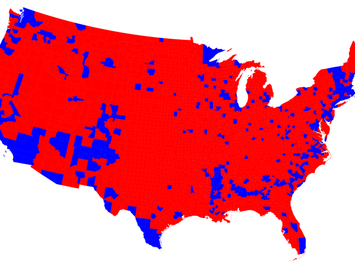
States themselves are not monolithically blue or red. Here's the projected winner in each county in the US. At first glance, there are a handful of blue islands, mostly concentrated along the coasts, surrounded by a sea of red.
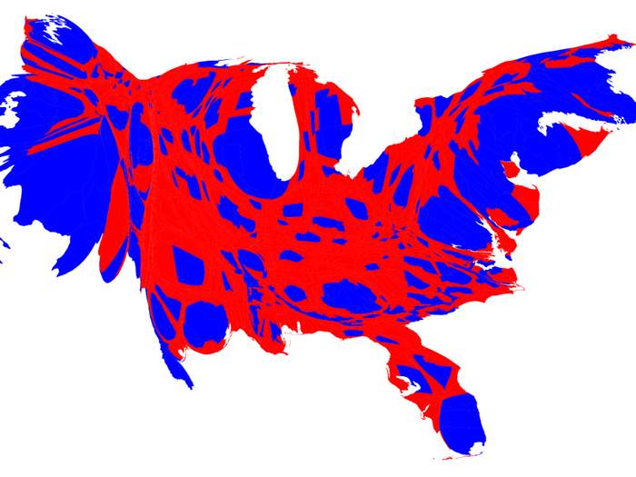
But many of those blue counties contain dense cities. Resizing counties by population, it becomes a little clearer why Clinton is likely to narrowly win the popular vote while losing in the Electoral College.
Counties themselves aren't uniformly blue or red. Looking at a color gradient using varying shades of purple, most counties had a tight split between Republican and Democratic voters, although a few islands of deep red and blue still remain.

Here's what the US presidential election map looks like adjusted for population

Popular Right Now
Popular Keywords
Advertisement