RANKED: All 53 newly released English Premier League shirts for the 2020-2021 season
Will Martin

- The start of another Premier League season means another wave of new football kits.
- To celebrate, Insider decided to take a look at all 53 new kits released by the 20 Premier League teams for the coming season and rank them.
- This ranking was done using a highly scientific methodology, and was absolutely not just based on which shirts this author liked the most.
- If you'd like to debate the ranking, drop me a tweet.
- Keep scrolling to take a look at all the season's new kits and find out which is Insider's number one.
53. Chelsea (Third)
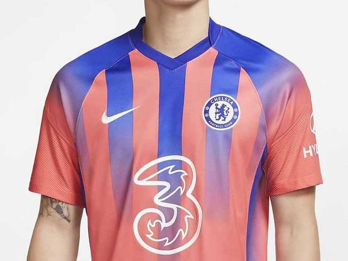
In a sentence or two: This is honestly one of the ugliest football shirts I have ever seen. It looks like the printer ran out of ink halfway through.
52. West Bromwich Albion (Home)
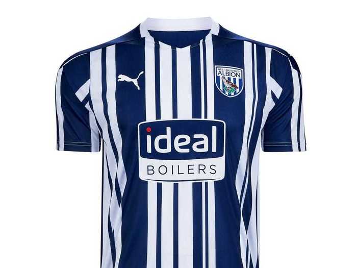
In a sentence or two: What's wrong with normal stripes?
51. Newcastle United (Third)
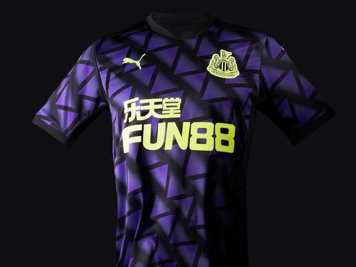
In a sentence or two: According to manufacturer Puma, the pattern on this shirt is based on Newcastle's iconic Tyne Bridge. I'm from Newcastle and I can categorically state that this is a load of garbage.
50. West Bromwich Albion (Third)

In a sentence or two: Anyone else got a sudden desire for a hot dog? Also, again, what's wrong with normal stripes?
49. Crystal Palace (Home)
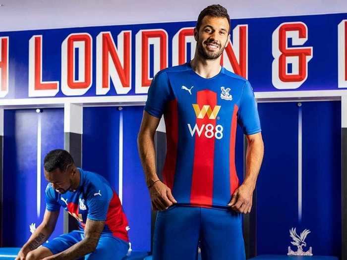
In a sentence or two: My mother always told me that if I don't have anything nice to say, I shouldn't say anything at all.
48. Wolverhampton Wanderers (Away)
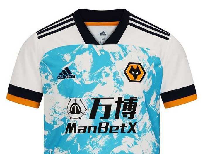
In a sentence or two: I actually think this shirt would look good if it was totally covered in the blue and white pattern, but the white and orange shoulders condemn this to the hall of shame.
47. Crystal Palace (Third)
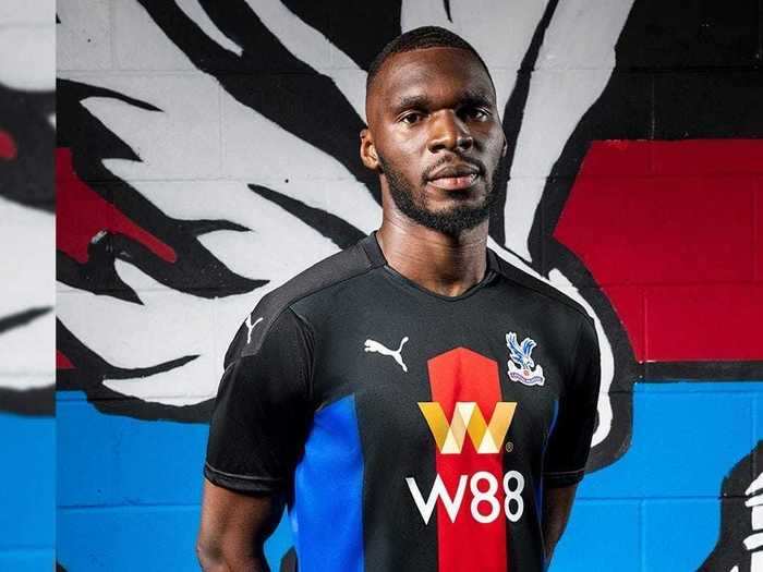
In a sentence or two: Not quite as bad as Palace's home kit, but still pretty bad. I don't understand what the designers were going for with the incomplete stripes.
46. Crystal Palace (Away)
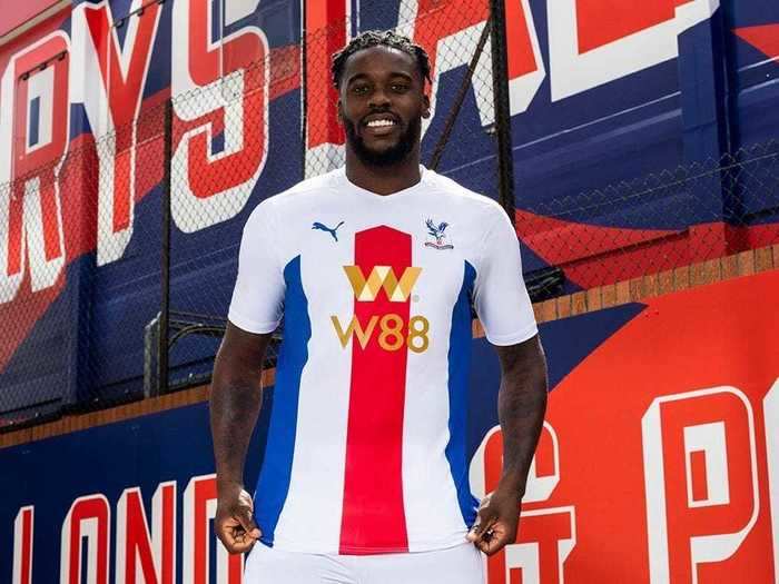
In a sentence or two: Can you tell I'm not a fan of Crystal Palace's new shirts?
45. Newcastle United (Away)
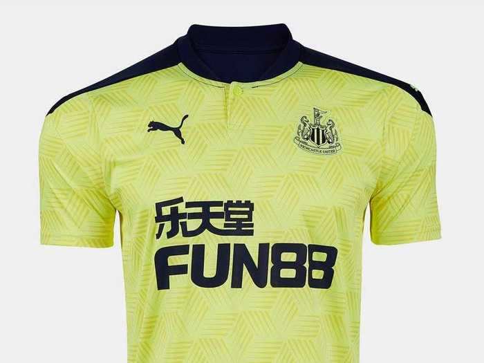
In a sentence or two: Fluorescent yellow very rarely looks good on football shirts, and this one is no exception. The patterning makes it even more egregious.
44. Burnley (Home)
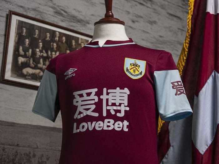
In a sentence or two: There's a lot wrong with this shirt. The collar looks strange, the sleeves aren't completely blue, and the sponsor logo is both ugly and far too big.
43. Fulham FC (Home)
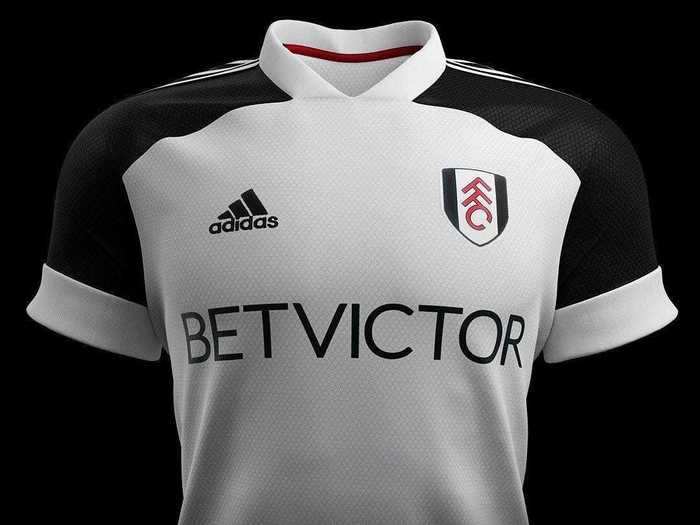
In a sentence or two: This isn't a bad shirt per se, just so uninspiring that I've already forgotten what it looks like.
42. West Bromwich Albion (Away)
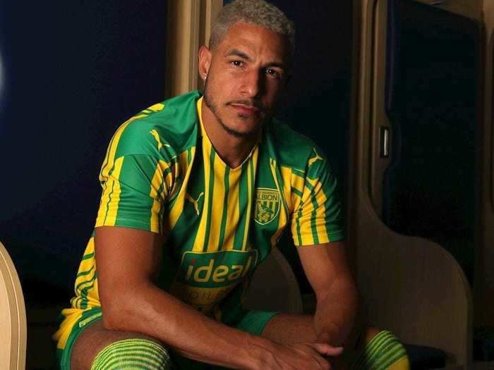
In a sentence or two: The least offensive of West Brom's three kits this year, but still absolutely awful. Looks like an earthing wire.
41. Fulham (Away)
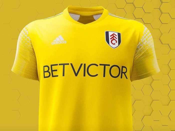
In a sentence or two: See also — Fulham's home shirt. But in yellow.
40. Wolverhampton Wanderers (Home)
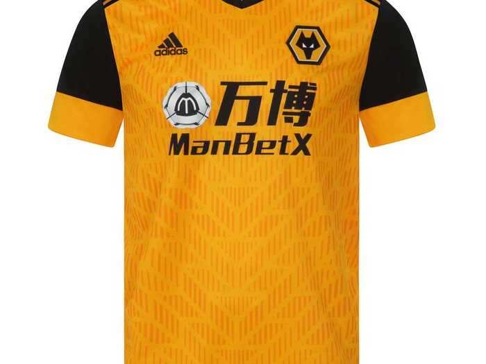
In a sentence or two: Wolves could have the best designed home shirt in the league, but it wouldn't save them from the fact that they play in orange.
39. Aston Villa (Away)
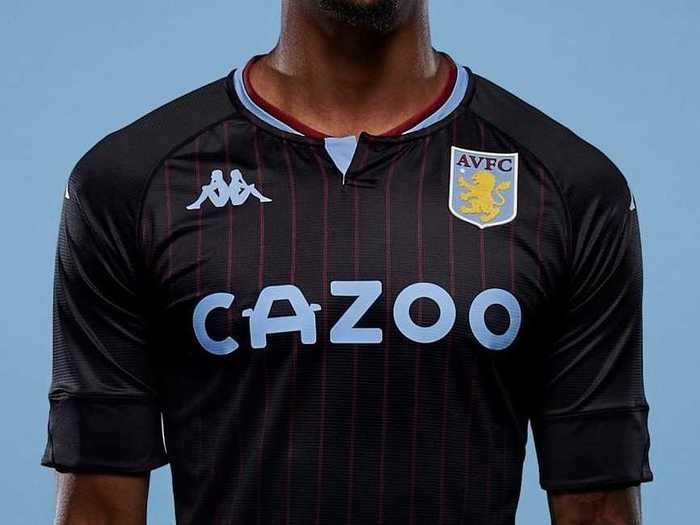
In a sentence or two: If this didn't have maroon pinstripes I'd really like it. Sadly it does, so I don't.
38. Tottenham Hotspur (Third)
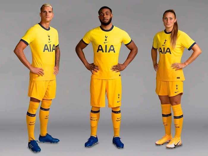
In a sentence or two: Having the badge in the middle of a shirt should be banned. Other than that, it's pretty inoffensive, but eminently forgettable.
37. Southampton (Home)
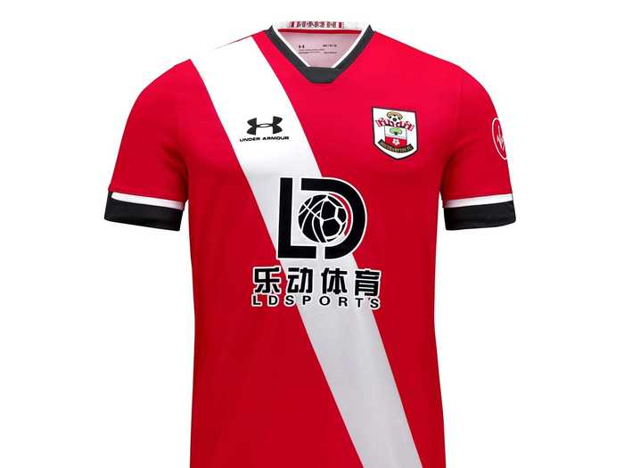
In a sentence or two: Southampton is set to look like a team of elementary school hall monitors this season.
36. Manchester United (Away)
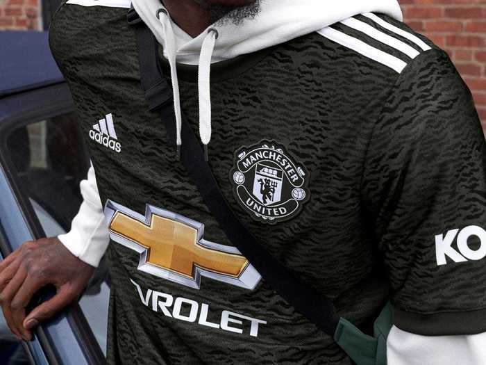
In a sentence or two: "Alexa, play the album Unknown Pleasure by Joy Division."
35. Newcastle United (Home)
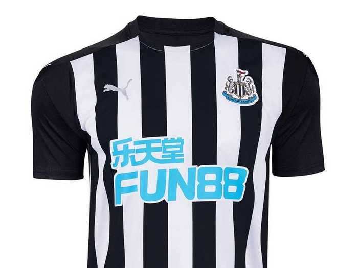
In a sentence or two: Disclaimer — I support Newcastle's arch rival Sunderland so I'm not particularly impartial. That said, this is a solid effort when it comes to looking like a zebra.
34. Manchester City (Away)
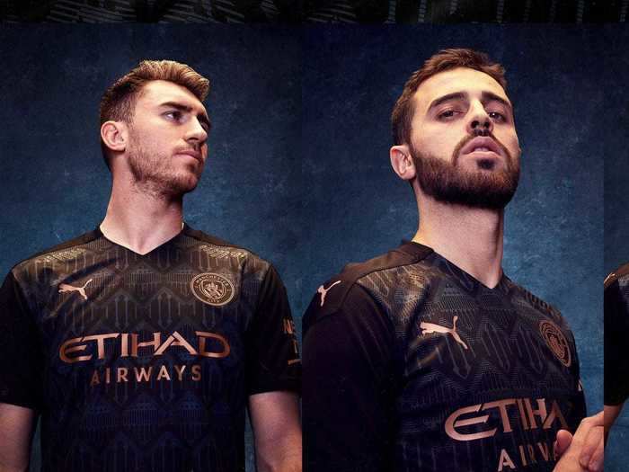
In a sentence or two: Eerily similar to cross town rival Manchester United's away shirt. The bronze sponsor and badge are a really lovely touch.
33. Manchester United (Home)
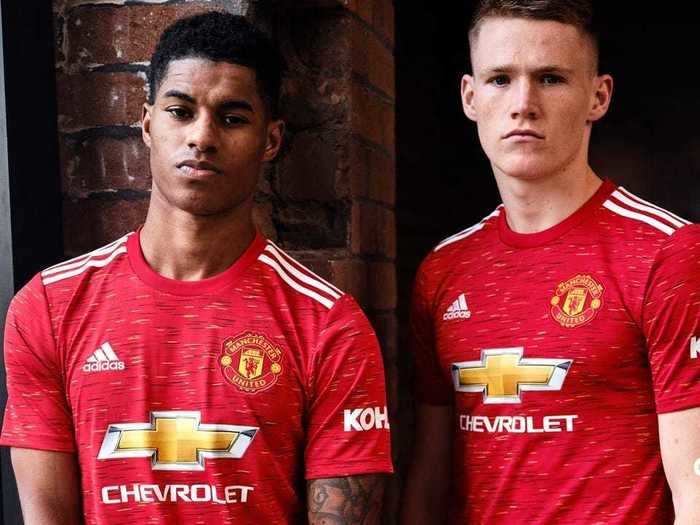
In a sentence: It looks like a bus seat, but I don't hate it.
32. Burnley (Away)
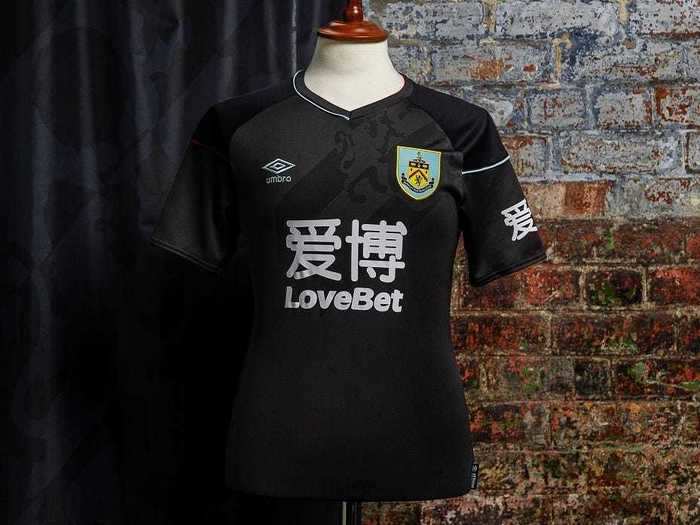
In a sentence or two: While Burnley's home shirt is awful, it's away kit is a solid but unspectacular affair. Once again though, the sponsor logo is way too big.
31. Manchester City (Home)
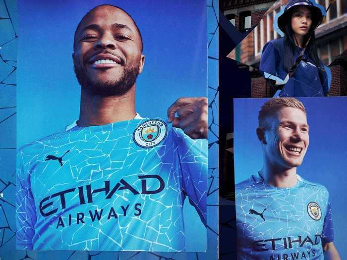
In a sentence or two: It looks like a broken iPhone screen, but I don't hate it.
30. Liverpool (Third)
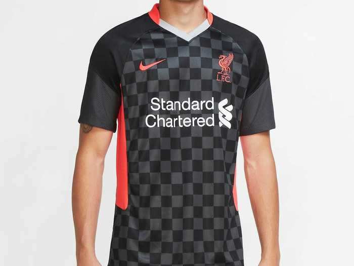
In a sentence or two: I was never very good at chess as a child, but this shirt makes me want to take it up again.
29. Southampton (Third)
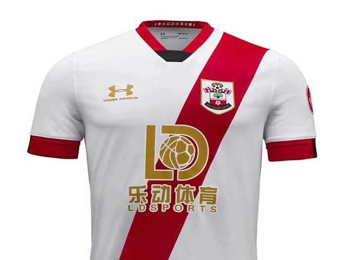
In a sentence or two: While I question the point of a team that finished 11th last season having a third kit at all, this is a decent effort. I particularly like the gold detailing.
28. West Ham United (Away)
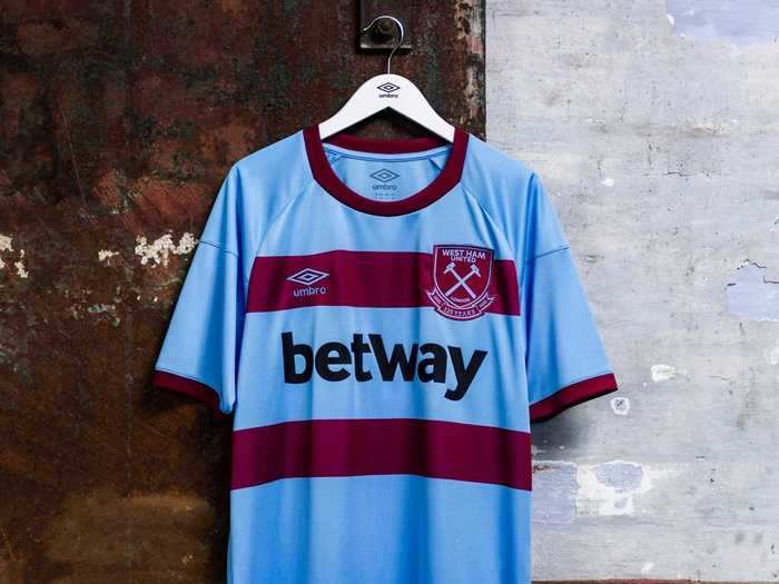
In a sentence or two: The two stripes feel a bit incongruous, but the colorway is great.
27. Arsenal (Third)
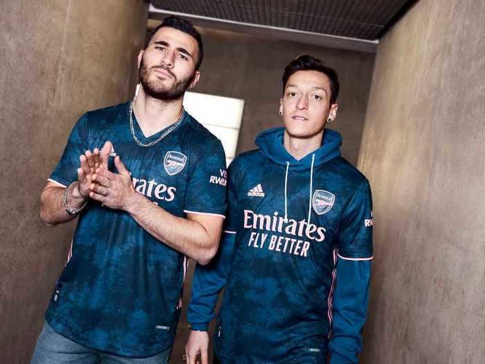
In a sentence or two: The body of the shirt is uninspiring, but this is really offset by the pale peach detailing.
26. Brighton (Away)
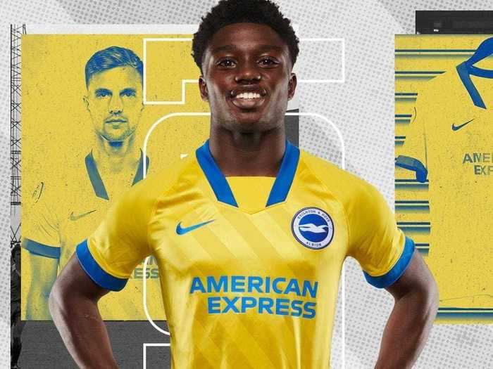
In a sentence or two: Yellow and blue is a classic away shirt combo, but this effort is let down by the weird collar and the clashing shades of blue.
25. Leicester City (Home)
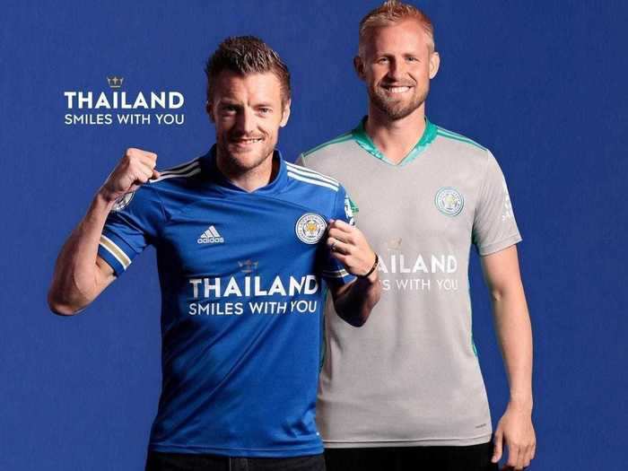
In a sentence or two: The shirt itself is a bit boring, but the fact Leicester is literally sponsored by the nation of Thailand is undeniably awesome.
24. Tottenham Hotspur (Home)
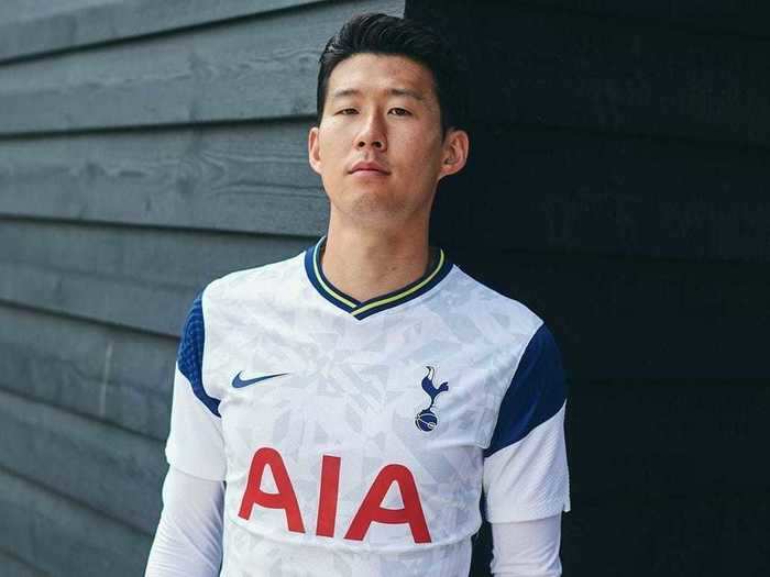
In a sentence or two: I really, really like the collar on this one, but the navy cutouts on the sleeves aren't to my taste. Solidly mid-table.
23. Aston Villa (Home)
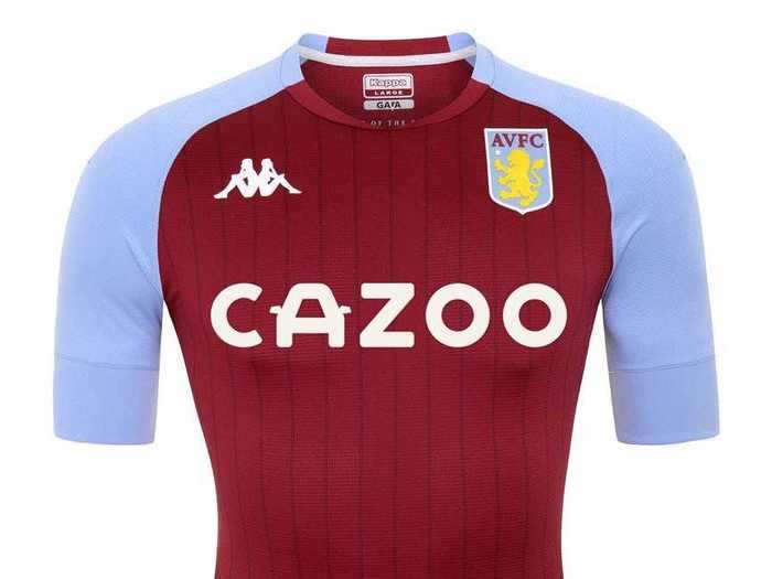
In a sentence or two: Italy's 2002 World Cup kit was made by Kappa and was one of the first football shirts I ever owned, so I've always got a soft spot for them as a manufacturer. A very solid effort let down by the pinstripes — just like the away kit.
22. Arsenal (Home)
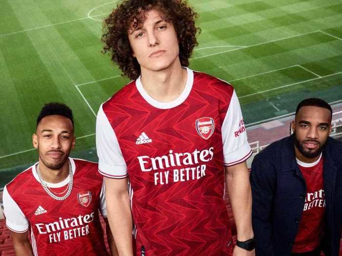
In a sentence or two: While the pattern on the red portion of this shirt looks a bit like a pub carpet, the collar and sleeve detailing are epic. Good job Adidas.
21. Leicester City (Away)
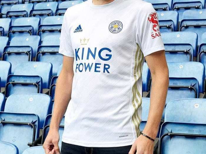
In a sentence or two: Gold stripes down the side are a nice touch, slightly ruined by the bright red sleeve sponsor. A solid away shirt.
20. Everton (Home)
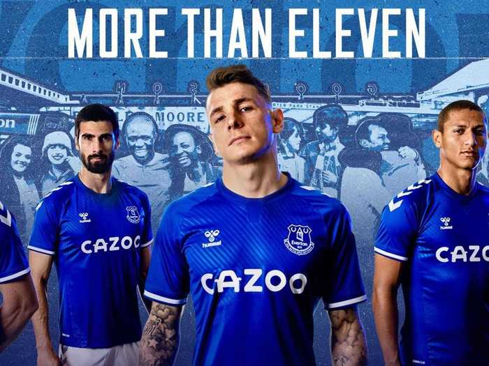
In a sentence or two: Not a particularly exciting shirt, but seeing Hummel back in the Premier League as a kit sponsor is brilliant, so this effort gets major brownie points.
19. Manchester United (Third)
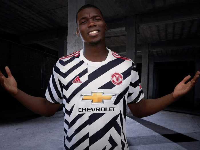
In a sentence or two: *Insert joke about this shirt being a tribute to Harry Maguire after his brush with the Greek police*
18. Brighton (Home)
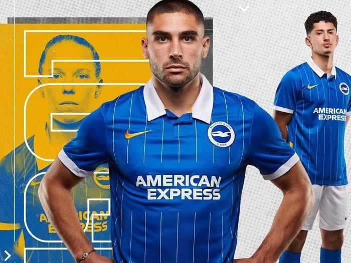
In a sentence or two: If Brighton traditionally played in all blue, this shirt would be a classic, but given its history of stripey shirts, I've got to mark it down. I do love the yellow Nike swoosh and simple sponsor, though.
17. Leeds United (Away)
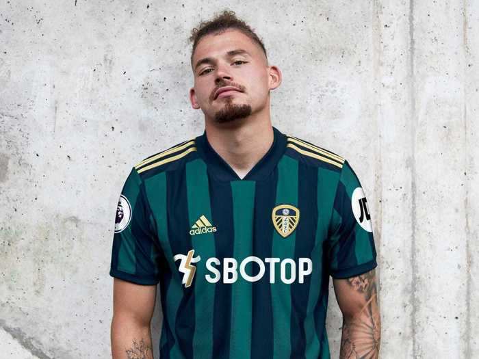
In a sentence or two: This shirt is highly ranked simply by virtue of being unusual. Green and navy stripes aren't something you see often in the Premier League, so Leeds' away shirt stands out in a sea of mediocrity.
16. Everton (Away)
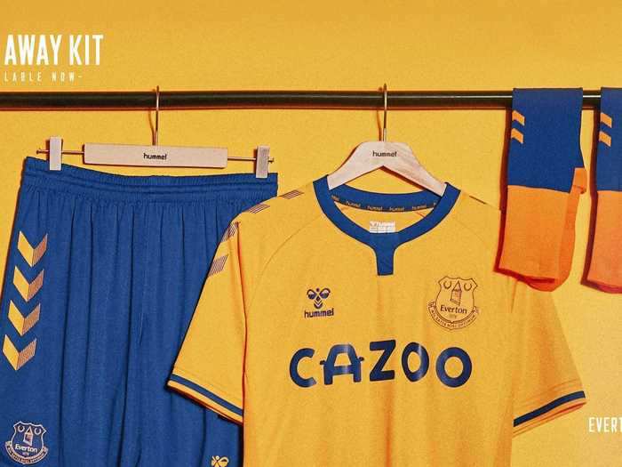
In a sentence or two: Oh my god, look at that collar, and those chevrons on the shorts. Iconic.
15. Liverpool (Away)
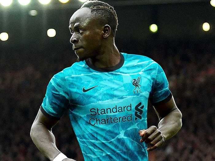
In a sentence or two: Fun fact about this Liverpool shirt — each shirt has an individual pattern. That alone is cool enough to make this a top third entry.
14. Chelsea (Away)
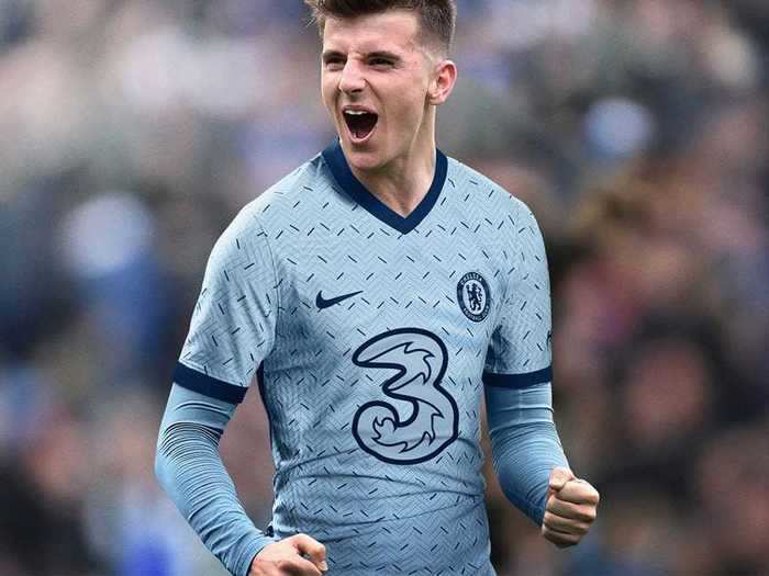
In a sentence or two: The pattern looks slightly like that non-slip metal flooring you get in industrial facilities, but I adore the color, which is apparently called "Cobalt Tint."
13. Sheffield United (Home)
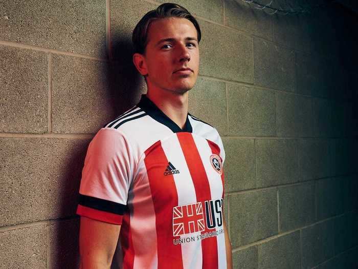
In a sentence or two: Strong traditional stripes, a Union Jack on the sponsor, nice black detailing. A solid effort.
12. Leicester City (Third)
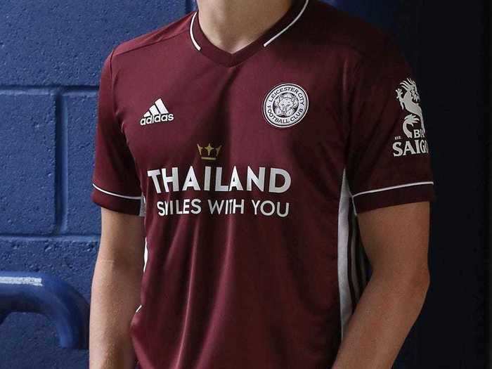
In a sentence or two: Basically identical to Leicester's home and away shirts, but in a more interesting color. Anyone fancy a glass of Pinot noir?
11. Southampton FC (Away)
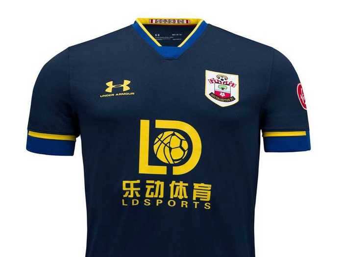
In a sentence or two: On color palette alone this is a top five entry, but the sponsor bumps it down a long way. The weird half-basketball, half-football in the middle looks like it was drawn by a child.
10. West Ham United (Home)
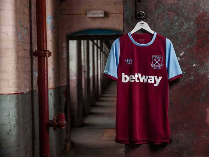
In a sentence or two: Credit to West Ham for how traditional and straightforward this shirt is. No need to muck around with the classics.
9. Sheffield United (Away)
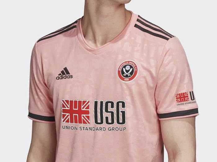
In a sentence or two: Very pretty. Football needs more pink kits.
8. Liverpool (Home)
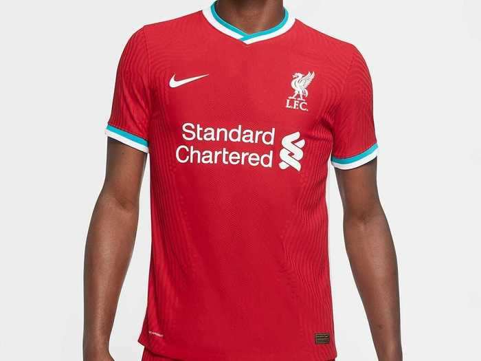
In a sentence or two: The light blue bands on the arms have been controversial among Liverpool fans, but I'm a big fan. They really make this nicely understated kit stand out.
7. Leeds United (Home)
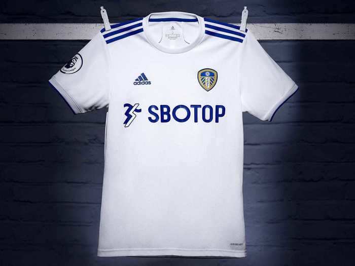
In a sentence or two: It's quite hard to mess up a plain white shirt, but Adidas have nailed this. Also, it's just really great seeing Leeds back in the Premier League, so this shirt gets bonus points.
6. West Ham United (Third)
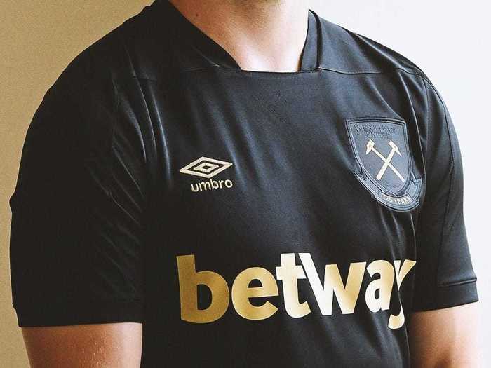
In a sentence or two: I won't lie, I don't love the sponsor, but the rest of the shirt is almost perfect. Black and gold is up there with the best color combos, so this is a top 10 entry.
5. Chelsea (Home)
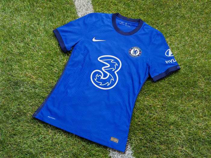
In a sentence or two: Nike has done a brilliant job with block colored shirts this year. Chelsea's home shirt is probably the best example of this, with the simple but striking sponsor and navy trim making it one of this season's best.
4. Tottenham Hotspur (Away)
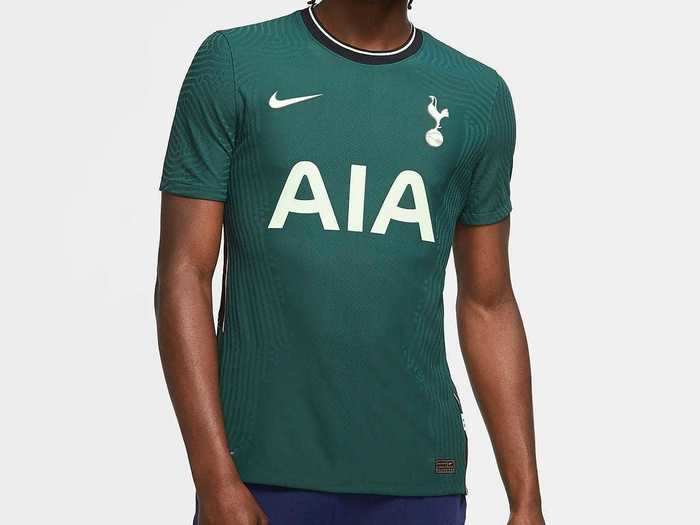
In a sentence or two: The sponsor is what makes this shirt. I love the color, it makes me think the shirt will smell like a bath soap called "Swedish forest" or "Danish rain."
3. Arsenal (Away)
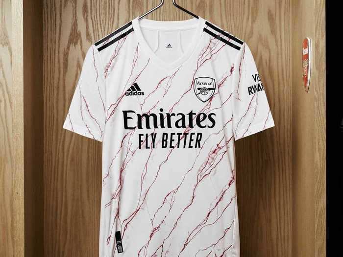
In a sentence or two: I love a bit of marble, so this kit fits my interests nicely. An unique and unorthodox design, but not too wacky.
2. Everton (Third)
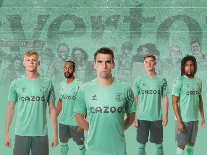
In a sentence or two: What's not to like — lovely calming color, understated sponsor, iconic manufacturer.
1. Manchester City (Third)
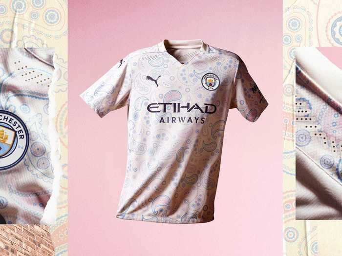
In a sentence or two (OK, three this time): This is probably both the best and the worst kit in the league this season. The paisley pattern and color are both absolutely hideous, but in what feels like a deliberate way. A divisive modern masterpiece.
READ MORE ARTICLES ON
Popular Right Now
Popular Keywords
Advertisement