- Home
- smallbusiness
- Tech
- A guide to bezels, the hotly-contested smartphone feature that's dividing designers
A guide to bezels, the hotly-contested smartphone feature that's dividing designers
What is a bezel, and why is it such a big deal?

Samsung and Google kicked off the narrow bezel trend back in 2011.
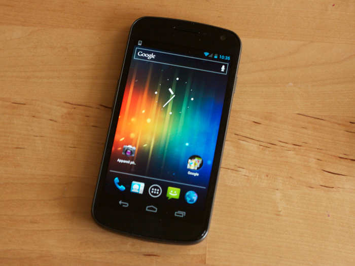
The companies worked together to produce that year's Galaxy Nexus device, which featured narrow borders on the sides of its screen.
The device also was the first to feature virtual navigation buttons in place of physical ones, providing a glimpse of the future, where the size of phone screens wouldn't need to be constricted to allow room for buttons.
Many technology enthusiasts love the new, nearly bezel-free phones.
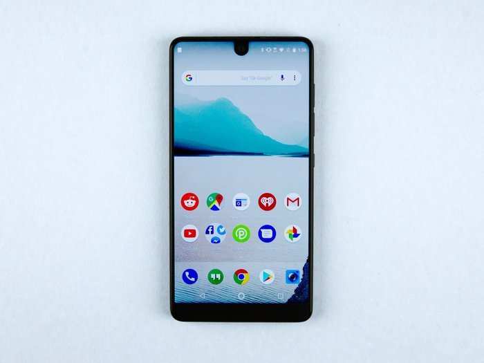
Take the reaction of The Verge's Dieter Bohn to the Essential Phone (above) as an example. That device features among the narrowest bezels of any smartphone on the market, and Bohn was a fan.
"Giant phones with big bezels feel really silly after using this phone," he wrote.
But those in the pro-bezel camp are equally passionate.
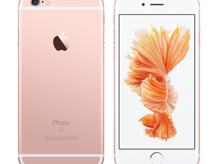
Designers and technology enthusiasts feel strongly about bezels on both sides of the debate.
Those in favor of bezels argue that good design isn't about appearances alone; instead, usability is a necessary component. Plainly put, the borders around screens make phones easier to hold and use, they argue. Phones without them are an inherently flawed.
The iPhone X was a big bone of contention between the opposite camps.
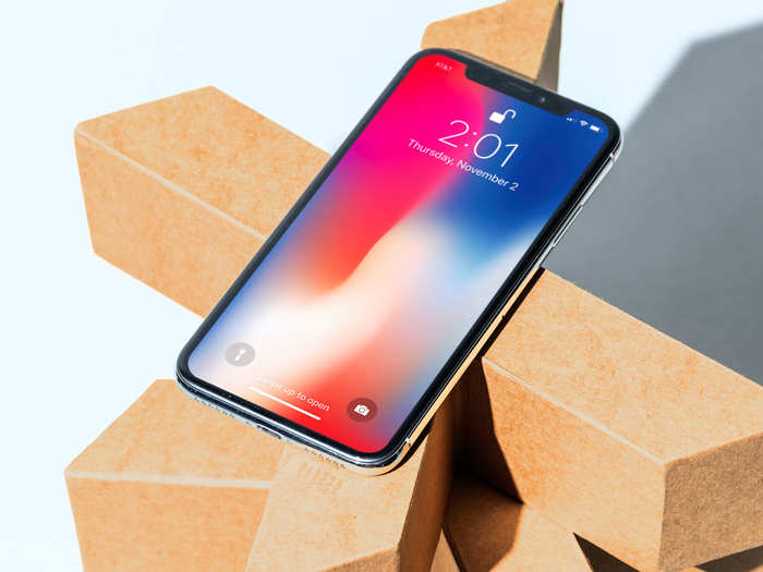
Here's what representatives of the two sides had to say about the nearly borderless design of Apple's new smartphone:
Anti-bezel:
Wired's Steven Levy loved that the design allowed Apple to devote more room for the iPhone X's screen.
"The iPhone X is a big screen in a compact form factor," he wrote. He continued: "I found the display a noticeable, and greatly pleasurable, advance over my 'old' iPhone 7, whether watching 'The Big Sick,' streaming a live football game, or simply swiping through Instagram."
But for The Verge's Nilay Patel, the iPhone X's bezels weren't narrow enough.
"Less ignorable are the bezels around the sides and bottom of the screen, which are actually quite large," he wrote.
Pro-bezel:
For Business Insider's Ben Gilbert, the phone's near-borderless design made the iPhone X uncomfortable to hold:
"With the iPhone X, the lack of a bezel not only means that I'm more likely to accidentally push something, but I also worry about dropping this phone. Instead of gripping the phone, I'm more likely to cradle it, so as not to hide the screen with any of my fingers."
But the drive for bezel-less phones may not be a matter of design alone.
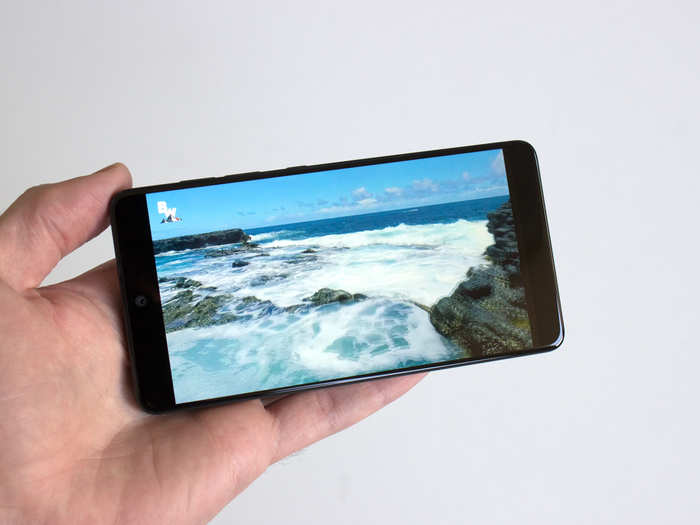
The push towards borderless screens and the rise of video technology are linked, said Gadi Amit, the founder at design studio New Deal Design. Phones aren't just phones anymore — they're our e-readers, television screens, and mini-computers.
“The carriers, phone manufacturers, and platforms such as Google and Apple all have a vested interest in providing more and more video," Amit said.
So, what's the future of smartphone design?
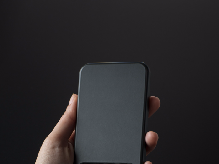
Because of Apple's influence in the tech industry, bezels may be gone for good, predicted the Next Web's Napier Lopez.
"Manufacturers will race to shave off another millimeter here or there," he wrote. Lopez continued: "Eventually, someone will find a way to make the front camera and speaker array virtually undetectable, essentially turning our phones into one massive touchscreen."
Popular Right Now
Popular Keywords
Advertisement