- Home
- slideshows
- miscellaneous
- We ordered from McDonald's kiosks to see if they're better than real cashiers - and the winner is clear
We ordered from McDonald's kiosks to see if they're better than real cashiers - and the winner is clear
The Chambers Street McDonald's near our office in New York City's Financial District now has kiosks and mobile ordering after undergoing an extensive renovation. There, by the grace of the Hamburglar, go I.

It's the middle of the lunch rush, so the place is packed. Luckily, the kiosks seem to be moving fairly quickly compared to the lengthening line at the registers.
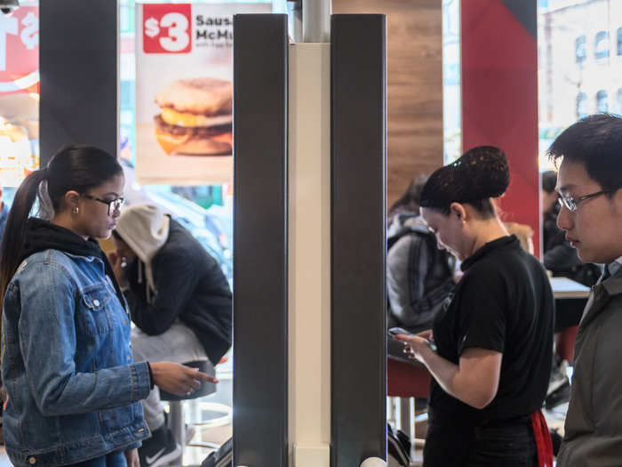
Using the kiosks is straightforward and surprisingly user-friendly.
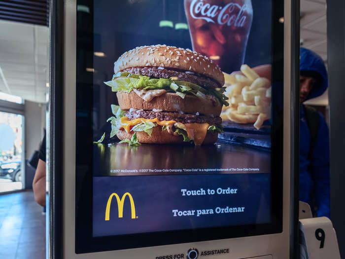
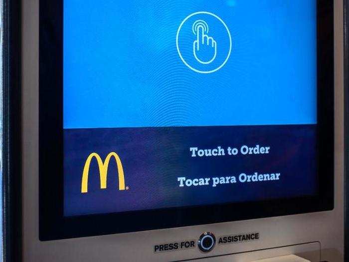
Just touch the screen to start ordering, and there's always an assistance button below. There's usually a handful of staff members roaming the kiosk area if help is needed.
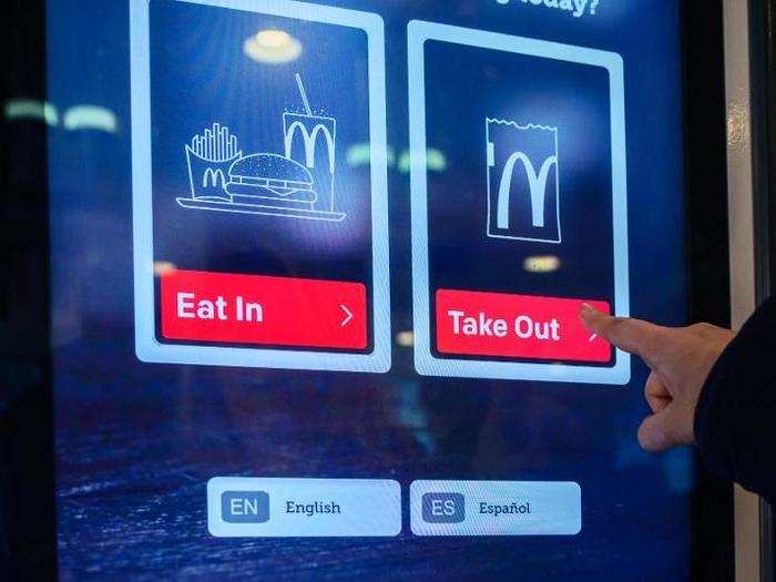
The first choice is easy: will you be eating in, or grabbing your food to go?
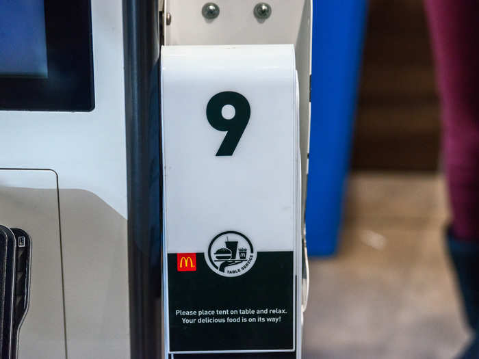
When ordering in, there are little table flags that you take with you to your table — yes, McDonald's is doing table service now. At the end of the ordering process, it'll ask for your flag number so they know which one to look for.
The menu is broken into submenus: beverages, sandwiches and meals, All Day Breakfast, etc. Under these are further submenus to help you narrow in on your order: chicken, fish, burgers, or whatever else you desire.
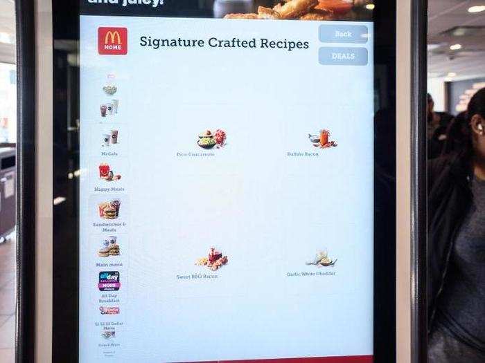
But I want some brunch to go, so the All Day Breakfast menu it is.
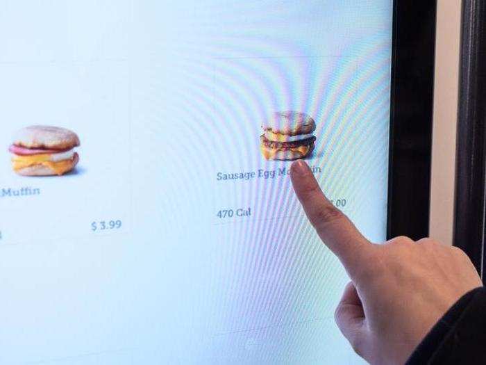
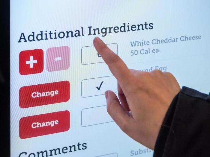
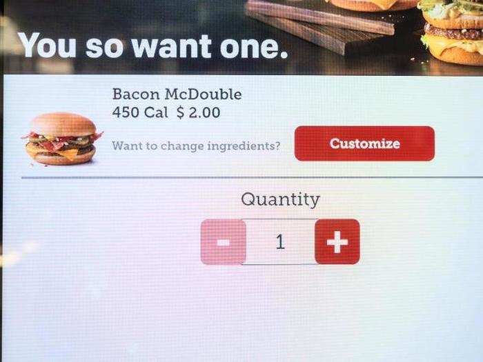
The beauty of the kiosk really is customization: making your order the way you want it on here is much easier than repeating what you want to a cashier several times. Just hit the customize button after you've chosen the item you want, and go from there.
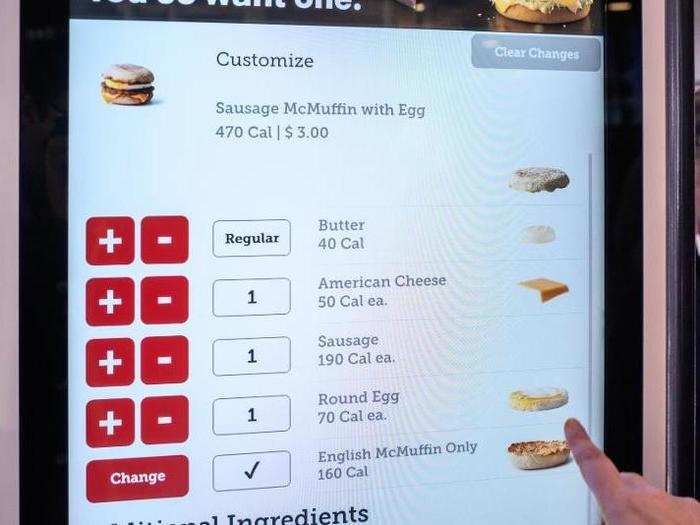
I wanted a sausage, egg, and cheese McGriddle with a McMuffin-style "round egg" instead of the default folded egg — it's the best way to go.
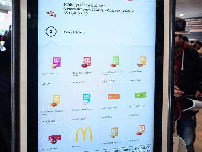
And if you're ordering McNuggets or tenders, don't worry: you get to choose the sauce you want. You can even get two of one sauce and one of the other — the world of kiosk customization is your proverbial oyster.
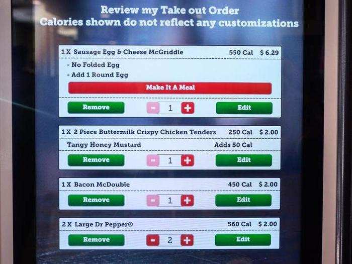
When you've chosen what you want, you're ready to pay. There's a review screen that shows every customization and choice, too, so you can make sure your order is correct. There's even a calorie count ... which some may wish to ignore.
Like I said, pretty straightforward stuff. You can pay at the kiosk with a debit, credit, or gift card — or most mobile payment systems — or wait in line to pay with cash or coupon.
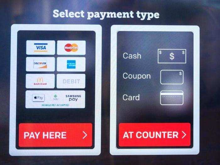
Since this is an experiment in avoiding the line, we're paying with card.
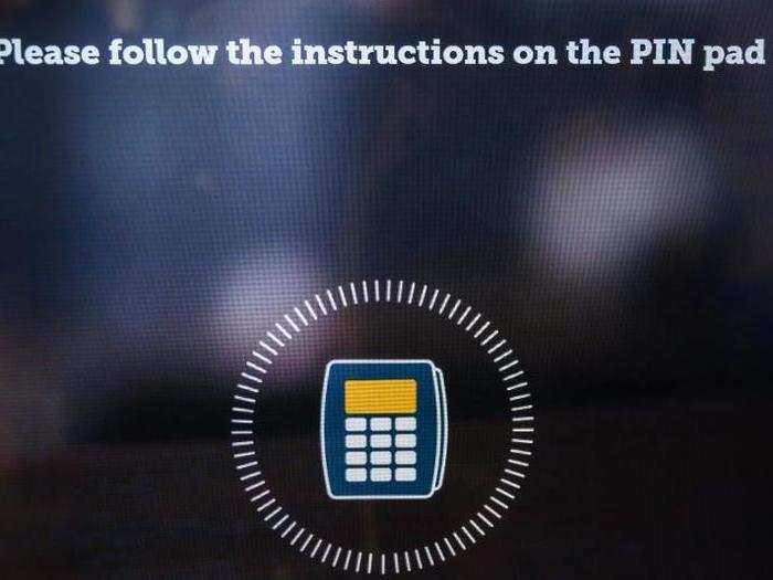
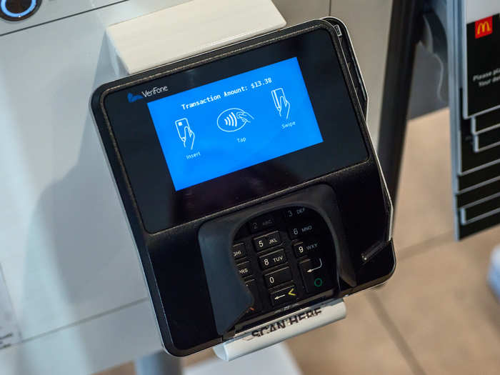
The payment system itself is just like anything you'd encounter at the counter: swipe, insert, or tap.
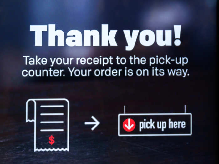
Once you've paid, the kiosk spits out a receipt with your order number on it, and you're off to wait at the pick-up counter.
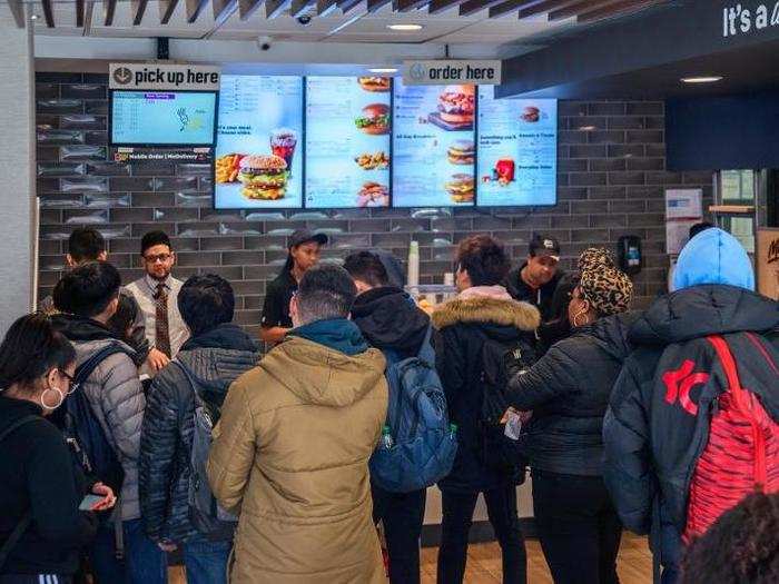
The lunch rush here means it's a pretty long wait — it took 10 minutes for the order to be ready.
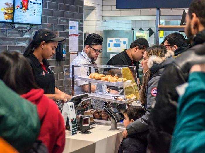
But it was easy to see that the kiosks turned over more customers more quickly. The pick-up counter was a constantly churning flurry of activity.
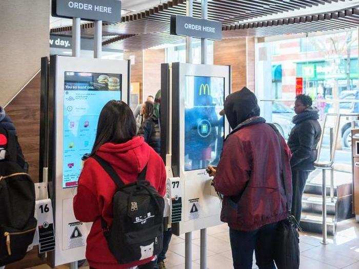
Meanwhile, the line for the registers only grew longer with time, and it moved glacially slow. I watched people who got in line when I started ordering from the kiosk, and they only made it to the front of the line by the time I picked up my food.
So, which is better? I'm used to the kiosks, so I prefer them — they're faster, more accurate, and make things easier to customize. And since workers are there to help if you're confused, I fail to see how it takes away jobs as of now.
A trivial plus for McDonald's enthusiasts: kiosks make it much easier to order an enormously embarrassing spread of food. Twenty-piece box of McNuggets and a Big Mac for one, anyone?
Popular Right Now
Popular Keywords
Advertisement