- Home
- slideshows
- miscellaneous
- Rebrands can remedy scandals, but they can also cause them. Here are 6 of the most controversial company rebrands of 2019.
Rebrands can remedy scandals, but they can also cause them. Here are 6 of the most controversial company rebrands of 2019.
Fast-fashion retailer Zara divided consumers when it launched its new, more high-fashion inspired logo.

Pepsi rebranded its cans in 2019 with a new tagline, "For the Love of It." Critics said it was a little too similar to McDonald's iconic "I'm Lovin' It" slogan.
Pepsi came under fire in 2019 when it announced its new slogan, which critics remarked was far too similar to McDonald's iconic tagline. In a statement to CNBC, Roberto Rios, senior vice president of marketing at PepsiCo, claimed the new slogan was inspired by the "iconic brand rooted in entertainment with a refreshing and delicious beverage people around the world love."
However, while people may love the taste of Pepsi, they certainly didn't love the new tagline and rebranding. Not only was the new slogan compared to McDonald's "I'm Lovin' It" catchphrase, but it also seemed to be eerily similar to Coca-Cola's 1982 slogan for Diet Coke, "Just for the Taste of It," which was brought back in 1995 and 2009.
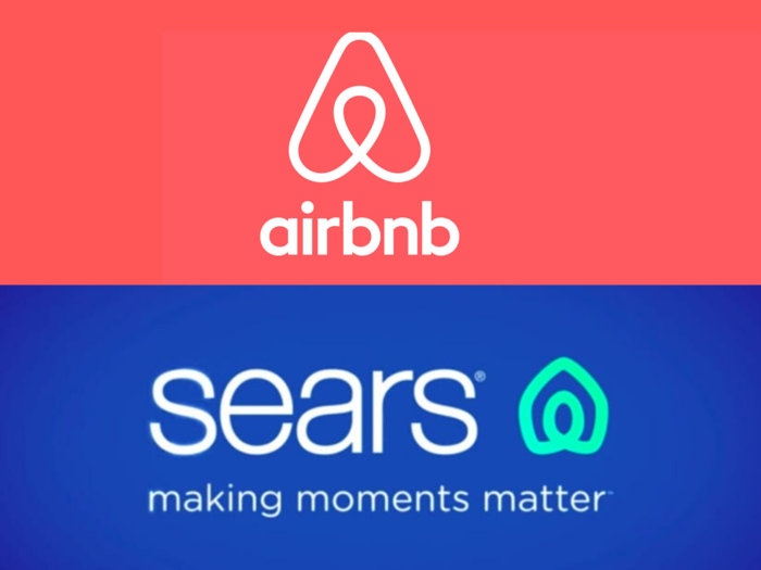
Sears came under fire for its new logo, which critics said resembled the Airbnb logo.

Sears has had a rough year. Between declining sales, a report of messy stores, and a battle to bounce back after bankruptcy, the retailer can't seem to catch a break. However, it caused even more controversy with its rebrand in March 2019. The new logo, which also features the phrase "making moments matter," was quickly compared to Airbnb's logo.
While the logo was reportedly created to represent the "infinity loop" of family, home, and heart, many critics simply couldn't ignore the fact it looked extremely similar to the home-rental website's symbol.
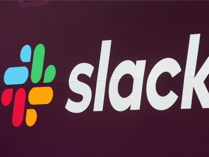
Slack wasn't cut any slack when its new logo was compared to a swastika and other offensive imagery.

When it comes to a company rebrand, the last thing marketing teams want is to offend. However, when Slack launched its revamped logo in January 2019, the company was promptly met with internet backlash. Some compared it to Google Photo's colorful logo, while others said it closely resembled offensive imagery like a Nazi swastika.
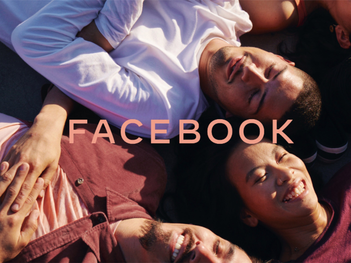
Facebook Incorporated, which owns the eponymous social networking platform, changed its logo following controversy over the company's transparency.

On November 5, Facebook Inc. announced its logo change, which shifted towards a more colorful yet minimalist font style. The logo features "Facebook" in a new, all-caps font and alternates between blue, green, purple, red, and orange in a GIF format. The colors chosen represent the company's multiple brands — blue for Facebook, green for WhatsApp, and purple, red, and orange for Instagram.
Following a year of controversy surrounding Facebook's data collection and privacy policies, the new logo was thought to distance the parent company from the social network. Antonio Lucio, Facebook's chief marketing officer, told Bloomberg that the company even considered changing the parent company name entirely prior to the rebrand, but was concerned this would come across as Facebook "trying to run from the problems associated with its brand."
Of course, the new branding was not without its critics. Twitter CEO Jack Dorsey, who has voiced his issues with Facebook in the past, seemed to take a jab at the new, all-caps branding in a tweet: "Twitter ... from TWITTER."
Volkswagen ditched its iconic logo for a sleeker, more modern design, but people weren't happy about one element of the design.
Following Volkswagen's 2015 emissions scandal, in which the company pleaded guilty to three felonies and agreed to pay $14.7 billion to settle, it rebranded in September 2019. Featuring thinner lines and a more minimalistic look, the new logo was created to reference the increasingly "electric future" of the car company.
One online design blogger called the new logo "damage control," and said the new design broke many design rules, though they did like the final look of the logo.
"As far as we can tell, the new design throws the rule book out of the window; the lines are far too thin, the angles of the letter strokes are all over the place, and the gap between the letters is too wide. Honestly, it shows blatant disregard for the rules."
- Read more:
- I bought the highest-rated pair of jeans on Amazon under $25 and will never buy jeans in-store again
- The 25 highest-paying companies in 2019
- These 10 billionaires have all gone broke or declared bankruptcy — read the wild stories of how they lost their fortunes
- The 10 biggest data breaches of the 2010s
Popular Right Now
Advertisement