INEQUALITY IN AMERICA: 6 charts that show how much more wealth the 1% have over everyone else
One of the most basic ways to look at inequality is the share of income going to the top 1%.

The share of wealth accruing to the top 1% of that distribution follows a similar trajectory as income, but with an even higher degree of concentration.
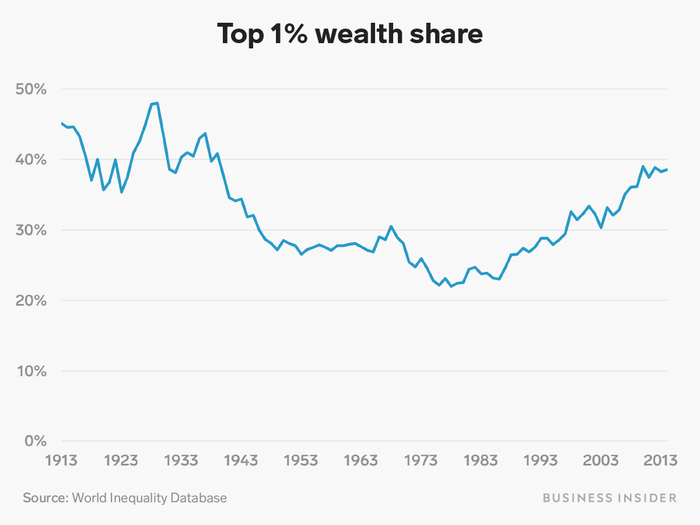
Similarly to income, the top 1% of the wealth distribution saw a decline in their share of the total national wealth of America between the 1910s and the 1970s, and then a steady increase over the last four decades.
Income represents how much money a family makes in a given year from wages, businesses they own, or from investments they have. Wealth represents the total net amount of assets a family owns — their house, any savings or retirement accounts, any cash in bank accounts, etc — less their debts.
The former tends to lead to the latter over time — income in excess beyond what a family spends in a year gets saved or used to pay down debt, adding to the family's net worth.
The biggest difference between the two charts is the scale of the y-axis. While the top 1% of the income distribution gains 20% of national income, the top 1% of the net-worth distribution controls about 40% of the wealth.
The takeaway: Wealth is even more concentrated in the hands of the top 1% than income is.
Meanwhile, inflation-adjusted wages for normal workers have grown only very slowly for decades.
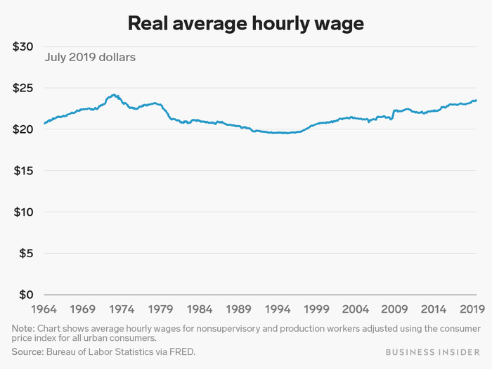
The average hourly wages for frontline, non-managerial workers has remained in a tight range (adjusted for inflation) since the Bureau of Labor Statistics' records began in 1964.
While wages have ticked up since a low in the early 90s, the main source of income for most working- and middle-class Americans has not kept pace with the income and wealth shares of the top 1%.
The US has a much more unequal income distribution by one standard metric than most other developed, wealthy countries.
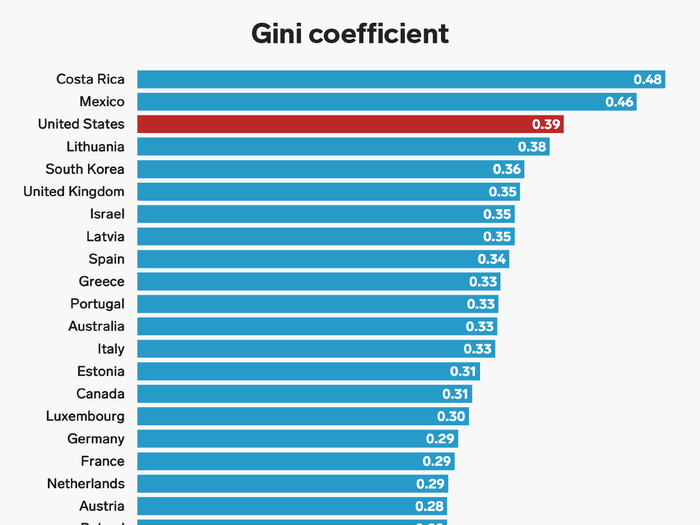
The Gini coefficient, a commonly used measure of income inequality, shows how far away from equal a country's income distribution is.
A coefficient of 0 indicates a completely equal distribution, where everyone has exactly the same income, while a coefficient of 1 indicates a completely unequal distribution, where one person receives all of the income in a country and everyone else gets nothing.
The above chart, using 2016 data from the Organization for Economic Cooperation and Development, compares that measure among several countries. By this metric, the US has a higher degree of income inequality than most other developed and wealthy nations.
One of the driving factors in rising inequality is the concentration of stock ownership at the top.
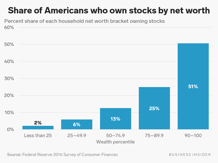
Representative Alexandria Ocasio-Cortez highlighted that divide in a January tweet, saying that celebrating stock market highs while wages remain stagnant represented "inequality in a nutshell."
This chart shows the share of Americans in each part of the wealth distribution who directly own stocks. While over half of families in the top 10% own stocks, only 2% in the bottom quarter do.
This divide means that many Americans are not directly benefiting from the roaring stock market of the last decade — meanwhile the rich, with help of the stock market's sharp recovery after the financial crisis, got richer.
The divide is even clearer when looking at how much stock Americans in each part of the wealth distribution own.
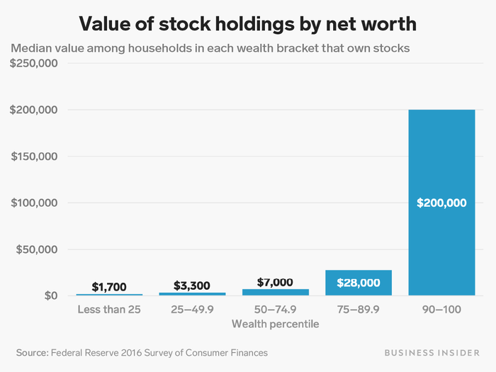
This chart looks at the value of direct stock holdings among families who owned stocks in each wealth bracket.
As noted in the previous slide, only 2% of households in the bottom quarter of the wealth distribution own any stocks at all. Among those bottom-quarter households that do own stock, the typical family's portfolio is worth just $1,700.
Meanwhile, half of households in the top 10% of the wealth distribution own stocks. Among those families, the typical portfolio is worth $200,000, or about 118 times as much as the holdings of a typical stock-owning family in the bottom quarter.
These kinds of trends help explain why inequality is such a major issue in American politics as we start off the formal election process.

Popular Right Now
Popular Keywords
Advertisement