- Home
- slideshows
- miscellaneous
- I'm a loyal iPhone user, but I switched to Samsung's Galaxy S20 and found 5 things I liked better compared to the iPhone 11 Pro
I'm a loyal iPhone user, but I switched to Samsung's Galaxy S20 and found 5 things I liked better compared to the iPhone 11 Pro
The Galaxy S20 has a super-fast display.

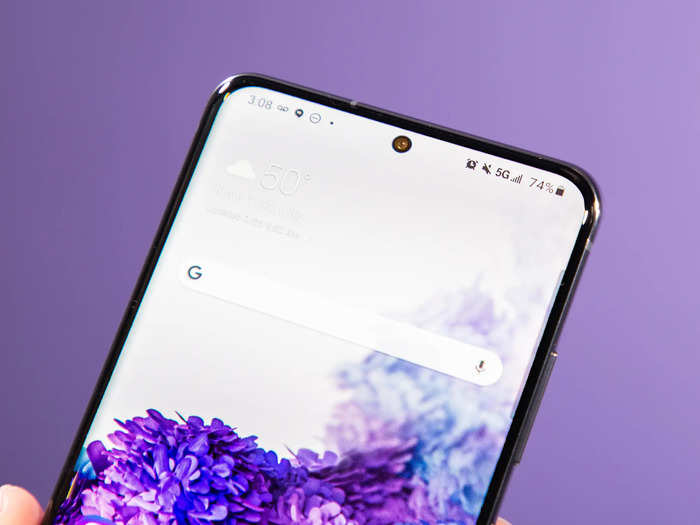
The Galaxy S20's screen also has a sleeker look with no notch cutout for the camera.

Starting with the Galaxy S10, Samsung began using a newly designed screen for its Galaxy S smartphones that nixes the top and bottom bezels and instead implements a small hole punch-shaped cutout near the top of the screen for its camera.
This, combined with the S20's slightly curved display, gives the front of the phone a sleeker and more seamless look than the iPhone 11 Pro, which has a much more noticeable cutout near the top of the display for the phone's front camera and Face ID sensors.
As a result, Samsung is able to fit a larger display on its device without making the phone itself all that much bigger. The Galaxy S20 Ultra has a massive 6.9-inch screen, while the iPhone 11 Pro Max's display measures 6.5 inches.
It's worth noting, however, that the iPhone's Face ID has generally been considered to be more secure than Samsung's facial recognition thanks to all the sensors included in that notch cutout. Apple devices project thousands of invisible dots across your face to create a depth map and also capture an infrared image of what you look like. Samsung devices just use the front camera to map your face, and previous reports have suggested that Samsung's facial recognition tech can be easily fooled.
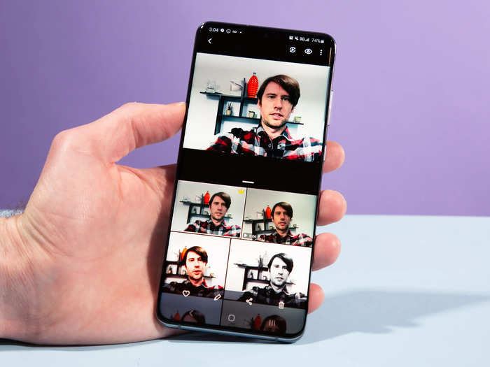
You can capture a photo or video in multiple different styles with just one press of the shutter on the Galaxy S20.

There are some characteristics of the iPhone's camera that I prefer over Samsung's — like its ability to capture more realistic detail when taking portrait shots — but the Galaxy S20's Single Shot is worth highlighting.
With Single Shot, you can press the shutter button once while the phone captures multiple versions of the scene in different styles. This could include a black-and-white photo, a short video, or sped-up footage of the scene. It's a particularly fun shooting mode if you're capturing scenes with a lot of movement, like kids playing, sporting events, or your pets.
The home screen is more customizable.

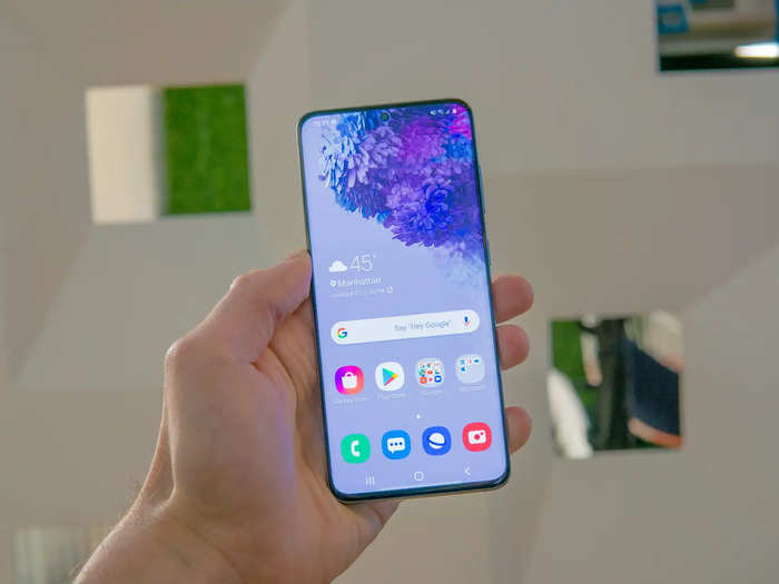
As is the case with just about any Android phone, the Galaxy S20 allows for more customization when it comes to the home screen and other aspects of the operating system.
Just hold down anywhere on the home screen, for example, and tap the "Widgets" button to add more content to your home screen. A widget is essentially a piece of an app that stays pinned to your home screen for use. You can add the Google search bar as a widget, for example, as well as bookmarks from Chrome, shortcuts to your Gmail or Outlook inbox, and more.
On an Android phone like the Galaxy S20, you can also drag and drop widgets to place them where you like on the home screen.
Apple's alternative to home screen widgets is the iPhone's "Today View," which is located to the left of the home screen. The "Today View" is a customizable stream of widgets where you can see information like the weather, news headlines, how much battery life is left in your AirPods, and more.
Apple's "Today View" may look cleaner than pinning widgets to the home screen, but I prefer the widget layout on Android phones. You don't have to swipe, since the information is located right there on the home screen, making it easier to see weather data at a glance. And being able to pin only the certain pieces of information I care about directly to the S20's home screen makes it feel more like I'm personalizing it, whereas "Today View" doesn't really feel like it's part of the home screen at all.
"Today View" feels more like an answer to the customized news feeds that Android device makers offer on their phones, like the Google feed and Samsung Daily, both of which are accessible when swiping right from the home screen.
Home screen widgets are just one way in which Android software usually provides more flexibility — there are many others.

The software will vary slightly depending on the Android device you're using, but most Android phones offer some level of flexibility when it comes to the user interface and how apps are run.
For example, a small but useful software characteristic I've always appreciated on Samsung phones like the S20 is the granular controls available for tweaking the volume. When pressing the volume key, you'll notice that a dropdown arrow appears next to the volume indicator. Tapping this arrow will launch a mini-menu that lets you control the volume for specific things like your ring tone, media, and notifications.
On an iPhone, you can only control the general overall volume by pressing the volume key.
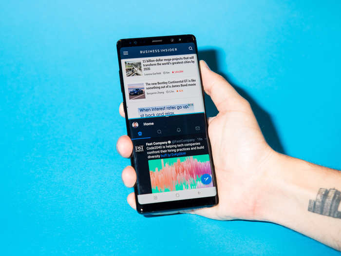
Android phones also let you run apps in split screen mode, which allows you to view 2 apps at once on screen. I don't find myself using this too often since dividing the screen in half on most phones makes apps feel too cramped. But it's still a nice option to have for times when you may feel like you're constantly switching between apps.
The iPhone doesn't have a feature like this, although Apple does offer split screen view for the iPad.
All told, Samsung's phones stand out for their impressive design, sharp and smooth screen, and flexible software, even if some of those features come with their own trade-offs.
Popular Right Now
Popular Keywords
Advertisement