- Home
- slideshows
- miscellaneous
- Here's how the new Gmail compares to the old version - and how to make the switch today
Here's how the new Gmail compares to the old version - and how to make the switch today
Here's what the old Gmail inbox looked like.

And here's what the new inbox looks like.
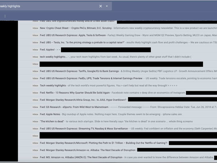
The new inbox has three 'views' — default, comfortable, and compact.
Upon first glance, the new inbox doesn't look much different from the old one. However, there are a few additions that are meant to improve your experience within the app. On the right side of the screen, there's now an area for plugins. By default, Google has included Calendar, Keep (a note-taking app), and Tasks. These have been included so you don't have to keep tabbing out of your email to check things like upcoming meetings on your calendar, or to look at any important information in your notes or tasks.
Here's a preview of what the 'default' view would look like.
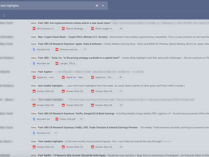
This view will show the names and file types of any attachments in the email below the subject line.
And 'comfortable' view.
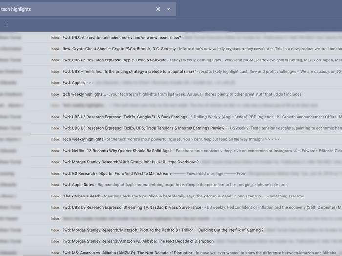
This view will only show whether or not there's an attachment, and is slightly more compact than default view.
And finally, 'compact' view.
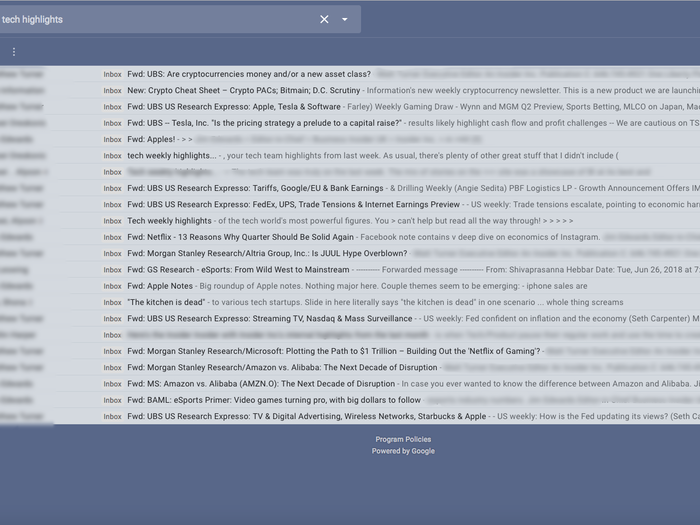
This view is the most compact, hence the name, and will show the most emails per page in your inbox.
Here's what the Calendar integration will look like, located at the right side of the screen.
Now you don't have to switch tabs to see what's coming up on your Google Calendar.
Under the Calendar, you can keep track of your notes with Keep.

You can import your notes from any other device that you use the Keep app with.
Finally, here's the Tasks integration.
You can also choose to add third-party plugins from the G Suite Marketplace to Gmail.
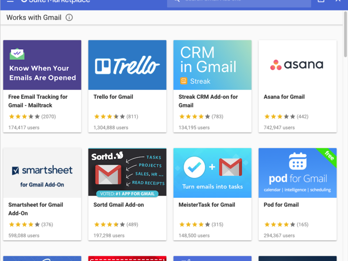
You can add more plugins by clicking on the 'plus' sign on the right side of the screen, underneath the three integrated Google plugins.
You can now choose to archive, delete, mark as read/unread, or 'snooze' emails in your inbox, by clicking on one of the icons on the right.
You can pick a specific date and time for the 'snooze' effect to end.
You can also collapse the menu on the left side by clicking the three bars next to the 'Gmail' icon at the top left.
This lets you have more space for your inbox, while still retaining the menu icons to navigate through different folders.
You can also send messages in 'confidential mode,' which adds some extra security to your messages.
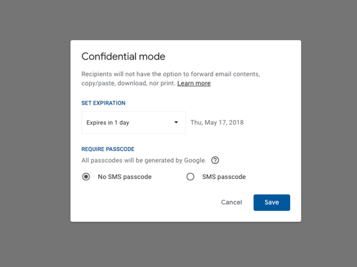
People you send emails to in confidential mode won't be able to forward, copy/paste, download, or print your email. However, if you really need to send something securely, you probably shouldn't be using Gmail for that in the first place.
The verdict: There's really not much of a reason to keep using the old Gmail.

The improvements are minor, but this wasn't intended to be a dramatic overhaul of the Gmail platform. It's definitely convenient to be able to check your calendar, notes, and tasks all within your Gmail tab — and that means two fewer tabs that you would have needed to open.
The inbox does look noticeably different, but barely. It is nice to be able to see exactly what attachments are in your inbox, but I found that it adds more clutter and chose to use the 'comfortable' inbox view.
So the biggest reason to switch is probably the plugin integration — other than that you're not missing much. And if you switch over and decide you don't like the change, you can easily switch back to the old Gmail.
Popular Right Now
Popular Keywords
Advertisement