- Home
- slideshows
- miscellaneous
- 8 best 'anti-ads' that sold you a product by telling you not to buy it
8 best 'anti-ads' that sold you a product by telling you not to buy it
Doritos created completely blank bags for its chips.

Hinge markets itself as 'the dating app designed to be deleted.'
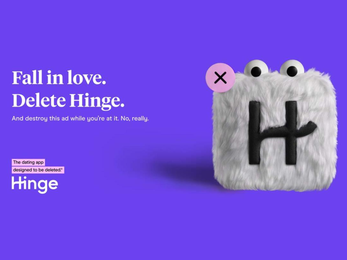
Dating app Hinge, differentiating itself from competitors Tinder and Bumble, created a mascot in the form of its app icon. Hingie, complete with fur and googly eyes, also has a little button attached on his top left corner, making him ready to be deleted.
Last month, Hinge unveiled a series of spots featuring Hingie being destroyed the very moment couples find love, according to Ad Age. First he's squished by a movie-theater seat springing back, then he's frozen in the pizza section at the supermarket, followed by an unfortunate run-in with a taxi's wheels. But that's Hingie's sole aim: To help people delete him.
Volkswagen created the original anti-ad in 1959.
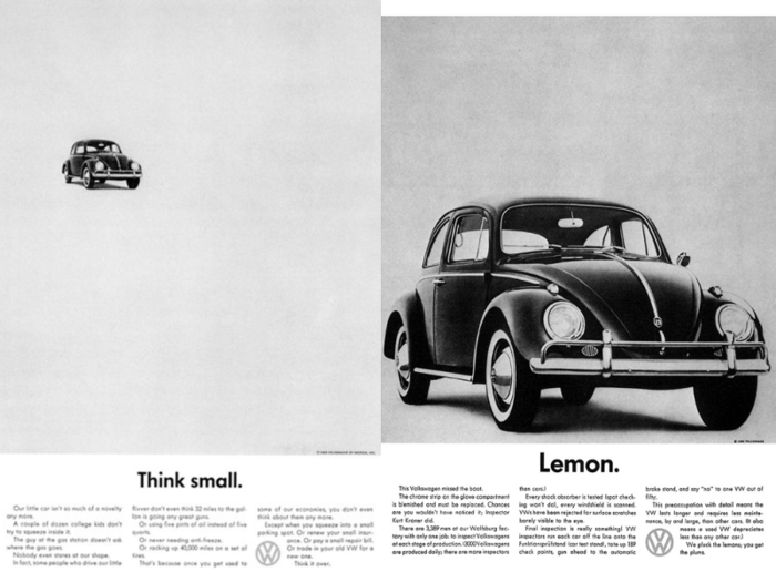
Volkswagen is credited with creating the original anti-ad campaign back in 1959, with "Think Small," a series of ads that drew attention to the VW's classic "lemon," the Beetle.
The ads may not seem modern by 21st-century standards, but other car ads of the time, by comparison, focused on the hard sell. They showcased the car's features, the lifestyle of its drivers, and full color close-ups of that year's model. 1959, after all, was also the year of the third generation Cadillac Eldorado, the high-finned antithesis of simplicity. VW's Beetle, and the ads that went with it, were self-deprecating, minimalist, and witty.
"Think Small" is now regarded by experts as one of the best ad campaigns of all time.
Supreme is known for slapping its logo on everything from T-shirts to bricks.
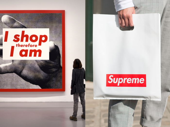
In 1987, American artist Barbara Kruger created "I shop therefore I am" by linking a found photograph with a provocative message, creating a world-famous artwork in the process.
Kruger became known for her groundbreaking art, which wryly criticized consumerism, all while maintaining the same Futura Bold Oblique font and color scheme. Then Supreme came along.
The skate brand, founded in 1994 by fashion designer James Jebbia, used the same font and color scheme as Kruger. Supreme has since become hugely popular for its branding, which, for the most part, consists of nothing but its logo. In fact, Supreme knows exactly how big a cult following it has, so it made a series of objects with its logo slapped on top, including a hammer, calculator, and even a brick.
When clothing brand Married to the Mob used Supreme's branding to create a series of shirts, Supreme filed a lawsuit in 2013, alleging copyright infringement. Married to the Mob claimed that Supreme had stolen its logo from Barbara Kruger. Eventually, both lawsuits were dropped.
Kruger, meanwhile, was furious that companies were suing each other over her original attack on consumerism, so she created a performance piece in the form of an imitation skate shop selling Supreme-esque items, including a skateboard with a design that read, "Don't be a jerk."
OK Soda was marketed as an anti-soda by Coca-Cola.
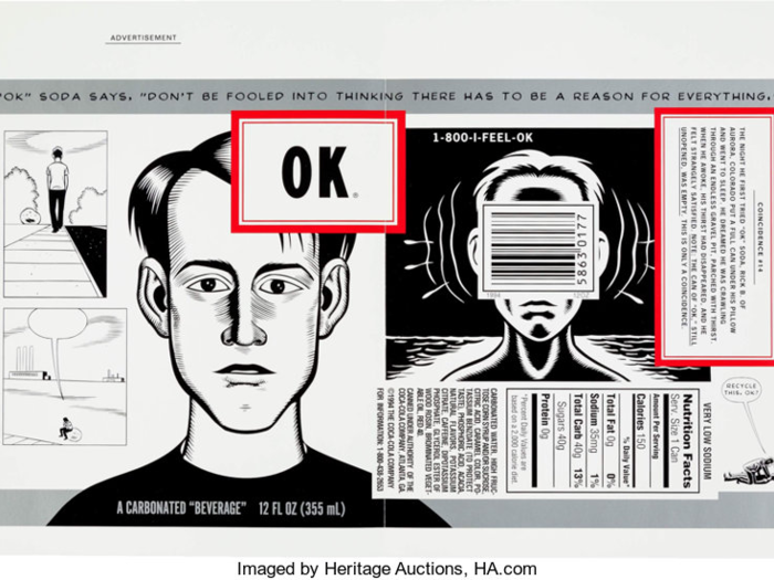
Sergio Zyman, the mind behind the 1985 marketing disaster that was New Coke, was rehired by the Coca-Cola Company eight years later to create OK Soda.
From its inception, OK Soda was meant to be a kind of anti-soda, with a minimalist logo and no mention of what it tasted like. The label only said it was "a carbonated 'beverage.'"
Despite its creative packaging featuring designs by cartoonists, OK Soda didn't resonate with consumers, and Coca-Cola dropped the brand in 1995. Since then, it's gained a cult following online.
Oatly's ads were self-referential.
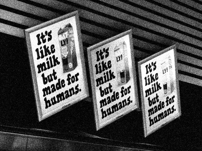
Swedish oat milk brand Oatly has gained a following among those seeking milk alternatives, and they're doing it through unconventional ad campaigns.
If you've walked through the streets of Amsterdam, Berlin, London, or New York lately, you may have seen some of their ads. One, on the side of a Berlin building, reads, "We made this ad look like street art so you would like it better than if it was just an ad."
While most people find Oatly's ads charming and authentic, some don't. In 2015, Oatly's Danish advertisements prompted a lawsuit from Danish dairy farmers. The tagline in question was, "It's like milk, but made for humans." As a result of the suit, Oatly's sales soared.
Selfridges added a Silence Room to its department stores and stripped products of their labels.
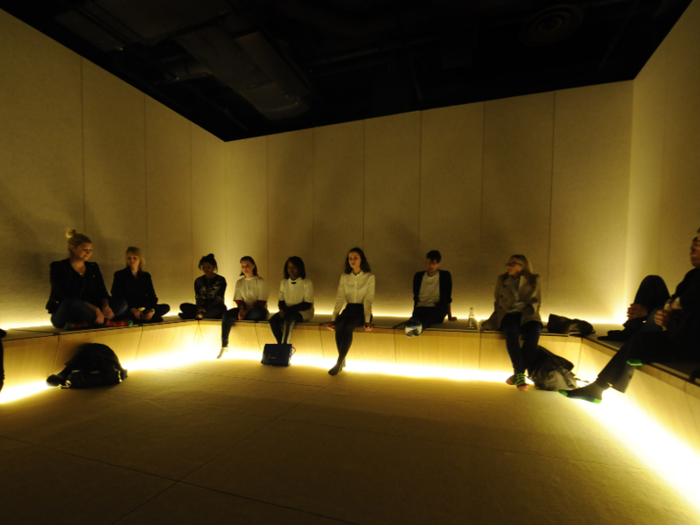
English department store Selfridges sought an antidote for shoppers in the aftermath of the hectic holiday season. So, in 2013, it brought back the Silence Room.
When Harry Gordon Selfridge founded the department store in 1909, he included a room for tired shoppers to sit down and relax, away from the noise and stress of shopping. The newer Silence Room, much like the original one, didn't contain any 21st-century technologies — shoppers were required to leave their phones (and their shoes) at the door.
As part of the No Noise project, Selfridges partnered up with brands like Marmite, Heinz, Levi's, and Dr. Dre to temporarily remove all labels from their packaging. Even the iconic yellow Selfridges shopping bags contained no logo.
Patagonia told consumers not to buy its clothes.
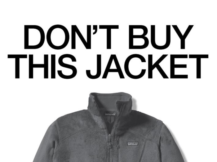
Just before Black Friday 2011, apparel company Patagonia took out an ad in the New York Times, telling its consumers not to buy its clothing. It wasn't trying to scare off customers — it just wanted them to only buy their products when they absolutely needed them.
"It's time for us as a company to address the issue of consumerism and do it head on," the ad read.
The ad was part of Patagonia's Common Threads Initiative, a program to reuse and repair the brand's clothing.
Popular Right Now
Advertisement