We asked a group of graphic design experts to rate the 2020 presidential candidate logos and they were not impressed
15. Former Maryland Representative John Delaney

14. Washington Governor Jay Inslee
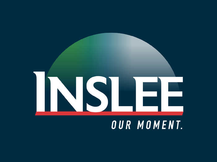
Average score: 2.2/10
Heller: 2/10 – "Poor type choice."
Lupton: 3/10 – "Whose moment? The candidate’s? The Democrats’? Who is this candidate? Who are the Democrats?"
Formosa: 3/10 – "More of a corporate logo than a personal logo, with a message 'Our moment' that says little."
Navitsky: 3/10 – "Secretly I want to give this a 10 because it’s so unexpected and weird, but ultimately it doesn’t feel like there’s a human behind it. And that seems fairly problematic."
Millman: 0/10 – No comment given
13. Entrepreneur Andrew Yang

Average score: 2.7/10
Heller: 4.5/10 – "Conventional, but using the flag in a somewhat clever fashion."
Lupton: 3/10 – "The flag cliché is really struggling here."
Formosa: 2/10 – "Not much to say about this red, white, and blue logo other than it looks like it’s coming from someone running for mayor of a small town. It’s not communicating anything beyond that to convince you he’s the guy you want."
Navitsky: 4/10 – "Forward momentum seems like the right message to send for 2020, but this overall feels pretty safe."
Millman: 0/10 – "An abomination."
Read more about Yang's campaign here.
12. Minnesota Senator Amy Klobuchar
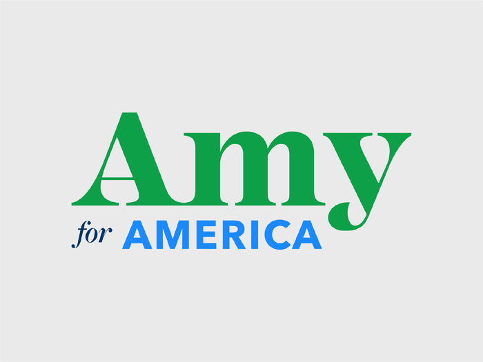
Average score: 3.8/10
Heller: 6/10 – "This has simplicity and grit. The lower case type is fine, but it really does not project presidential, more like Amy for congress."
Lupton: 5/10 – "It looks like she is running for president of her high school class."
Formosa: 3/10 – "A green 'Amy' and the logo’s typeface sends a message of friendliness – but not necessarily confidence in electing her as president of the United States. Friendly and approachable are good qualities, but they aren't everything. And for America' as a slogan? Not very catchy – I would hope all the candidates are."
Navitsky: 4/10 – "The ornate serif feels overly decorative and lacks credibility. This one seems to be trying a bit too hard."
Millman: 1/10 – "The color palette will wreak havoc on color-blind people."
Read more about Klobuchar's campaign here.
11. South Bend, Indiana Mayor Pete Buttigieg
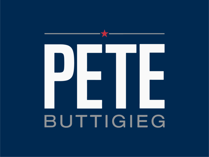
Average score: 4.2/10
Heller: 5/10 – "PETE does nothing. The star reminds me of so many others. He does not have a strong brand, whoever he is."
Lupton: 8/10 – "The regular guy vibe works, but underscoring his last name could pull the whole mark together."
Formosa: 4/10 – "First names seem to work better when the names are less common. It’s getting just fair grades from me on differentiation, impact, and trust."
Navitsky: 3/10 – "Mayor Pete is an impressive candidate, but his logo feels like a missed opportunity. It’s incredibly expected and underwhelming — not at all reflective of him as an individual."
Millman: 1/10 – No comment given
10. Hawaii Representative Tulsi Gabbard
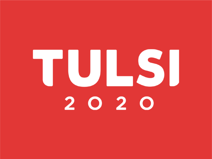
Average score: 4.4/10
Heller: 3/10 –"Mixed response. It is stark. Red is strong. But it says nothing. It could be a artisanal beer."
Lupton: 9/10 – "Wonderful letter-forms — bold and warm. The typeface makes the name visually memorable."
Formosa: 3/10 – "Especially at this stage in the election ... with [so many] Democratic candidates in contention, there is not enough being expressed in this logo to attract interest or graphically reflect anything about her views or personality. And I can’t get over the fact that it looks like a logo for a power tool company."
Navitsky: 4/10 – "The cuts in the 'i' and 't' don’t feel like they are adding any value to the overall logo, and I find them more distracting than anything."
Millman: 3/10 – No comment given
9. Motivational speaker and author Marianne Williamson
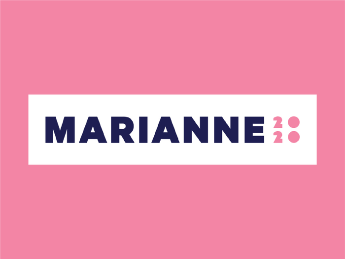
Average score: 4.5/10
Heller: 6.5/10 – "I have no idea who she is. Its pretty yet does not imply 'power' it plays off the pussy-hat movement. Too rarified. But soothing to the eyes."
Lupton: 6/10 – "Too girly."
Formosa: 1/10 – "This logo, with text saying 'Marianne 2020' isn’t conveying a lot of confidence. Pink can be a powerful color. It’s not very powerful here."
Navitsky: 6/10 – "I quite like that this identity feels so different from everything else in its approachability."
Millman: 3/10 – "Not a presidential logo, but points for pink."
Read more about Williamson's campaign here.
8. Former Colorado Governor John Hickenlooper

Average score: 4.7/10
Heller: 7.5/10 – "This is fine, but the mountains suggest his origins not the nation as a whole. It works better as a logo for candidate for governor."
Lupton: 6/10 – "The mountain metaphor overwhelms the candidate’s name."
Formosa: 4/10 – "The mountain symbols on a light blue background are fine if he wants to be president of Colorado, which in a sense he already is. But it doesn’t have the universal impact that it should, receiving low scores on impact and trust."
Navitsky: 5/10 – "This identity plays into a lot of tropes, but in a way that does feel fairly modern. Unfortunately, also a bit forgettable — the mountains are more memorable than the name."
Millman: 1/10 – No comment given
7. Former Housing and Urban Development Secretary Julián Castro
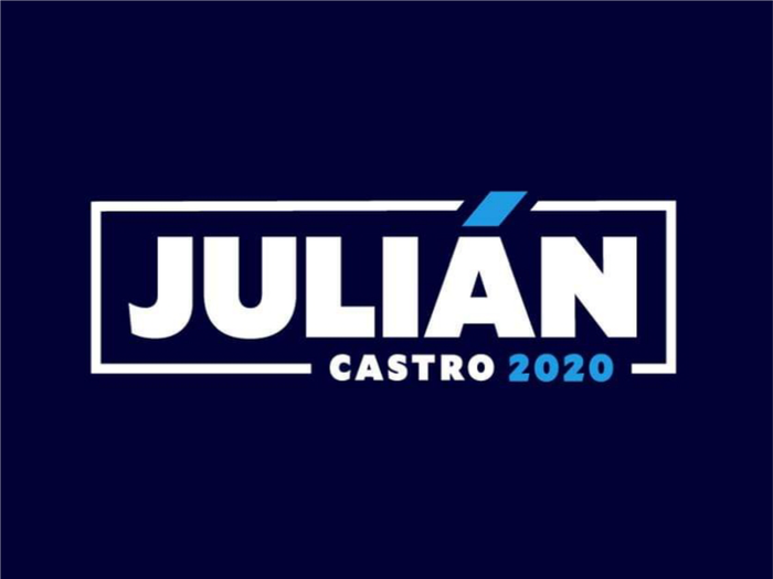
Average score: 5/10
Heller: 6/10 – "The accent mark is a nice touch. It suggest ethnicity. Nonetheless, I’m not crazy about the Castro element being so diminutive."
Lupton: 7/10 – "Matching up the accent on the Á with the blue 2020 creates a fresh rhythm."
Formosa: 4/10 – "Not hitting the mark on differentiation, impact or trust. And the size difference between his large first name and tiny last name is puzzling."
Navitsky: 7/10 – "I appreciate that Julián very intentionally played up his heritage. It feels authentically him, and effectively distinguishes him from the other candidates."
Millman: 1/10 – No comment given
Read more about Castro's campaign here.
6. New York Senator Kirsten Gillibrand
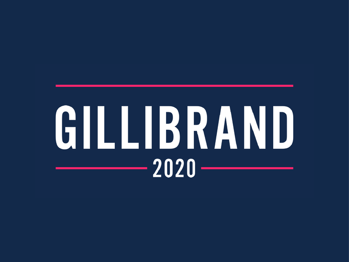
Average score: 5.5/10
Heller: 6/10 – "This is PETE with more 'national' color. It is also an echo of “Hillary” from last campaign."
Lupton: 8/10 – "Strong. Direct. No metaphors."
Formosa: 6/10 – "It’s military looking, could just as easily say 'Join the US Army.' As a personal identity it doesn’t reflect what I know of Kirsten Gillibrand."
Navitsky: 4/10 – "Simple. Direct. And that’s about it."
Millman: 2.5/10 – No comment given
5. Vermont Senator Bernie Sanders
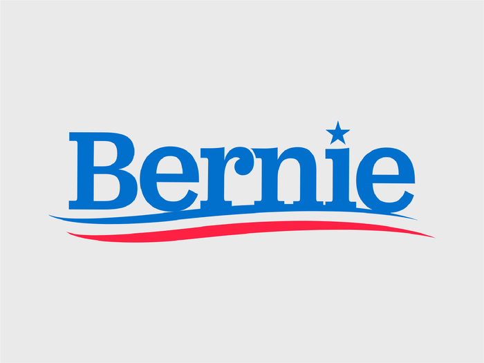
Average score: 6/10
Heller: 4.5/10 – "Old school, reminiscent of last campaign and not necessarily his own campaign."
Lupton: 8/10 – "Bernie is a brand. He can get away with using just his first name. The wavy gravy stripes and stars are superfluous."
Formosa: 7/10 – "Appropriate for Bernie, traditional red, white and blue with a 1970’s vibe. Difficult to rate this one, because it seems so appropriate."
Navitsky: 8/10 – "Although arguably traditional in its use of an approachable serif and the stars and stripes motif, there is something pretty iconic and memorable about the way all of these things come together. Though, I do wish his hair was incorporated in some way."
Millman: 2.5/10 – "Derivative of Obama’s in all the worst, laziest ways."
Read more about Sander's campaign here.
4. Massachusetts Senator Elizabeth Warren
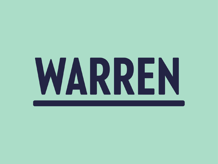
Average score: 6/10
Heller: 3/10 – "Wish it weren’t so wishy-washy. Fails to make any statement of either change or status quo. Bland."
Lupton: 8/10 – "Strong lettering with an American wood-type feel."
Formosa: 8/10 – "Simply 'WARREN' in all caps and underlined, on a mint green background, creates an instantly noticeable departure from the typical red, white and blue. Risky perhaps for traditionalists, but that may exactly be the point intended. True to her brand, it infers independent thinking."
Navitsky: 7/10 – "What’s most interesting to me is Warren’s use of mint. It feels like a step forward, but also feels trusting and established. It does a good job communicating her proven effectiveness as a leader."
Millman: 4/10 – "Kind of barren."
Read more about Warren's campaign here.
3. New Jersey Senator Cory Booker

Average score: 6.3/10
Heller: 9.5/10 – "To the point, vibrant, bold. I am mixed about the first name trope. I think BOOKER 2020 would work just as well if not better. Maybe the campaign should use both."
Lupton: 7/10 – "Too much emphasis here on 2020. First-name-only logo feels smug."
Formosa: 5/10 – "The logo is strong graphically, but rather generic."
Navitsky: 6/10 – "I wish he would have moved away from the traditional red and blue, but I think the bold and graphic use of color and typography is successful. It feels like it’s reflective of someone who will take action."
Millman: 4/10 – "As you would expect."
Read more about Booker's campaign here.
2. Former Texas Congressman Beto O'Rourke
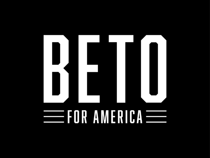
Average score: 6.5/10
Heller: 8.5/10 – "Stark, no nonsense but lacks charm."
Lupton: 9/10 – "Those crisp angular capitals are tall and handsome."
Formosa: 5/10 – "Strong graphic, puts him on a first name basis, but the black background is ominous. 'For America' is a lost opportunity for saying something meaningful."
Navitsky: 7/10 – "There’s something very refreshing to me about Beto’s identity and its use of black. It’s confident, direct, a little bit punk, and gives a window into his approach to candidacy."
Millman: 3/10 – "A missed opportunity for something more progressive."
Read more about O'Rourke's campaign here.
1. California Senator Kamala Harris
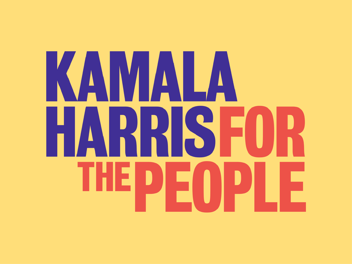
Average score: 7.4/10
Heller: 8.5/10 – "I like the typography and color very much. This is the most refreshing of the group, but I don’t think it is a logo. It is a headline. She needs a complimentary logo."
Lupton: 8/10 – "Great slogan. It’s brave to treat the slogan and the candidate’s name with the same scale and intensity. Colors are too Disney."
Formosa: 5/10 – "Kudos for breaking away from the standard red, white and blue motif, but also risky based on the purple/red /yellow colors chosen."
Navitsky: 8.5/10 – "What I find most successful about Kamala’s identity is that she’s giving her mission and initiative the same importance as her name. It feels like a movement. I also think the modern approach to the traditional red and blue and the use of yellow (positivity!) is something else that sets it apart from the rest."
Millman: 7/10 – "The only decent logo here."
Read more about Harris' campaign here.

Popular Right Now
Popular Keywords
Advertisement