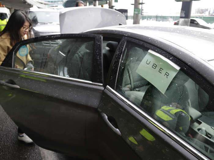
Uber just went public - here's what the app looked like when it first launched in New York City in 2011
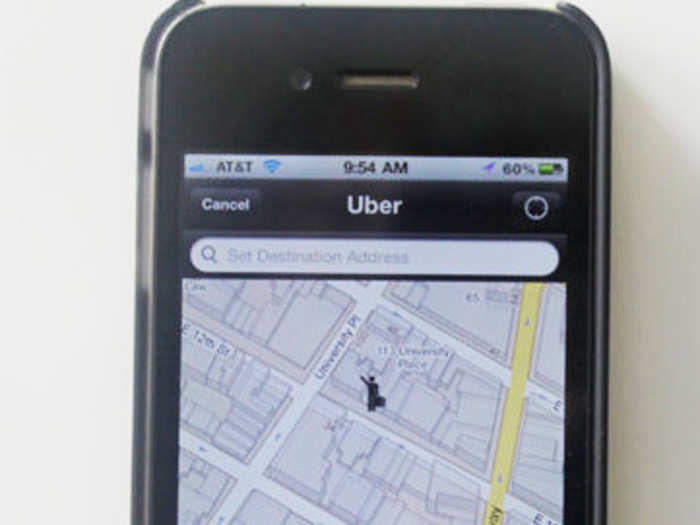
Here's what it looked like when requesting a pickup in Uber's app back when it launched in New York in 2011. The interface is much simpler, and the design language is completely different.

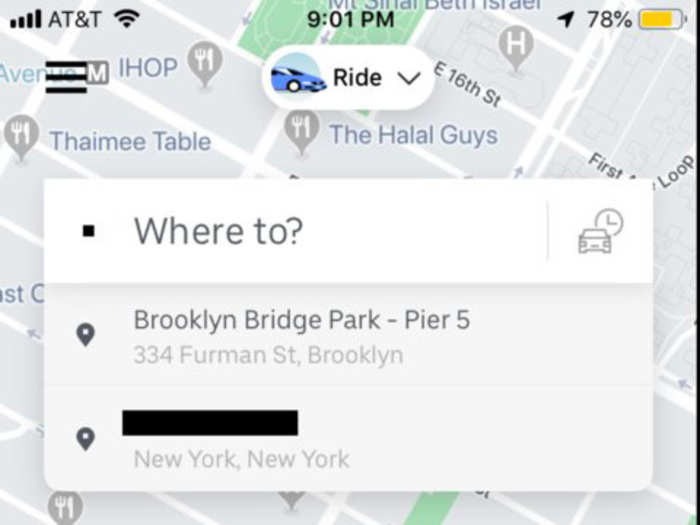
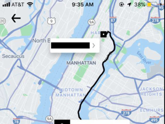
Now, here's the modern Uber app interface when requesting a ride. You'll notice the design is much sleeker and more detailed, and the app is able to display much more information at a glance.
For example, you can see how long it will take for the driver to arrive before you even place your request. The map is also much richer than it was eight years ago. Of course, improvements to Google Maps and Apple's iOS operating system have also contributed to the boost in the app's quality.
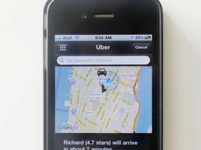
Here's what Uber's app looked like as it was locating the nearest driver back in 2011.
Today, Uber's app can display your other recent stops as you enter your destination. The map also provides an indication of how many Uber drivers are currently in your area.
While the old Uber app looks much more primitive and limited than today's version, it still prominently displayed information like the driver's name, star rating, and ETA.
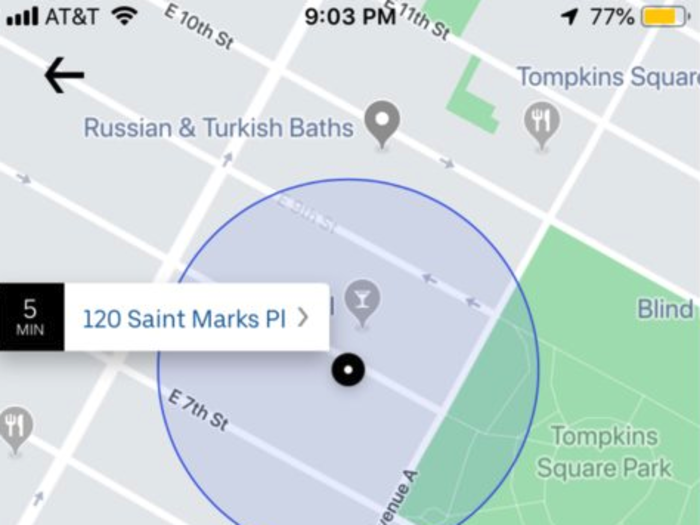
Here's another look at the modern app. In addition to displaying the amount of time it will take to arrive at your destination, it also shows the likely route.
But no matter what the app looks like, the basic idea hasn't changed in all this time: Push a button on your phone, get a ride.
Popular Right Now
Advertisement