- Home
- slideshows
- miscellaneous
- 'Today View' is the underutilized iPhone feature that mimics the best thing about Android phones
'Today View' is the underutilized iPhone feature that mimics the best thing about Android phones
"Today View" is where the iPhone houses widgets.

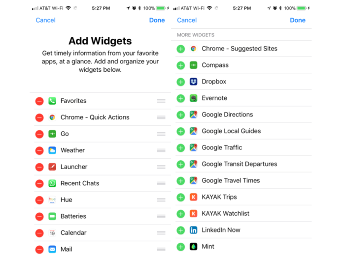
To change it around and see what's available to you, go to the bottom of that Today View screen and hit "Edit."

This brings you to the "Add Widgets" screen, where you can add, rearrange, or delete widgets. The apps at the top (on the left side of the above photo) are the ones that are on your Today screen already, and the apps at the bottom (the right side of the above photo) are the ones you have the option to add.
Some apps show up twice: one for each function. iCal, for example, has two widgets: "Up Next" tells you what your next appointment is, and "Calendar" gives you a snippet of your day (I much prefer the latter widget).
You'll notice on your Add Widgets screen that a lot of apps don't have widgets. There are a couple of ways around that.

Fortunately, iMessage is not missing from the available widgets— it's just in the Phone app's Favorites widget.
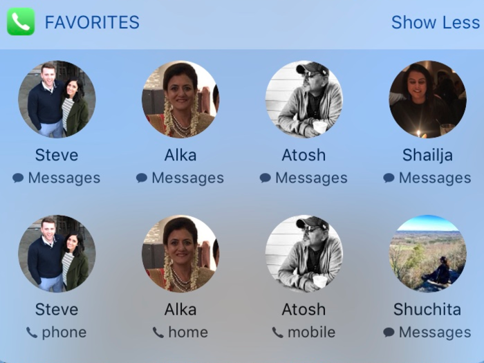
Once you've added the Favorites widget from the Add Widget menu, go to your Phone app's "Favorites" section. Hit the + icon in the top left and choose a contact to decide whether you want it to be a shortcut to text, call, email, or FaceTime them. Those icons will show up in your Favorites widget accordingly.
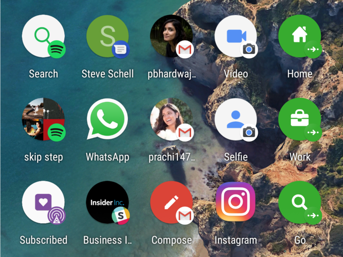
Unlike Google's Pixel phone, the iPhone doesn't let you create shortcuts for group conversations. It also doesn't let you make a comprehensive shortcut for a single contact so that you can access multiple methods of communication for one person with one tap.
As you can see, I had to add messaging and calling separately for each of my favorite contacts, but it gets the job done. Hit "Show Less" to take up less space on the screen.
For some of the other shortcuts that are missing from the menu, you can download the free version of Launcher App.

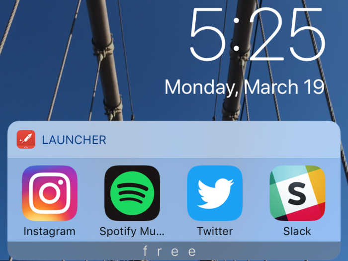
Download and open the Launcher app to choose how to fill your seven free spaces — the Launcher App loads those in its own Today View widget.
The free version gives you minimal flexibility with third-party apps, but it still gives easy access from your lock screen to the apps that you want to get to quickly (e.g. social media).
In addition to providing shortcuts to apps, the free version of Launcher App also lets you make shortcuts to contact someone (call, email, FaceTime, and messaging are all available) in case you need more room for those.
TL;DR: The iPhone has a widget system that you should absolutely use — but go into it knowing that it's going to be more limited than Android's level of customization.

For one thing, the iPhone stacks all of your widgets on top of each other, meaning the more you have, the more you have to scroll to use reach the ones at the bottom. I find myself having to rearrange them often since the setup requires you to prioritize. Meanwhile, Android's widgets are much smaller and can be placed freely, meaning you can choose to see them all at once, or group them on separate screens.
Also, the apps that do have widgets don't have as many action options as Android phones do. There isn't one for Gmail on the iPhone, for instance, so I have to rely on Apple Mail's widget. I also missed having a shortcut for my go-to Spotify playlist and one for my work Slack channel, like I did on the Pixel.
One thing in favor of Apple's version is that it gives you access to the widgets right from your lock screen, while Pixel requires you to log in. To open the app on the iPhone, you'll still have to log in, but for quick view ones like weather or your calendar, it's all right there with a swipe of a finger.
Popular Right Now
Popular Keywords
Advertisement