The best and worst Easter eggs and hidden meanings in 20 company logos
FedEx made the original Easter egg logo.
Amazon is another well-known one.
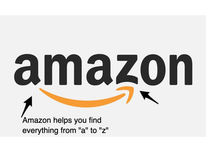
Millman's rating: 8/10
"It's a nice, sturdy, fun, and somewhat whimsical example. It becomes a precursor to not only having everything, but also eliminating everybody else."
Gillette's hidden meaning is more subtle.
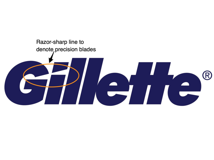
Millman's rating: 7.5/10
"I think that this is more of an inside job. It's just a nice, clever little touch. I don't think it communicates anything more than that. It's an Easter egg."
Hershey’s Kisses feel forced, according to Millman.
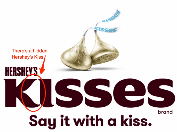
Millman's rating: 5/10
"The problem that I have with this logo is the proportion of the letterforms. I think in order to force-fit a secret message into the 'kisses,' the proportion is off. So what they gain in having the kiss there, they lose in the proportionality of the letterforms, which just feels very forced."
Toblerone makes chocolate, which makes for playful branding.
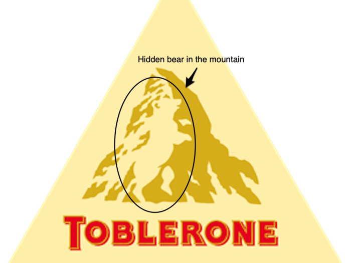
Millman's rating: 7/10
"It's cute. I don't think it's particularly well-drawn. It's a little clunky, but I don't think it's egregious. I think the typography is really in need of a redesign. I mean, how many shadows can you put in one logo?"
Sony VAIO's logo is meant to represent the transition from analog technology to digital.
Millman's rating: 8/10
"I think that this is gorgeous. My only criticism of this is the 'I.' It has that weird curve to it, that I felt took it away from being perfect. It's superfluous."
Le Tour de France, the prestigious cycling marathon, has been embroiled in doping scandals for years.
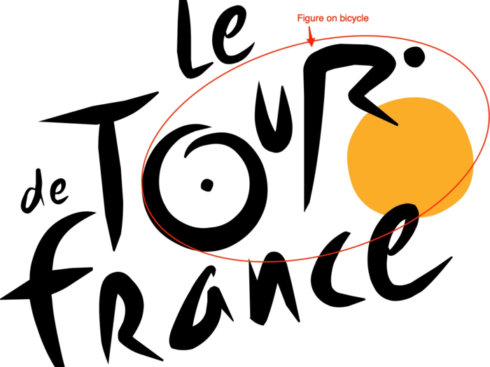
Millman's rating: 5/10
"I just find the whole thing to be rather clunky and too obvious. It's just a mess. It's really poorly drawn. It's really hard for me to separate the brand from the behavior."
In this year's Tour de France, the US team, EF Education First, is among the favorites for first place.
Kolner Zoo hides animals as well as a cathedral in its logo.
Millman's rating: 4/10
"That elephant looks like an anteater. It's really, really poorly drawn. The star for the eye — the whole thing feels really forced and unfortunate."
Northwest Airlines is now defunct, but the logo is still remembered.
Millman's rating: 2/10
"It's just too close to the band NWA, too unoriginal. I would've imagined that if they were still in business they would've redesigned."
Goodwill's logo grew on Millman over time.
Millman's rating: 8/10
"It's really well-proportioned, it's clever. I don't love the overall identity of the brand, but I love the way it's executed. I don't love the cuteness, but as a cute, happy logo, I think it's really good."
The Sun Microsystems logo had very high points and very low points for Millman.
Millman's rating: 2/10
"How many times do you need to say 'sun'? I don't mind the cube — that actually works. What ruins it for me is the 'Sun microsystems' iconography."
Baskin-Robbins employs a nauseating color scheme that Millman hated.
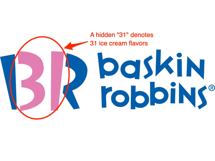
Millman's rating: 0/10
"Jones Knowles Ritchie, who recently redid the Dunkin' identity, please redesign the Baskin-Robbins identity. I'm pleading with them to hire Tosh Hall, the creative director of JKR. Please redesign this."
The Guild of Food Writers was another one of Millman's favorites.
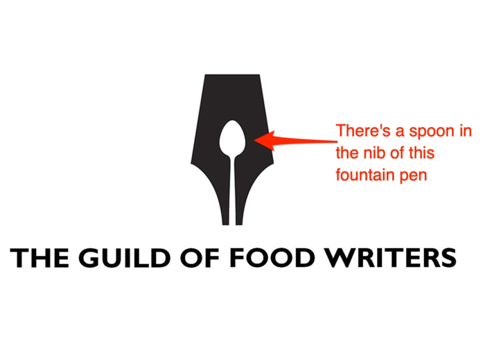
Millman's rating: 9/10
"I love this. I think it's a perfect execution. It's elegant, it's simple, it's not completely hitting you over the head. It's just a really elegant and charming logo."
Although Millman loved the logo she was not a fan of the tapering spoon — she wanted its lines to be parallel.
The Bronx Zoo's logo was particularly bothersome for Millman, who had just seen real giraffes on a trip to Tanzania.
Millman's rating: 6/10
"The birds really bother me. They feel like vultures. And proportionally, the whole thing just feels really off. It doesn't make any sense to me. Why are they so high above the skyline? I also think that the typography is disproportionate to the width and the presence of the animal. The proportions of the giraffes are off, the proportion in relation to the presence of the animals is off."
Pinterest's logo is meant to hide a pin, but to Millman the "P" barely resembled one.
Millman's rating: 3/10
"I think it's too obvious and not obvious enough, if you know what I'm saying."
Millman reviewed Codefish's original logo (left) but preferred the newer one (right).
Millman's rating: 3/10
"I feel like it's clunky and awkward."
Millman found a collection of fish-inspired logos and preferred the first one on the list over both Codefish logos.
Cisco's logo is a nod to its tech and local heritage.
Millman's rating: 8.5/10
"I like it. I think that it's super simple. I like that it reminds you that the word 'Cisco' came from the word 'San Francisco' in a nice and not overly-obvious way. "
Tostitos infuriated Millman.
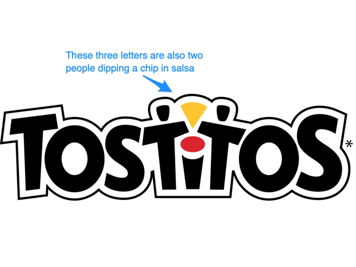
Millman's rating: 1/10
"Right up there with Verizon for the worst logo of all time. I think the Tostitos logo is a disaster. Everything about it is just embarrassing. It's a forced image of a strange bowl. It's terrible."
The Pittsburgh Zoo's logo, much like the other two zoos on the list, used animal silhouettes in its logo.
Millman's rating: 3/10
"I don't understand why all of these zoos are trying to create double entendres. This one looks like an alien movie poster where [the gorilla and lion] are about to have a fight. And what's with these birds on the top? I also think the kerning between the words 'Pittsburgh' and 'Zoo' is so big you could park a car through it."
The London Symphony Orchestra (LSO) logo was Millman's favorite.
Millman's rating: 10/10
"One of the nicest and most lyrical logos I've seen in a long time. This feels like it was really intentional and very craftily and artistically made."

Popular Right Now
Popular Keywords
Advertisement