- Home
- slideshows
- miscellaneous
- Striking maps show how race keeps kids from climbing the economic ladder across the US
Striking maps show how race keeps kids from climbing the economic ladder across the US
Striking maps show how race keeps kids from climbing the economic ladder across the US

Striking maps show how race keeps kids from climbing the economic ladder across the US
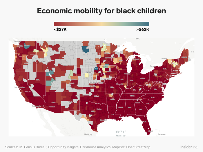
These results change drastically when we filter for black Americans who grew up with varying income levels. The map becomes a sea of dark red, with only a few blips of orange, yellow, and blue. The few exceptions are neighborhoods in Utah, Washington, Iowa, and the Dakotas, though each of these states displays its fair share of red.
This means that black Americans saw lower levels of economic mobility across many neighborhoods in the US, regardless of whether they grew up poor, wealthy, or middle-income. Even when we filtered for income level, there was little variation in the map's colors. The researchers determine that these lower levels of mobility apply predominantly to black men.
Striking maps show how race keeps kids from climbing the economic ladder across the US
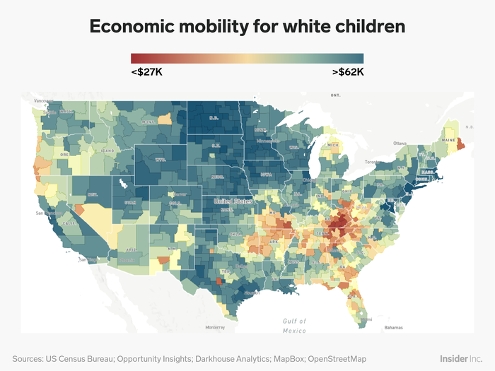
The map for white Americans who grew up with varying income levels is almost the exact opposite: It's covered in shades of blue, with sparse patches of yellow and orange (levels of economic mobility that are close to the nationwide average).
For the most part, neighborhoods where white Americans grew up to have particularly low levels of economic mobility are located in Kentucky. By contrast, New England and the Great Plains saw the darkest shades of blue, along with select areas of Texas and California.
This data changes when we filter for childhood income levels. When we look at white Americans who grew up poor, the map becomes mostly red. But when we consider white Americans who grew up wealthy, it transforms into a giant stretch of deep blue.
Striking maps show how race keeps kids from climbing the economic ladder across the US
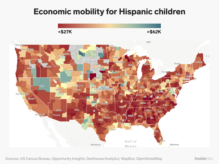
The map for Hispanic Americans is mostly orange, with a large swath of red along the South. While Hispanic children from high-income neighborhoods seem to have a better chance at moving up the economic ladder than black children, for the most part their mobility levels are commensurate with their socioeconomic status growing up.
Striking maps show how race keeps kids from climbing the economic ladder across the US
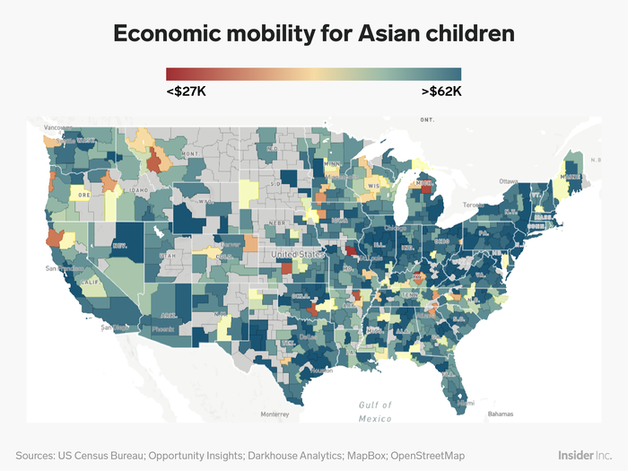
Asian Americans, on the other hand, have consistently high levels of economic mobility. Even Asian children from low-income families often out-earn their white counterparts.
Although this map is not quite as robust as the map for white Americans, it, too, is covered in shades of blue. Neighborhoods where Asian Americans saw the most economic mobility are located in the Rust Belt, a region in economic decline.
Striking maps show how race keeps kids from climbing the economic ladder across the US
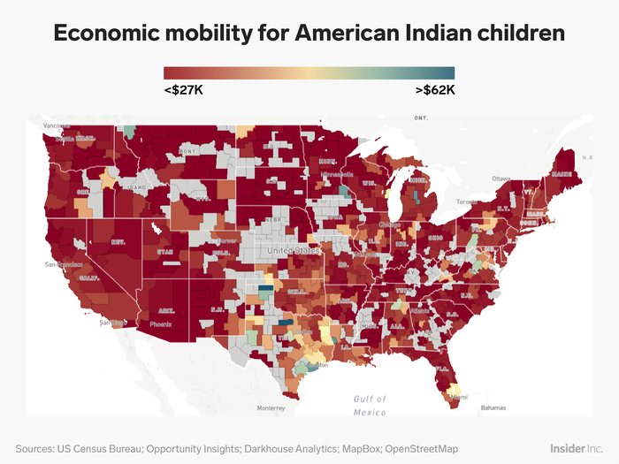
No group was more disadvantaged compared to the national average than American Indian children. Almost the entire map is covered in red, and there are even fewer patches of yellow, orange, and blue compared to map for black Americans.
That said, American Indians had a slightly better chance of improving their economic condition if they were raised in a high-income household.
This suggests that, of all the children represented in the project, black males face the most persistent obstacles to climbing the economic ladder.
Popular Right Now
Popular Keywords
Advertisement