- Home
- slideshows
- miscellaneous
- Samsung's new Galaxy S10 is almost a master class in how to make a superb, premium smartphone
Samsung's new Galaxy S10 is almost a master class in how to make a superb, premium smartphone
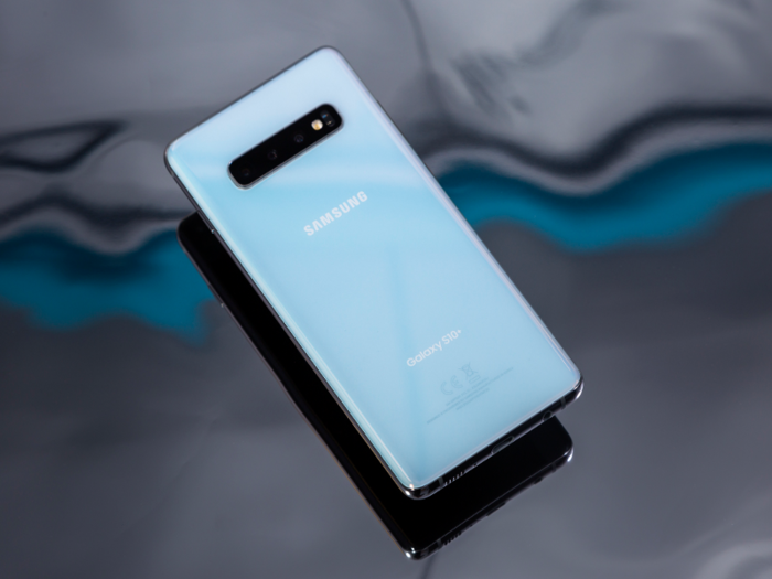
There's no doubt this is the best-looking smartphone Samsung has made so far — at least without a case.

The hole-punch is better than the notch.
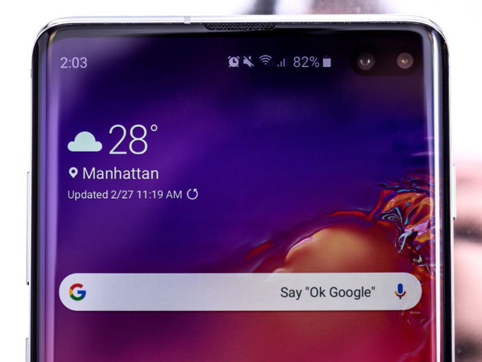
I don't really have any issues with the divisive display notch, but if I had to pick, I'd go for the hole-punch design over the notch.
The hole-punch design for the selfie camera(s) looks and feels far more efficient with the space it uses up than a typical notch used on the iPhone XS and other Android phones. There's no wasted screen space at all with the hole-punch design, and it isn't as noticeable in everyday usage.
And the hole-punch design doesn't interrupt the display's top edge, which makes for a solid rectangular display shape that complements the Galaxy S10's utterly narrow bezels.
The display is fantastic, but I don't really see the added benefits of Samsung's new "Dynamic AMOLED" display that's supposedly better than previous Galaxy displays.
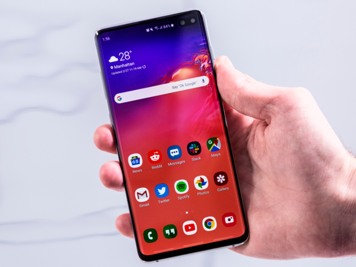
The Galaxy S10 touts a "Dynamic AMOLED" display that supports HDR10+ and it looks great, but I haven't noticed much of a difference from the Galaxy S8 or S9. You get the same 1440p resolution as previous Galaxy phones (but the resolution is set to 1080p by default, also like previous Galaxy phones). Colors might be slightly more vibrant and rich, but it's nothing to write someone with a Galaxy S8 or S9 about.
The HDR10+ support only works with content that supports HDR10+ itself, and I don't really encounter much of that on a daily basis. And personally, I don't get the hype of HDR on videos. I've tried to understand how it looks better than non-HDR content, and I just don't see it. Perhaps I'm HDR-blind.
The Galaxy S10 works great out of the box with the latest processor and Samsung's new One UI.
The Galaxy S10 works like any new phone that comes with the latest processor should. It's fast and fluid while running and switching between apps. But I've also noticed fewer stutters compared to previous Galaxy phones, which could be attributable to the generous 8GB of RAM that comes standard on the S10 and S10 Plus, as well as Samsung's new One UI interface that runs on top of Android to make the S10 fell more ... Samsung-y.
With that said, Samsung's One UI makes the S10 look and feel less like a Samsung phone and more like an alternative version of Google's own Pixel UI from its Pixel phones. In my mind, that's a good thing.
Despite One UI's resemblance to Pixel UI, there's no guarantee that you'll get updates as quickly or often as Google's own Pixel phones. Samsung is notoriously slow in delivering updates, at least for new versions of Android.
Samsung (or any other tech company) hasn't reinvented the battery yet, so there's nothing significant to report on battery life other than that it's good.
You'll get comfortable battery life with the Galaxy S10, and it could even last into a second day without much issue, especially if you keep the display's default 1080p resolution and use wallpapers that have a lot of black that prevent the screen from using power. Setting the S10 to Night Mode, which makes the notifications shade and settings menu all-black, also helps with battery life.
To give you an idea, I was averaging about 30% remaining battery life after 24 hours between charges, including regular daily usage and not charging overnight.
Reverse wireless charging, or "Wireless PowerShare," is there if you need it. But I haven't run into a situation where I've needed to use it.
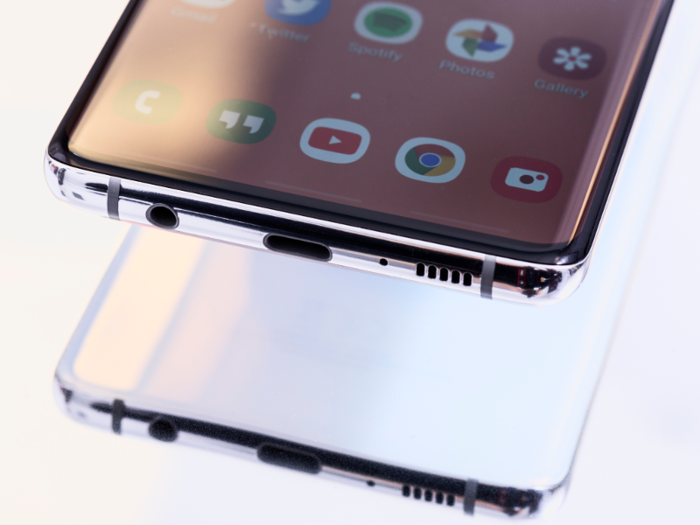
The best use for reverse wireless charging is to charge wireless accessories, like Samsung's new wireless Galaxy Buds.
Otherwise, this is a feature that largely benefits your friends or family with low smartphone batteries. They'll get a battery top-up while you sit there unable to use your phone because it's charging someone else's phone. I suppose it can be a good jab towards your iPhone-toting friends, as their iPhones would be getting rescued by a Samsung/Android phone.
It's the kind of feature that you might never use during the lifetime of the Galaxy S10, but it doesn't make the phone any worse at all. It's nice to have, I suppose.
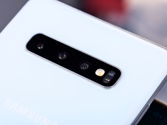
The camera is great, and I love the new ultra-wide angle camera that Samsung added for the first time.

As usual, Samsung's latest smartphone takes great photos, and the addition of the third ultra-wide lens is great. I've been taking regular photos and following them up with ultra-wides, and I'm always happy I did.
With that said, the ultra-wide camera hasn't quite become my default camera due to the slight fish-eye effect, where straight edges tend to bow inwards towards the center of the photo.
You can check out more photos taken by the Galaxy S10 Plus compared to the Pixel 3 here.
It takes good selfies, too, but Samsung wasted a huge opportunity to do something special with the dual-lens selfie camera on the Galaxy S10 Plus.

No problems with regular selfies here, except Samsung could have given the S10 an ultra-wide selfie camera.
There's a dual-lens selfie camera on the Galaxy S10 Plus, but one of the lenses is just a depth sensor for better portrait mode shots, which is disappointing. The Galaxy S10e and Galaxy S10 can do portrait mode shots with a single selfie lens, so it seems a wasted opportunity to dedicate a secondary lens for something that a single selfie camera can already do.
What's worse is that the Galaxy S10 Plus and its depth sensing lens don't take perfect portrait mode shots. I've seen parts of my hair or headphones being blurred out as if they were part of the background when they shouldn't have been. You can see what I mean in my photo comparison between the Galaxy S10 Plus and the Pixel 3.
There is a slightly wider selfie option in the Galaxy S10 phones, but it's barely any wider than regular selfies.
I found that I ended up using the less secure facial recognition 90% of the time over the fancy new ultrasonic in-display fingerprint sensor.
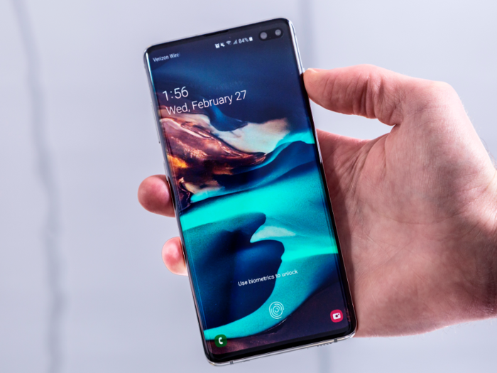
Samsung's ultrasonic in-display fingerprint sensor itself is pretty good, and it works when your thumb is wet or dirty unlike the OnePlus 6T's in-display fingerprint sensor. I only say "pretty good" because it simply refuses to register my fingerprint while I'm in bed, for some reason.
There is one thing that significantly slowed down the unlocking process, to the point that I simply used the faster facial recognition most of the time: I had trouble with consistently hitting the scanning area with my thumb. It takes forever for the fingerprint symbol to show up after picking up the phone, even with the always-on display feature turned on. Muscle memory works most of the time, but not so much in the dark, at least with the Galaxy S10's in-display sensor.
So far, the OnePlus 6T still has the better in-display fingerprint experience. The fingerprint symbol appears immediately when I pick up the phone, and I immediately know where to place my thumb.
Thankfully, that's something that can easily be fixed with a software update, and I hope adding fingerprint sensor guides gets on Samsung's list of things to improve.
One thing about in-display sensors in general: Having to look at the phone — even with muscle memory — to make sure I'm placing my thumb in the right place makes the unlocking process feel slower than using the good old-fashioned capacitive fingerprint sensors. With the Pixel 3 and other phones that use capacitive sensors, I can pick them up and feel exactly where I need to put my finger without looking, and they feel faster to unlock as a result. There's just no physical guide or feedback for where you should put your thumb on phones with invisible sensors.
In-display fingerprint sensors may not be as picky with the dryness or cleanliness of your fingers, and it's really nice to have the sensor on the front of the phone again, but it does feel like one step forward and one step back.
Samsung also missed an opportunity to do something fresh with the included fast charger.
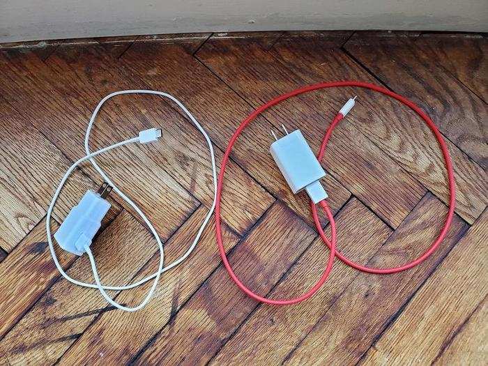
The Galaxy S10 comes with the same stale fast charger and cable the company has been using for years. It feels cheap and flimsy compared to the $550 OnePlus 6T's charger, which costs hundreds less than what Samsung's asking for the $900 Galaxy S10 and $1,000 Galaxy S10 Plus.
I suppose I'm grateful that Samsung includes a fast charger with its phones, since Apple makes you buy separate accessories for fast charging. And the cheap-feeling charger isn't a deal-breaker by any means. Still, after using the OnePlus 6T and its charger for a few months, it felt like Samsung could do better here, especially when you're spending so much on a premium luxury device.
The biggest shame is that Samsung is reserving its new, faster 25W charger for the Galaxy S10 5G. After using the OnePlus 6T McLaren Edition's 30W charger, Samsung's regular 15W fast charging feels slow — including the S10 5G's 25W charger with the Galaxy S10 would have differentiated the Galaxy S10.
My only other complaint is nitpicky: The power button is positioned directly in line with the volume up button on the other side of the phone, and it's led me so take numerous accidental screenshots.
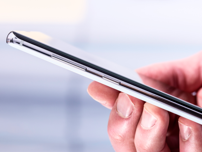
It's not a deal-breaker, but the power button is positioned way too high up on the Galaxy S10 Plus's right edge. It's a reach to press it, and it lines up with the volume up button on the other side of the phone, which led me to take many accidental screenshots when I'm trying to lock the phone.
This wasn't an issue on the Galaxy S9, where the power button was much further down the phone.
Yay or nay?
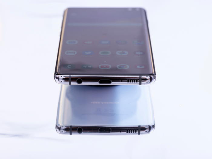
There's a lot that's new with Samsung's Galaxy S10, which makes the S10 phones feel like an overhaul over previous Galaxy S phones and less like an incremental update like the S9 did compared to the S8. At the end of the day, it's very much a Samsung phone that employs Samsung's familiar formula with a few little extras and updates that make a big difference, and that's a good thing.
You get one of the best designs and displays in the smartphone business, and the ultra-wide camera is a killer feature that previous Galaxy phones don't have. The regular camera is pretty great, too!
One of the main disappointments here is the in-display fingerprint sensor, at least in its current state, where it's hard to use because there's little visual feedback as to where you should actually put your thumb.
It's also a huge shame that Samsung decided to dedicate an entire selfie camera on the Galaxy S10 Plus for depth-sensing when it could have added an ultra-wide selfie camera.
Still, it's a definite "yay" for the Galaxy S10, despite issues with the in-display fingerprint sensor and the lacking ultra-wide selfie camera.
Popular Right Now
Popular Keywords
Advertisement