- Home
- slideshows
- miscellaneous
- I visited Ikea's new Manhattan location - and it was like nothing else I've seen from the retailer
I visited Ikea's new Manhattan location - and it was like nothing else I've seen from the retailer
The Ikea studio is located on Third Avenue, between 60th and 59th Streets on the Upper East Side.

The space used to be an Urban Outfitters, and it's situated right across from a Bloomingdale's. The exterior now boasts that unmistakable yellow-and-blue branding.

But this isn't a regular big-box Ikea store. You're not going to be seeing families hauling dressers and tables out the door ...

... and it's not a place where shoppers are going to roam for hours, stopping only to partake in a meal of Swedish meatballs. This is a planning studio

This is the first Ikea planning studio in the United States. Ikea has opened similar centers in major cities like London and Moscow, and the next one is slated to launch in Paris.
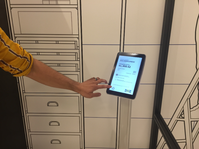
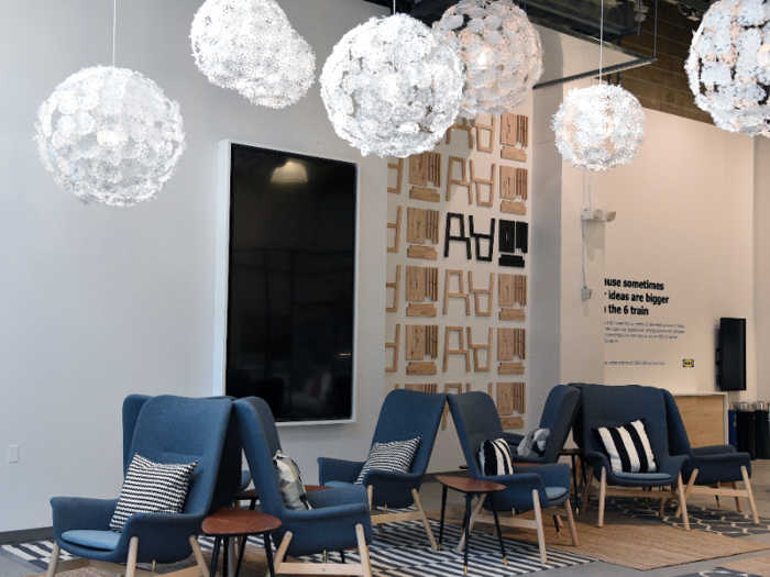
The lobby features plenty of tablets and two stations, representing kitchens and all other rooms. My first tour guide said that Ikea's planning studio has been tailored to allow busy visitors to move through the studio at their own pace.
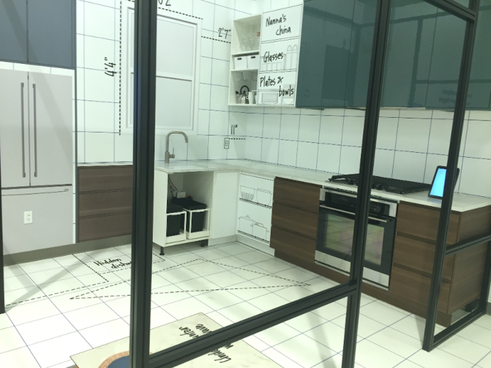
You can schedule an appointment for a free one-on-one session online, opt for a walk-in, or just browse. But the quiet and relatively spacious lobby is your entry point into the rest of the studio.
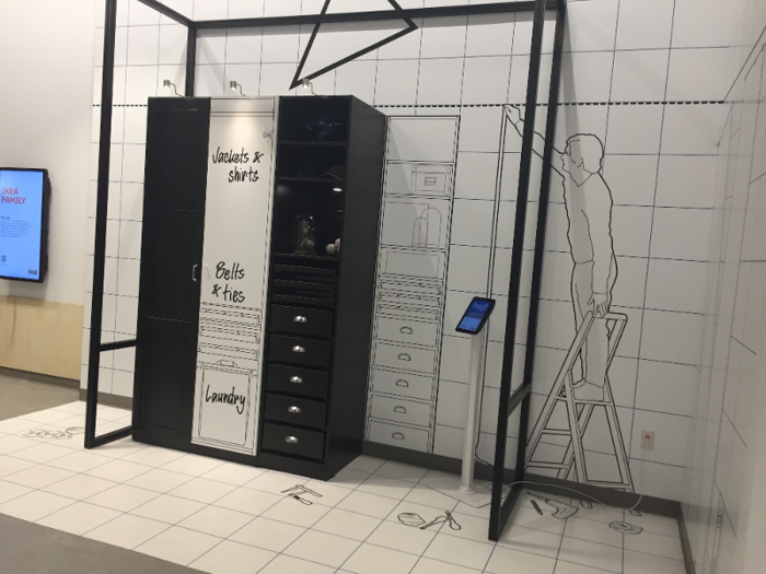
Upstairs, Ikea will showcase exclusive collections and pieces that aren't yet available for sale online or in stores.
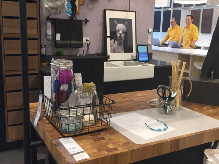
Visitors can walk through several model homes, which are all based on the lodgings of real-life New Yorkers.
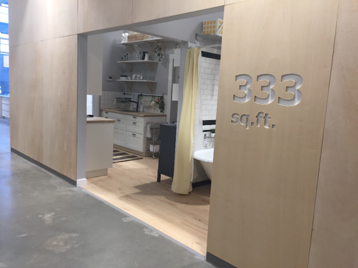
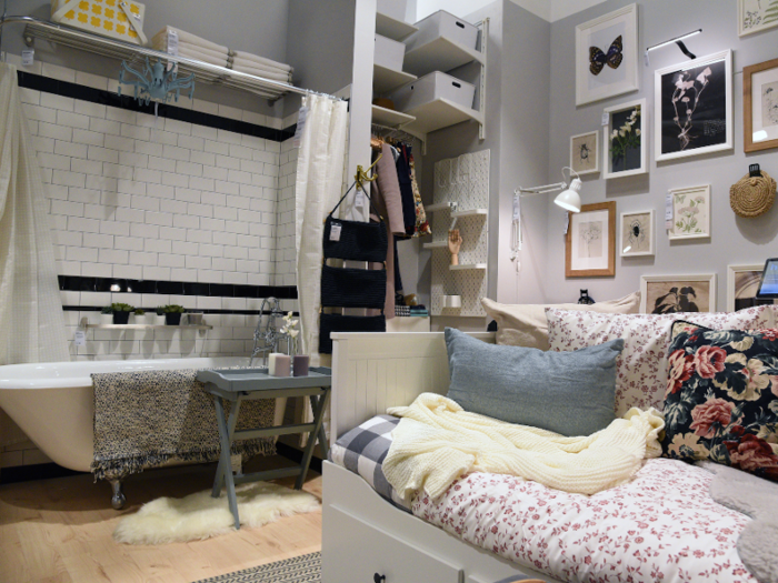
This model studio apartment — complete with the not-unheard-of New York City feature of a bathtub in the living room — represents the real floor plan of a Manhattanite renter.
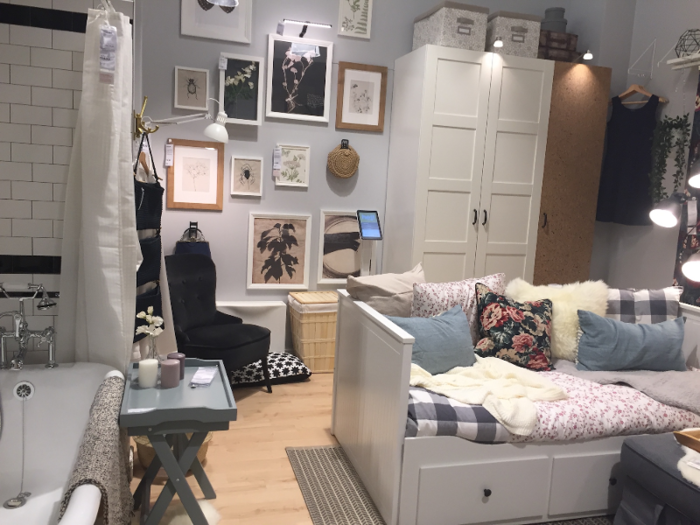
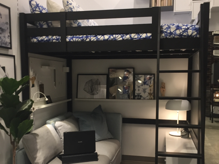
The model showcases how different Ikea products offer space-saving solutions, like customizable shelves, wheeled trays, and accessories that can be easily assembled and disassembled to accommodate moves.
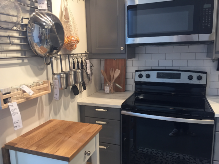
The apartment also featured a small kitchen — my second tour guide told me that Ikea had found that the average apartment kitchen has eight cabinets in New York City — and a bathroom.
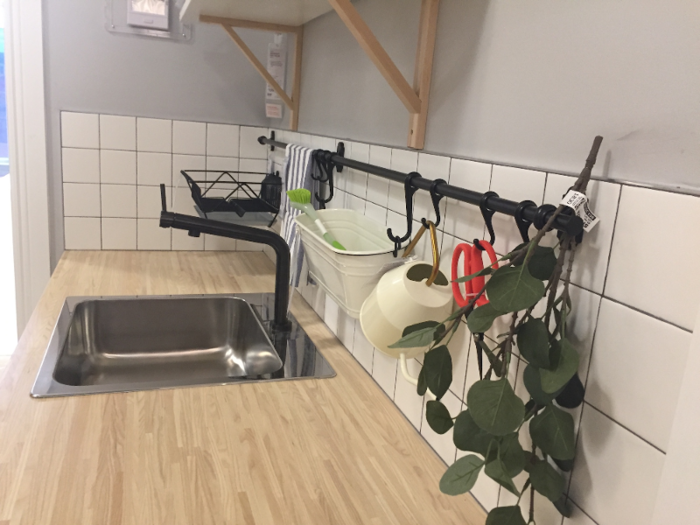
The tour guide also noted that Ikea approached this space with the idea that renters can't undertake substantive remodeling projects.
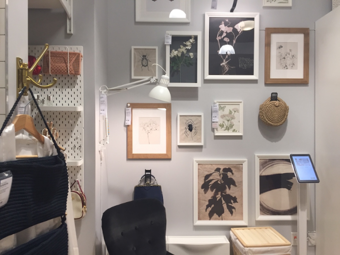
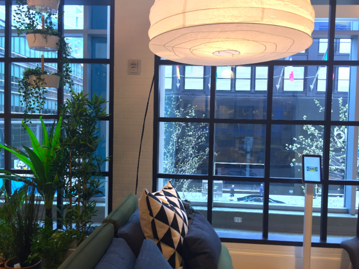
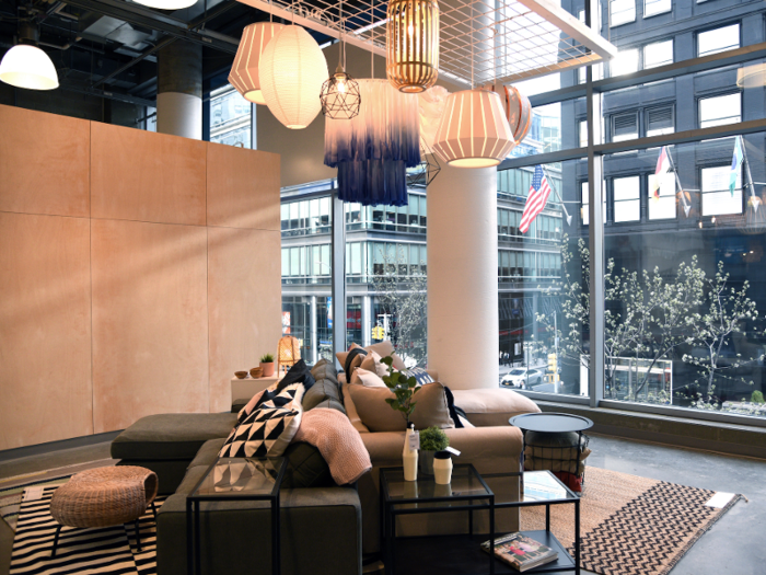
The next model apartment was bigger, with massive windows.
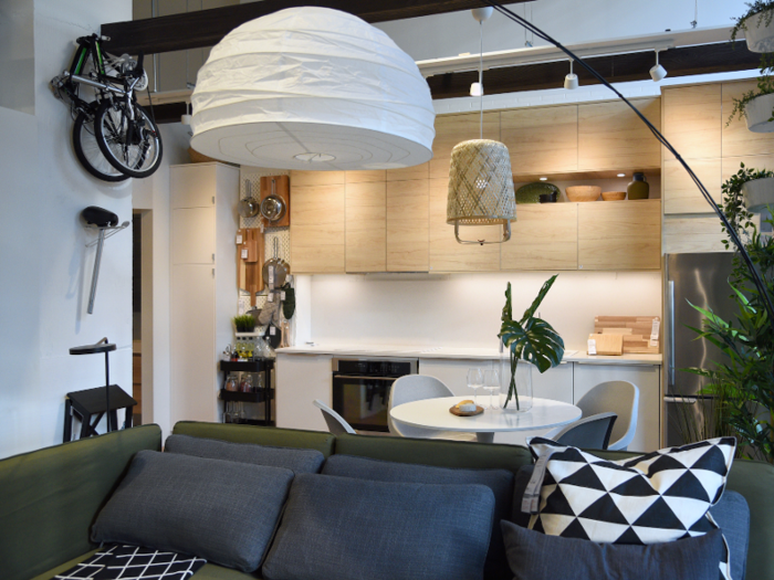
Ikea recreated the floor plan of a couple that lives in an apartment featuring a multi-purpose living and dining space.
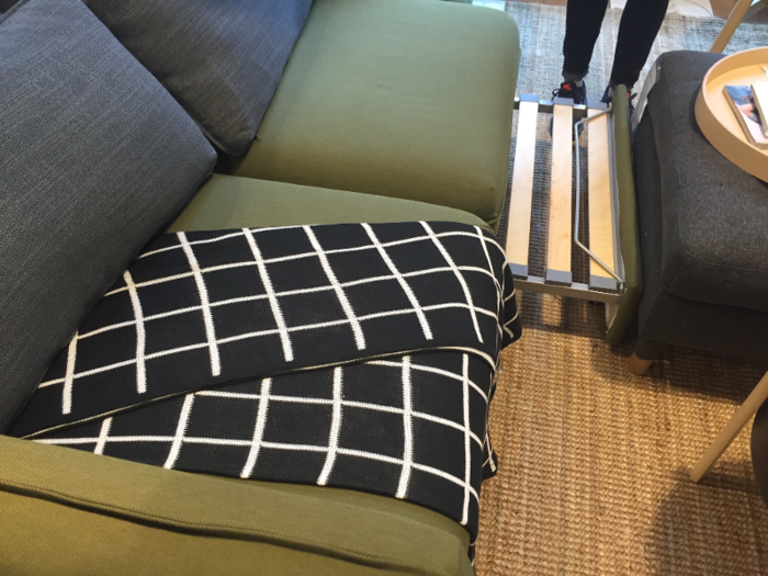
My tour guide noted that this couple saves space with a sofa that doubles as a pullout bed.
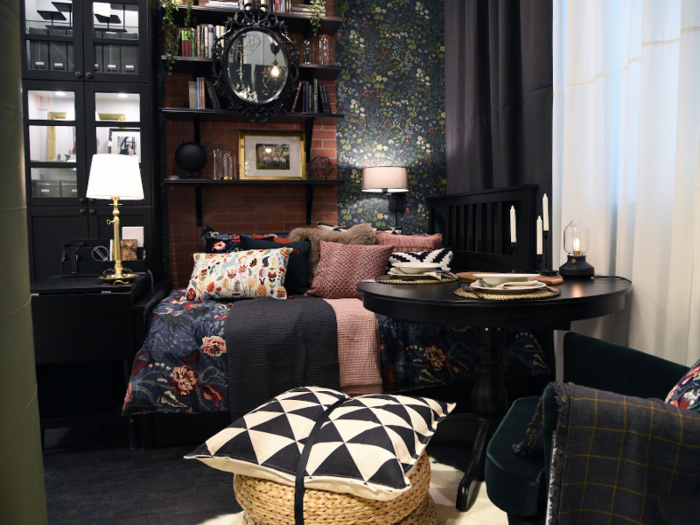
And the final full-fledged model was based on a pair with "maximalist" tastes, preferring to showcase their various valuables in an apartment with limited space.
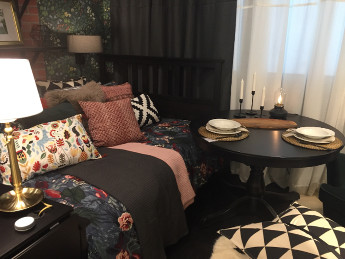
Creative shelving and furniture that doubled as storage containers helped this apartment avoid clutter.
I headed down the stairs to meet my final tour guide. He noted that the studio's downstairs area provides a quiet, calm space for shoppers to consult with Ikea coworkers or plan their rooms solo.
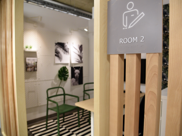
It's got a few different alcoves for shoppers who'd prefer to plan in private ...
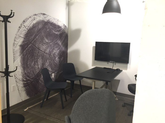
... as well as plenty of computers. Shoppers can play around with Ikea's room-planning online features, which are also available on the furniture retailer's website.
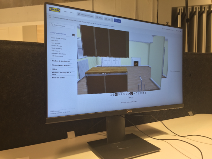
The studio was dotted with touch screens, allowing customers to look up different Ikea products.
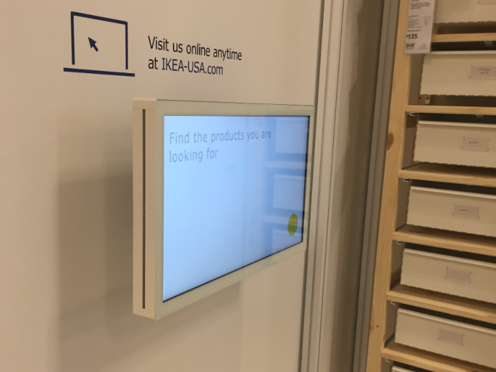
As I made my way around the studio, guided by different employees, a few themes began to emerge.
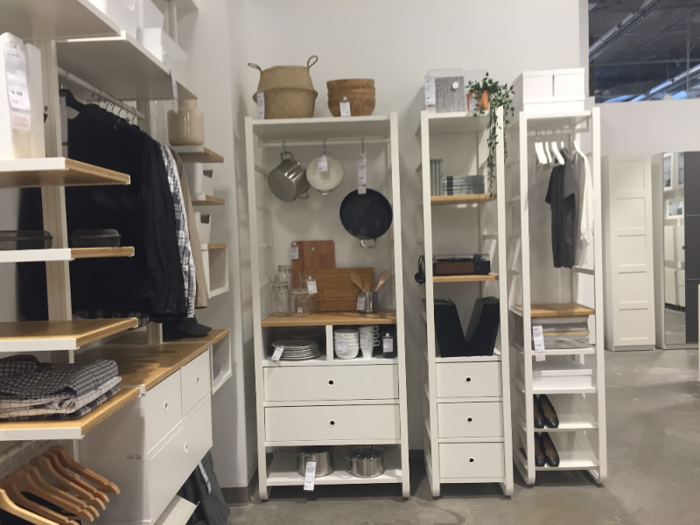
The featured rooms, products, and organizational systems were tailor-made to meet several concerns common among people living in New York City.

Namely, a lack of space ...
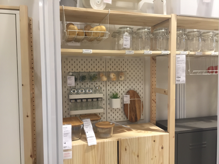
... and a shortage of time.

Green Sykes told Business Insider that the studio features solutions specific to "people who live in small spaces."
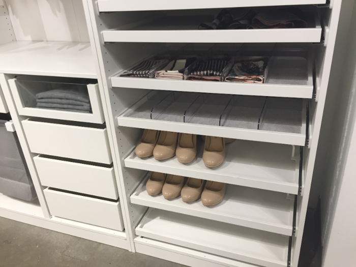
Ikea's new planning studio addressed the issue by showcasing customizable shelving ...

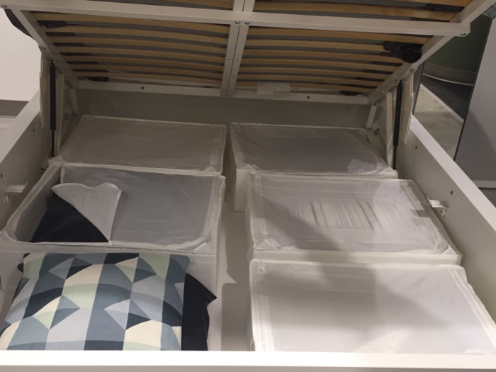
... couches and beds that doubled as storage containers ...
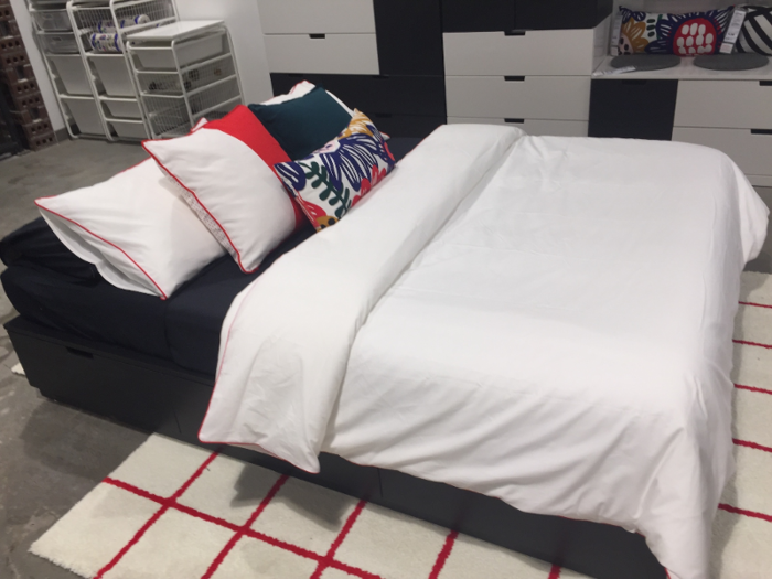
... even pieces that provided access to stored items without having to pull out drawers in a cramped space ...
... a range of Ikea's organizational systems ...
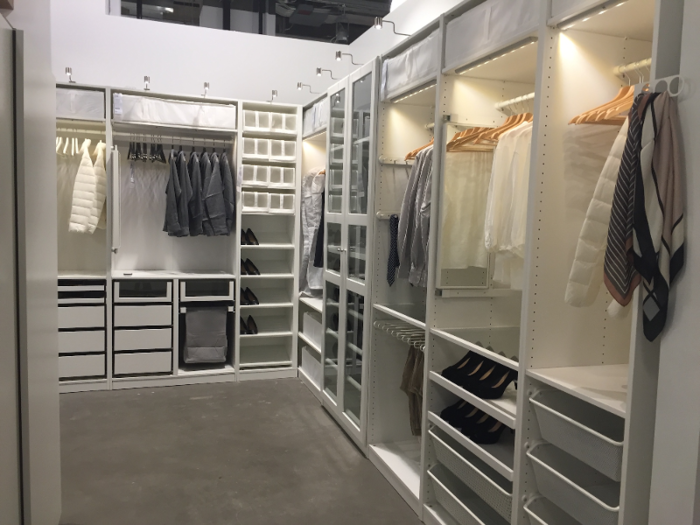
... and furniture laid out in a way that encouraged visitors to think critically about how to maximize their space.
The furniture retailer also designed this planning center with the average "time-starved" New Yorker in mind, according to Green Sykes.
"Hopefully this provides more accessibility to Ikea because they can get to it easier," she said.
"They can come in and they can shop on their own, but if they'd like some individualized attention, to plan whatever their project is, they can get that," Green Sykes said. "They don't have to worry about taking the product on the train or walking out with lots of bags, because we can deliver it for them."

"The idea is around creating greater convenience and realistic solutions," she said.
Popular Right Now
Popular Keywords
Advertisement