- Home
- slideshows
- miscellaneous
- Everything I loved and hated about using HTC's new $800 flagship smartphone, the U12+
Everything I loved and hated about using HTC's new $800 flagship smartphone, the U12+
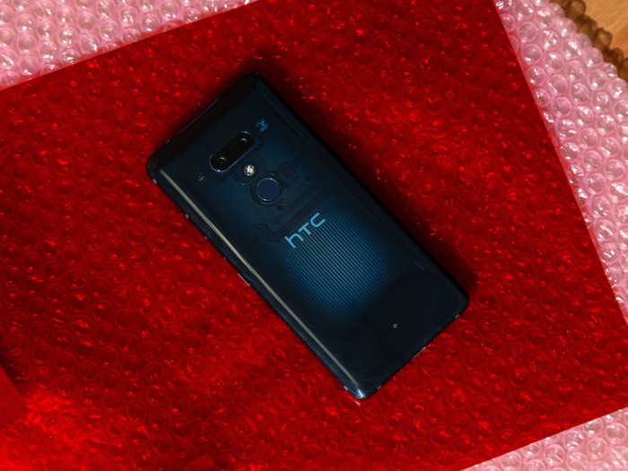
Love: The transparent back

Hate: The slipperiness
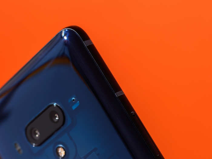
That beautiful shiny finish has a major downside: the HTC U12+ is dangerously slippery.
The HTC U12+ slides off of any surface that's not perfectly flat. If you place the phone face-up on your couch cushion and walk away, expect it to be on the floor upon your return.
The HTC U12+ will slip right out of your hand, seemingly on its own. You'll think you have a tight grip on, but it won't matter, because you will undoubtedly fumble it in a way that would be comical if you weren't terrified of cracking your $800 glass smartphone.
I love you, shiny finish, but you are not meant for the cruel realities of this life.
Love: USB-C charging
It's basically the norm for an Android phone to have USB-C charging these days. But what isn't yet the norm is using that USB-C port for more than just charging up your phone.
HTC is kind enough to include a pair of headphones in the box when you buy an HTC U12+, which is great since the headphone jack has been removed. But the bonus of USB-C headphones — no matter how cheap and basic-looking they are — is that they're able to support noise-canceling.
HTC does another cool thing where its headphones are concerned: You can create a personal audio profile on the U11 Life in order to tune the headphones to your own hearing. The phone will play sounds through the buds to scan your ear structure, then tune the noise canceling for your personal needs. It seems a little gimmicky, but it also seems to actually work.
Hate: The screen
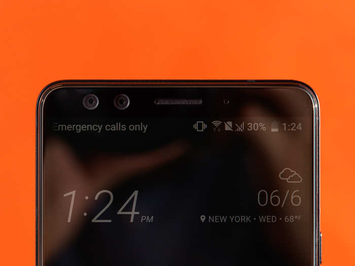
The screen. Oh, the screen.
For the first few minutes of using the HTC U12+, I thought the screen was fine — and then I compared it to my own phone, an iPhone 6s.
My nearly 3-year-old phone was significantly brighter and sharper than the HTC U12+. I compared it on several apps, including instagram, Google Maps, and an entire episode of "The Bold Type" on Hulu. In every situation, my iPhone screen looked better.
Sure, the HTC U12+ has a much larger screen, which is great for watching videos. But if those videos are dim — even at full screen brightness — is it really better?
Love: The rear camera
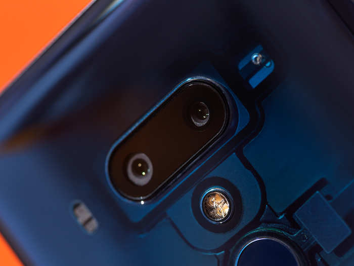
The last few HTC phones have had great cameras, and the HTC U12+ is no exception.
This is the first HTC flagship model with dual rear lenses, and so far, I'm impressed. The photos are sharp and vibrant, the bokeh effect is beautiful and surprisingly close to a real DSLR photo, and close-ups look significantly brighter and more detailed than shots taken on my iPhone.
HTC also offers plenty of manual controls thanks to its Pro mode. You can adjust white balance, ISO, and shutter speed, and there are extra modes for macro close-ups and sports photography. You can even shoot RAW if you so choose.
Hate: The front camera
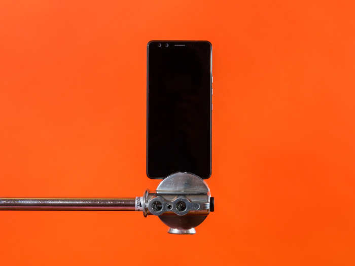
I wish I could say the front camera was as much of a delight to use as the rear camera.
HTC added dual front-facing lenses on the U12+, which was neither needed nor wanted. The dual lenses allow for portrait-mode selfies, a feature that's becoming increasingly popular thanks to the iPhone X and Google Pixel 2.
The problem is, portrait-mode selfies don't look that great on those two phones, and they look even worse on the HTC U12+. The front-facing camera is fixed focus, which means that unlike most smartphones, you can't tap on your face to focus the camera. Most of my selfies came out blurry, particularly those taken with portrait mode.
And don't get me started on the face-smoothing. Much like other premium Android smartphones, the HTC U12+ has an extreme face-smoothing feature that makes you look like a totally different person. No thanks.
Love: The squeezable edges and "Edge Sense"
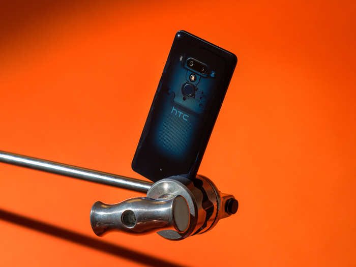
Both the HTC U11 and the HTC U12+ have a feature that, while not exactly necessary, is delightful: The phones are actually squeezable.
When you squeeze the sides of the phone toward the bottom — below the power button — it's a shortcut that brings up the camera, or whatever tool you choose. You can also squeeze and hold, which is pre-set to bring up Google Assistant. Both types of squeezes are re-mappable.
I found myself using this feature to bring up the camera all the time. It's quicker than swiping left on an iPhone, and squeezing again actually takes the photo. It's not a must-have feature, but it's certainly nice to have.
HTC also added something called Edge Sense, which makes the edges of the phone touch sensitive in the same spot — right below the power button on either side of the screen.
By double tapping, you bring up the Android version of Apple's reachability feature. The display will shrink and shift down to the left or right, depending on which side you tapped on. Again, not a must-have feature, but it's useful without being annoying or disruptive.
Hate: The haptic side buttons
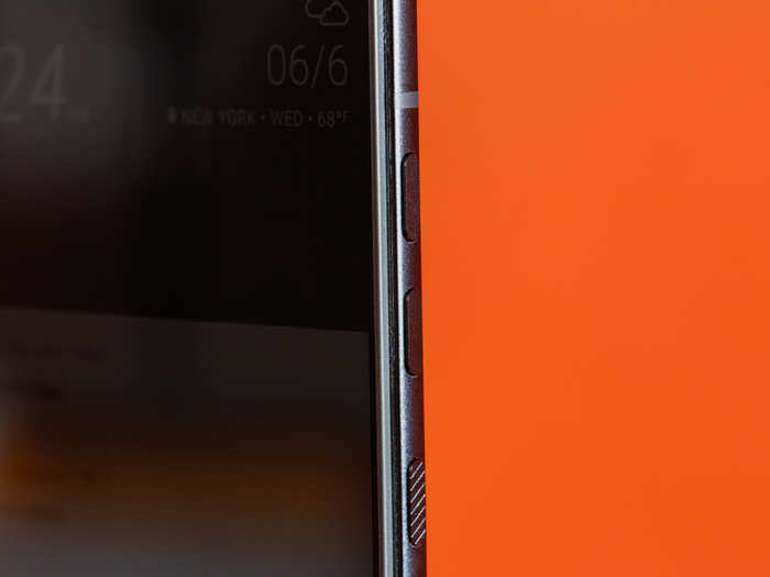
With the haptic keys on the U12+, HTC took things too far.
I love haptics as much as the next person. They're pleasant in an oddly satisfying ASMR type of way, and the immediate feedback supplies you with a tiny sense of accomplishment. But I do not need haptic volume or power buttons on my phone.
Rather than including real, tactile buttons on the U12+, HTC fixed something that was never broken. No one ever had a problem with real volume keys, or took issue with a clickable power button. And yet, in the name of innovation, the HTC U12+ has fake buttons.
Sure, Apple did this with the home button on the iPhone 7 not too long ago. But it seemed to be a stepping stone along the way to removing the home button altogether. With the HTC U12+, it's hard to figure out what the motivation was for making the change.
Ultimately, it all comes down to one factor: the price tag.

The HTC U12+ has plenty of qualities that make it worth considering before your next smartphone purchase.
It has a solid, and occasionally stellar, rear camera. It's a gorgeous, unusual-looking phone. And it's forward-thinking, thanks to USB-C charging, touch-sensitive edges, and a large screen.
But the HTC U12+ also has a few main issues. Its front-facing camera is subpar, the display is dim, and it's simply too slippery.
I also had some frustrations on the software side. HTC insists on including something called BlinkFeed, a newsfeed-like module that appears when you swipe left on the home screen. The feed is essentially useless — on phones like the Google Pixel 2, you'll see a personalized Google News feed there instead — and this week, it actually served me fake news about the NBA draft (Draymond Green is not being traded to the New Orleans Pelicans, thank goodness).
All that aside, the HTC U12+ starts at $800. That's not much of a surprise given that we're living in the age of sky-high smartphone prices, but it feels like a high price to pay for a phone with a lot of shortcomings.
Popular Right Now
Popular Keywords
Advertisement