- Home
- slideshows
- miscellaneous
- 12 easy things I changed on the Galaxy S10 to make it better
12 easy things I changed on the Galaxy S10 to make it better
The — very — first thing I did was during the setup process, as soon as I turned on the Galaxy S10.

The Galaxy S10 has a sharp 1440p display, but it's set to 1080p by default. Don't change that.
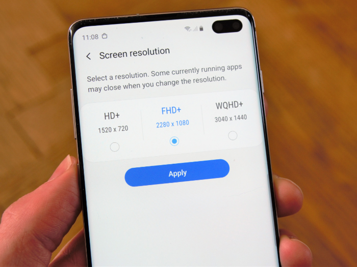
When you first start up the Galaxy S10, its display resolution is set to FHD+ 1080p.
The temptation is strong to set the display resolution to its full WQHD+ 1440p option for the crispiest, sharpest look.
Truth be told, I hardly notice a difference between the default FHD+ 1080p mode and the WQHD 1440p option. And keeping it to FHD+ resolution will help extend your battery life, as the Galaxy S10's processor doesn't need to work as hard to render items on the display at a sharper resolution.
Make the Galaxy S10's display truly pop.
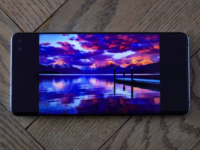
Oddly enough, the Galaxy S10's default display color mode is set to "Natural," which you can see above, and it looks fine. But there's a "Vivid" option (pictured below) that makes colors truly pop. Colors are way more vibrant with Vivid mode. This makes the biggest difference for the Galaxy S10's display.
To set the Galaxy S10's display to the Vivid color option, go to:
Settings > Display > Screen mode > select "Vivid"
Turn on Night Mode to give Android and the One UI a sleek dark look.
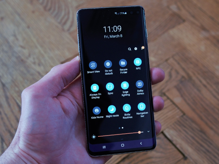
One of the best thing I did when I first got the Galaxy S10 was to enable its Night Mode option that turns the notifications shade, settings menu, and Samsung apps like Messages pitch black.
Not only is it easier on the eyes — especially at night — but it looks sleeker, in my opinion. Setting whatever you can to a dark or night mode will also help with battery life, as the Galaxy S10's won't be using up battery power to light up the default white color theme.
To enable Night Mode:
Swipe down the notifications shade > swipe down again > swipe left > tap Night mode.
Get rid of the Android navigation buttons to make your display ultra-clean.
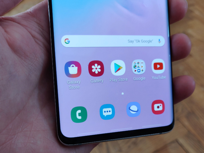
By default, you get the standard Android navigation buttons on the bottom of the screen, including the multi-task button, the home button, and the back button.
You can clean up Android's look on the Galaxy S10 by switching to gestures instead of buttons, which removes the navigation bar at the bottom. I kept the Gesture hints option turned on to serve as a guide for where to swipe.
To do this, go to:
Settings > Display > Navigation bar > select "Full screen gestures."
Swipe down from anywhere on the home screen to pull down the notifications shade.

Out of the box, swiping down on the Galaxy S10's home screen will bring up the Android app drawer where all your apps can be found. The thing is, swiping up already does that. So I decided to set the swipe-down gesture for something more useful — bringing down the android notifications shade.
Doing this makes it easier to pull down the Android notifications shade, as you don't need to reach up to the top of the screen to swipe the shade down. You can swipe down the notifications shade from the middle of the home screen, or even close to the bottom.
To do this, go to:
Settings > Display > Home screen > tap "Quick-open notification panel"
Change the way Samsung's new "One UI" interface looks to make it less cartoon-y.
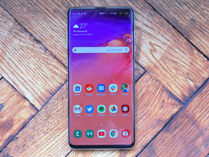
When I first saw Samsung's new One UI interface on the Galaxy S10, I wasn't very impressed. The icons were so large that it looked a little cartoon-y, which doesn't match the svelte and sleek Galaxy S10's aesthetic.
To remedy this, I made the home screen icon grid more compact, which made the icons smaller and let me add more apps to the home screen.
To do this, go to:
Settings > Display > Home screen > Home screen grid > tap "5x6," or whichever grid style you like.
Do the same for the "Apps screen grid" option in the Home screen menu.
Change the color of the Galaxy S10's edge lighting for notifications.

I'm a big fan of the Galaxy S10's edge lighting when a notification shows up, but I was underwhelmed by the default pastel pink color. I set the edge lighting's color to be white, which creates a more impressive effect when you get a notification.
To do this, go to:
Settings > Display > Edge screen > Edge lighting > Edge lighting style > tap "Color" > tap the pastel blue color on the top right of the color palette. It might be pastel blue on the color palette, but it shows up as white when you get a notification.
From the Edge lighting style menu, you can also change the animation and thickness of the edge lighting when you get a notification. I change mine to "Wave."
Set the Bixby button to do something useful.
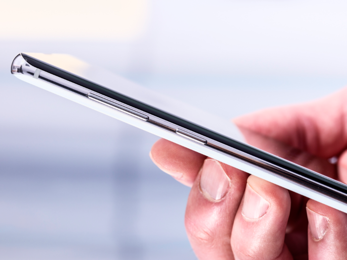
Samsung is now lettings Galaxy S8, S9, and S10 users change — or "remap" — what the Bixby button on your phone's left edge does.
Essentially, it lets you change the Bixby button into a shortcut for an app or feature you want quick access to. I changed the Bixby button on the Galaxy S10 to open the Hangouts app, as that's the app I switch to back and forth the most.
There are two steps you might need to take to do this, as I had to when I first started the phone.
1. You'll need to make sure your Galaxy Apps are up to date.
- First, tap the Galaxy Store icon, and an update menu should appear if your Galaxy apps need to be updated.
- Tap update.
- Then, tap the three-vertical-dot button on the top right.
- Press "My Page."
- Tap "Update all."
2. To remap the Bixby button:
- Press the Bixby button.
- Suffer through the Bixby Voice setup (press "skip" for voice training Bixby to recognize your voice unless you want to use Bixby Voice).
- Press the triple-vertical-dot button on the right of the Bixby Voice home screen.
- Tap Settings.
- Tap Bixby key.
- Tap "Double press to open Bixby" so that you'll only summon Bixby Voice if you accidentally double-press the Bixby button. Unfortunately, there's no way to fully disable Bixby Voice with the Bixby button.
- Tap "Use single press." This will let you pick what app or quick-command a single-press of the Bixby button to open.
- Select which app or quick-command you want the Bixby button to open.
Change the keyboard to Google's keyboard.
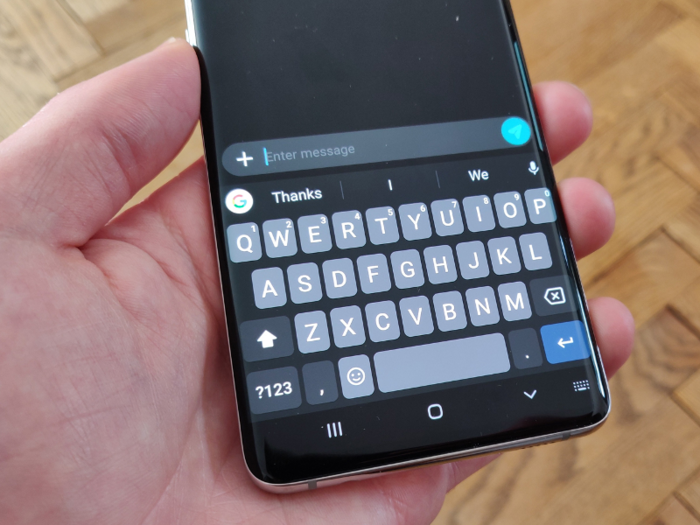
Samsung's default keyboard is fine, but I've always preferred Google's own Gboard. The keys are wider, which makes it easier and faster to type more accurately. It's also a cleaner keyboard compared to the cluttered Samsung keyboard. You can also customize Gboard more than you can Samsung's keyboard.
Just install the Gboard app from the Google Play Store and follow the instructions. Then, you can customize Gboard to your preferred themes and settings. I've opted for a black keyboard with blue accents here over the original light gray theme.
Make the Galaxy S10 'feel' faster.
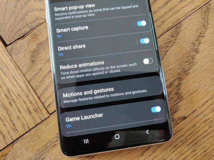
It's surprising that this option isn't on by default, as it makes the Galaxy S10 feel faster. Essentially, it reduces the superfluous animations when navigating around the Android operating system, which lets you get back to your home screen and close or open apps more quickly.
With animations switched on by default, it always felt like I was waiting for the animations to finish before I could go on to do what I wanted to do next.
To get rid of them, go to:
Settings > Advanced features > tap Reduce animations.
And finally, find an amazing wallpaper.
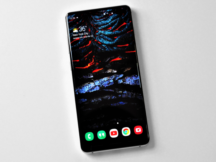
The default wallpapers on the Galaxy S10 are better than those from previous Galaxy phones, but they don't do justice to the Galaxy S10's display.
One of the best places to find wallpapers is Reddit, specifically the r/Amoledbackgrounds subreddit. Scroll through the backgrounds to find one that you like. Most of the backgrounds there are dark and have contrasting accents to make the most out of the Galaxy S10's AMOLED display.
Popular Right Now
Popular Keywords
Advertisement