These maps show how different Red America is from Blue America
Red counties are 84% less populous.

Red counties are 37% less diverse.
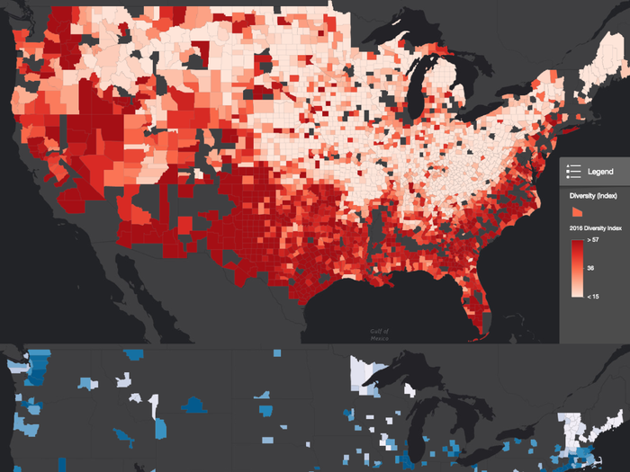
(32.7 vs. 51.9 average sores on an index that measures likelihood of randomly selecting two people of a different race).
Red counties are 34% more white.
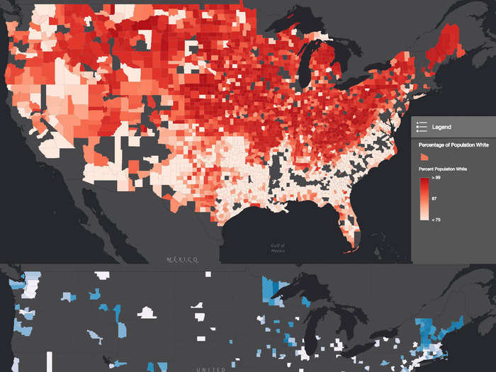
(84.9% vs. 63.5% average)
Red counties are 69% less black.
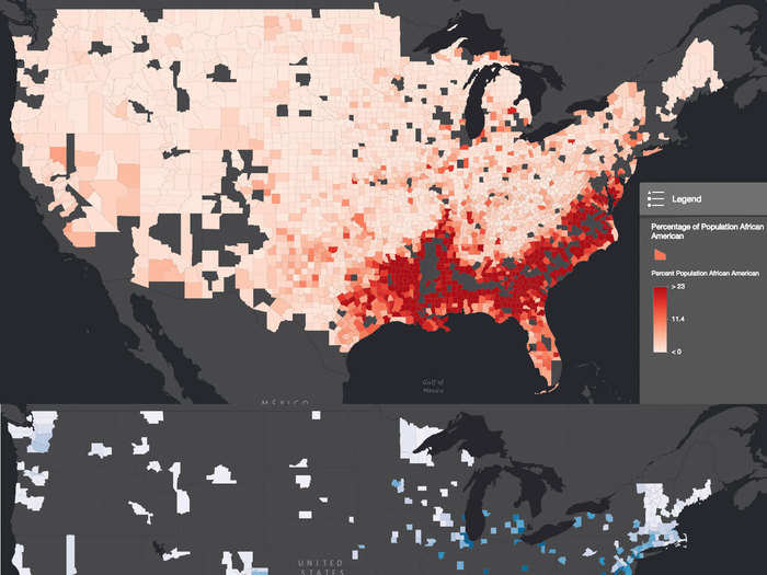
(6.8% vs. 21.6% average)
Red counties are 48% less Hispanic.
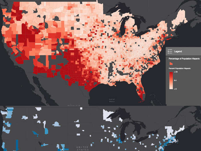
(8.2% vs. 15.9% average)
Red counties have a 23% higher share of veterans.
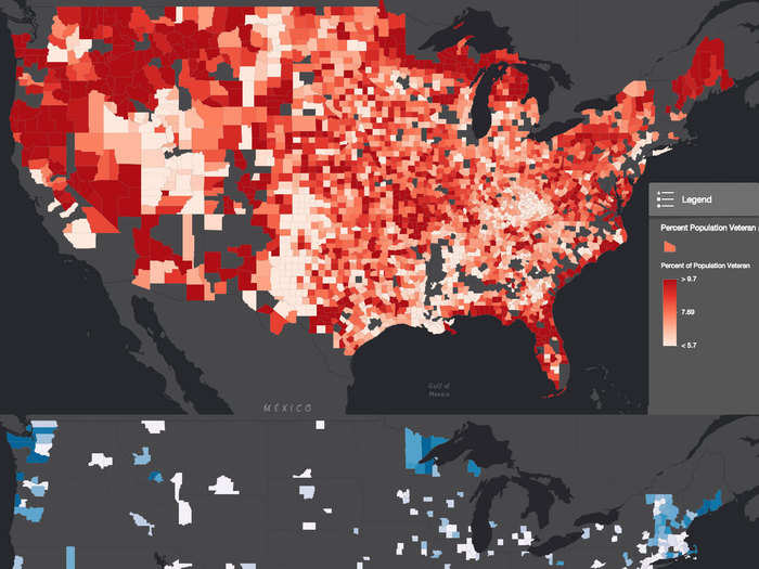
(7.9% vs. 6.4% average)
People in red counties are 44% less likely to have a bachelor’s degree.
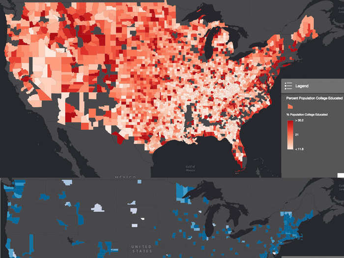
(19.5% vs. 29.5% average population share)
People in red counties are 14% less likely to get food stamps.
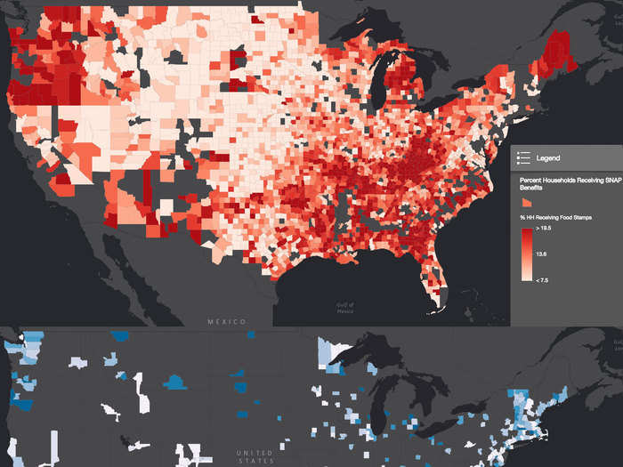
(13.3% vs. 15.4% average population share)
People in red counties are 22% more likely to shop at Walmart.
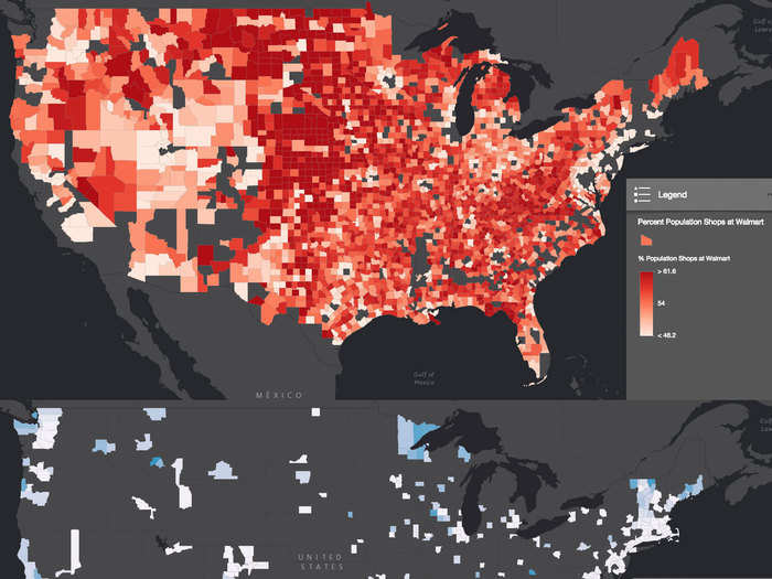
(55.6% vs. 45.4% average population share)
People in red counties are 11% more likely to "rarely check ingredients of food before buying."
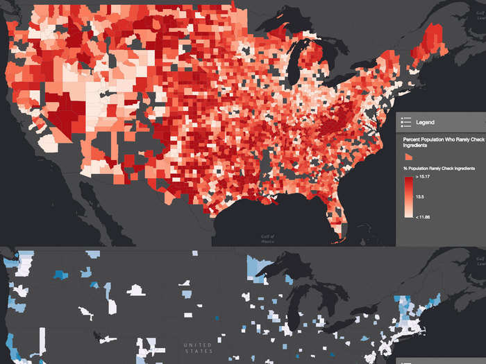
(13.7% vs 12.3% average population share)
People in red counties spend 10% more on smoking products each year.
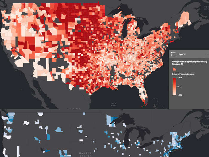
($433 vs. $395 average)
People in red counties are 18% less likely to watch the NBA during regular season.
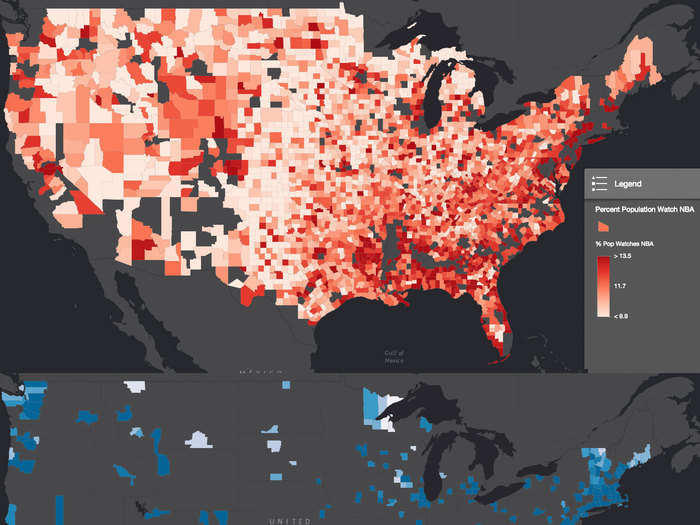
(11.4% vs. 13.9% average population share)
People in red counties are 3% more likely to watch the NFL during regular season.
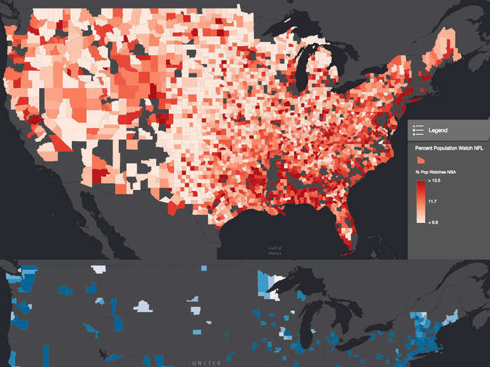
(28.4% vs. 27.6% average population share)
People in red counties are 17% less likely to exercise regularly.
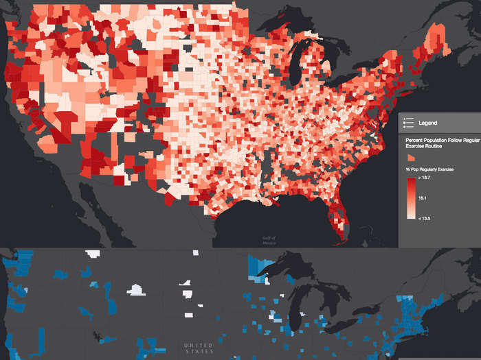
(average 15.6% vs 18.9% population share)
People in red counties are 42% less likely to do yoga.
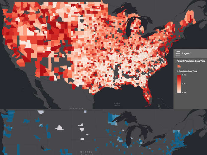
(5.1% vs. 3.6% average population share)
People in red counties are 3% more likely to say they are financially worse off than a year ago.
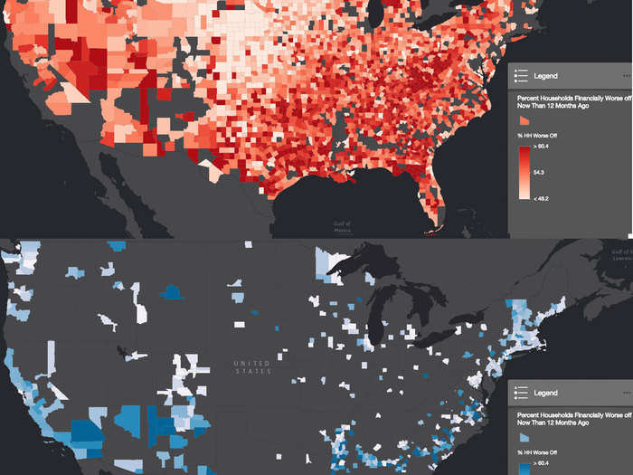
(average 54.6% vs 52.9% average population share).
Popular Right Now
Advertisement