- Home
- entertainment
- news
- 16 design details you probably missed on 'WandaVision'
16 design details you probably missed on 'WandaVision'
Erin Ajello

- "WandaVision" kicked off phase four of the MCU, and it's full of fun details and Easter eggs.
- The set design of the nine-episode series took viewers through the decades from the 1950s to today.
- The show borrowed a lot of design inspiration from popular sitcoms from the 1950s to the 2000s.
Marvel's "WandaVision" chronicled the sitcom-like reality Wanda Maximoff created after the events of "Avengers: Endgame."
The nine-episode series, which kicked off phase four of the Marvel Cinematic Universe, made plenty of clever references to other Marvel comics and to the sitcoms Wanda modeled her reality around.
Throughout the show, the set design in Wanda and Vision's home cements the episodes in different decades and nods to other famous shows from the different eras.
Read on for some set- and production-design details you might have missed on "WandaVision."
Warning: This slideshow contains major spoilers for "WandaVision."
The production designer made an effort to draw inspiration from sitcoms without copying the look of any one show.
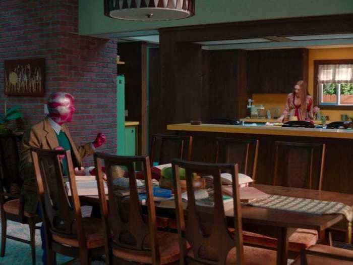
Sitcom fans can easily find parallels between the style of "WandaVision" and other popular shows, but production designer Mark Worthington made a conscious decision to avoid completely replicating the look of particular series.
"We didn't want to land on a sitcom for an era and say, 'We're going to copy that,'" he told Insider's entertainment correspondent Kirsten Acuna in February.
Instead, the show draws design inspiration from a variety of iconic series — as well as the trending styles of the era each episode is set in — to create the "WandaVision" version of each decade.
"We had to look at all sitcoms from an era," Worthington said. "You internalize that and find your own version of the '50s sitcoms, the '60s sitcoms, and so on."
The interior design of the house changes each episode to reflect the decade, but the basic layout remains recognizable.
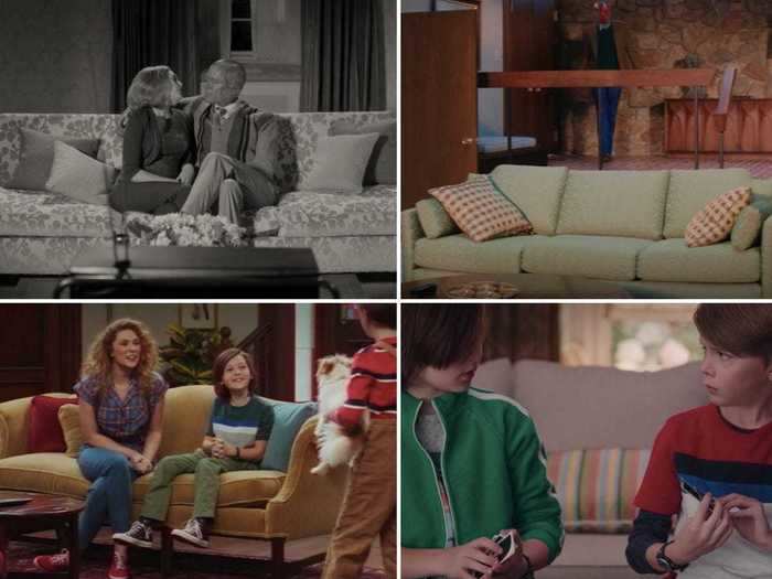
In every era, the front door of the house opens into the entryway and living room, followed by the dining room, which opens into the kitchen with a backdoor.
Even though staircases, nurseries, and other additions pop up throughout the series, Worthington told Collider in February that they intentionally kept the basic layout the same in each era.
"We wanted it to be the same layout recognizably," he said. "So that when you jump from eras, you go, 'That's the front door, that's where the fireplace is, that's where the path through the kitchen is. Yeah. OK. I'm in the same environment, but now within a new sitcom era context.'"
One key part of the outside of the house also stayed the same on each episode.
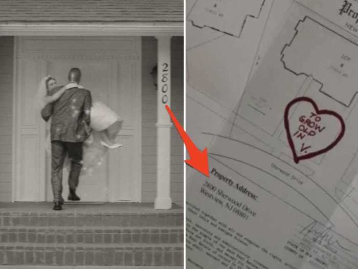
Wanda and Vision's house number, 2800, stayed the same throughout every episode.
The exterior design of the house changed to suit the trends of each decade, like transforming from a one-story 1950s home to a two-story house for the later decades, but 2800 can be seen on each version of the house.
Later, on episode eight, viewers learn that the house is actually on a plot of land that Vision bought for him and Wanda "to grow old in." And the address matches the one on the actual deed.
But some fans think this detail could also be a reference to Earth-2800, where the Marvel Cinematic Universe may be taking place.
The interior design in Wanda and Vision's home on episode one seemed to take inspiration from "I Love Lucy."
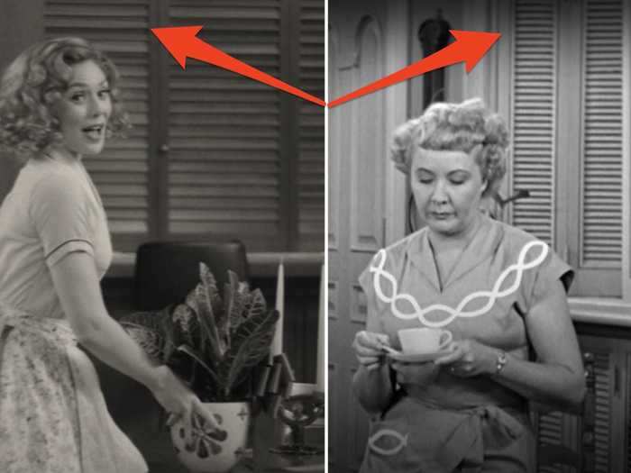
The first episode is styled to look and sound like a 1950s sitcom, complete with a black-and-white color palette and audible reactions from an imaginary studio audience.
In January, director Matt Shakman told Entertainment Tonight that the first episode paid homage to"The Dick Van Dyke Show" and "I Love Lucy."
Wanda's kitchen is similar to Lucy Ricardo's, both featuring a backdoor that neighbors use for visits and shutters that open into the living room.
Their bedroom setup reflects a common trend in television of the era.
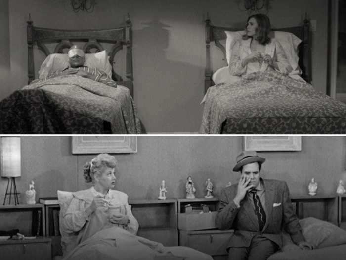
One specific image on the second episode clearly harks back to early sitcom culture: Wanda and Vision sleeping in separate twin beds.
From the 1930s through the 1960s, shots of men and women sharing a bed (or anything else that hinted at sex) were largely taboo. Instead, couples were shown in separate twin beds.
This troupe was present on "I Love Lucy," and it can be seen on "The Dick Van Dyke Show," which also heavily inspired episode one.
The second episode incorporated 1960s trends like patterned couches and low furniture.
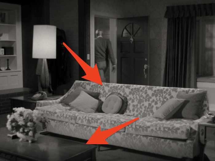
The second episode is set in the 1960s, and Wanda's furniture reflects that change from episode one.
Her living room looked very similar to the house set on "Bewitched," with a window on the wall by the door, the entrance and fireplace to the side, and a couch facing the audience.
The couch itself resembled the long, low design on the set of "I Dream of Jeannie," and was a popular style of the era.
The floral pattern of Wanda's couch also reflected a common design trend of the decade.
Fans noticed that certain Infinity Stone colors stand out throughout the show, especially on episode two.
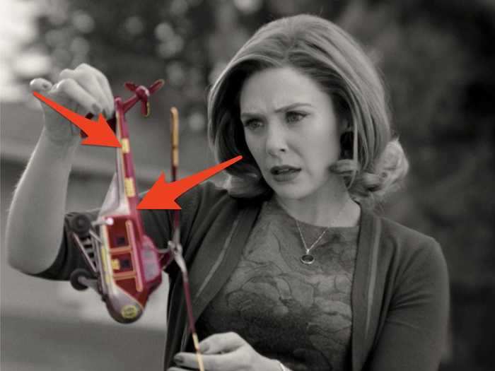
The Infinity Stones — Mind (yellow), Reality (red), Power (purple), Space (blue), Time (green), and Soul (orange) — played a prominent role in the third phase of the Marvel Cinematic Universe.
The Mind Stone has particular significance to Wanda and Vision because it provides at least some of their powers, but Wanda is also often associated with the Reality Stone because her powers glow red and she has the ability to warp people's surroundings.
With this in mind, it's fitting that the first two colors that appeared on the show (while it was still in black and white) were red and yellow.
Wanda first sees the red-and-yellow S.W.O.R.D. drone-turned-toy-helicopter, and later, Dottie's hand bleeds red.
After the second episode, when the show is fully in color, purple and blue also become prominent parts of the design. In particular, they seem to surround Agnes and Monica, respectively.
Agnes is after Wanda's power, so it makes sense that she matches the purple Power Stone, and Monica has a history with S.W.O.R.D. and space, so blue is fitting for her.
When asked if the inclusion of the Infinity Stone colors was intentional, Worthington told Comicbook.com in February that it wasn't something he did consciously, but it is an "absolutely valid" observation.
The 1970s had plenty of iconic design trends, and Wanda and Vision's house featured the most popular ones.
Interior design from the 1970s has plenty of recognizable trends, such as sunken living rooms, brick and stone interior walls, green and orange furniture, and open floor plans.
The sunken living room in Wanda's home on episode three looks similar to the one on "The Brady Bunch," with a low stone fireplace, interior brick walls, thick banisters, and plenty of plants and knick-knacks scattered around.
Their kitchen also featured popular 1970s-era staples such as wood paneling and colorful appliances.
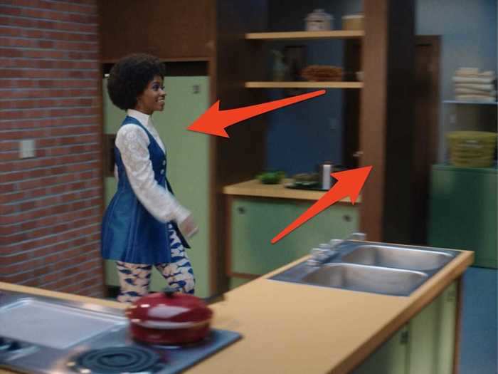
Wanda's kitchen on episode three included green appliances and cabinets, which reflect the popular avocado kitchen trend from the 1960s and 1970s.
The same light-green style can be seen on 1970s sitcoms like "Good Times."
Wanda's open-plan kitchen and brick interiors are also similar to the designs on "The Mary Tyler Moore Show" from the 1970s.
As was popular in the 1970s, Wanda and Vision's kitchen included plenty of wood paneling as well.
The show's happiest moments seem to happen on the episode with the brightest color palette.
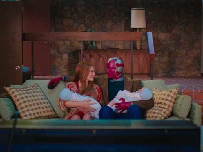
Wanda realizes she's pregnant and gives birth to her twin boys on the third episode.
Titled "Now in Color," the episode features bright furniture and clothing that make the upbeat moments feel even more cheerful
Worthington told Rotten Tomatoes in February, "It's colorful, it's very '70s era, and, yeah, there's this fun positive thing that happens in the episode. So all that tracks really well."
The exterior shots of Agnes' house on episode five repurposed a set from "Bewitched."
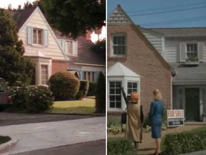
Agnes' house on episode five is actually the exterior of the house from "Bewitched," according to CBR.
Although the popular sitcom aired in the 1960s and the house is largely featured on the 1980s-inspired episode and beyond, the detail still holds significant meaning.
By the end of the series, viewers learn that Agnes is actually Agatha Harkness, a witch from the Marvel comics.
This connection to the supernatural sitcom was one of the more subtle clues about her true identity and powers.
The 1980s design on episode five had different features from the previous decades.
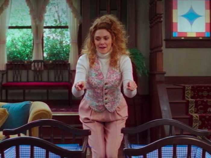
The fifth episode borrowed trends from the 1980s and 1990s, so the bright-green and rich-orange designs of the 1960s and 1970s were out.
Instead, floral wallpaper, carpeting, lace curtains, and stained-glass details were frequently incorporated into homes. And softer colors gained popularity.
These trends were heavily featured on 1980s sitcoms like "Family Ties" and "Full House."
On episode five, Wanda and Vision's house also featured two staircases to the second floor, one in the living room and one in the kitchen, which was popular on the sitcom sets of the decade.
The design of the fifth episode's theme song mimicked an iconic scene from the "Full House" intro.
The opening theme for the fifth episode follows the 1980s and 1990s sitcom trend of showing images of characters throughout various stages of their life as well as group shots with a happy family interacting together.
In particular, the shot of Wanda, Vision, and their boys picnicking in front of a gazebo resembles a scene from the "Full House" opening credits.
Although all the sitcom references are important to Wanda's storyline, this "Full House" comparison feels particularly meaningful considering Wanda actress Elizabeth Olsen's twin sisters, Mary-Kate and Ashley, starred on the show.
The 1990s kitchen has one noticeable change from the previous eras.
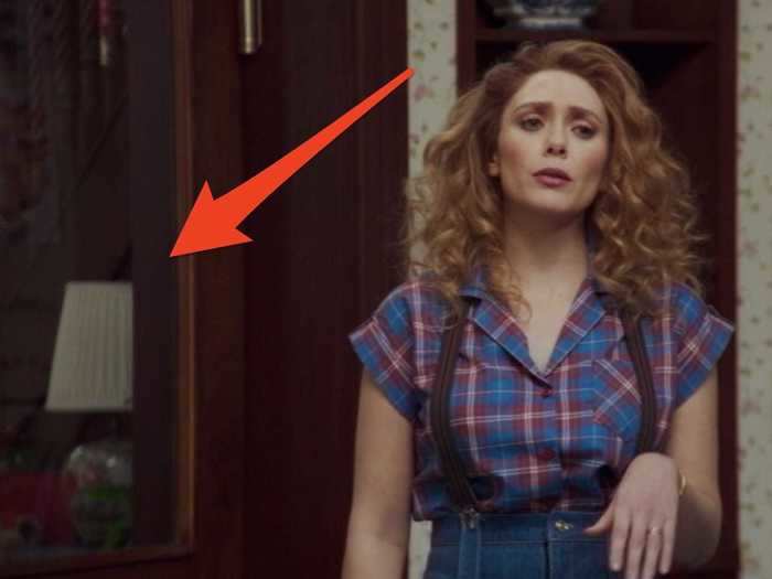
During the first three episodes, the kitchen featured an open doorway that led into the living room. But on the fifth episode, a swinging door was added to the design.
The change makes Wanda and Vison's kitchen look more like the "Full House" kitchen, complete with curtains and a brown china cabinet.
The Halloween episode showed plenty of 2000s design trends that have since gone out of style.
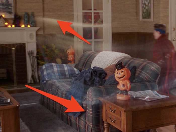
During the 2000s, some design trends came and went out of fashion rather quickly.
Brown walls and features replaced the floral wallpaper of the 1980s and 1990s, more solid-colored furniture gained popularity, and living rooms were set up in ways that highlighted the newest trend, flat-screen televisions.
Wanda and Vision's living room showcased these trends on the "Malcolm in the Middle"-inspired sixth episode.
Wanda and Vision's kitchen on the seventh episode showed off the most popular 2010 trends.
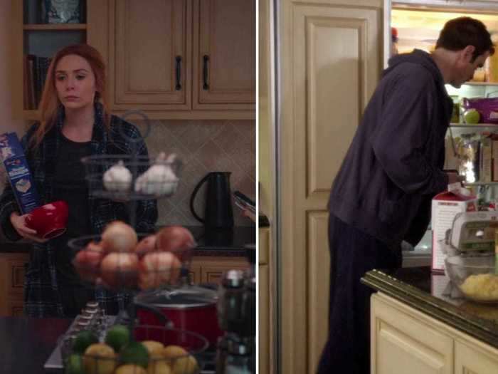
By the 2010s, kitchen styles changed to include tiles instead of wallpaper and light cabinets instead of dark wood. Kitchen islands were also all the rage.
Wanda and Vision's kitchen on episode seven mimics these trends, with a tile backsplash framed by light-tan cabinets.
A similar design can be seen on "Modern Family," which the whole episode was heavily inspired by.
READ MORE ARTICLES ON
Popular Right Now
Popular Keywords
Advertisement