- Home
- entertainment
- news
- 10 details you might have missed in 'Westworld' season 4, revealed by the show's production designer
10 details you might have missed in 'Westworld' season 4, revealed by the show's production designer
Kim Renfro

- "Westworld" production designer Jon Carlos spoke with Insider about creating the show's detailed sets.
- Carlos and the team know superfans love looking for clues in the backgrounds or designs.
Warning: Spoilers ahead for "Westworld" season four, episode six: "Fidelity."
Every time Christina looked into a mirror, the production team made sure there was blue visible in the shot, referencing Dolores Abernathy's blue dress.
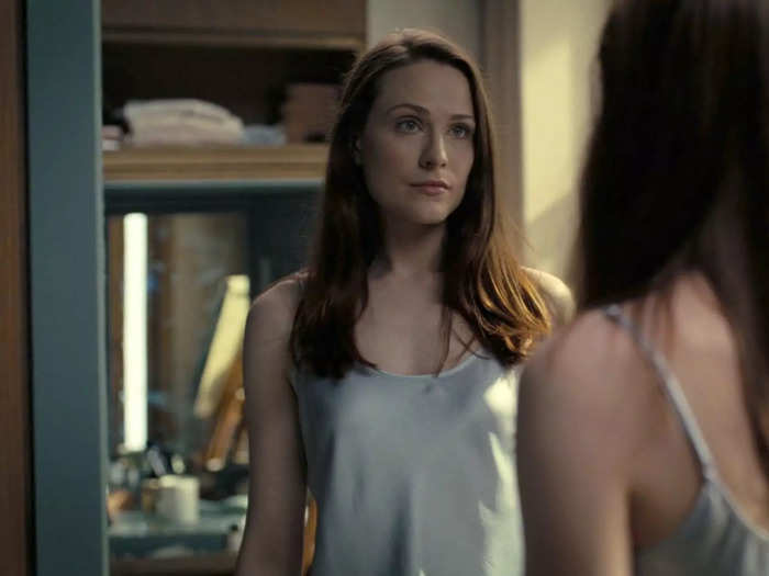
"Anytime there's a mirror, there's a blue accent color painted around it," production designer Jon Carlos said in a recent Zoom call with Insider.
Christina, a new character played by Evan Rachel Wood, was introduced in season four with a deliberate amount of mystery surrounding her identity. Was she Dolores again? Living in a simulated world? Or is this the real world? The only hint we had at first was her name, chosen by cocreator Lisa Joy and the writers' room because it references a famous painting that had served as inspiration for Dolores' character.
Carlos and the team wanted to lean into the ways Christina (literally) mirrors Dolores, and invite a parallel with the audience watching at home as the character begins to question her life.
"It's a moment of a reflection and I think the viewer engaging the exact same questions she is," Carlos said. "This amazing synergy happens between viewer and a portrayal of character."
The cryogenic chamber's design was inspired by Da Vinci's "Vitruvian Man," not a certain famous cartoon mouse (as some fans may have guessed).
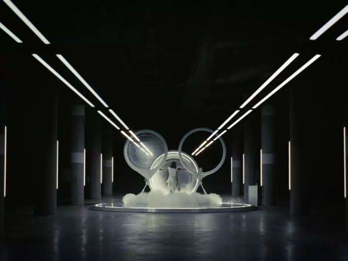
"That entire rig is a fully practical build," Carlos said. "There are no visual effects whatsoever. That was a really strong collaboration between our design team and our construction welding team and special effects and the sound that it made. When it opened up, it was just so beautiful."
The design of double doors that align perfectly into a set of circles was an intentional reference to Leonardo DaVinci's "Vitruvian Man" drawing — a theme that has been present in the "Westworld" opening credits since the very first season.
Carlos said they worked on concept art that initially had the door popping up over the front, and then sliding over (kinda like a minivan door).
"We really just felt like lateral movement was going to be more conducive for our 16:9 screen proportion," Carlos said. "But when it opened, I didn't want it to just slide because I wanted there to be balance."
He continued: "The Vitruvian Man is all a study about proportion and rules of golden triangle and the geometry of the human body. So the second I put something off center, it ruins the intent of that composition. That's why I went with the double door — so that I could get perfect symmetry."
Now onto the most detailed set project of "Westworld" season four: the renovation of the massive Sweetwater set into a 1920s Chicago theme park.
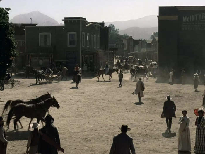
The Melody Ranch Studio in California was home to the original "Westworld" park in seasons one and two. Carlos' team returned to that very same location for the new park: Temperance.
Within the story of "Westworld" season four, we learn that Halores (the host copy of Dolores who is living as Charlotte Hale) has rebooted Delos' brand by creating a new version of Westworld set in 1920s Chicago.
Carlos recalls one quote from "Westworld" cocreator Jonathan Nolan that stuck with him.
"The entire time he was like, 'I love what we're doing on a meta level,'" Carlos said. "It was so meta that every single Western building that we shot with on season one is literally behind the facades we put in front. So you open a door, and you're back into the Western space. You walk literally right around the corner and look behind you, and it's all the old Western lumber behind the buildings."
The Temperance park facade was built with custom lights and hand painted signs to match Sweetwater shop-for-shop.
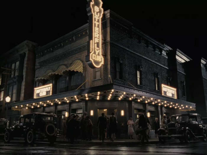
Carlos was excited to explore most textures within Temperance, including hard-paved roads that could handle water — which meant Carlos could "double" the production value by using reflections.
"Every single one of those light bulb signs was a custom built sign by our construction department led by Jeff Schubert," Carlos said. "We got to play with commercialism and commodity and advertisement — displaying of wears in the storefronts."
Carlos continued: "So in terms of just geography, we started at the train and we just walked down the street. It was so important for us to maintain the exact same beats that we had seen in the loops in season one."
Which brings us to the Butterfly Club, a premiere attraction on the main street of Westworld, Shogun World, and now Temperance.
The unique sign for Temperance's Butterfly Club has precise elements from the maze pattern hidden throughout the park.
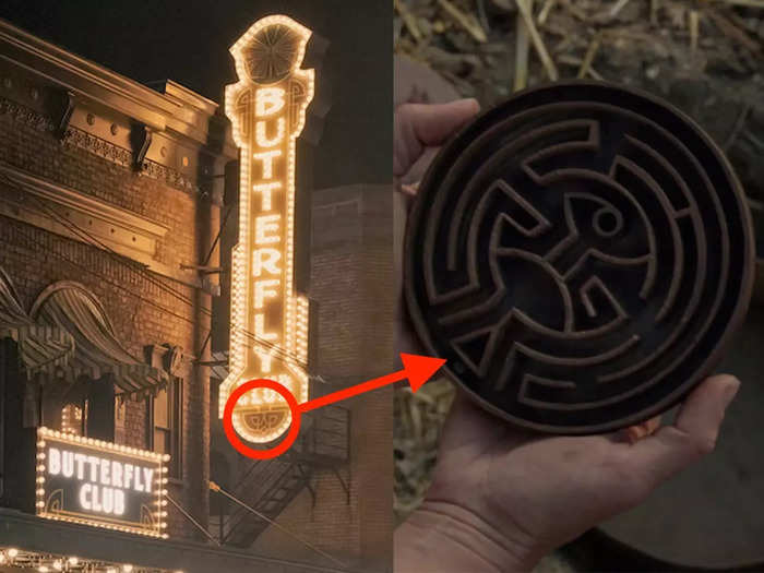
Carlos credits Simon Jones, a graphic designer who has been with the show since season one (and whose wife also works on the series) with this detail.
"It's nice that we have the same art family that returns every year," Carlos said. "The benefit is there's this ability to hide history symbolically throughout different design elements. Simon is a master at hiding the maze. It's in more places than you would ever imagine and in more places than you'll ever see."
Jones had the idea to have the bottom of the Butterfly Club sign include the bottom lines of the maze pattern.
"Then we extruded the lines all the way up and basically the head of the center of the maze was the butterfly at the top," Carlos said.
This mysterious design has been the symbol of hosts' journey to consciousness since the pilot episode, and clearly fans should keep a careful eye out for more of these covert inclusions of the maze in future episodes.
The gold statues inside the Butterfly Club were an intentional reference back to Dolores and Halores' hotel room scene in season three.
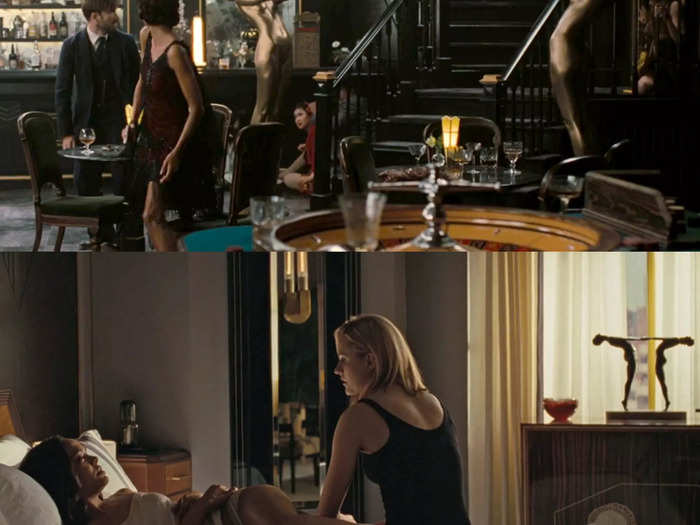
"That's the sick thing about my team is that a lot of things are ridiculously intentional like that," Carlos said. "So there are two things we're playing with. The first is how hosts are oftentimes seen as inanimate objects. There's essentially pieces of statuary. So playing with, 'What does a human look like when it's no longer moving?'"
He continued: "There's this unnatural quality that happens when someone just stops completely and there's no movement. We somehow accept statuary in that state and we glorify it as beautiful, but the second an actual human becomes a statue there's something insanely wicked and very uncomfortable about that."
So Carlos said anytime they can use statuary "in a naked form and without natural hair," they're always calling back to the host's manufacturing and "the objectification of the human form for visual pleasure."
The second thing they're playing with when it comes to the gold statues is a direct callback to the statues that were in season three, episode three when Dolores and Halores were in a hotel room together.
When fans first saw that scene, we didn't yet know which host control unit was inside Charlotte Hale's body. But the statue on the table next to them, which showed two symmetrical figures, hinted at their twin connection.
"That [season three statue] was showing the symbiotic relationship between the two of them," Carlos said. "And as we progress through the season, we see the separation. So when we come back to the Butterfly Club, those two women holding hands are no longer touching. That was a direct correlation back to that particular statue."
Background signs and stores in Temperance are named after people in the art and prop construction departments.
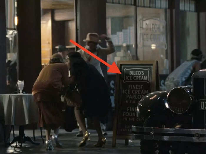
Carlos hasn't put his own name into "Westworld" yet, though this year he added the name of his collaborator, set decorator Julie "Jules" Ochipinti, into her very own "Ochipinti Alley" for Temperance.
"I tend to not like hiding my name in sets, but there is a tradition that Nathan Crowley — who designed the pilot — instituted that I was beholden to," Carlos said. "Most of the western building names in season one were members of the art or prop or construction department. He was honoring all the artisans that it was gonna take to create that particular world. I thought that was just so special."
So with Temperance, Carlos went back to this approach and put many of the crew members' names into storefronts and signs.
One example (seen above) is the DeLio's ice cream store that several parkgoers run past in episode three. Carlos says a man named Chris DeLio was one of the art directors spearheading the main street of Temperance.
Carlos says there are hints within the quarry set that point to other parks Halores may be building.
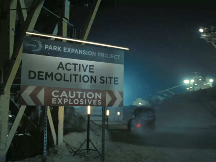
Carlos also said there was a sign on the main walk of Temperance that advertised how park guests could go explore the "quarry" — just as guests in the Westworld park had been able to venture out towards the river or towns like Pariah. That quarry sign was in the background in episode three, and was a perfect way to foreshadow Maeve and Caleb's deadly trip to the quarry that takes place in episode four.
Not only was that detail planted, but the quarry itself contains some hidden clues about future storylines.
"When they go to the quarry, we're starting to show there's other parks being expanded upon," Carlos said. "So it's not just Temperance — she's creating other parks within that world. So there are Easter eggs at what those other parks are that you can find."
When asked if he could elaborate, Carlos smiled and declined, instead opting to let the superfans do some digging of their own.
Carlos says the human architecture in the show is based on squares, while circular designs represent the hosts. You can even see this in the fidelity chambers Caleb is held in.
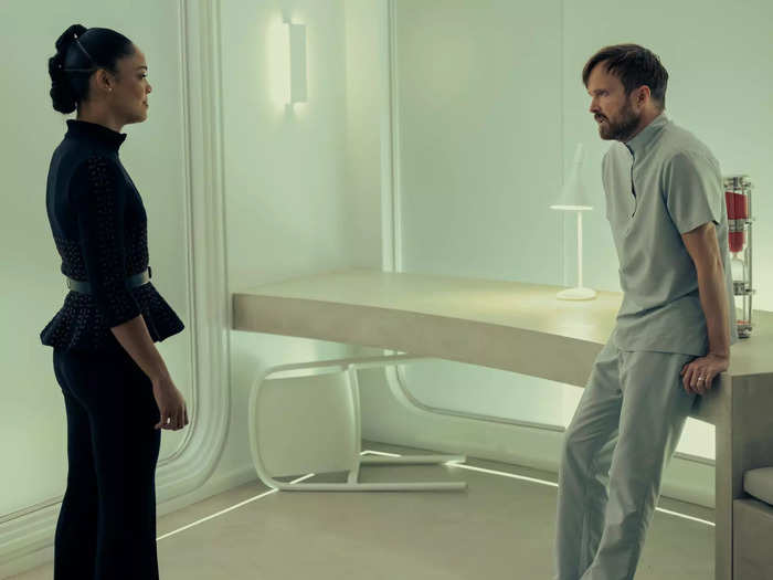
"One thing that I started playing with this season was between shapes that are 'human' and shapes that are 'host' and the transition of control," Carlos said. "So in season one, they start in the labs and it's all these rhomboidal shapes of the labs made from hard pieces of glass that come to sharp corners."
But with the hosts (namely Halores) now in control, Carlos has started rounding out the edges of designs and "pulling" a more dynamic shape out of that rhomboid structure.
"I'm basically slowly moving from rectilinear architecture design into circular architecture design, which is 'host' — that's why Hale's control tower is completely circular," Carlos said. "And when you look at the aerial footprint of 'Host City,' it's laid out in a spoke."
This is even true for the observation chamber that the multiple Calebs are held in during episode six. Each individual chamber has rounded edges and is designed to create a circle when you see it from above.
In the new control center we see in season four, the color scheme is flipped because the power has changed from the humans to the hosts.
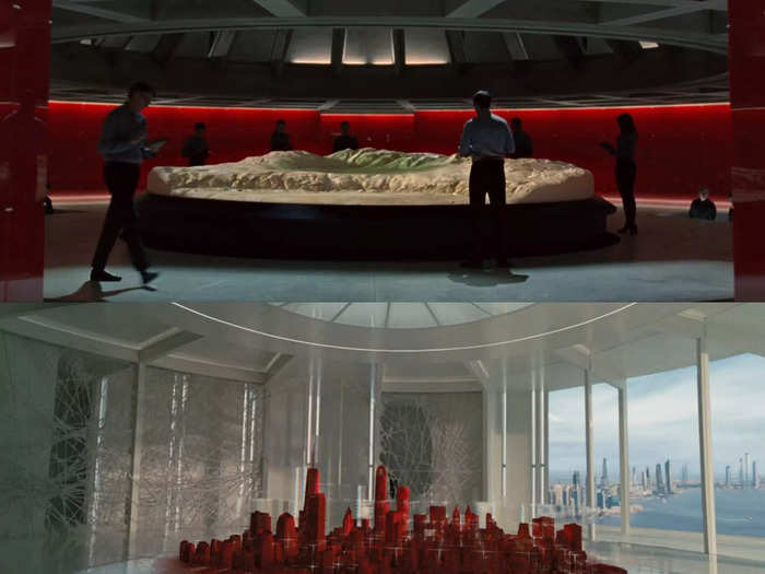
Before even diving into the color scheme, it's worth nothing that the ceiling on the original Westworld control room has square ceiling panels — aligning with Carlos' theme of linear architecture signaling human power. But in Halores' control room, everything is circular.
Carlos says this season they've done a lot of work with color inversion as power changes hands between humans and hosts.
The first season of "Westworld" showed us a vivid bright red wall design for the human's control room at the Delos offices.
"But when we get into Halores' tower, it's the inverse," Carlos said. "So the walls are white and the map is red because it's an inversion of human power to host power."
For more production design secrets, read Insider's season three interview with Carlos, production designer Howard Cummings, and set decorator Julie "Jules" Ochipinti here.
Popular Right Now
Popular Keywords
Advertisement