These 15 tech company logos have changed drastically since they started
Yahoo left its playful logo in 2013 for a more professional looking, streamlined letters.
Google no longer has the playful, round shaped fonts, and gives a more modern look.
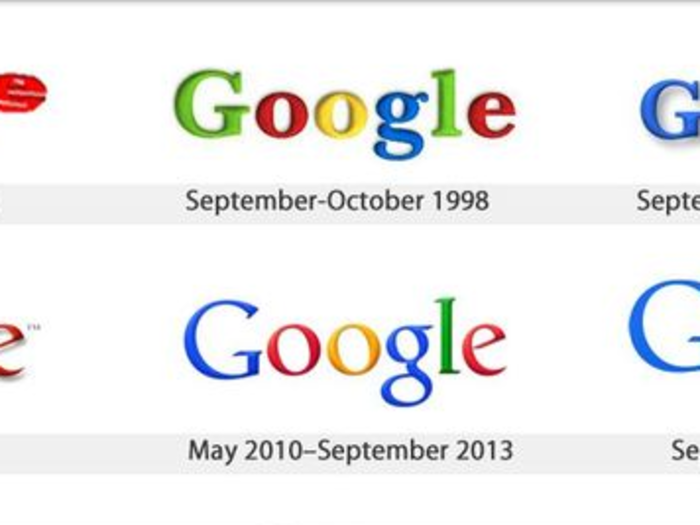
Google actually made another slight change to its logo in 2014 - can you spot the difference?
Apple's "rainbow apple" left a strong impression in 1977, but the company took a more simplified approach for a white, 3D logo in 2007.
Samsung started out as a noodle shop, so its first logo looks a bit non-techie, but it eventually switched to its famous blue logo in 1993.
Microsoft changed its logo almost every decade, from a trendy round shaped font to something that stresses its Windows product line.
AT&T's first logo spelled out "long distance calling," but now it simply features a blue orbit, a representation of its global reach.
Nokia's first logo featuring a fish is supposed to represent a river in front of the company's first office.
IBM hasn't changed its logo since 1972 and it's still one of the most easily recognizable brands in the world.
Hewlett Packard (HP) went through a lot of logo changes since its founding in 1939, but it seems to have settled for a logo with two simple letters.
Intel reached its peak prominence with the "Intel Inside" logo, but reverted back to a simple "Intel" logo in 2006.
Amazon's logo has changed quite a bit over the years, and now it seems like it moved back to its 2000 logo.
Dell's logo hasn't changed much except for its color over the years.
Xerox changed its 40-year logo in 2008 to the red, lower case logo with a sense of fun embedded in it.
Playstation apparently considered more than 20 different logos when it first debuted, before finally settling for the one featuring four bright colors in 1994. It now has a simple, unified white logo.
Now that you've seen how tech logos have changed...
Popular Right Now
Advertisement