Did You Notice These 21 Companies Changed Their Logos This Year?
This is Olive Garden's old logo. The restaurant changed its logo in March ...

... and was jeered for making a logo that some people felt was too generic.

Google's old logo is synonymous with the internet to many who use its products.
Its new logo isn't much different (the 'g' and the 'l' have been moved ever so slightly to the right).
WWE's old logo is a holdover from when it had an edgier show in the early 2000s.
Its new logo is cleaner and more professional.
Foursquare ditched its old logo when it split itself into two apps — Foursquare and Swarm.
The new logo was created to look like both a map pin and a superhero symbol.
Publishing giant Penguin Random House's old logo acknowledged each of its combined firms.

The new logo fuses them into a single identity.

Bacardi's old logo featured the brand's iconic bat.
The new logo has a smaller bat, creating a cleaner, more distinct design.
PayPal made some improvements to its old logo.
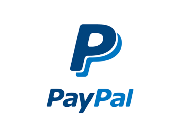
The new logo has a bolder word mark and more vibrant colors, and the overlapping Ps are designed to emphasize human connection.

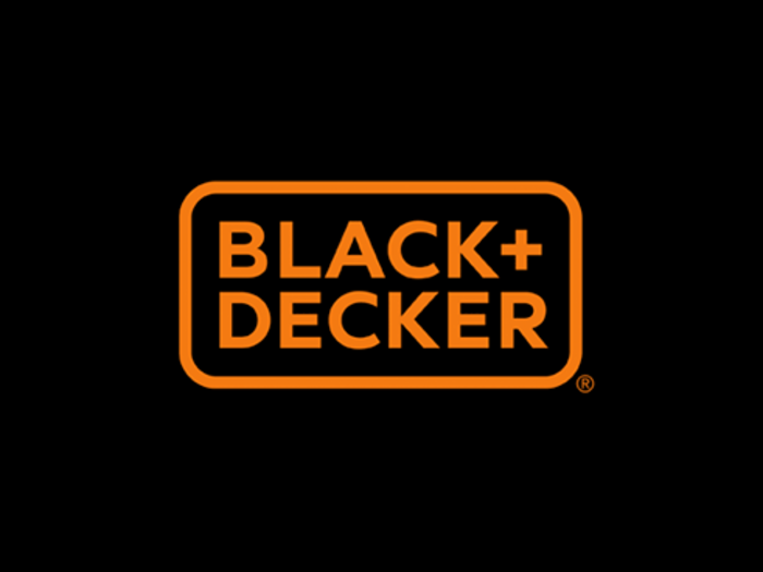
Black & Decker's old logo used an ampersand to connect the names of the brand's two founders.
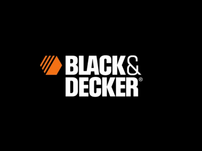
Its new logo uses the trendier plus sign, instead.
Lipton's old logo featured a bright lemon.
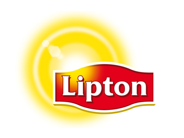
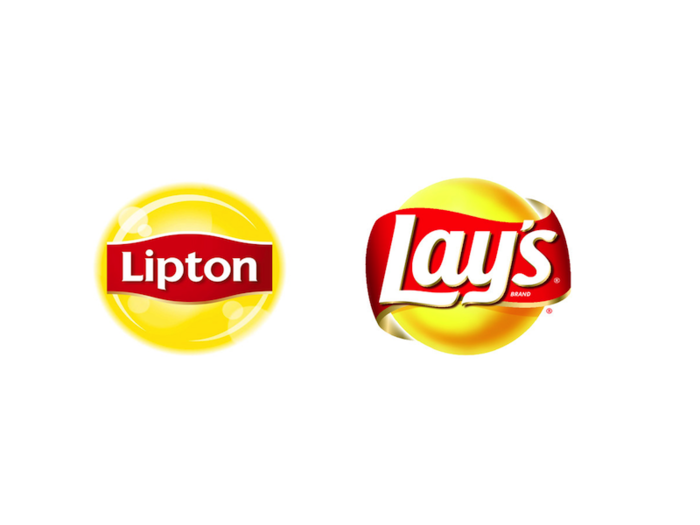
The new logo isn't too different, but it reminds us a lot of the Lay's potato chips logo.
See what we mean?
Hotwire's old logo included an airplane design to remind you it's a travel booking company.
The new logo just has this red dot.
Cadillac's old logo is something of an icon in the automotive world.
The new logo isn't much different, but Cadillac got rid of the laurel wreath that used to appear underneath its crest.
Florida State University's old logo was there when the Seminoles won the national championship in football this past season.
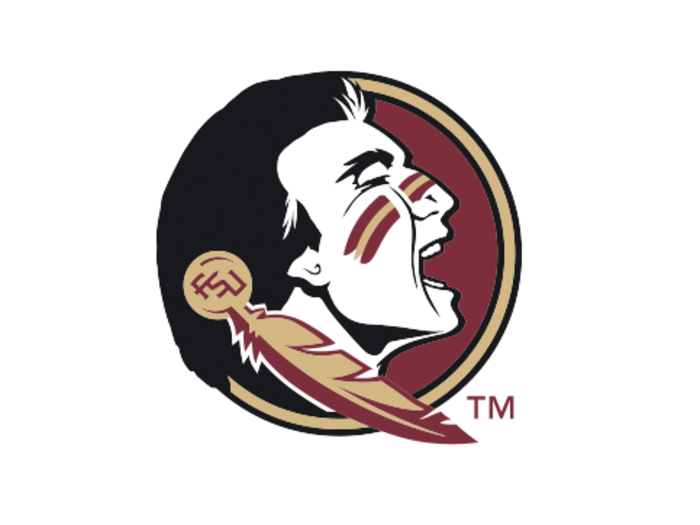
Its new logo tilts the Seminole's head toward the sky and replaces the "Florida State" lettering with a feather.
Getting rid of your school name might be a college sports logo trend. Here's Illinois' old logo.
And here's the new logo, which identifies the school only with a block 'I'.
In the pros, the Tampa Bay Buccaneers made some tweaks to its old flag logo, seen here.
The result is Tampa's brighter new logo, ARRRGHuably the Bucs' best yet.
Italian soccer giant Inter Milan also made a few changes. Here's it's old logo.
And here's its new logo, which no longer has the star on top.
Reebok's old logo was never quite as famous as the Nike Swoosh or Adidas' three-stripe design.
But its new logo makes the brand look more like a B2B software company.
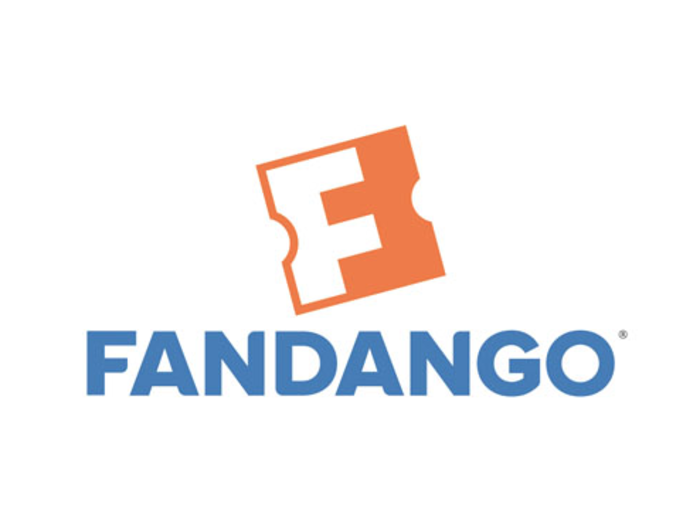
Fandango's old logo was designed to look like a movie ticket.
Its new logo has its letters closer together, and an upside-down 'F' hidden in the orange space.
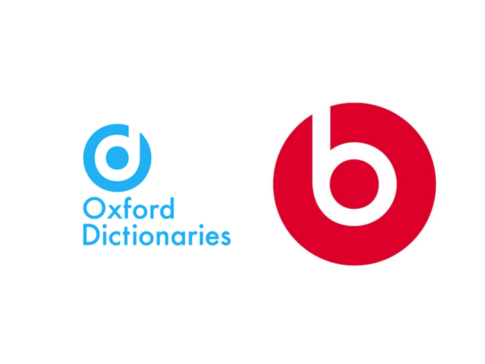
Oxford Dictionaries' old logo was a fairly plain word mark.

Its new logo is a bit more stylish, but it looks a lot like the logo for Beats by Dr. Dre.

See? That's the Beats logo on the right.
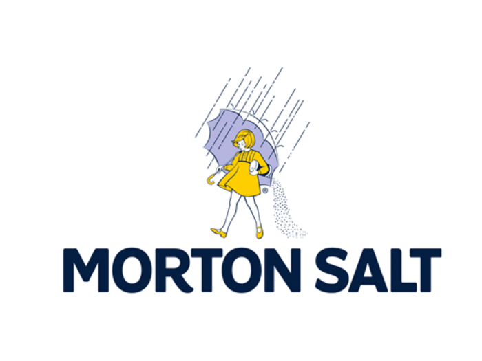
Morton Salt's old logo has been a fixture of grocery stores everywhere for years.
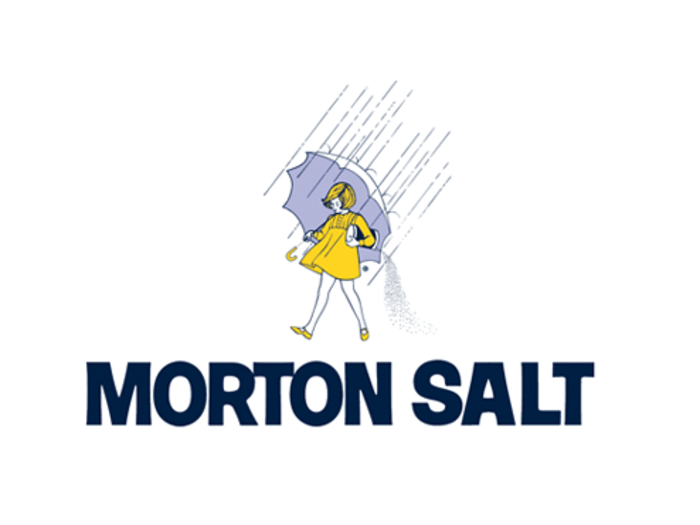
Their new logo has several very slight changes. There's a little curve at the end of the 'R' in the lettering, and fewer blue lines in the woman's hair.
Visa's old logo famously had a golden tip on the 'V'.
The new logo gets rid of this flourish. The letters are also darker shades of blue.
Popular Right Now
Popular Keywords
Advertisement
