The 13 Most Drastic Big Brand Logo Changes Ever Seen
When it came to design, the latter half of the 20th century marked a time of slimming down and simplification. IBM's logo evolution reflects this trend — its current design dates back to 1972.
Pepsi represents the path that many brands have taken — phasing out lettering entirely until all that remains in a logo is the symbol itself. Pepsi's first logo is illustrative of the design emphasis of the late 1800s — the more intricate a design, the better. Things certainly have changed.
Adolf Hitler is often credited for designing an early version of the iconic VW Beetle. The pre-WWII logo for the car manufacturer bears Hitler's influence as well, a Nazi-style swastika clearly outlining the perimeter. VW dropped the swastika quickly for a cleaner design that eventually became today's button-like logo.
Granted, Audiwerke was only one of four companies that came to make up the Audi we know today. But given that it's the namesake of the current company, its logo stands in stark contrast to the minimalist ring design of the 21st century.
When FedEx changed its name and expanded its operation to offer overnight shipping, it freshened up its logo as well. Can you spot the arrow in the negative space of the "Ex"?
Apple's original logo, co-designed by Steve Jobs, depicted Sir Isaac Newton seconds away from revelation. It was complex to the point of being hard to look at, hence a quick switch (in 1976) to the beloved rainbow apple and the evolution to today's sleek design.
Shell's logo hasn't changed in substance over time, but there are miles between today's design and the original.
Nokia's first logo dates back to the company's origins as a Finnish industrial powerhouse. Although it would be amusing if the technology company still incorporated a fish into their logo, we see why the evolution away from that theme took place.
The Fiat logo's bold evolution has been marked by many drastic redesigns. Seeing their oldest crest alongside their newest is indicative of not just how far the company has come, but how much design in general has evolved.

Mazda's original logo, like Pepsi's, is letter-oriented. The switch to the "M" logo occurred in 1997, Mazda having tried three different symbols before it.
Compared with its contemporaries, Kodak's earliest logo was surprisingly ahead of its time in terms of design. The evolution to the Kodak name as its logo occurred in the 1930s, and the company hasn't looked back since.
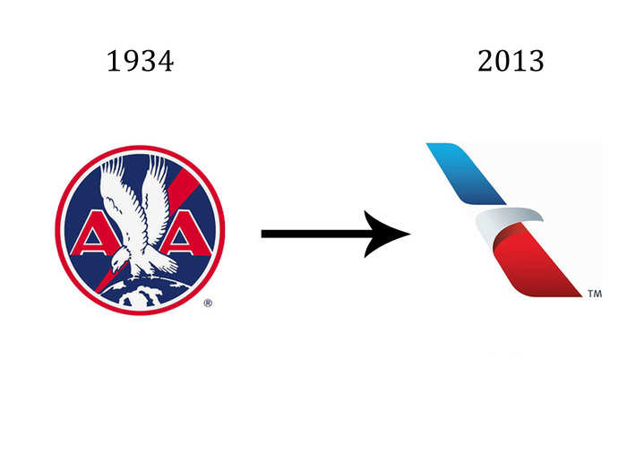
American Airlines is shaking things up this year with a bold redesign of its 79-year-old "double-A" theme, which has come to represent flight in the U.S. Its overhaul is a monumental milestone in AA's history.
Saab bounced between bordered and borderless logos for a good part of the 20th century. This year, it decided to ditch the borders (and an interim griffin) again for a minimalist, low-impact look. It's a departure from the original pop-art design.

These logo changes are drastic ...

Popular Right Now
Popular Keywords
Advertisement