- Home
- Advertising
- 17 Incredibly Creative Outdoor Ads
17 Incredibly Creative Outdoor Ads
British Airways, "Look Up"

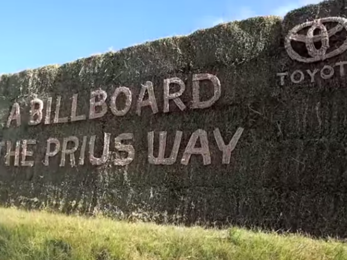
Toyota, "The billboards that came from nature went back to nature"
Agency: Saatchi & Saatchi, Sydney, Australia
Year: 2014
The people at Toyota, being the eco-friendly bunch that they are, took the idea of temporary and created a new way to advertise the Prius.
They made their billboards entirely out of materials found in nature like sand, mud, and grass. Over time, the billboards wore down, but before that happened people shared pictures of the campaign all over social media, making the temporary ads a success.
IBM, People For Smarter Cities
Agency: Ogilvy & Mather, France
Year: 2013
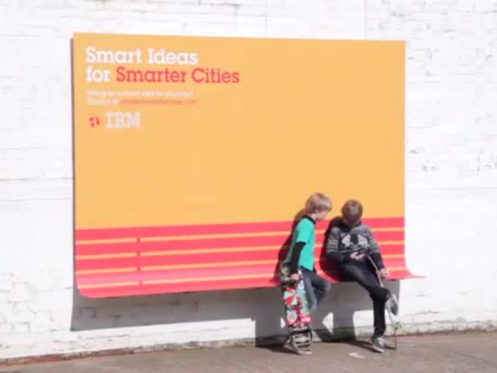
Ogilvy & Mather France used IBM’s outdoor campaign to solve some pesky, everyday problems people face when they live in a city.
The agency created this innovative campaign by turning three of IBM’s outdoor ads into functional items. One ad doubled as a bench, another as a spot to stay dry when it rained, and another functioned as a ramp.
The National Centre for Domestic Violence, "Drag Him Away"

Agency: JWT London
Year: 2012
The NCDV of London took a heavy topic and turned it into an interactive teaching experience.
They created this billboard in London’s Euston Station that shows a man yelling at a woman as the screen reads, “USE YOUR PHONE TO STOP THIS NOW DRAG HIM AWAY AT ncdv/org.uk/stop.”
When viewers took out their phones and logged on to the site, they could drag the man and watch as he slowly moved across a number of screens to reveal more information about domestic violence.
See the billboard in action:
Pepsi Max UK, Unbelievable Bus Shelter

Agency: AMV BBDO, London
Year: 2014
Pepsi converted a normal bus shelter ad into an augmented reality experience for its Unbelievable campaign.
People sitting underneath the bus shelter were tricked into thinking they saw some absurd things, like a tiger lurking on the sidewalk, or a UFO invasion touching down.
See the full experience below:
Warner Bros., "Break Glass"
Agency: JMW kommunikation, Sweden
Year: 2014
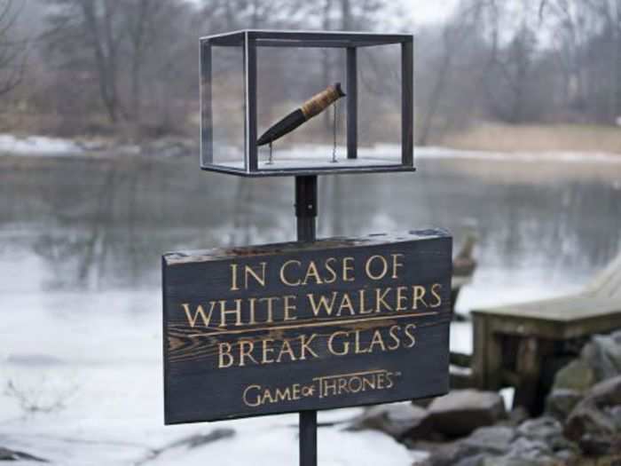
You never know what you might find lurking in the woods during the middle of the winter. A white walker from HBO's "Game of Thrones" perhaps?
Probably not, but in the event of a snow-walking zombie sighting, one Swedish agency placed this box in a few central locations in Stockholm. A special dagger was placed inside (because these medieval creature can only be killed with a special kind of weapon) to protect people and to promote season three of the HBO show.
DHL, "Trojan mailing"
Agency: Jung von Matt/Neckar, Stuttgart, Germany
Year: 2014
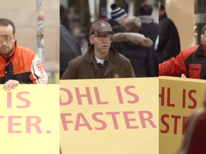
DHL knows that advertising on billboards in Time Square and other popular locations can be pricey.
To cut down on costs, without losing an opportunity to advertise, DHL crafted a sneaky plan to get its competitors to advertise for them. The company sent out boxes covered in thermoactive foil that revealed a message from DHL once the boxes were taken outside.
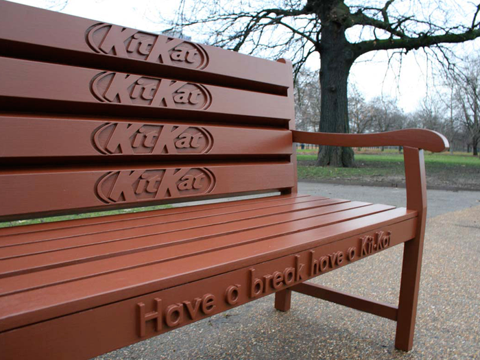
Kit Kat, Bench
Agency: JWT London
Year: 2008
What better way to make you want a Kit Kat than to have you sit on a bench that looks just like the delicious chocolate bar.
A few versions of the chocolate bar bench have been made, one with just a corner of the “chocolate” sticking out from the wrapper and another with the entire candy bar exposed.
This bench reads, “Have a break have a Kit-Kat.” A simple, yet clever idea.
Australian Childhood Foundation, "Invisible"
Agency: JWT Melbourne, Australia
Year: 2009
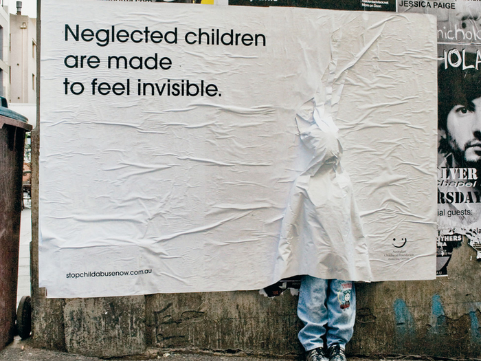
To raise awareness about neglected children and child abuse, the "Invisible" campaign created these billboards.
Each ad was plastered over a child-sized mannequin, making it look like a child was actually trapped behind the ad. With its feet sticking out of the bottom of the ad, the mannequin really does look lifelike. This definitely got people's attention as they walked by.
Swissmilk, "Milk Makes You Strong"
Agency: Ruf Lanz, Zurich, Switzerland
Year: 2014
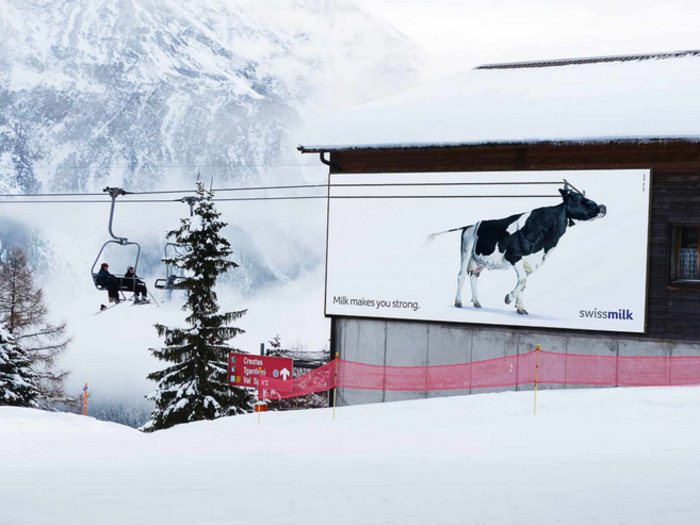
Milk makes you strong. It makes cows strong enough to hold up cable car wires and transport skiers on chair lifts, according to Swissmilk.
This outdoor ad from Swissmilk is simple and smart. Created by the Ruf Lanz agency in Zurich, Switzerland, the billboard exaggerates just how strong milk might make you, but the visuals are clean and the message is clear.
TNT and Purell, "The Last Ship"
Agency: Mono, New York
Year: 2014
Sometimes great ideas are born when partnerships are made.
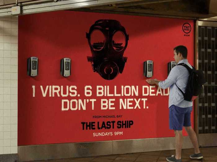
To promote its new drama "The Last Ship," TNT partnered up with Purell and put these ads up in New York's Grand Central Terminal.
The show is about stopping a deadly virus from spreading all over the world. So why not use some hand sanitizer and lower your chances of catching this virus? Or, just get rid of some of those subway germs.
Kit Kat and Google, "Have a seat"
Agency: JWT Amsterdam, Amsterdam, The Netherlands
Year: 2013
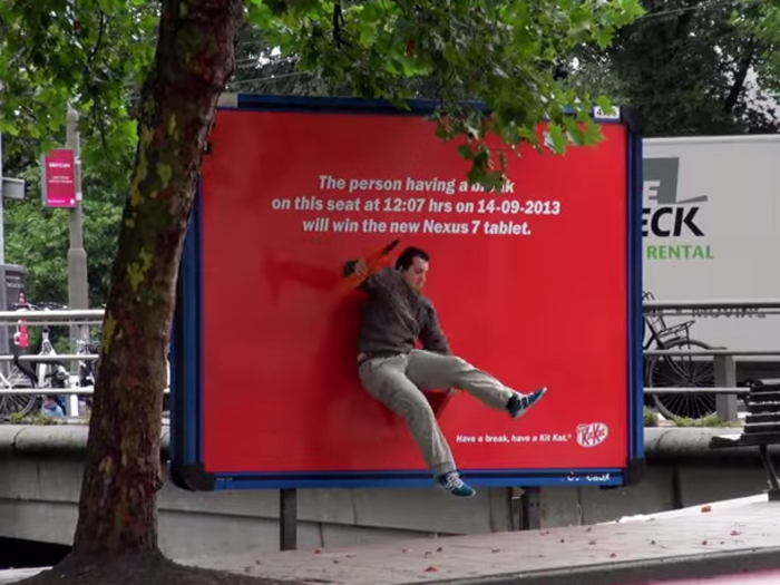
To promote a new partnership between Kit Kat and Google, and the launch of the new Android Kit Kat operating system, these two companies found a creative way to get people buzzing about their new product.
These unique outdoor ads were placed in special locations in Amsterdam. Each ad had a little bench for people to "take a break."
Anyone who was there at the right time was rewarded with a Nexus 7 tablet.
Panasonic, Nose Trimmers
Agency: Saatchi & Saatchi, Indonesia
Year: 2009
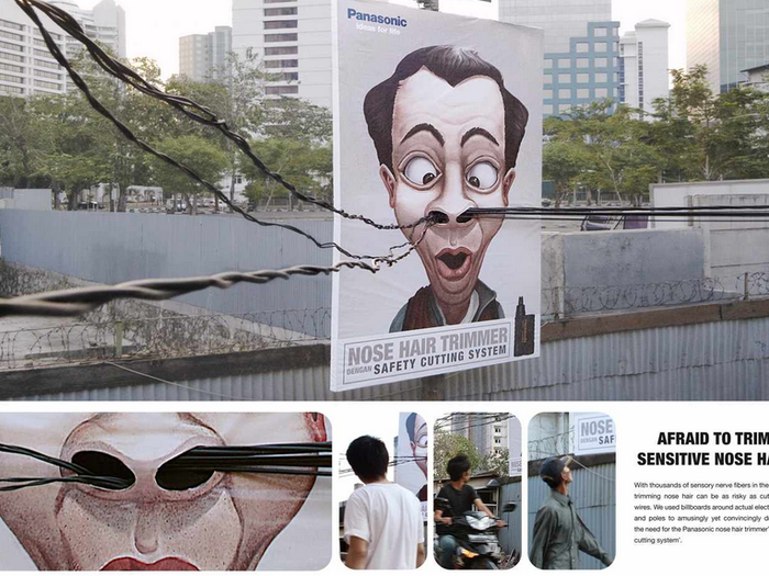
These billboards were built around real, live wires to dramatize how tricky trimming nose hairs can be.
The inside of your nose is sensitive and you wouldn't want to cut yourself. The thick wires also show the need to trim those pesky hairs in a new, very visual way.
Sealord, Smoked salmon

Agency: Saatchi & Saatchi, New Zealand
Year: 2014
If you're driving on the highway and you pass something that's on fire, chances are you'll slow down and take a look.
So Sealord's decision to set its billboard on fire, demonstrating how to best prepare its smoked salmon, was a fantastic idea. Even when the fire went out, the smoke continued to rise.
Here's a look at the fiery ad:
Fundación ANAR, "Only for children"
Agency: Grey, Spain
Year: 2013
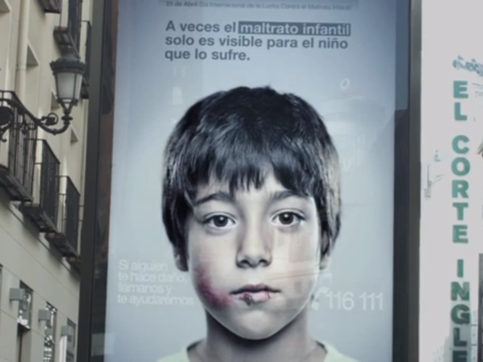
The ANAR foundation wanted to send a message to children living in dangerous situations or to children that were being abused. But they didn't want the adults, or the aggressors, to see the same message that the children saw.
To solve this problem, the ANAR devised this clever outdoor ad that showed one image to adults and another to children under the age of ten.
Volkswagen, "Up!"
Agency: Agence. V., Saint-Ouen, France
Year: 2012
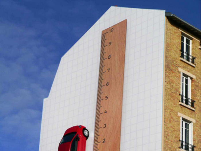
Outdoor ads are filled with all kinds of cars, but very rarely do companies put an actual car in their outdoor ad.
Some have done it before, but Volkswagen (in keeping with the small idea) took a little car and stuck it next to a big ruler to show how the car measures up.
The bottom of the ad reads "It's great to be small."
McDonald's, Steaming transit shelter
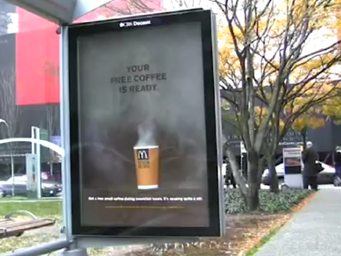
Agency: Cossette, Vancouver, Canada
Year: 2009
At certain times of day, this bus shelter ad looks like any old ad with a cup of coffee on it. At other times of day though, the ad comes to life and shares a new message.
The ad was designed to release random bursts of smoke from its built-in smoke machine at random times of the day. As the casing fills with smoke, a message is revealed telling people to stop by McDonald's for a free treat.
You've seen some creative ads, now check out some creative people.

Popular Right Now
Popular Keywords
Advertisement